New 2025 38mm Railmaster

Posts
3,655
Likes
7,732
Just because it was released for a movie doesn't mean it's not a good tool watch.

Definitely not what I'm saying. It is a tool watch.


There is a rich history of ornamentation in tool items when they stop seeing regular use or when their use case changes. One fair example is the decoration on Japanese swords as they saw less and less combat use in Edo period Japan. Same thing with watches.

I think it's more of a conceptual or philosophical thing, the ultimate purpose of a watch is to tell time accurately so as long as it does that it is a useful tool.
 
Posts
1,540
Likes
2,635
It seems that boutiques did get these in advance and have them available for display and purchase now. Got to check both the grey and brown pieces out - all I can say is that the pictures are fairly accurate in depicting how they look in real life. There isn't any opalescence or color shifts in the light as far as I was able to tell, and the dial is definitely a matte finish. Everything is otherwise identical to the 38mm AT 'colors' case, except with the conventional brushing and partially sandblasted crown. Whether or not you're a fan of the gradient and/or hands will likely define whether you find the watch appealing.

The brown one screams "Ranchero" every time I look at it, so much so that I wondered why it wasn't just launched with the name.
 
Posts
3,655
Likes
7,732
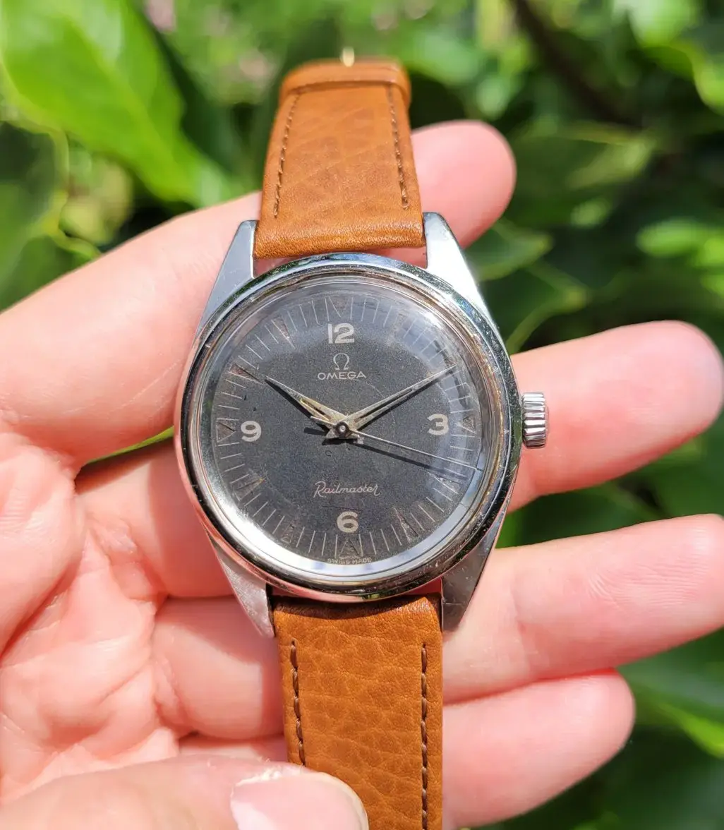
The grey variant is interesting. Doubt Omega was thinking about this, but it reminds me of an uncommon Railmaster variant with silver-ish dial and text.


https://omegaforums.net/direct-messages/silver-dial-rm.126853/ and https://omegaforums.net/threads/silver-dial-railmaster-2914-6-arrived-today.106548/

They might have taken inspiration from there, actually. There seems to be a huge number of people unaware that the current anniversary fois dial was based upon a real dial.
 
Posts
571
Likes
1,340
The brown one screams "Ranchero" every time I look at it, so much so that I wondered why it wasn't just launched with the name.

Because, taking my vintage Omega fan hat off, the Ranchero name sucks. They barely allow the Railmaster to be its own line, I can't imagine they'd muddy the waters with one labelled Railmaster and one labelled Ranchero.

The grey variant is interesting. Doubt Omega was thinking about this, but it reminds me of an uncommon Railmaster variant I once owned with silver-ish dial and text.

https://omegaforums.net/threads/silver-dial-railmaster-2914-6-arrived-today.106548/

Their social media posts and the left/right comparison on the website suggest they were focused mainly on the standard first gen with this release. But the hand set, specifically the unique lume, and the numeral font and lume style are unquestionably lifted straight from the second gen. The beige one I do think is Ranchero inspired. The gradient I don't think was really Railmaster inspired at all though, that's just the Summer Blue models and Aqua Terra turqouise gradient done again. Omega seems to really like gradient dials lately for some reason. And then everything else about it isn't inspired by anything except the Aqua Terra spare parts inventory.
 
Posts
3,655
Likes
7,732
Because, taking my vintage Omega fan hat off, the Ranchero name sucks. They barely allow the Railmaster to be its own line, I can't imagine they'd muddy the waters with one labelled Railmaster and one labelled Ranchero.


Their social media posts and the left/right comparison on the website suggest they were focused mainly on the standard first gen with this release. But the hand set, specifically the unique lume, and the numeral font and lume style are unquestionably lifted straight from the second gen. The beige one I do think is Ranchero inspired. The gradient I don't think was really Railmaster inspired at all though, that's just the Summer Blue models and Aqua Terra turqouise gradient done again. Omega seems to really like gradient dials lately for some reason. And then everything else about it isn't inspired by anything except the Aqua Terra spare parts inventory.

It's not the same gradient as the summer blue. I'm almost 100% certain that the summer blue fume dials use varying particle size to create that sparkly, grainy and slightly less obvious gradient. These seem much more "standard" gradient (as far as I can tell)

RE the Ranchero name, I largely agree that it is a much lesser known name and would definitely be confusing.
 
Posts
571
Likes
1,340
It's not the same gradient as the summer blue. I'm almost 100% certain that the summer blue fume dials use varying particle size to create that sparkly, grainy and slightly less obvious gradient. These seem much more "standard" gradient (as far as I can tell)

RE the Ranchero name, I largely agree that it is a much lesser known name and would definitely be confusing.

Yeah sorry to clarify I just meant the style trend of a gradient dial, not the exact effect. That seems to be their recent trendy thing.
 
Posts
10
Likes
20
It's not the same gradient as the summer blue. I'm almost 100% certain that the summer blue fume dials use varying particle size to create that sparkly, grainy and slightly less obvious gradient. These seem much more "standard" gradient (as far as I can tell)
That's not what he meant at all, and you know it. He obviously meant a gradient dial, not the exact same gradient dial.
 
Posts
3,655
Likes
7,732
That's not what he meant at all, and you know it. He obviously meant a gradient dial, not the exact same gradient dial.

hey there, I appreciate you coming to Jakey's defense but my comment wasn't meant as a disagreement of attack. I think Jakeys probably understood that, though.

It may be that seeing small differences as large or significant comes with the territory of being interested in wrist watches. I mean, a blue watch is a blue watch, right? And a black one is black. But, we get caught up in the minutiae of the details. To me, dial details, no matter how small they may look, can be pretty significant. If all blue dials are not all blue, then all gradient dials are not all... gradient dials. Is may seem like a minor point, but imagine a world where Omega moves completely into the gradient dial game. In 20 years, people will absolutely be discussing what makes those dials different. For the record, I don't really see that happening.

Sometimes a disagreement over a minor detail can add to a conversation without being a typical internet passive aggressive correction. I hope that was clear to Jakeys but if it wasn't, I'm happy to clear things up with him.
 
Posts
571
Likes
1,340
I hope that was clear to Jakeys but if it wasn't, I'm happy to clear things up with him.

No, I think it's best if the lawyers take it from here.

😜
 
Posts
16,856
Likes
47,859
Believe it or not Railmasters sell bigger in the Japanese market more than anywhere.
So I can see the 38mm sizing.

Was told it was a re-release that would price below the AT a bit before the release.
 
Posts
1,790
Likes
2,630
I honestly don't hate the brown one. A pretty thin, 38mm watch, that is reasonably attractive. The bracelet on both seem like a waste, and the black one looks boring, but the brown with subdial isn't too bad.

Exactly this for me. I have no emotional investment in the "Railmaster" branding, and frankly wish they'd just put the Omega logo on the dial and nothing else. The betrayal of RM tradition doesn't bother me at all. To me this is a very nice-looking AT with small seconds. Don't care for the bracelet option, but the brown on the brown leather is one of the most attractive releases Omega has made in at least a few years, IMO. Perfect sizing on the case and nicely configured no-date dial. As with all their watches, wildly overpriced at retail, but when these start showing up preowned in mid 3s, I'll seriously consider one.
 
Posts
117
Likes
97
one of the last Omega toolwatches would be the PloProf.

This Seamaster AT Railmaster is not the toolwatch that the railmaster used to be.

Nice release nevertheless. They have the same case (polished / brushed) as the Aqua Terra before the highly polished Shades came.

Nice mix between stylish Watch and basic Watch.
 
Posts
10,652
Likes
51,881
I started seeing some wrist shots on reddit. It was thus far the greyish dial. I find the subseconds model of the two more interesting, despite my bias the wrist shots made me appreciate the model a little more. I’m trying to make time to get to an AD in my state to try on the not so long ago released telemetry dial speedy, there is one for sale online and the seller is very reputable but I gotta see if that 43mm dial is gonna look ok size wise, aesthetically it’s beautiful.

Anyway I may head down with a friend who plans on picking up one of the new masters of rail so it will be interesting to see Mano y Mano
 
Posts
12,950
Likes
22,416
I think it’s naff.

A shame as I love the Railmaster and was close to getting a 60th model but I can’t do the faux patina. Had they just gone with a modern black dial with standard lume and an all brushed case it could be a winner, especially if they’d also used a straight lug case (although the current case shape is fine as well).

It just looks like another half arsed attempt that everyone knows will be discontinued in 3 years before they have another go.

Feels like they let one of the design juniors loose on the Railmaster every time they’re due to finish their apprenticeship
 
Posts
485
Likes
811
Looking at photos on social media, the grey model does appear a bit more legible that the stock photos show.
 
Posts
104
Likes
1,301
After looking at pictures and videos, thinking about it, and looking again, I have come to a conclusion. I don’t have an Aqua Terra, but have been wanting one. What kept me from making a deal was the presence of a date window. The Skyfall generation had the best looks in my opinion, when it comes to placement and shape of the date window. Now, this new grey dial Railmaster looks very good. Different from the beautiful second generation though, but this Railmaster is for me the most desirable watch of the current Aqua Terra line. A proper toolwatch, no, but it need not be.

Who says today’s locomotive engineers can’t have slightly nicer and blingy watches? Their great grandfathers wore Hamilton 992 and other high grade railroad approved Illinois, Waltham, South Bend etc. pocket watches, and there was nothing austere about their appearance.
 
Posts
320
Likes
374
Sigh... they should have done something special for the Railmaster, like magnetic resistance to 150 Tesla instead of only 15. I know I know, no one will experience a difference, but it would be a point that sets it apart from the AT. Because now it is just a "lowcost" AT with a matte dial and no date IMO.
 
Posts
92
Likes
46
I think it’s naff.

A shame as I love the Railmaster and was close to getting a 60th model but I can’t do the faux patina. Had they just gone with a modern black dial with standard lume and an all brushed case it could be a winner, especially if they’d also used a straight lug case (although the current case shape is fine as well).

It just looks like another half arsed attempt that everyone knows will be discontinued in 3 years before they have another go.

Feels like they let one of the design juniors loose on the Railmaster every time they’re due to finish their apprenticeship
I understand you 100% the Omega designers or whatever they should be, have no ideas of what a real Railmaster should look like at all. I'm really disappointed of this new shameful release and you pointed it perfectly out, STRAIGHT LUG CASE BLACK DIAL BRUSHED CASE. I'm thinking at Omega are joint cigarettes smokers at work and this is the result
 
Posts
766
Likes
2,373
The problem is they already hit it out of the park decades ago, but the necessity of running a business dictates finding ways to sell new watches. A purist would say take one of the old designs and make it slightly better.

But marketing would say "how the heck will we sell the same thing that people didn't really buy decades ago? For way more money?"

So this design makes total sense, even if it is best viewed as an AT, not a Railmaster.