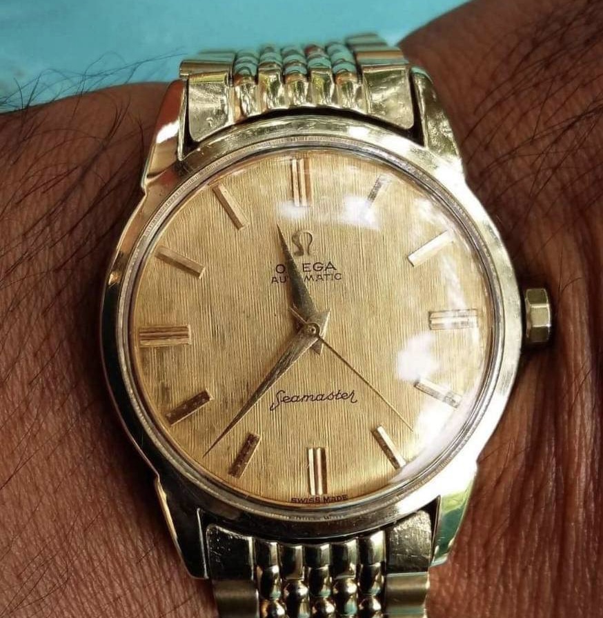
My new “uncommon dial” which I hope it was legit.
- Posts
- 521
- Likes
- 410
joe band
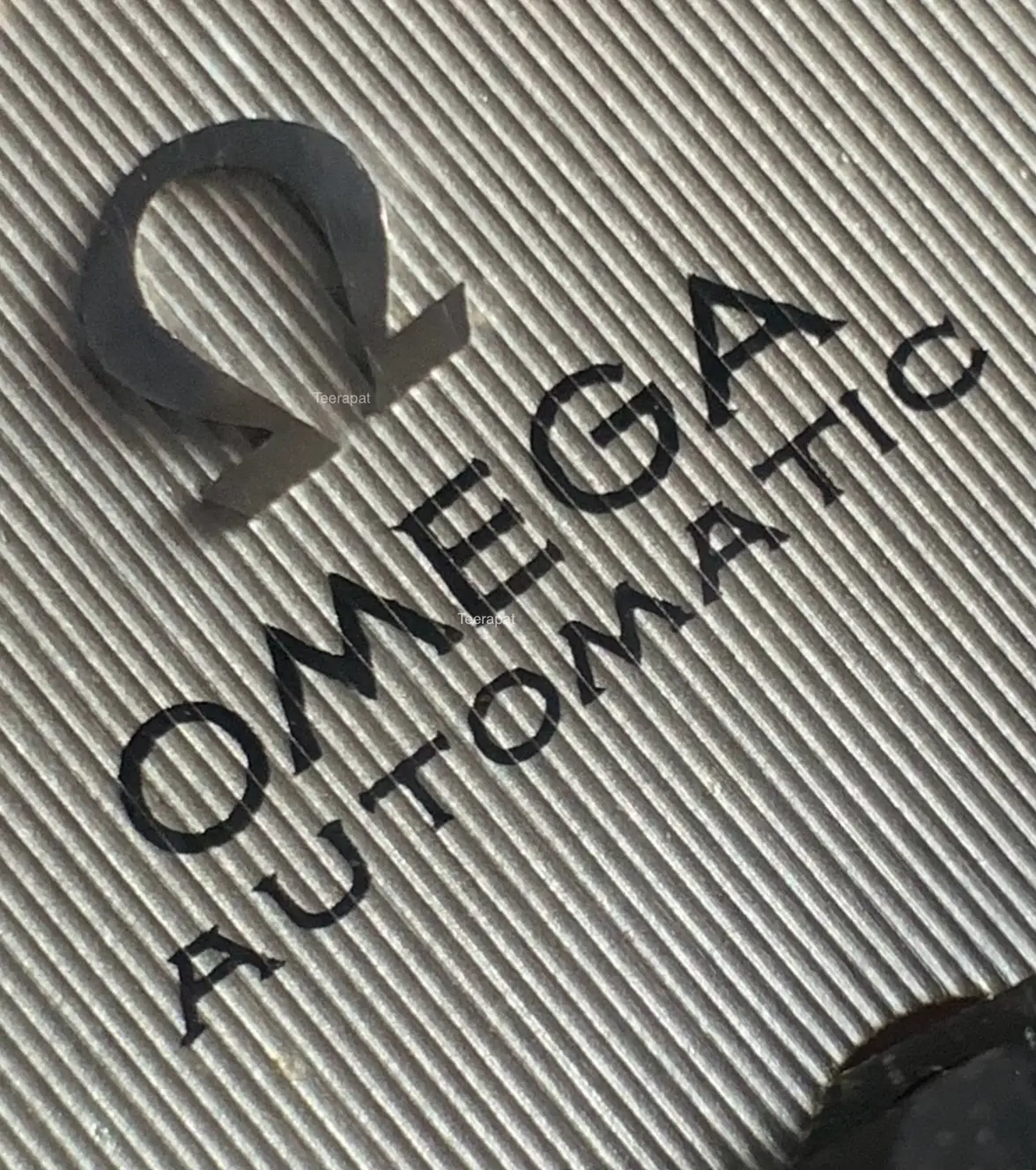
·looks original, that serif font is hard to duplicate well. i see the case softer than your description, but not bad. aesthetically i would've like the applied metal logo to. have been centered a little better, but it's a beautiful watch, congrats.
qazwsx1
·qazwsx1
·Clelow
·Nice overall appearance.

