Modern Rolex Design?

Posts
6,704
Likes
21,624
Full disclaimer: love my vintage Rolex, and the other brands I collect. That being said...

Is it me, or are the modern Rolex offerings, from a design standpoint, completely ghastly and unappealing. Plus, their graphics are totally over-done. Many other brands also seem to be suffering from the "rapper aesthetic", but Omega less so.
 
Posts
3,817
Likes
16,136
take two basic case designs, 3 differing bezels, a leather band and a bracelet, paint the face an assortment of colours and *poof*, you have the entire Rolex line.

No imagination.
 
Posts
75
Likes
74
I agree partially. You see this kind of "slack" with a lot of brands that life from only their names, just look at all the garbage Ferrari and Lamborghini built over the years.

I am in no way saying these brands are all bad. I like quiet a few models.
Edited:
 
Posts
11,737
Likes
37,926
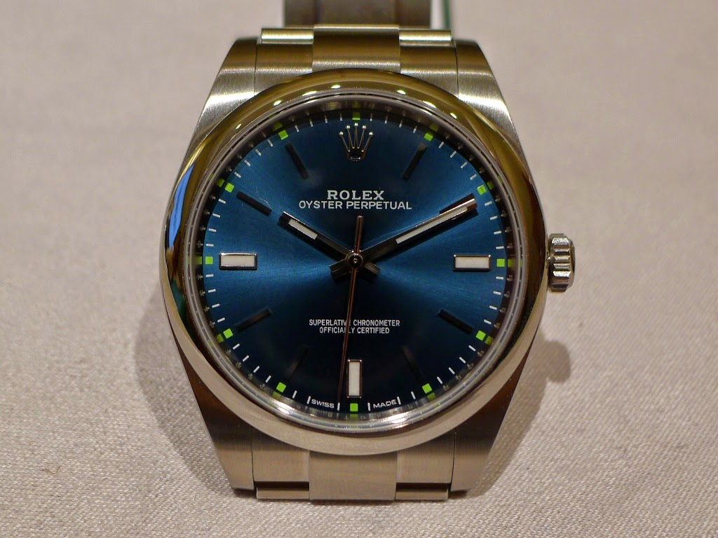
I just find them to be a fatal combination of boring overall designs with garish little details. For instance, look at the current Explorer vs a nice old 1016 - one is timeless, one is flashy yet boring. Or the current Oyster Perpetual 39mm - why isn't there a simple silver or black dial? Instead we're offered bright colored dials with stupid colored hour markers in ridiculous colors like orange or red. Why?
 
Posts
14,275
Likes
41,130
In the case of the modern version of the Explorer 1, I think Rolex should have followed the Omega philosophy regarding the Speedmaster. The basic Speedmaster Professional is such an icon, that it remains changed only very little over the years of its existence. Rolex, on the other hand, took an icon and turned it into a watch that I totally dislike! Ugly dial, the sapphire crystal, not at all the icon the Explorer 1 was. And a lot of other iconic models appear to have been changed for the sake of change. Tell me I'm living in the past! Too many "gimmicky" looking additions and modifications to many of their models to suit me.
 
Posts
1,567
Likes
859
In the case of the modern version of the Explorer 1, I think Rolex should have followed the Omega philosophy regarding the Speedmaster. The basic Speedmaster Professional is such an icon, that it remains changed only very little over the years of its existence. Rolex, on the other hand, took an icon and turned it into a watch that I totally dislike! Ugly dial, the sapphire crystal, not at all the icon the Explorer 1 was. And a lot of other iconic models appear to have been changed for the sake of change. Tell me I'm living in the past! Too many "gimmicky" looking additions and modifications to many of their models to suit me.

I am an Omega and Rolex fan boy. I think Rolex models win as they don't change much and when it is not broken why fix it? However, I agree with Canuck a historic line like the Explorer 1 they have messed up regarding the crystal etc. Not much has changed with Rolex apart for the cases getting bigger on other models, not a bad thing the 36mm on my wrist looks like a boys watch although it looks perfect on other gentleman's wrists. What Rolex have done with the recent oyster perpetual 39mm annoyed me, the stupid square dots around the dial. They have made a classic look cheap but getting confused with classic and moden fusion.
 
Posts
2,326
Likes
1,884
The current Rolex line looks very 70s to me with the stick hands.

Tom
 
Posts
196
Likes
167
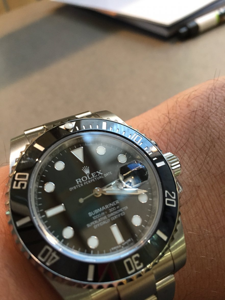
I agree. They have spoiled the Submariner too. Current model is too square and chunky. I was discussing this with somebody in OB the other day and how they could have lost some of their market - me for example. With a 6.5 inch wrist the Moonwatch fits just about right and the old Sub would have as well (the new Snoopy is on the last buckle hole and still a bit loose.
The current Sub just makes me look either like a skinny bloke trying to man up with a big blingy watch or a kid who's just raided his Dad's watch drawer. And because of its simplicity,the no-date Submariner is the only Rolex I like.
 
Posts
530
Likes
3,540
In my opinion rolex is doing way more interesting things with tudor nowadays. Its like they got all the talented people and move them there.
Anyway just like a lot of other brands, the name is a lot bigger than the products, they will keep selling like crazy no matter what.
 
Posts
967
Likes
1,018
I agree with you. After cruising through the Omega boutiwue and then looking at the other brands in other stores I favor the Omegas more

Full disclaimer: love my vintage Rolex, and the other brands I collect. That being said...

Is it me, or are the modern Rolex offerings, from a design standpoint, completely ghastly and unappealing. Plus, their graphics are totally over-done. Many other brands also seem to be suffering from the "rapper aesthetic", but Omega less so.
 
Posts
3,817
Likes
16,136
Rolex has a really nice watch they're just not marketing properly....

the Tudor Black Bay.

I picked up a Tudor catalog the other day..... its everything the Rolex line should be, clean sturdy tool watches.

funny that.
 
Posts
6,832
Likes
13,793
I just find them to be a fatal combination of boring overall designs with garish little details. For instance, look at the current Explorer vs a nice old 1016 - one is timeless, one is flashy yet boring. Or the current Oyster Perpetual 39mm - why isn't there a simple silver or black dial? Instead we're offered bright colored dials with stupid colored hour markers in ridiculous colors like orange or red. Why?
well, if you want a simple black dial oyster perpetual 39mm one could argue the new explorer may be it...except that it may seem flashy and boring...
 
Posts
6,832
Likes
13,793
I agree. They have spoiled the Submariner too. Current model is too square and chunky. I was discussing this with somebody in OB the other day and how they could have lost some of their market - me for example. With a 6.5 inch wrist the Moonwatch fits just about right and the old Sub would have as well (the new Snoopy is on the last buckle hole and still a bit loose.
The current Sub just makes me look either like a skinny bloke trying to man up with a big blingy watch or a kid who's just raided his Dad's watch drawer. And because of its simplicity,the no-date Submariner is the only Rolex I like.
I sort of agree. I am not a great fan of the ceramic chunkier modern subs....although I must admit the 114060 is still a beauty, but the crown protectors are a bit too square ish and bulky. On the other hand the lugs and bracelet are closer to the original 5512.

In the end that is why I got a 14060M instead of 114060, parachrom, sturdy, but with pin lugs and aluminum bezel.
 
Posts
6,832
Likes
13,793
In the case of the modern version of the Explorer 1, I think Rolex should have followed the Omega philosophy regarding the Speedmaster. The basic Speedmaster Professional is such an icon, that it remains changed only very little over the years of its existence. Rolex, on the other hand, took an icon and turned it into a watch that I totally dislike! Ugly dial, the sapphire crystal, not at all the icon the Explorer 1 was. And a lot of other iconic models appear to have been changed for the sake of change. Tell me I'm living in the past! Too many "gimmicky" looking additions and modifications to many of their models to suit me.
I like the E1.
 
Posts
1,089
Likes
634
Full disclaimer: love my vintage Rolex, and the other brands I collect. That being said...

Is it me, or are the modern Rolex offerings, from a design standpoint, completely ghastly and unappealing. Plus, their graphics are totally over-done. Many other brands also seem to be suffering from the "rapper aesthetic", but Omega less so.

Nah.
 
Posts
15,048
Likes
24,018
One of my major complaints, is I feel they did a poor job of matching the bracelet dimensions to the size of the case as they changed the case over the years.
This would have a big aesthetics effect in my view.

 
Posts
1,567
Likes
859
One of my major complaints, is I feel they did a poor job of matching the bracelet dimensions to the size of the case as they changed the case over the years.
This would have a big aesthetics effect in my view.


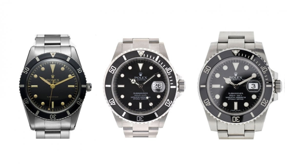
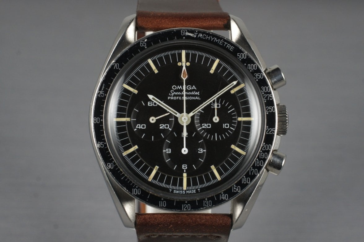
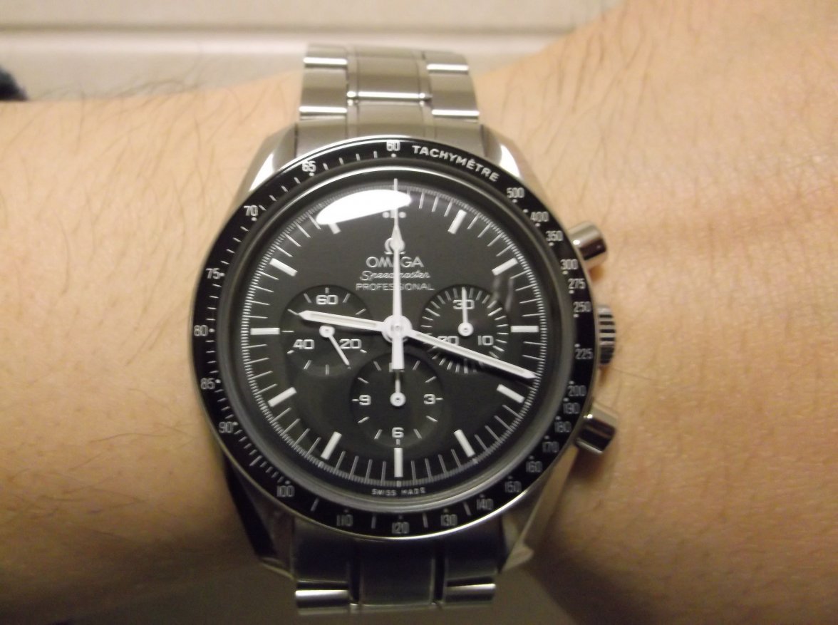
This picture is profound. One of the reasons why the sub is an icon is because it has not changed much since 1953. If we compare the current pic of 145.012 and current moonwatch in my opinion the speedy is even more iconic. For one 145.012 went to the moon and second the speedy changed less than the sub. The 145.012 picture was found on bing images quick search, forgive me if the 145.012 is incorrect in any way.
 
Posts
1,870
Likes
1,402
Full disclaimer: love my vintage Rolex, and the other brands I collect. That being said...

Is it me, or are the modern Rolex offerings, from a design standpoint, completely ghastly and unappealing. Plus, their graphics are totally over-done. Many other brands also seem to be suffering from the "rapper aesthetic", but Omega less so.
I just think their designs are not harmonious at all.
Is Rolex all about conservatism, staying within their traditional design language while also maintaining precision in engineering and quality materials? They don't want to increase the case size of the Submariner because it would be sacrilegious? Don't rock the boat too much, but rather make small changes here and there to satisfy the shifting aesthetic tastes of the newest aspirational prospective buyers? That's all well and fine but the majority of their choices have been terrible.
The BLNR and Hulk work with the larger lugs and Maxi Dials because they match the shiny ceramic bezels and blingy color choices. The lugs and dials DON'T work on the regular GMTs and Submariners because of the black dials and traditional aesthetic. It's like the Rolex designers have completely lost their grip on how to proportion elements correctly. Seriously, look at the pic @cicindela posted - the modern Submariner on the far right looks like an Invicta compared to the lovely earlier models - everything piece is garish, overstuffed, on steroids.
For years now collectors have been DROOLING over Panda and Paul Newman style Daytonas, so what does Rolex do? Release one with Arabic numerals that looks like it was designed by an 8 year old who only uses comic sans.
As others have noted the Tudor offerings seem to be where Rolex is making bold yet fantastic choices.
Not to use the tired trope of comparing watches to cars but I see a lot of Ford in Tudor and Lincoln in Rolex. Hopefully this will change ......