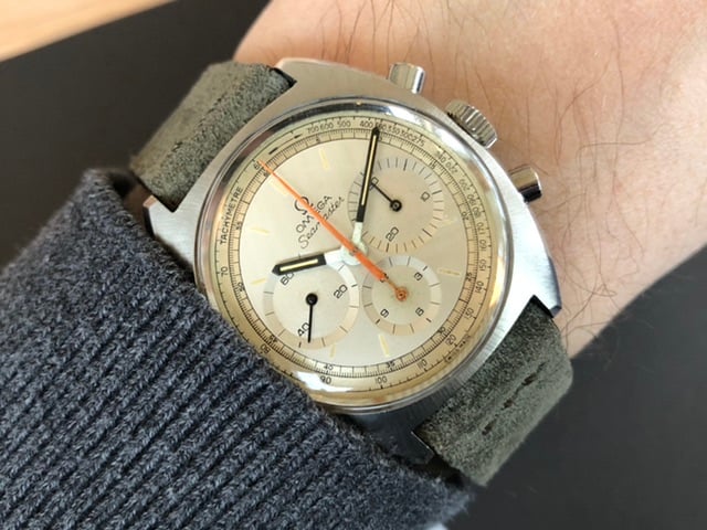
Landed a (special) Vintage Seamaster Chronograph
DirtyDozen12
·Same uneven concentric circles 👍
- Posts
- 1
- Likes
- 0
WATCHES4FUN
·It’s been a while I didn’t land something really special 😀
A couple of months ago @The Master of Speed pointed me towards some photographs he found on the web, saying he never saw such a dial before. I had a look and realized this was something really new to my eyes as well.
I managed to contact the owner who wasn’t willing to sell his watch but noted my interest for an eventual later conversation. A month later, while I was desperately browsing the web searching for another example of that watch, the owner got back to me saying if I was ready to pay his (super fair) asking the watch was mine. Bingo!
Next challenge was to get it back to Switzerland from the other side of the world... Indonesia... @sliceoftime_ has been of a great help for my due dilligence and vouched for the seller who he happened to personally know. 👍
Two weeks of travel, delay, unexpected FedEx statuses, customs scrutiny, conversations and (quite some) stress, the unicorn has finally arrived.
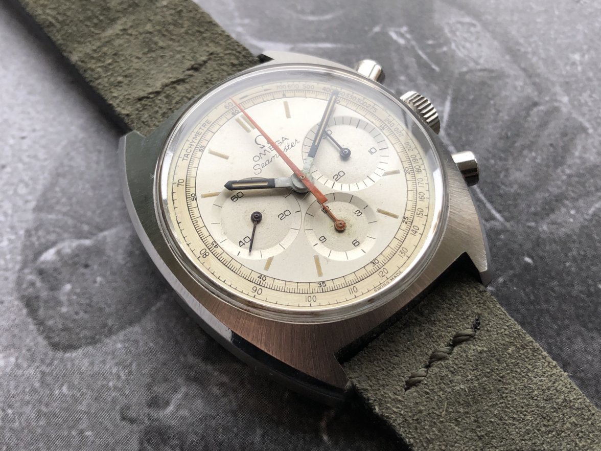
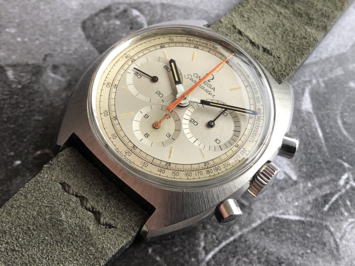
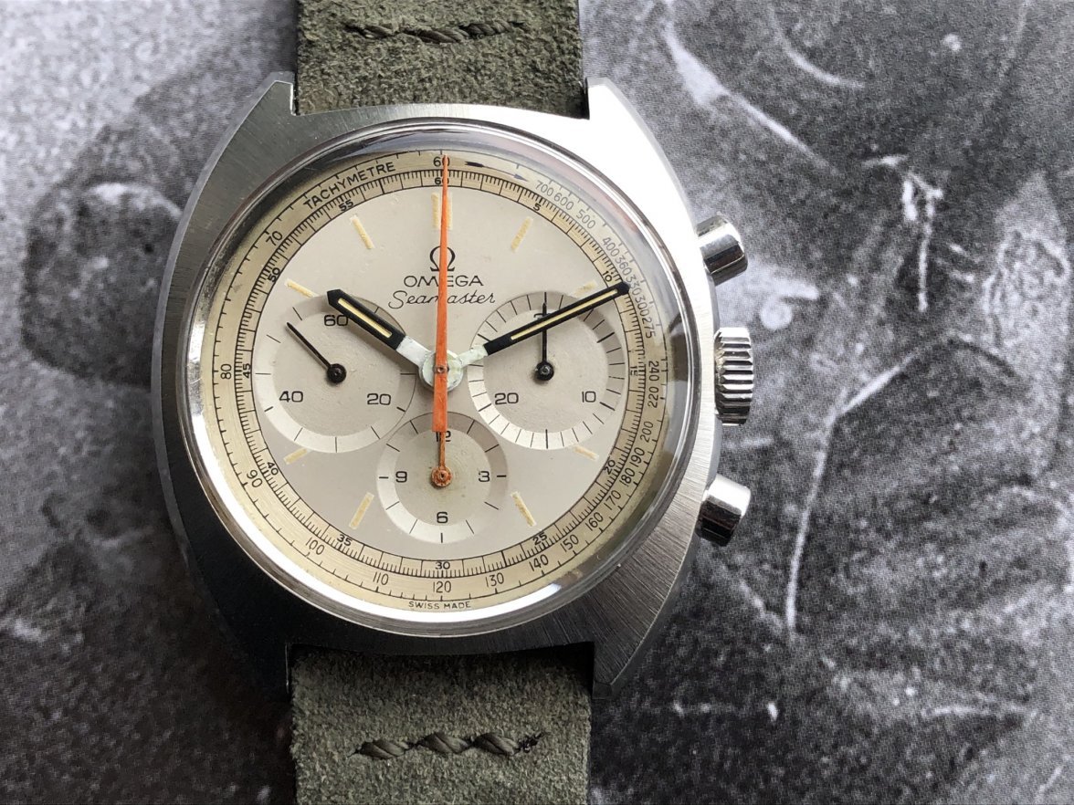
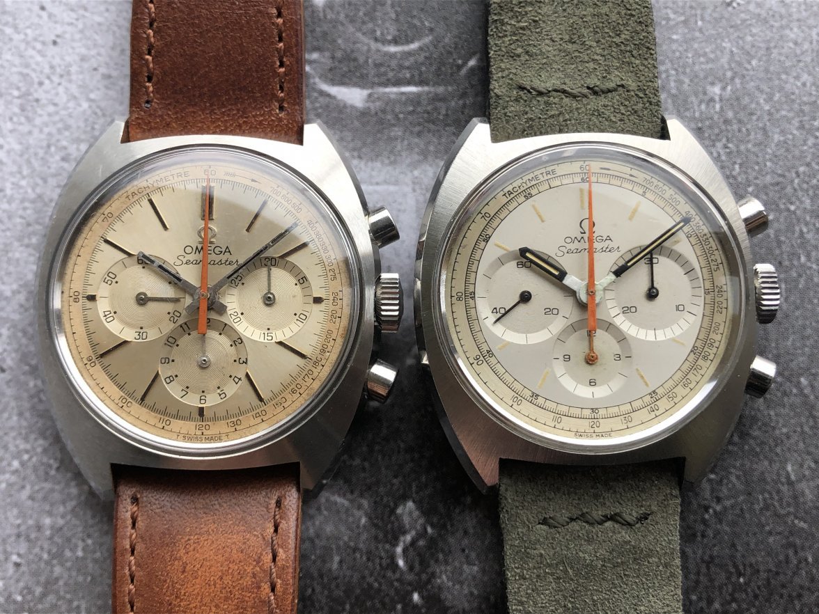
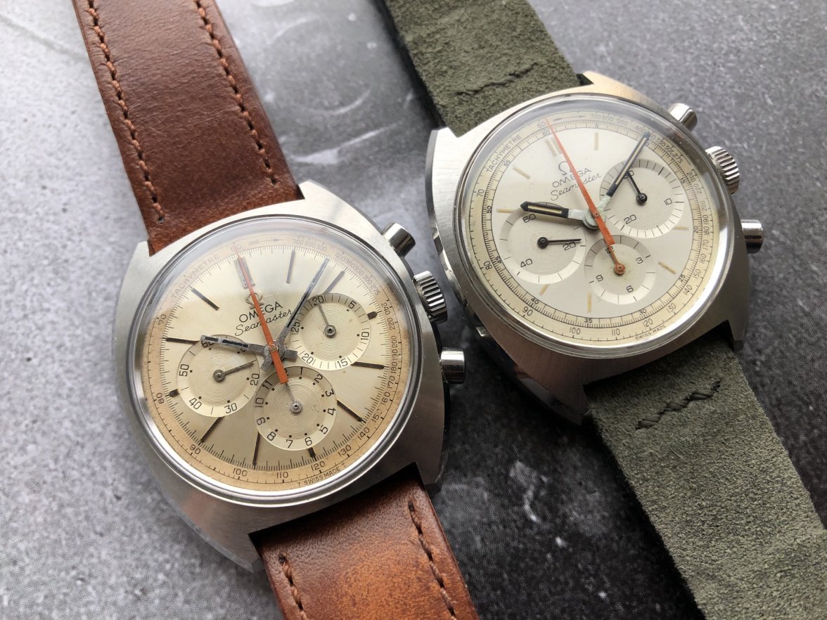
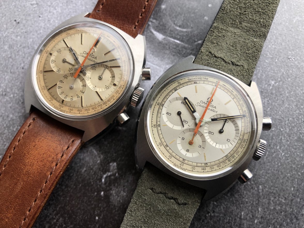
Big eyes at 3 & 9, double scale, small counter at 6, tritium indexes, no T swiss made
Everything is so special and so different from the regular Seamaster Chronographs we already know.
The champagne radial Seamaster was listed for sale. Now it’s clear it will stay with me - too much joy in putting them aside and play the spot the differences game. 😀
With this incredible find I think my 2019 is done. Now time for family and year end celebrations with a really special Seamaster on my wrist 😎
P. S: Happy SpeedyTuesday 😁
P. S. 2: Will update the 145.006 / 145.016 Seamaster Chronograph Research Thread later, when I get more infos about it 😀
P. S. 3: Huge thanks to the fellow collectors and friends who have been very helpful in routing this watch to me. Great community 👍
kov
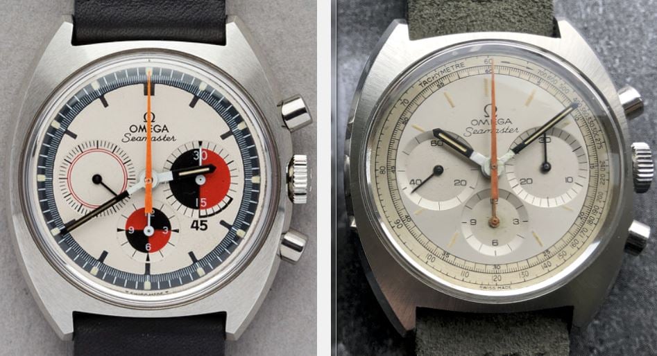
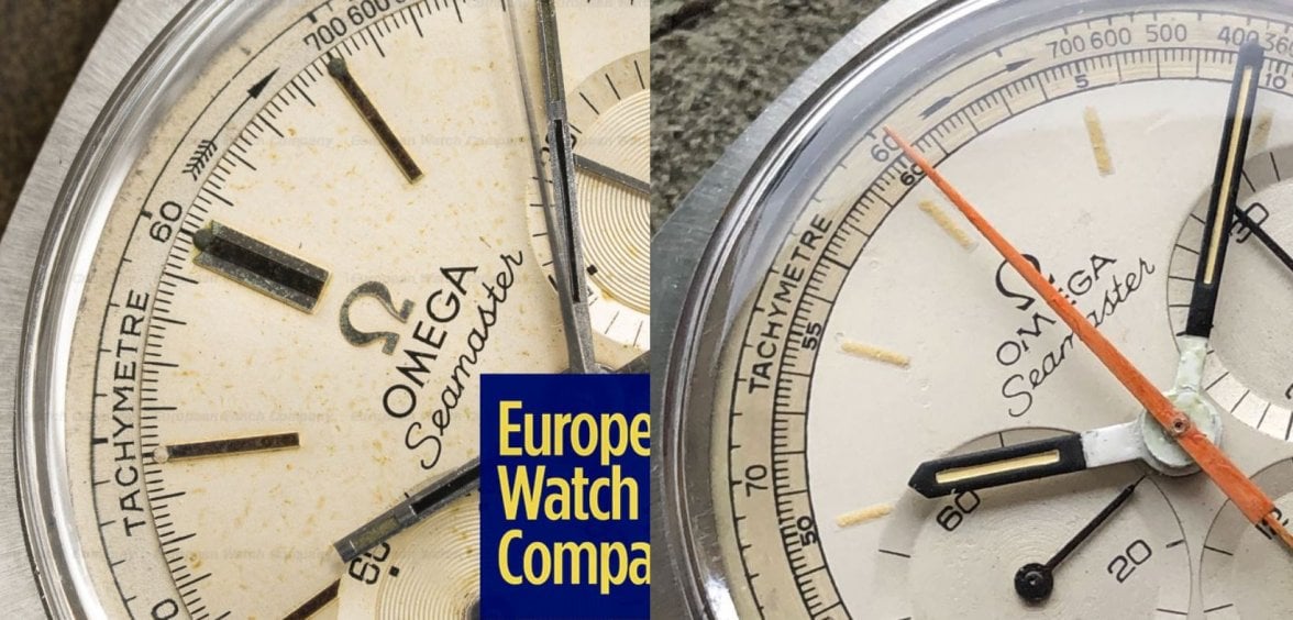
·It is difficult to say how similar they are as we are limited by resolution. But it would seem that the dial on the right could have been used to create the dial on the left. It appears that these Soccer Timer dials are not so hard to come by. And the Soccer Timer theory would make sense with the style of hour/minute hands. And account for their incongruous length with the minute track, which is further out on the Soccer Timer dial.
I think this is the theory with the highest potential so far. 👍
Will get an appointment at the Archives and show it to David after the holidays. We’ll see.
In any case, happy with my purchase and it didn’t leave the wrist since it arrived here 😀
Sample or a custom redial it’s a keeper. In the oddities chapter of the collection 😀
Thanks for the comments and happy year end celebrations, folks - now it’s family time 👍
Tony C.
··Ωf Jury memberI am actually skeptical that it was originally a Soccer Timer dial. I can see as far as the possibility that a re-dialer wasn't comfortable with having to reproduce the color scheme, but find it dubious that the current dial design might have been chosen instead. Not only is it radically different - not a choice typically made by competent re-dialers - but the change of the lower sub-dial hand to orange strikes me as what would have been an odd, carefully chosen decision. Perhaps most compelling to my mind, though, is the disparity between the outer tracks and interior of the dial. The color and patina of the former looks as if it could well be original, suggesting that while the main (interior) part of the dial was likely refinished, it did not begin its life as a Soccer Timer.
DirtyDozen12
·@kov Thank you for the discussion and happy holidays!
To me, the printing of the outer track and tachymeter scale lacks a sharpness, and the fonts are missing a certain character (a dangerous word), that can be seen on other dials from the period. I also find there to be a general lack of patina on the periphery of the dial.
I have seen very ambitious (to be charitable) redials on Longines chronographs and so this redesign does not seem out of the realm of possibility.
The color and patina of the former looks as if it could well be original,
I have seen very ambitious (to be charitable) redials on Longines chronographs and so this redesign does not seem out of the realm of possibility.
Tony C.
··Ωf Jury member@kov Thank you for the discussion and happy holidays!
To me, the printing of the outer track and tachymeter scale lacks a sharpness, and the fonts are missing a certain character (a dangerous word), that can be seen on other dials from the period. I also find there to be a general lack of patina on the periphery of the dial.
I have seen very ambitious (to be charitable) redials on Longines chronographs and so this redesign does not seem out of the realm of possibility.
I take your point about sharpness, but assuming that it is a redial, and given that it is arguably pretty decent work, I find it odd that the artist would have chosen such a different, and patinated-look for the outer track. Why not make it consistent?
Boony
·Either way this goes its a great read and there's been some super sleuthing going on here... very forensic. Much like the recent election, I'll keep my opinion to myself but either way its a cool looking watch... no doubting that! Great 😀
whyboddau
·I think this is the theory with the highest potential so far. 👍
Will get an appointment at the Archives and show it to David after the holidays. We’ll see.
In any case, happy with my purchase and it didn’t leave the wrist since it arrived here 😀
Sample or a custom redial it’s a keeper. In the oddities chapter of the collection 😀
Thanks for the comments and happy year end celebrations, folks - now it’s family time 👍
Muddlerminnow
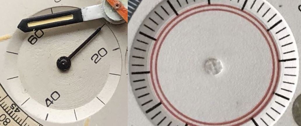
·I'm not convinced the soccer timer dial is the source for the Kov's dial. Look closely at the transition zones for the subdials--there's a rim in the transition that is not on Kov's:
Jury is still out, lots of weird stuff here, but if it's a redial, it's awfully well done, and I wouldn't mind having it on my wrist, lol.
Jury is still out, lots of weird stuff here, but if it's a redial, it's awfully well done, and I wouldn't mind having it on my wrist, lol.
sliceoftime_
·It’s been a while I didn’t land something really special 😀
A couple of months ago @The Master of Speed pointed me towards some photographs he found on the web, saying he never saw such a dial before. I had a look and realized this was something really new to my eyes as well.
I managed to contact the owner who wasn’t willing to sell his watch but noted my interest for an eventual later conversation. A month later, while I was desperately browsing the web searching for another example of that watch, the owner got back to me saying if I was ready to pay his (super fair) asking the watch was mine. Bingo!
Next challenge was to get it back to Switzerland from the other side of the world... Indonesia... @sliceoftime_ has been of a great help for my due dilligence and vouched for the seller who he happened to personally know. 👍
Two weeks of travel, delay, unexpected FedEx statuses, customs scrutiny, conversations and (quite some) stress, the unicorn has finally arrived.
Big eyes at 3 & 9, double scale, small counter at 6, tritium indexes, no T swiss made
Everything is so special and so different from the regular Seamaster Chronographs we already know.
The champagne radial Seamaster was listed for sale. Now it’s clear it will stay with me - too much joy in putting them aside and play the spot the differences game. 😀
With this incredible find I think my 2019 is done. Now time for family and year end celebrations with a really special Seamaster on my wrist 😎
P. S: Happy SpeedyTuesday 😁
P. S. 2: Will update the 145.006 / 145.016 Seamaster Chronograph Research Thread later, when I get more infos about it 😀
P. S. 3: Huge thanks to the fellow collectors and friends who have been very helpful in routing this watch to me. Great community 👍
Northernman
··Lemaniac👎Been trying to catch up on this thread.
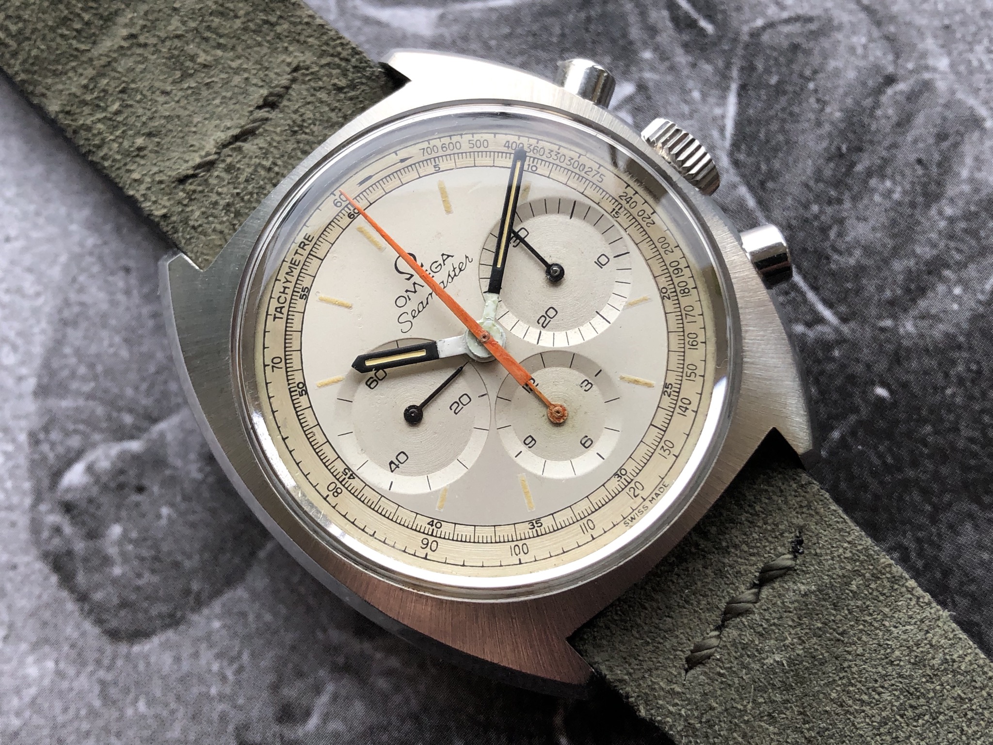
I am afraid that it’s a complete Franken. Not a very bad one, but it’s got nothing to do with what Lemania (for Omega) made originally.
This dial is showing all signs of having some creative work done.
The surface shows signs of a badly corroded dial having been painted over.
Looking at the surface of the sub-dials, the circular surface finish have been unevenly filled with excess paint.
The normal procedure when repainting a dial would be to strip it of all paint and varnish, down to bear metal. On this dial they have simply painted over the centre of a already corroded dial.
By doing this they have avoided repainting the outer track (which is a pig to get right) and in the same instance slabbed an Omega logo on the centre of it.
The arrow on the tachy-scale looks like no other Lemania, Omega or Tissot from that period. All Lemania made chronographs I have seen (never mind the logo on the dial) have an arrow with a “feathered tail”.
The origin of the outer tracks on the dial is, in itself a small mystery to investigate, but the repainted centre is just that. Repainted as in painted over.
Hour and minute hands have obviously been getting a lick of paint.
Observe how thick and uneven the white paint at the centre is.
The minute hand is also too long in order to match the outer track.
Further evidence would be possible to see if a picture of the movement and case back could be posted.
Cheers.
ICONO
·Not seen this thread before…
I am sorry… it’s a dial manufactured, by someone…other than Omega
Not since that ropey, ( & disputed !), Universal Geneve…with 2 x ‘55’ numbers, on the tachy track…have I seen such strange redialling…
I actually think this watch has been worked on, at least twice,…by different people…one far more skilled, than the other…
Edited:
kov
·I am really enjoying this thread. It's been long time we haven't had some advanced scrutiny here. I like !
Like with the basic authentication 101, it's all about knowing where to look and what to look for - here we have a kind of advanced scrutiny 101 course that, I believe a lot of members will appreciate.
I am waiting for the extract to come and then will share a movement picture as well as the case ref, no worries. I'm willing to know what the archives will say of this movement, first.
tikkathree
·I can see why anyone with working eyeballs would be completely won over by this watch: visually appealing at arms' length indeed. What strikes me - and I'm going back up the thread for another look - is the difference between the lovely case finish and the slightly less-than-perfect hands.
Nice watch, let's have another look...... yes it's nice on the wrist.
I'd like to see back-off photos too but bravo to the op for wearing their new acquisition without getting all paranoid about our collective opinions.
Nice watch, let's have another look...... yes it's nice on the wrist.
I'd like to see back-off photos too but bravo to the op for wearing their new acquisition without getting all paranoid about our collective opinions.
Edited:
kov
·I'd like to see back-off photos too but bravo to the op for wearing their new acquisition without getting all paranoid about our collective opinions.
You'll get them 😉
And yep even if it happens to be a redial, if the movement matches the reference I won't be sad. Worst case, I'll find a correct dial and hands for the day I decide to resell it... or not, if somebody likes it as I do. But this time I'll have more to tell about the watch, and an interesting thread to show for full disclosure.
I bought it because I found it appealing to my eye and for further research on the 145.xx6 references. My eye keeps finding it appealing so I will keep wearing it, with same pleasure. Forensics do not matter.
simonsays
·It is an interesting discussion, and a very pretty watch dial. I too though am leaning towards re dial. The sharp pointed 4 on the 60 min track just does not appear correct, and the sloppy no serif numerals on the sub dials make me feel this has been tampered with. The thick paint in the sub dials also seems to be a result of application rather than degradation.
The hands also seem to have had more than a touch of paint. Considering the case looks so good it seems unlikely to be coeval.
As everyone agrees though, this dial is visually very appealing, so what ever the skill levels in execution, the design has worked out very well.
Definitely a watch to wear and enjoy.
Similar threads
- Posts
- 0
- Views
- 422
- Posts
- 6
- Views
- 3K
REDUCED: Omega Seamaster Chronograph 176.007 BR - Box & Papers
Location: US
TFA
FS
cvalue13
Private Watch Sales
$1800USD
- Posts
- 7
- Views
- 3K
