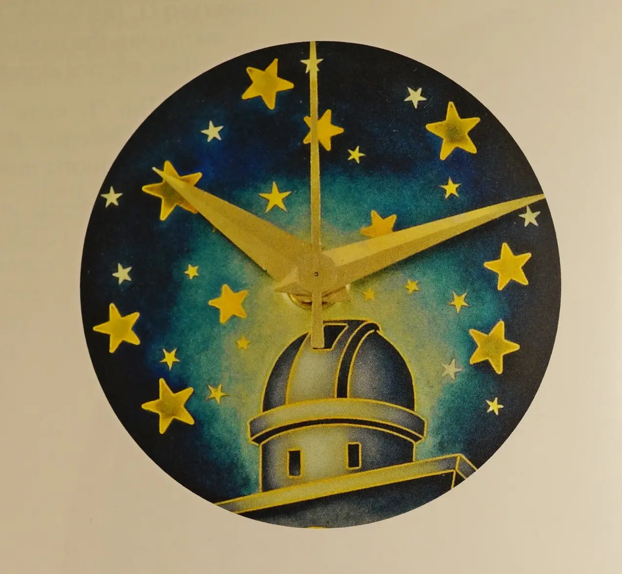
I bought a Constellation (with a cool dial)
Scarecrow Boat
·Here's the video @zhixi uploaded, I copied it over from iCloud
Trev
··The Architectgatorcpa
··ΩF InvestiGatorI see it just fine now.
gatorcpa
gatorcpa
dsio
··Ash @ ΩFI’m not an expert on these and have never seen an authentic one, but I have seen one rough one that was clearly of poor quality and looked nothing like the OPs watch, and a second one that was of vastly better quality produced by a Cloisonné dial maker in Israel who had quite a bit of skill and had been improving further over the years. I can’t find the photos I took of that loose dial but it was a very attractive one and well finished.
All of the original examples have some natural degree of variation due to the method of production so its never going to be as close as a normal stamped dial but there’s also going to be a much bigger difference between the original and an aftermarket example, but then that guy in Israel was already very good when I saw it in 2014, and he’s been improving too.
Its a real shame the extract service is down at the movement but given the nature of the watch it might still be worth reaching out to the museum on this one as it might be catch their attention.
- Posts
- 20
- Likes
- 34
zhixi
·Thanks everyone for your constructive feedback, I thoroughly enjoyed reading through all the comments and critiques.
While looking at these cloisonné enamel watches, I think it’s important to bear in mind not many of us have seen them in the flesh. I’ve myself have only gotten to handle a few over the past 25 years. I took a relatively long video so that the beauty of these dials can be shared with everyone.
Regarding authenticity, all I can say is that I’ve had a long enough relationship with my dealer, his expertise in Omega, and the price for which I paid, to be fairly confident of what I have. At the end of the day, like any other vintage watch we buy, we surmise authenticity based on not one particular thing, but rather the sum of all parts (case, movement, crystal, crown etc), other factors such as uniformity of wear, accompanying documentation, and in this case, provenance etc. I believe this watch, when considered in this light, to be honest.
Moreover, every cloisonné enamel dial of the observatory dial is unique in some way. For example, no two dials have the exact same star alignment if one looks closely. Some have a “flat” Omega logo (Phillips) while others are rounded and raised (A journey through time; Omegamania). Some have lumed indices and hands (Phillips), while others are not. Some have longer hands than others (Phillips). No two have been found on the exact same bracelet. John Goldberger believes he has the only rose gold version of this watch, when all others are in yellow gold. Etc etc. Also, owing to the ravages of time, it’s hard to say how each differently each of these dials could have aged over the past 70+ years. I personally not have seen any scholarly research into how sunlight or moisture affects these dials, even though we know factors such as these, can indeed render two identical dials completely different (ie what we call patina).
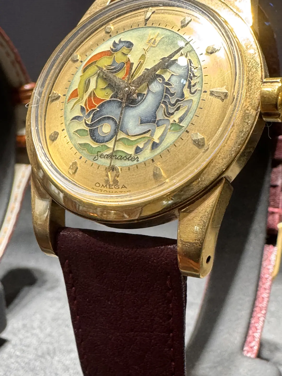
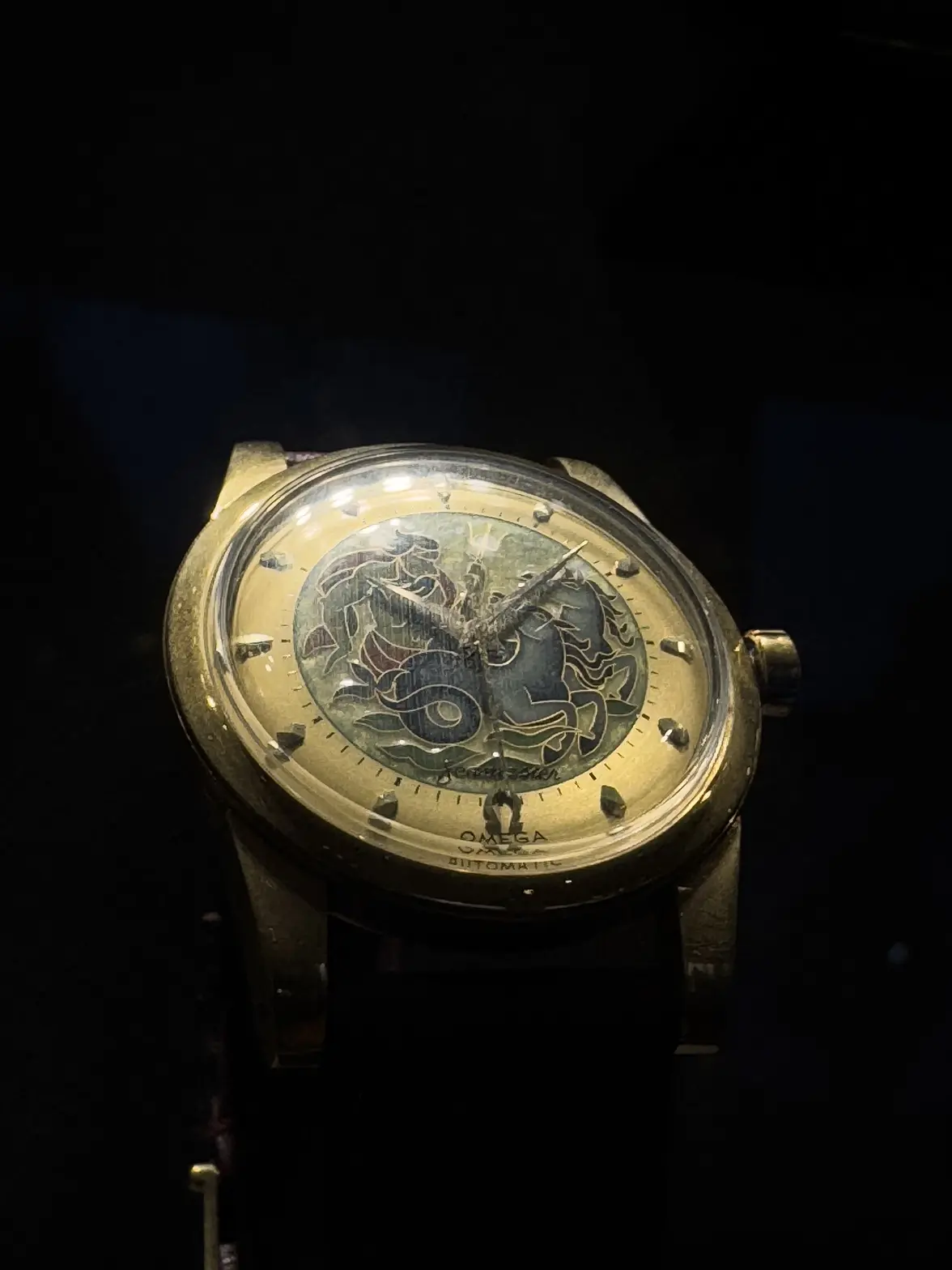
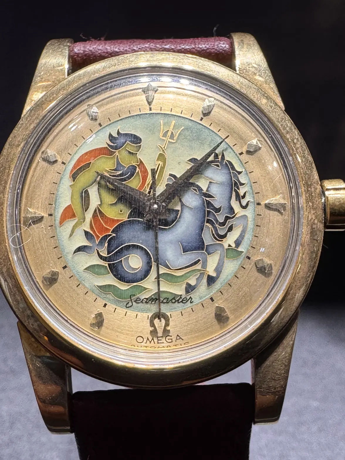
With the above in mind, here’s another watch I’d like to share with everyone. Enjoy.
- Posts
- 20
- Likes
- 34
Davidt
·That seamaster is stunning
Vinz Clortho
·That is a gorgeous dial and unique timepiece!
- Posts
- 20
- Likes
- 34
zhixi
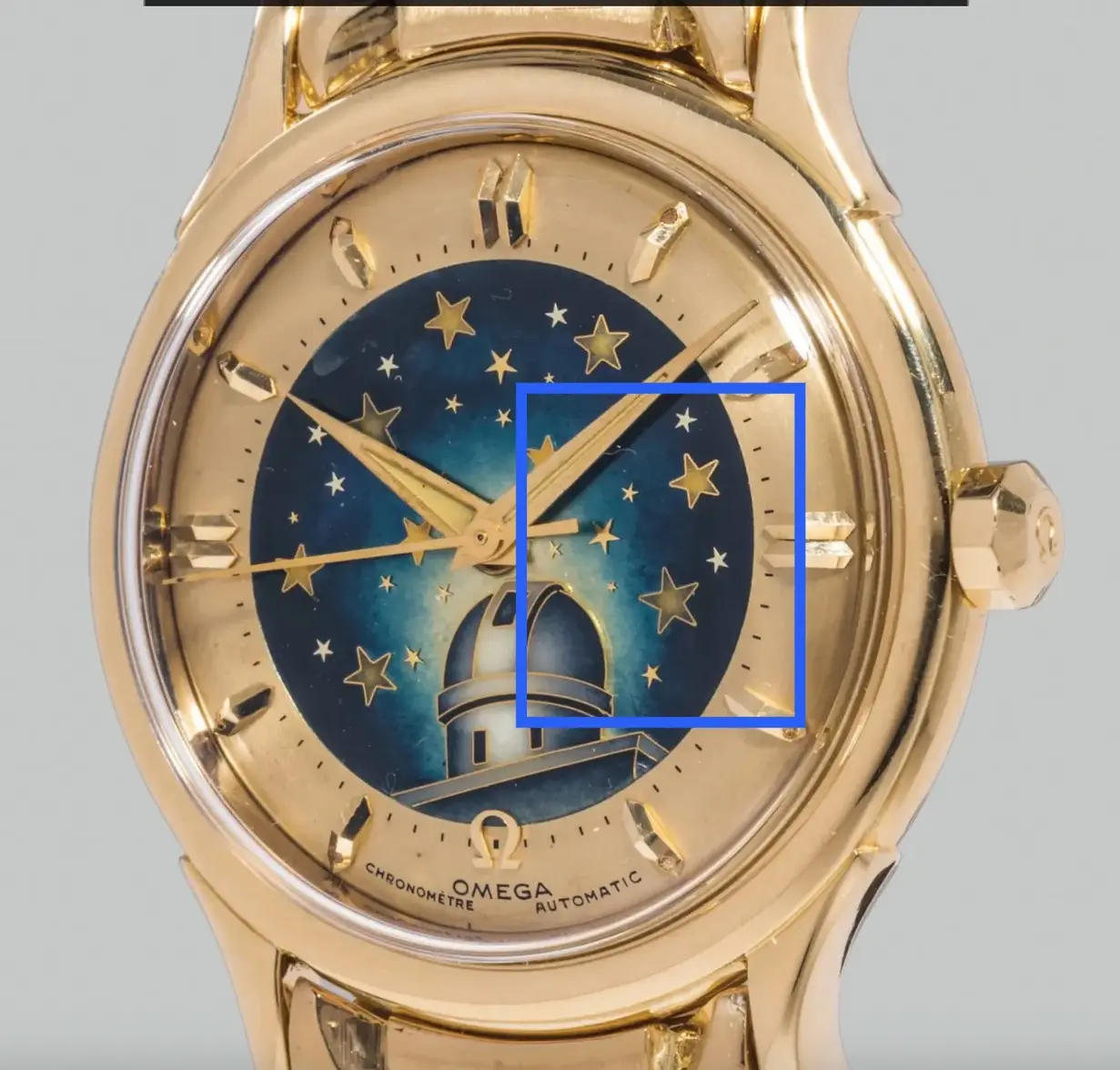
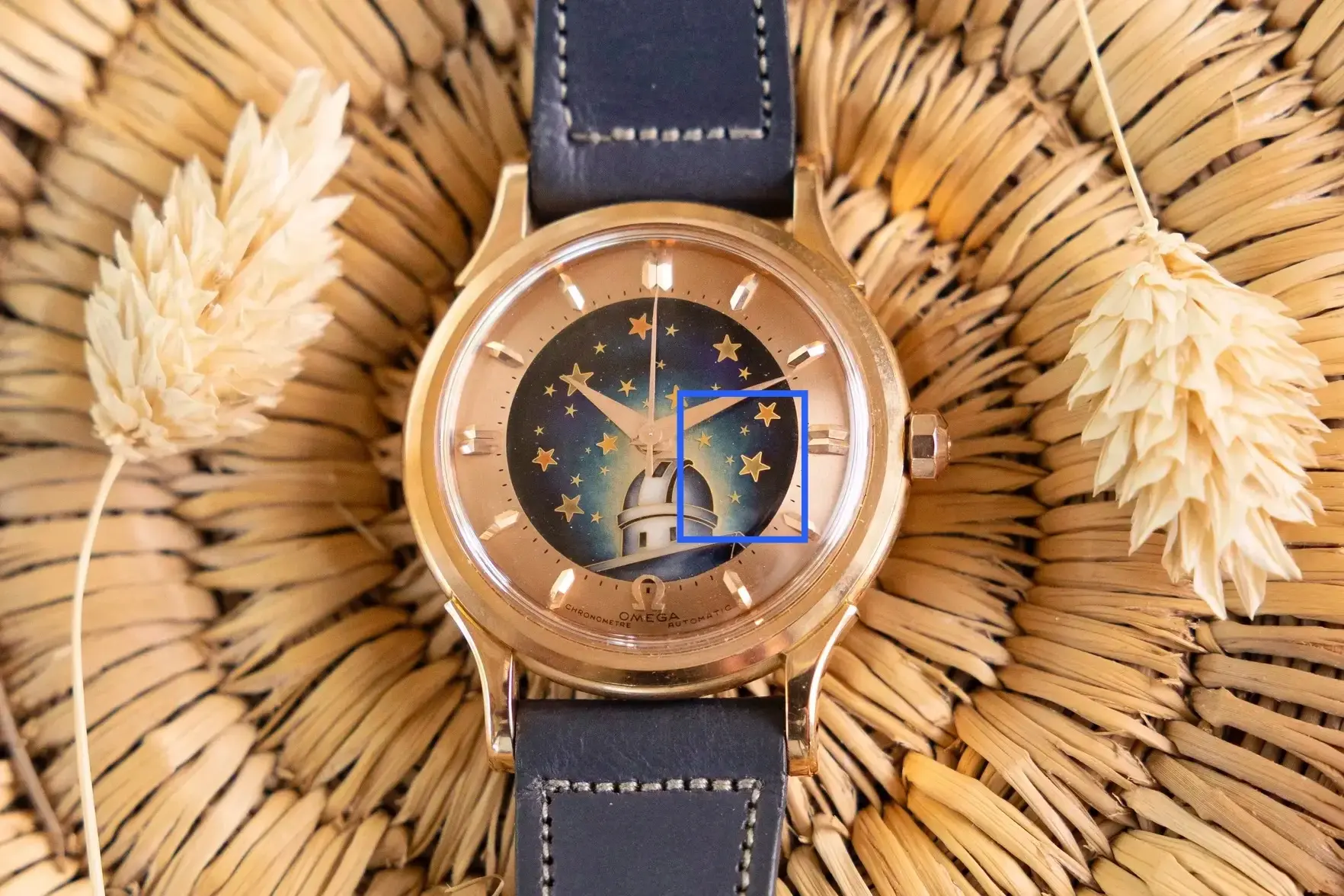
·For me the larger enamel filled stars do not look good on the OP watch compared to the others posted - they look crude and the enamel fill appears more monotone than the three dials from the Omega museum, Phillips and Hodinkee which all look nicely formed on the tips and coloured carefully. The OP dials stars look like they came from the same hand as the aftermarket dial above.
OP Dial:
Aftermarket Dial:
Phillips dial:
Hodinkee dial:
Museum dial:
Ok the image quality isn't great on all of these but you can see the trend, not to mention those minute markers and the edge of the enamel...
simonl19
·Peemacgee
··Purrrr-veyor of luxury cat box loungersAn odd addition to piggy back on this (rather special) thread.
You’d be better starting your own thread and give a bit of an introduction and what you think about the watch.
(And post pics not links please)
Edit
And best to post in modern Omega section not vintage.
Sharp
·Sorry to circle back on this. Did you also notice that between John Goldberger (Hodinkee) and Phillips auction watches, not only do they have different star alignments, but even the total number of stars are different. I did ponder this before buying my watch. To me, this seems like a bigger discrepancy (but not that’s not say I think one or both aren’t good; quite the opposite).
This is not the issue I see with your dial, the problem is the quality, you can take each element in your dial and compare it with the aftermarket dial posted and many are a very close match including the layout of the stars. I think the enamel and border of the stars I posted alone is enough to nail it but the execution of the observatory windows are not close in finesse to the original dials pictured, the wobbly enamel edge is not good, the fading in the night sky, everything suggests your dial and the aftermarket example were made by the same person IMO. The theory it has aged differently is wishful thinking. Obviously you have it in hand so can make the comparison with a loupe to provide more certainty - the image quality of the aftermarket dial is pretty decent on that sales listing.
This being said it sounds like you have paid some sort of in-between price and are happy with the dial so in the end it is all good regardless I suppose? The Seamaster dial you posted looks excellent at first glance.
Regarding some of the other posts, plenty of peoples internet sleuthing over the years has contributed to verifying all sorts of watches on this forum, the idea you need HD scans or to fly to Switzerland just because a watch is valuable is very strange.
Anyone that finds this thread whilst looking into these observatory dials can do a quick check on the quality/colour/edges/shape of the stars in comparison with the images posted to distinguish the modern artists work from an original before needing to dig any deeper. That is all I have to add - I am sure some other members will have further opinions to contribute.
simonl19
·
My mistake - im new to this forum

