cvalue13
·Here is a collection of hot takes on the the “New Ed White” / cal.321B. Basically, points below are minutiae that, if mentioned at all in reviews, are mentioned only briefly.
For the detail-oriented amongst us, these points may become a starting list of trivial details you will-or-will-not like about the “Speedmaster Moonwatch 321 in Stainless Steel” (Omega's mouthful name).
Before living with this reference, I’d have told you I’d rather hesalite, brushed not polished, and free of charge; but with the good fortune of having room in budget for such an unnecessary extravagance, I’ve discovered a watch that defies expectations in part because of the trivial details. (It's still damn expensive.)
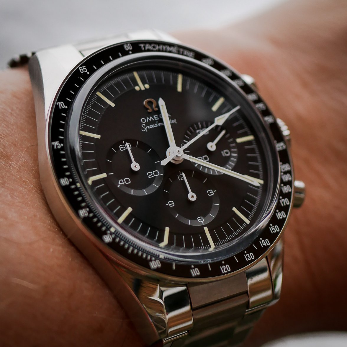
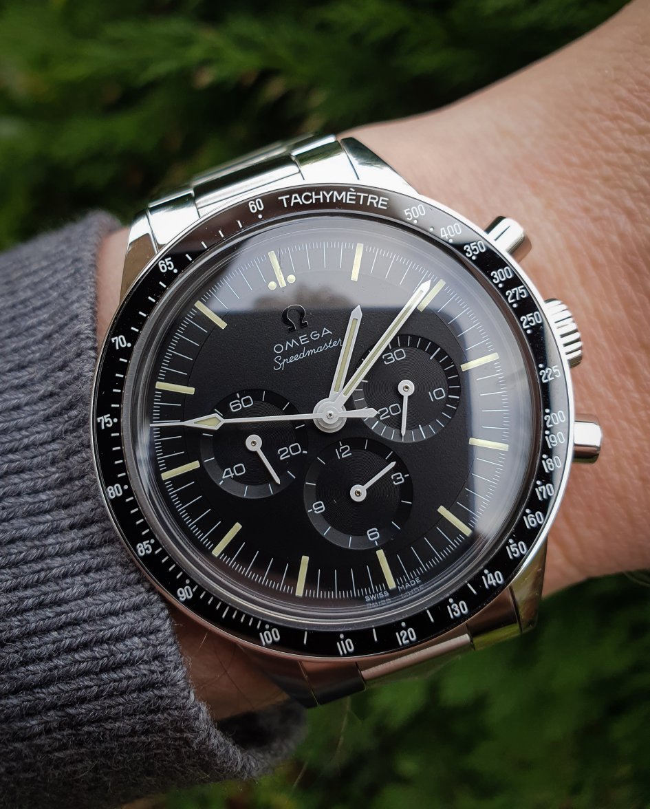
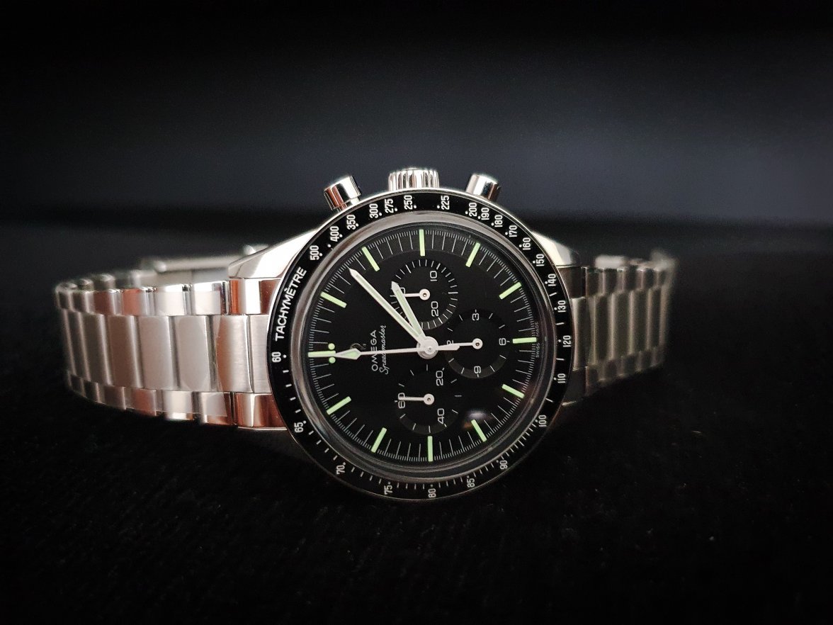
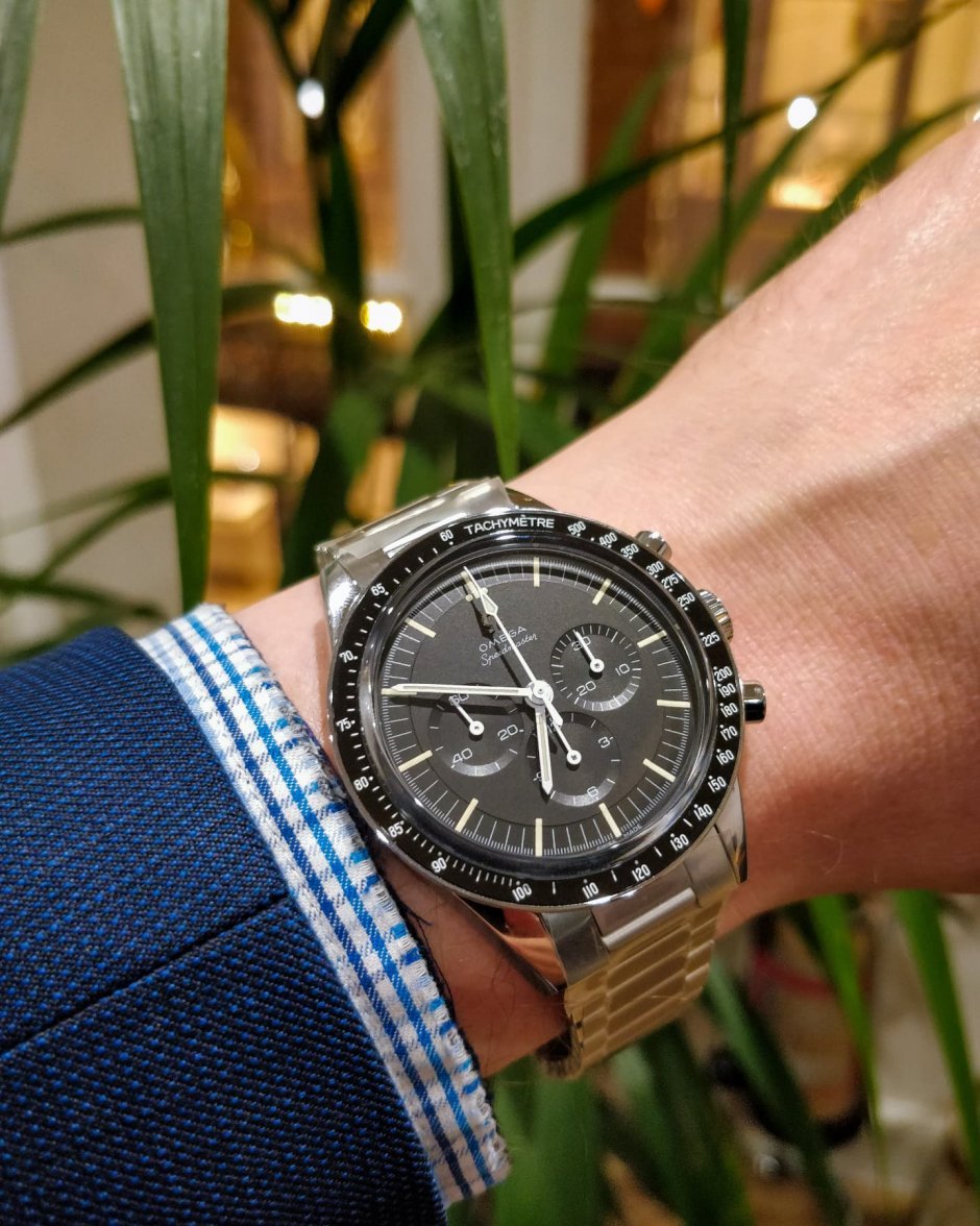
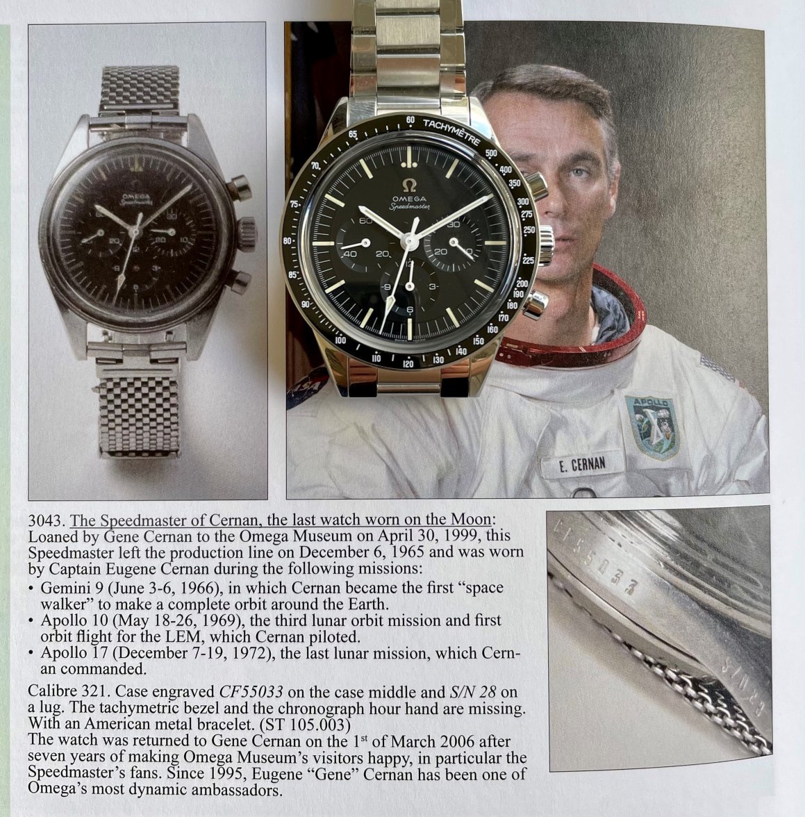
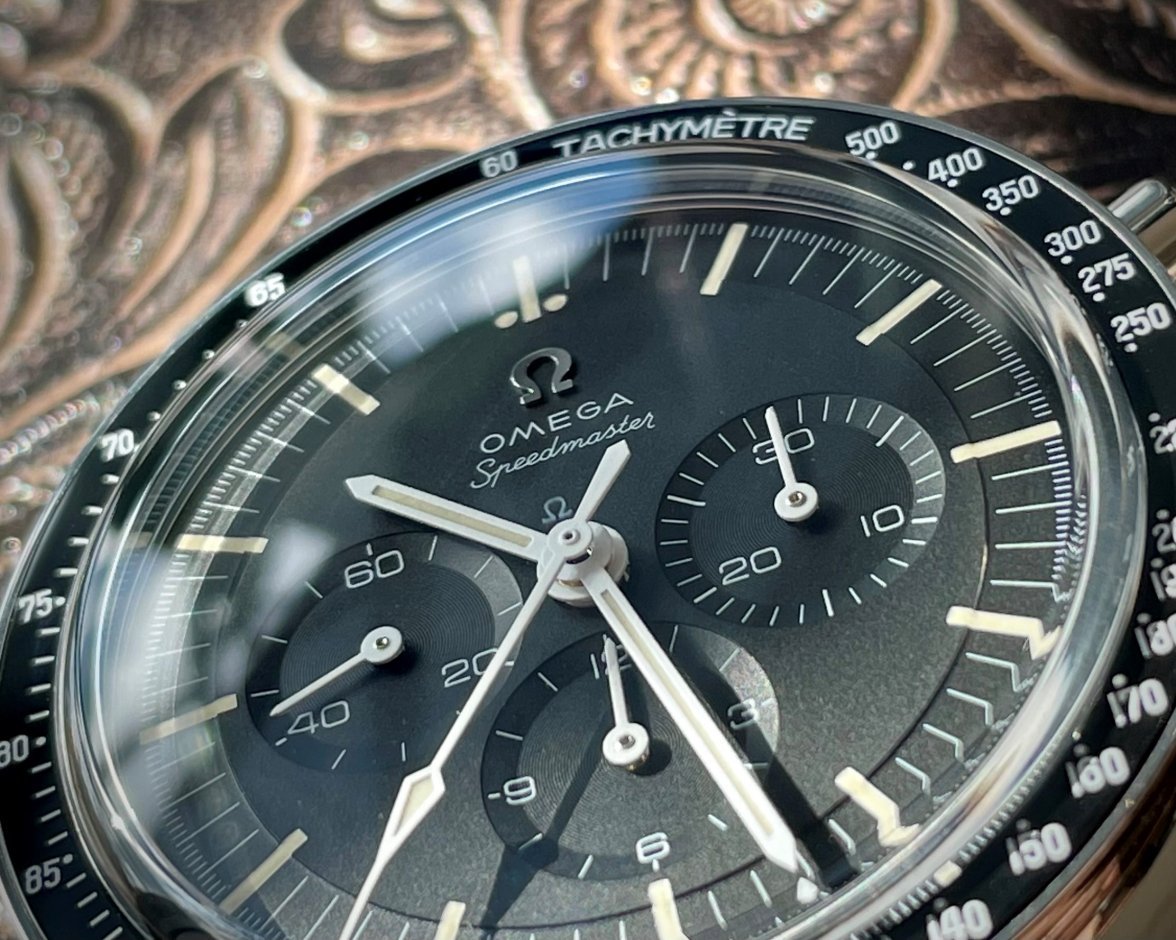
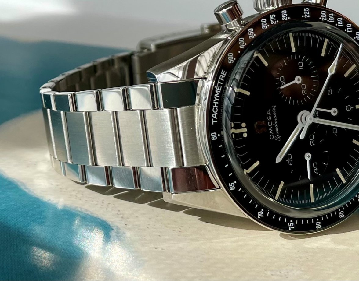
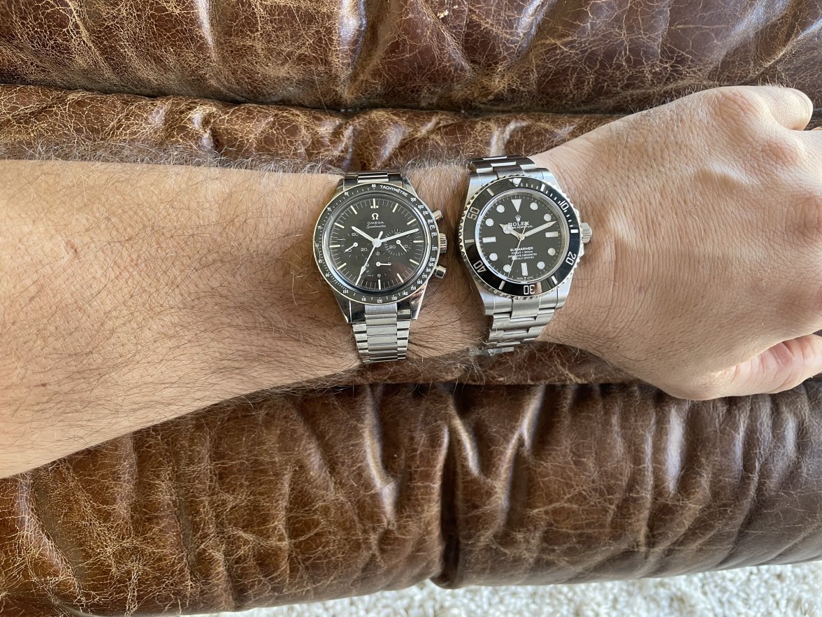
Let’s start with a hero shot:
In no order, some watch nerd hot takes:
Service = Bienne Only
The vintage 321 and 321A versions of the caliber are "Bienne only" service in Omega’s view (not allowed “local” service).
The 321B version of the caliber in the 2020 “Ed White,” is similarly considered by Omega to be “Bienne only” service. And for the new cal.321B, this means movement parts will not be readily available (at all?) except in Bienne.
So, unless that designation changes (seems unlikely), service of this reference will likely take longer (unless you live in Bienne) and cost more (much more?) on any cal.321B serviced by Omega.
Knowing this would not have changed my mind in purchasing the watch, but knowing it before I purchased would have sat better with me.
Good Nick Name ≠ Easy to Come By
For the detail-oriented amongst us, precision in terminology is a tick-inducing subject. After months of researching (and weeks of wearing) this watch, the terms “Ed White” or “new cal.321” proved too unwieldy and inaccurate for the obsessive side of me.
The reference nickname “Ed White” was claimed long ago to describe the vintage reference. And, calling this reference the “cal.321” conflates it with not only the modern platinum watch, but also every historical Omega reference containing the cal.321 (that’s a lot of conflation), or even future references Omega’s not yet announced. And, technically, this reference contains the cal.321B.
So, in the below, I call this reference the “Cernan cal.321B” or the “Cernan.” This nickname approach quells my own ticks, in that it:
(1) differentiates this reference from the vintage “Ed White” reference;
(2) differentiates the cal.321B movement used in this reference from the cal.321 or cal.321A references used in vintage references;
(3) reflects Omega’s use of Cernan’s watch to build the model underpinning the design of this specific reference (which design connection may go even deeper than marketing materials suggest); and
(4) reflects my personal, romantic, view that Cernan the man deserves his due in the world of watch nicknames; there isn’t going to be a better candidate than this reference, the “Cernan cal.321B.”
Bear with me for any appearance of hubris whatsoever in thinking I might move a nickname needle; I really don’t expect to.
Instead, in drafting the below, writing “Ed White” or merely “cal.321” over and over proved far to uncomfortable for the obsessive in me - and if only I give Mr. Cernan some “low knuckles” for his role in this reference, here’s my go at it.
No Paint in Central Pin = Cernan Design Cue?
For both the Cernan 321B and the new cal.3861s, some have criticized the lack of white paint on the center pin of the chrono and running-second sub-dial handset.
At least for the Cernan, I might have a suggestion as to Omega’s thinking here. It’s widely known that Omega (in brilliant if obvious marketing) built this reference based on a modeling of Cernan’s moonwatch. And Cernan’s watch did not have paint in the center pins (see also photo above from AJTT).
But, at least for the design of the Cernan 321B, the lack of white paint on the center pins is - if nothing else - consistent with the mythology of replicating the aesthetic of Cernan’s moonwatch.
Also, I personally think the watch dial looks good this way (as much as any such minutiae could be said to look “good” or bad”). There’s something tool-watch about it, perhaps? Others find it distracting.
Branding = No Moonwatch/Professional Hype
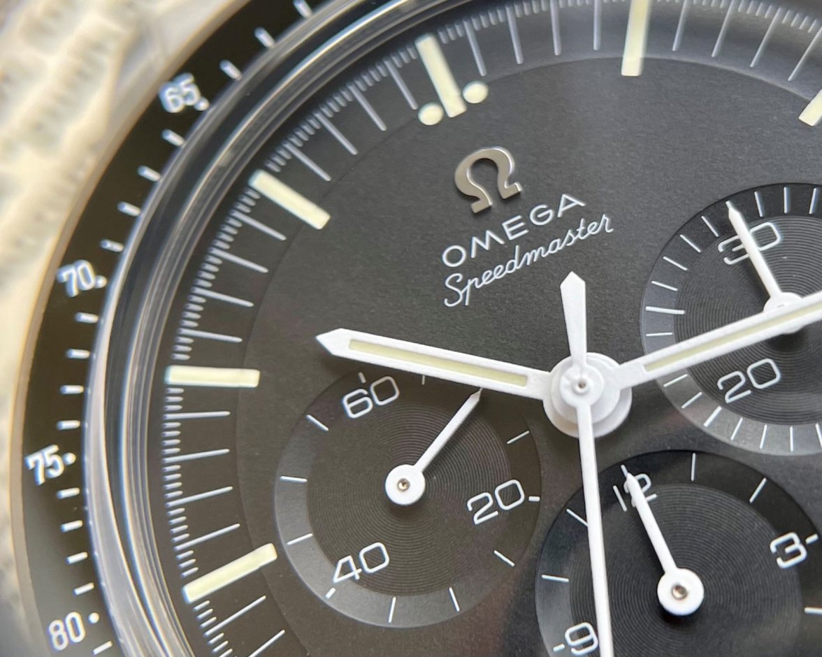
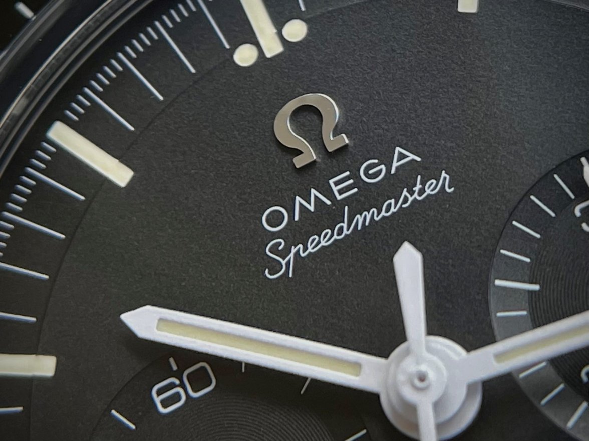
Speaking of replicating Cernan’s personal watch, it’s worth noting that the Cernan 321B reference’s dial simply says “Omega Speedmaster,” and the sapphire back says only “Speedmaster.”
This simplicity in branding is surely a result of “replicating” the same degree of simplicity found on Cernan’s own watch.
In either event, the resulting simplicity in design and lack of aesthetic branding are I think a key feature of this reference’s overall beauty. Less here, is more.
Sapphire ≠ Milk Ring
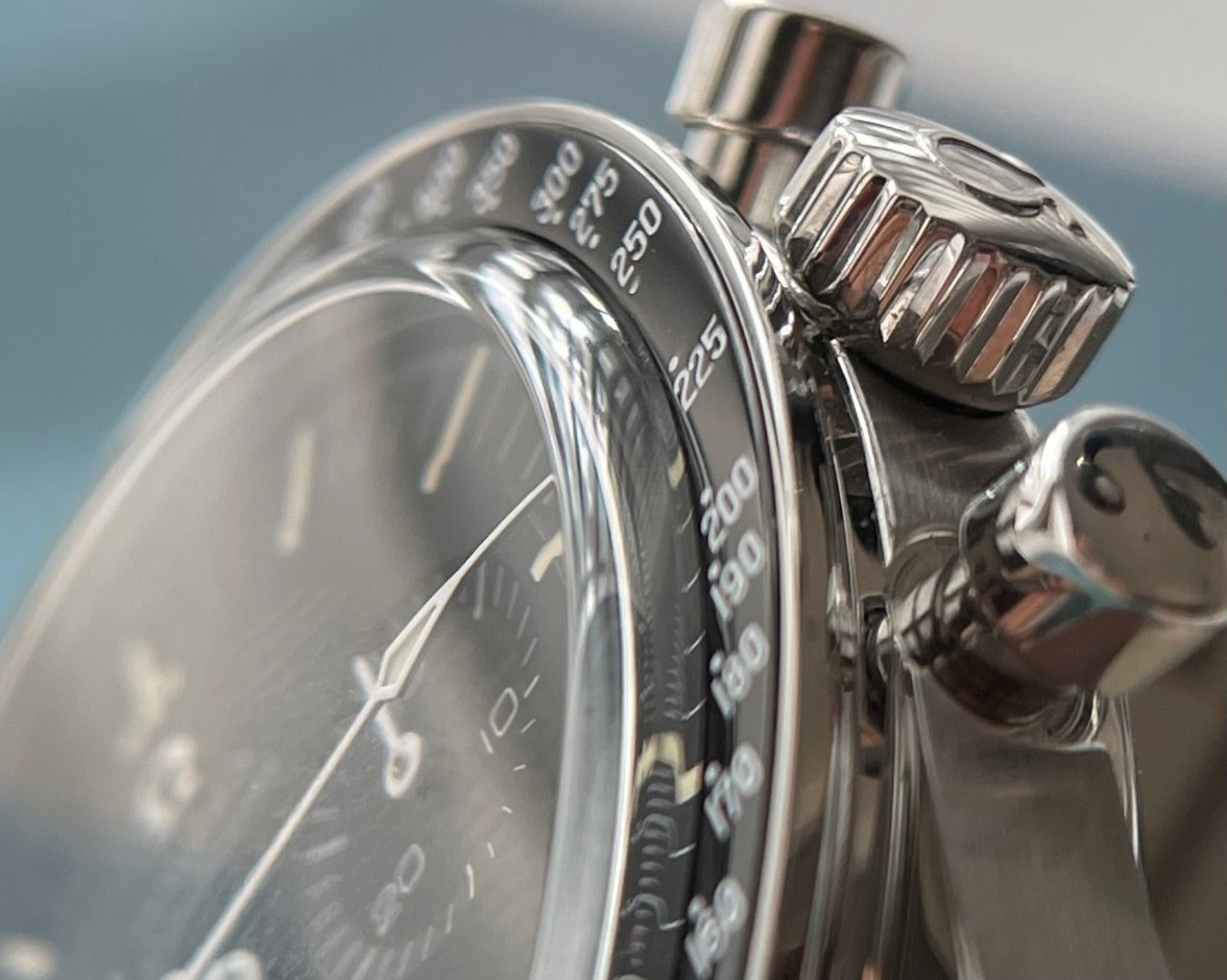
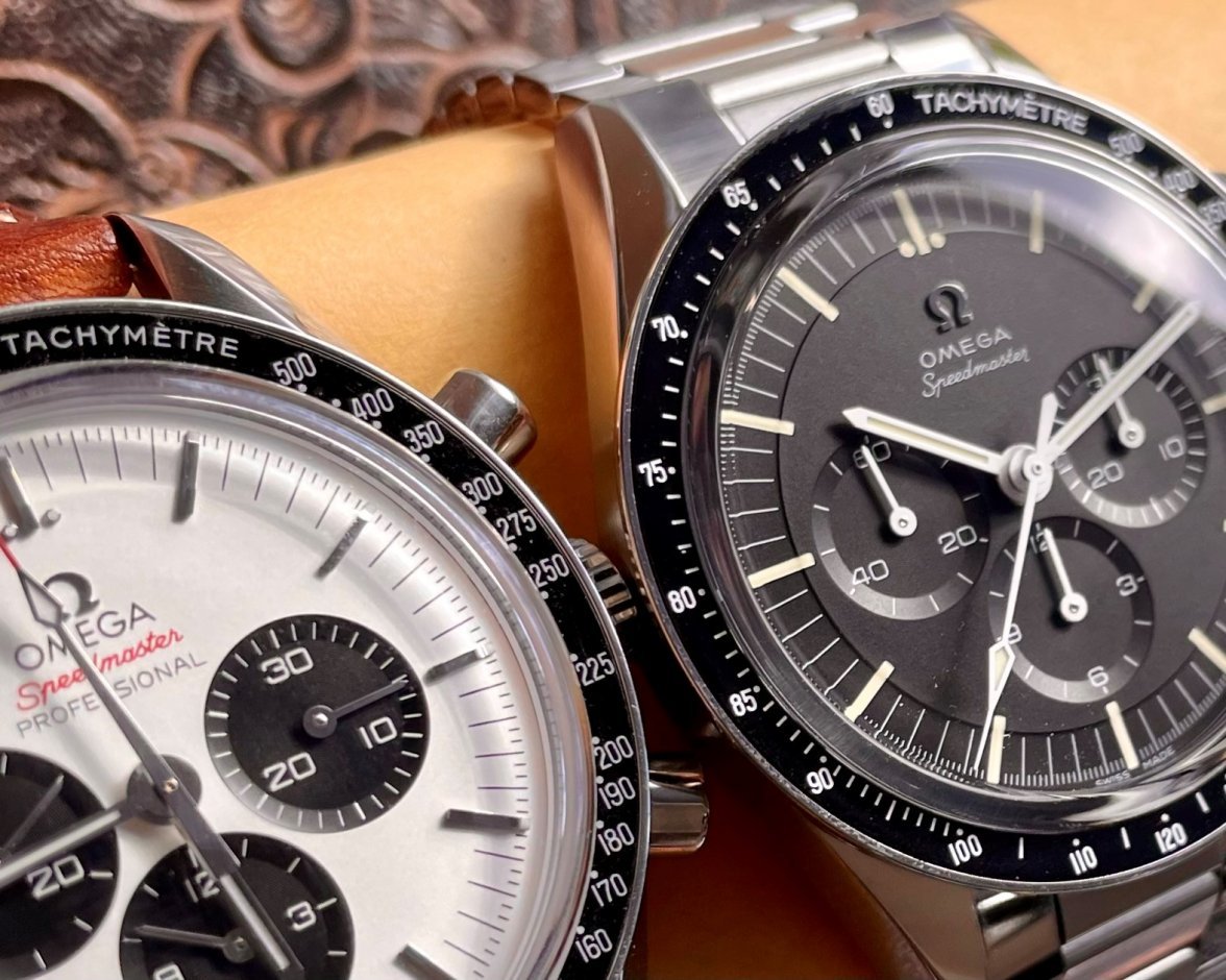
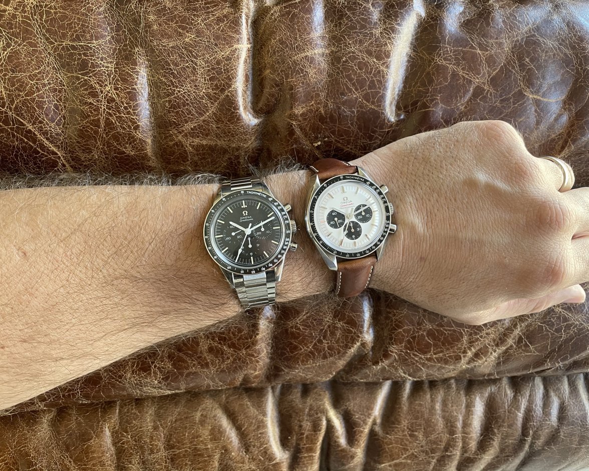
As soon as the Cernan 321B was announced and described, the forums lit up with the requisite amount of debate over hesalite vs sapphire. And in my experience the “hesalite vs sapphire” debate is typically at least ~1/3 “milky ring” focused; and at least regarding black dialed Speedmasters, I’m in the anti-milk crowd.
The Cernan proves that the milky ring issue is not inherent to all sapphire watches. The Cernan has a sapphire crystal but does not have the much maligned “milky ring.” How the Cernan manages to thread this needle I don’t know, and I’ve been down one hell of a rabbit hole wondering over it.
Feel free to wonder down that rabbit hole if you want me to show my work, but for present purposes let me give you only the conclusions:
(A) compared to the sapphire cal.1861 Speedys, Cernans have no milky ring, assumedly owing in part to the latter having a redesigned (more domed) crystal and a black gasket (the cal.1861s speedys having a grey gasket); and
(B) strangely, the new sapphire cal.3861 Speedys appear to have the same redesigned crystal and also a black gasket, and are purported by owners to have less milky ring than the cal.1861 Speedys, but as far as I can tell the cal.3861 Speedys continue to have far more milky ring than does the Cernan 321B.
The real take-away here is this: that the Cernan lacks the milky ring matters to me because, all else being equal, I would have preferred a plexi Cernan due to my distaste for the milky ring on black-dialed Speedys. That I didn’t have to compromise on “milky ring,” is a material point.
I held my breath until it arrived in my hand, then sighed in relief.
No doubt sapphire and hesalite continue to have differing optical and physical qualities, for better and worse - but with the Cernan, Omega has closed one considerable gap in the hesalite vs sapphire debate.
Sapphire Omega Logo = Laser Beams in Your Dreams
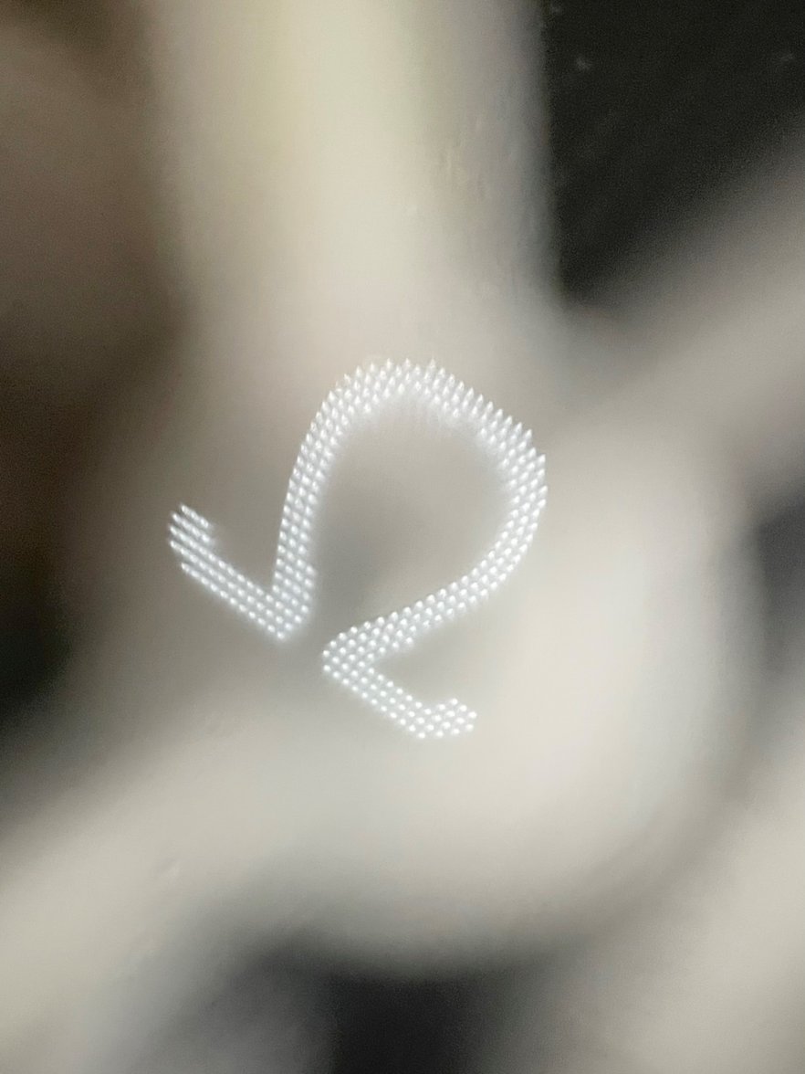
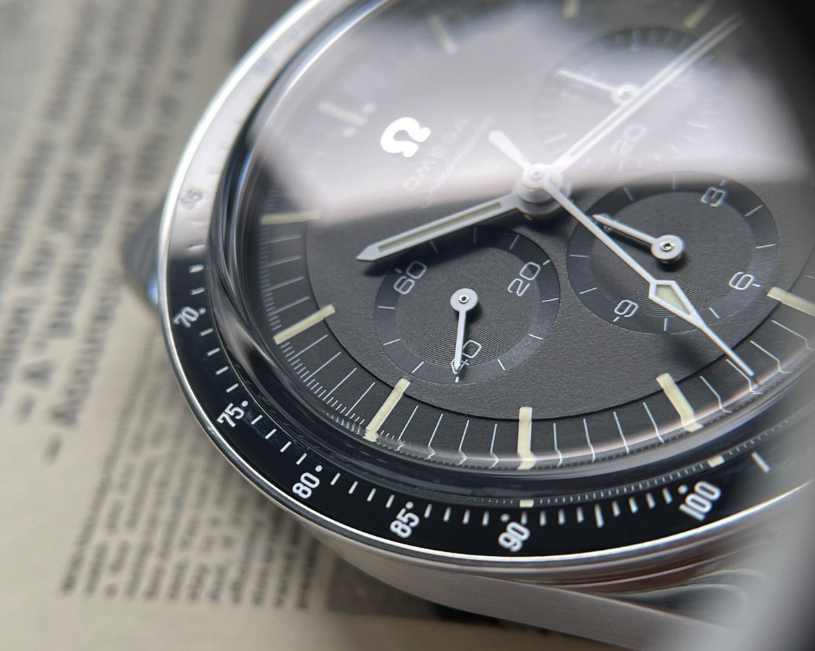
Speaking of the sapphire crystal vs hesalite: Omega did not want to lose the tiny, romantic logo that is typically stamped in the center of hesalite crystals, so they used a special laser technique on the sapphire.
Specifically, the laser-sapphire logo found on the Cernan 321B is not laser-etched into the surface of the sapphire as one might expect, but instead the laser is used to etch the logo within the depth of the sapphire (that is, the etch is ‘suspended’ within the center thickness of the sapphire).
In a video by an Omega product manager, there is the suggestion that the Cernan reference is the first time this specific technique has been used on a sapphire Omega. While other sapphire Omega’s in the past have had the tiny logo, the suggestion by this representative - to my ear - was that those priors had been surface etched, while the Cernan used the “latest in laser technology” for a newfangled approach.
In any event, here is a detail and then also microscopic photo of the Cernan laser logo (please someone with a prior model’s sapphire logo provide a comparison microscopic picture!)
Dial ≠ Black Varnish?
Best I understand it, the cal.1861 and cal.3861 Speedmaster dials are black in virtue of a varnishing process.
In a video with Omega’s product manager, he says the Cernan’s dial is not varnish but instead some other process but - due to his accent and speed of speech - I cannot decipher. He goes on to mention that this different process allows for more precise application of the various indices, numbering, etc., on the dial.
Ears open for further clarifying of how the Cernan dial coloration process is different from the cal.1861/3861 speedy dials (and if that could portend any differences in how they hold up, or age).
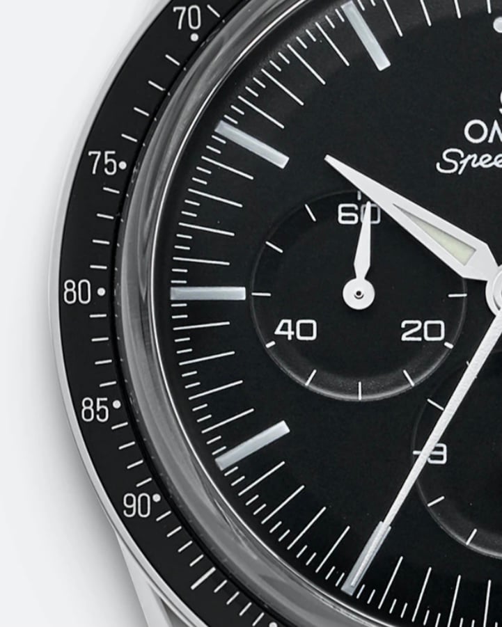
Ceramic Bezel = White Font (Not Silver)
On a “normal” Speedmaster, the bezel is made of aluminum, and the font is the color of the underlying polished aluminum - or “silver” in color, and reflective.
In contrast, the Cernan bezel font is pure white. The white font results from the white enamel used to “fill” the laser-engraved font voids within the ceramic. Under magnification, the font looks like milk filled just below the brim of a black ceramic bowl.
White font gives the bezel a subtly distinctive look. And, perhaps the white font is particularly helpful to the Cernan, which is otherwise highly polished all around (wouldn’t more silver in the bezel font fall flat?).
In any event, the white-on-black tachy font I find slightly more legible than silver-on-black aluminum bezels (as stands to reason, purely by contrast).
Ceramic is known for its strengths, but it is not infallible or indestructible. Nor is enamel. So, it will be interesting to see over time how “aging” occurs on these thin, ceramic bezels.
Lume = More Than Regular Speedy?
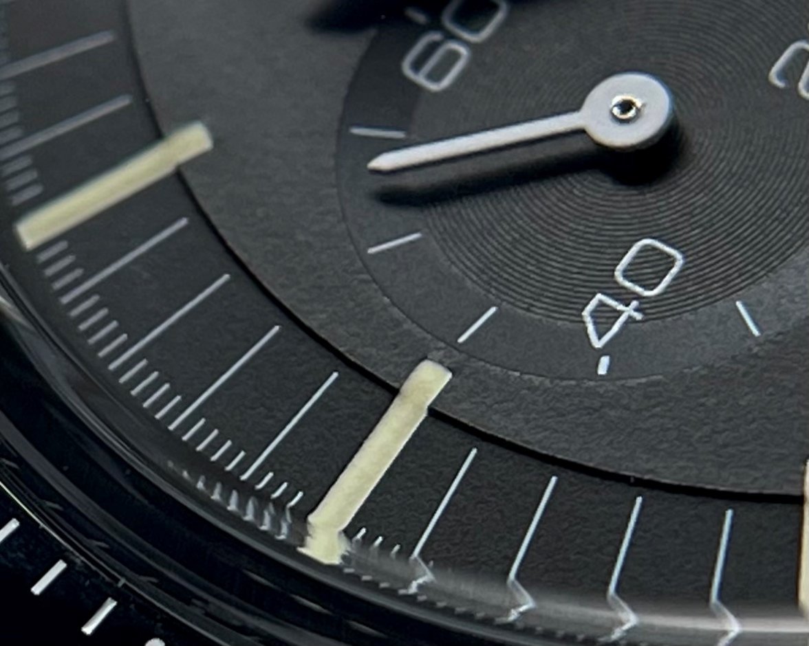
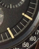
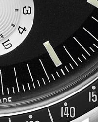
Compared to the 1861 or 3861 Speedmasters, the lumed indices in the cal.321 are:
(1) long indices (and, to my eye, better paired with the tear-drop chrono hand);
(2) machined into the face of the dial, creating a ‘trough’ into which the lume itself is nestled; and
(3) according to Omega, stuffed to the brim with lume … moaar lume.
Indeed, to my eye this is a bright watch, for a Speedmaster.
That said, when it comes to lume comparisons, some watches need more lume than others. Black-dial/white-handset Speedmasters are incredibly legible, and as a result don’t “require” as much lume, as often, as might many other watches. I own several watches where at dusk the lume already becomes helpful if not necessary to telling time; on this Cernan 321B, however, I can still read the dial (absent lume) well into twilight.
Lume ≠ Fauxtina (According to Aunt Cheryl test)
This will be controversial, since everyone has their own definition of “fauxtina.”
But let me recast the fauxtina debate a little differently: unlike the Trilogy SM300 (for example), my aunt Cheryl could never be fooled into thinking the Cernan is an old watch.
Only if Omega made the lume green-tinted would it be more difficult to convince aunt Cheryl this watch is old.
But who would want green-tinted lume on this watch? And stark white lume (is that possible?) might combine with stark white bezel font and handset to a “careful what you wish for” overload of stark white.
The off-white lume, instead of making the watch appear vintage, simply makes the watch look good.
Hell, the Cernan’s bracelet would do more to convince aunt Cheryl this watch is old.
Bracelet = A Beautiful Compromise?
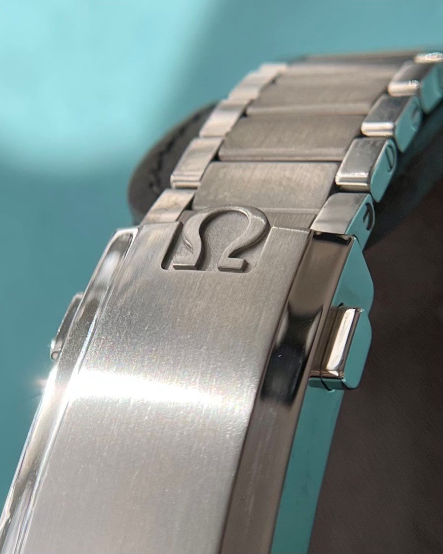
The bracelet is beautiful, and comfortable. I can only assume it’s robust. There’s not much else to say here.
Except, the bracelet does not have an on-the-fly adjustable clasp.
For the cost of this watch, an adjustable clasp would have avoided any and all complaints, but only if it would not have required adding depth to the clasp. This is a flat link bracelet, and its beauty is in its flat-linky-ness.
If at Omega they thought “well, we can give them flat-linky-ness or we can give them an adjustable clasp, but we can’t give them both,” then they gave me what I wanted.
Serial Number ≠ Series
Don’t expect to determine the “age” or other info from your Cernan 321B’s serial numbers.
There are two serial series seen to date (887XXXXX and 888XXXXX), those series are shared with other cal.321B watches (such as the platinum, but also possibly other models in the future), and more generally series numbers are not intended to be a reliable LE-like numbering convention.
# of Cernans/Year ≠ 2000
Another non-LE-like numbering convention are Omega’s confusing and non-committal comments on the number of cal.321B movements it may produce each year. There are at least three reasons confounding any attempt to correlate a Cernan serial to its production “age”:
(A) first, the number of cal.321B movements made/yr. cannot be conflated with the number of Cernan references to be made (again, see the platinum model, and possibly other 321B-based watches in the future);
(B) second, Omega representatives have stated that, of the 2000 aspirational movements/yr., only 1000 of those are aspirationally allocated to the Cernan reference;
(C) third and most importantly, none of the above really matters or should be relied upon: Omega may ramp up or down production of movements, add watches utilizing the cal.321B movement, etc., because this is not an LE.
Presentation Box ≠ Limited Edition or Nice
The very expensive Cernan 321B comes in the same presentation box as did the “regular” cal.1861.
Meanwhile, many other Omega watches that are far less expensive come in more impressive presentation boxes. For example, a Tokyo 2020 cost less than ½ the Cernan but came in a rather nice white lacquered presentation box.
On the other hand, my Tokyo 2020 lacquered presentation box has set buried in a closet since the day I received it, along with all the other misfit boxes both beautiful and ordinary.
So, while a nicer box with the Cernan would have been nice, I believe it is for me a purely emotional/marketing “want,” than any sort of practical requirement. And, Omega seems to be asserting (hiding behind the assertion?) that the Cernan 321B is a regular production watch, that gets regular production treatment.
Still, for $14K, I want but don't need a cooler box to sit idle in my closet.
Whole > Sum Parts
The features discussed above come together into a watch that is uniquely beautiful, if not without faults.
Aesthetically, this watch appears incredibly modern on the wrist, while still pulling at the heart of the historically sentimental. Nothing about this watch reads as “vintage” or “reproduction,” except perhaps to the most observant of Speedy/Omega devotee. You have to know the story to see the story.
And for the detail oriented sort, the combination of the obvious design features such as the resurrected cal.321B, straight lugs, and polish only tell only a brute portion of that story; it’s the minutiae that come together to make one grow fully fond of it: the white enamel font of the bezel, the lack of branding, the long/off-white indices, etc., etc.,... all come together into something really quite special.
If you can get one for free or 1/2 price, there is no question you should, as compared to the other Speedmasters for 1/2 this price; if you must pay full price, there are very good reasons to do so. Many of those reasons are minutiae.
Would love to hear other's minutiae, critiques, or corrections to anything above - and most importantly PICTURES
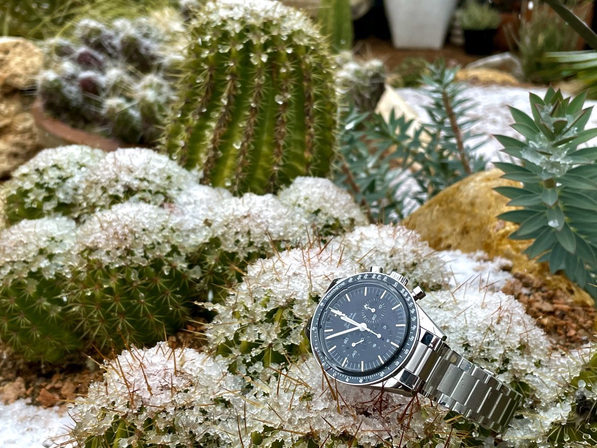

Edited:
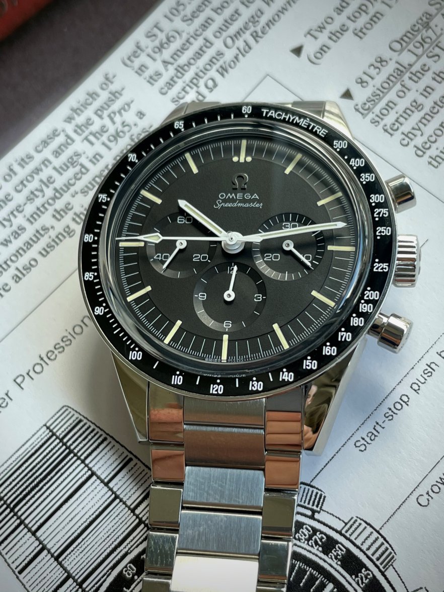
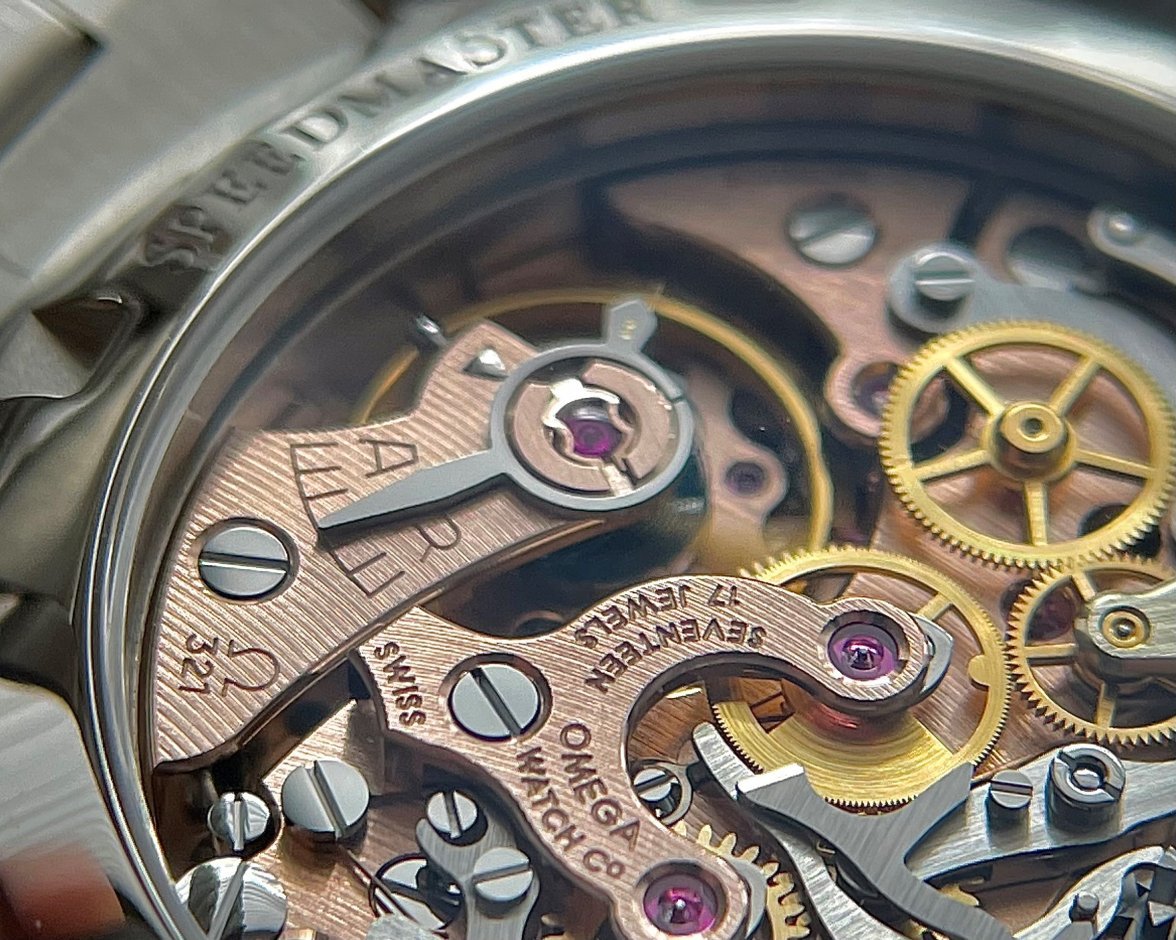
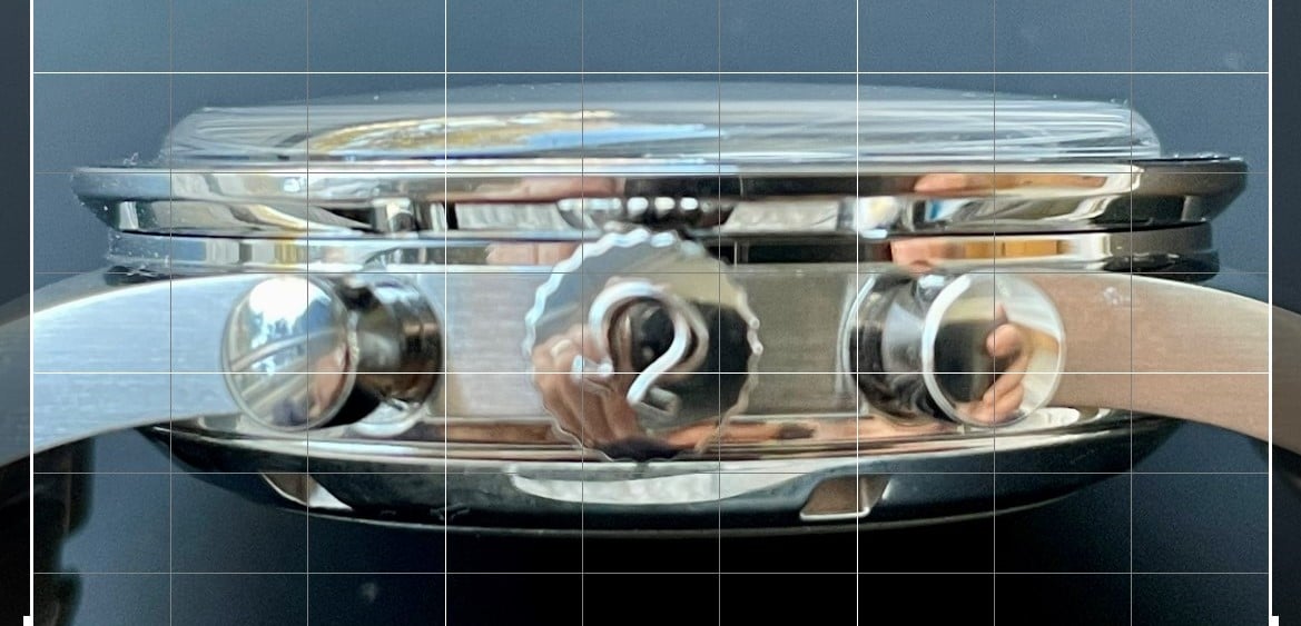
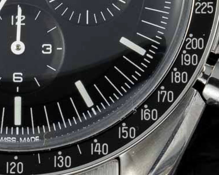
 and I'm also sooo relieved that the "Cernan 321b's" crystal is devoid of that god-awful milk ring...
