- Posts
- 13
- Likes
- 0
Moose93
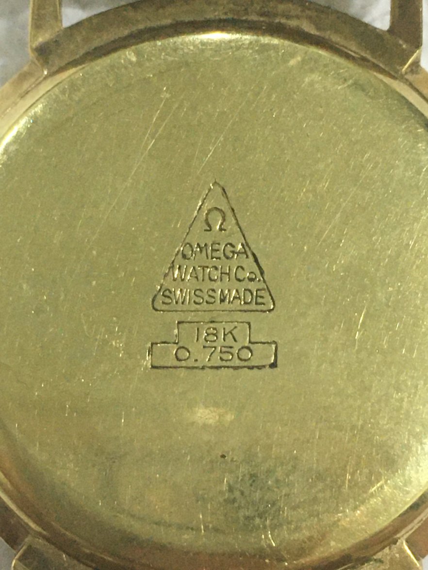
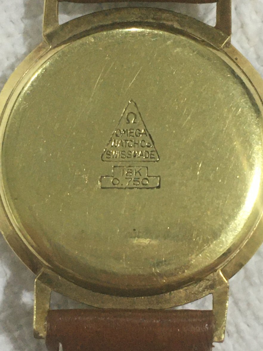
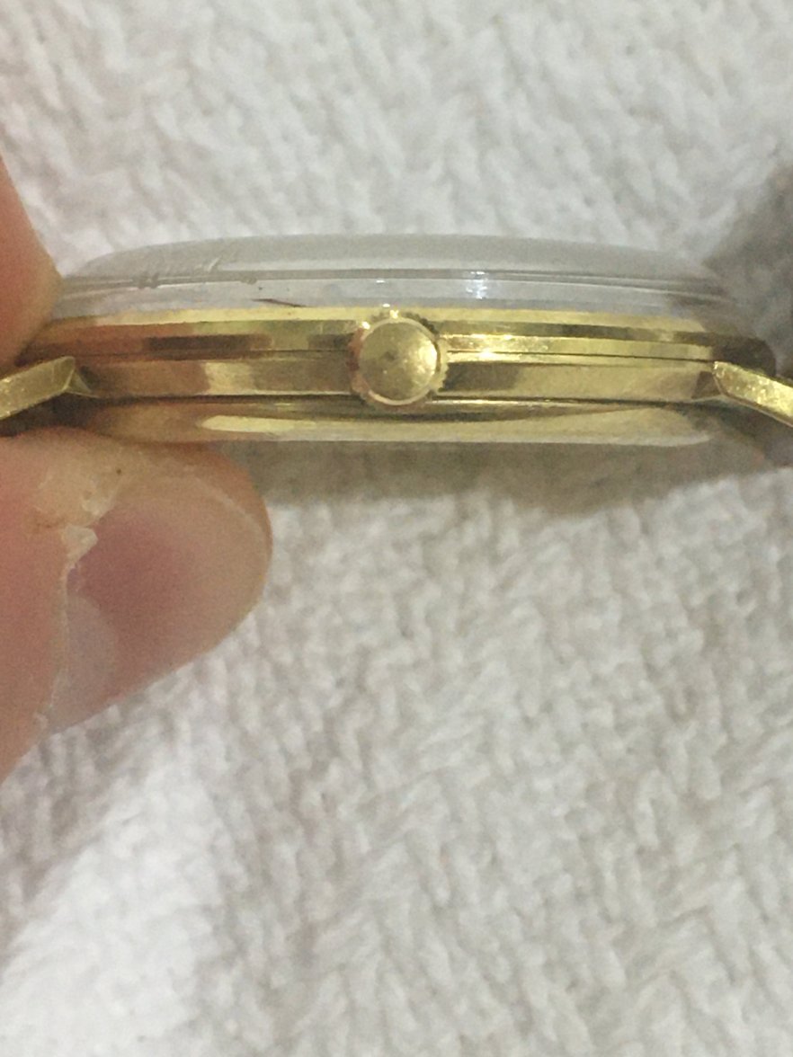
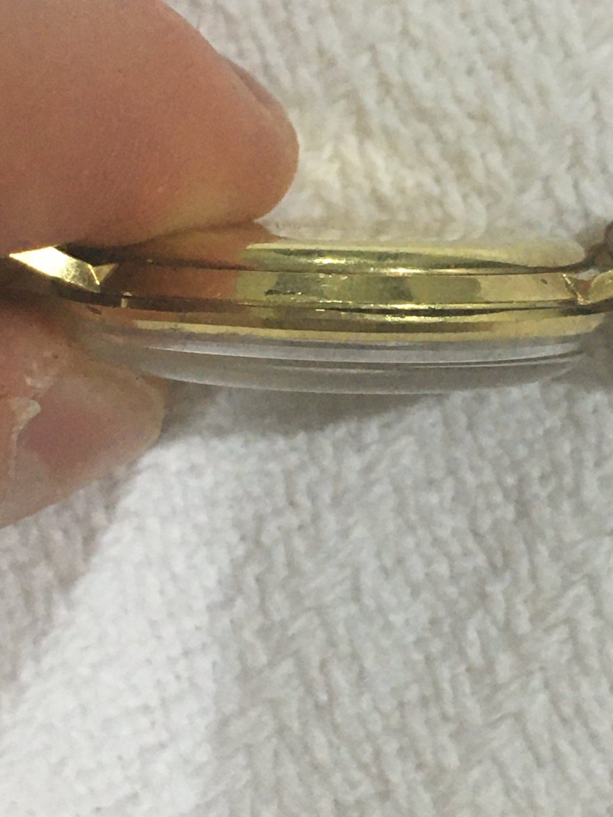
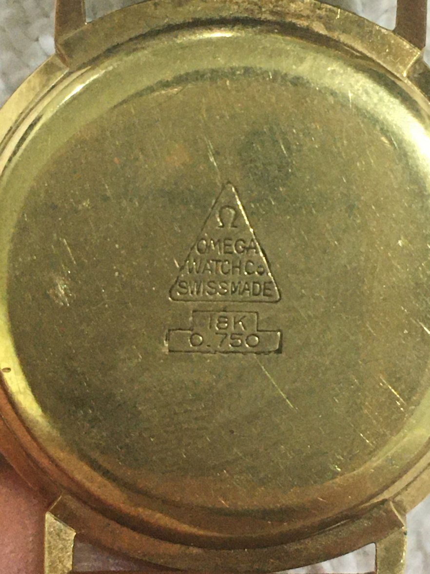
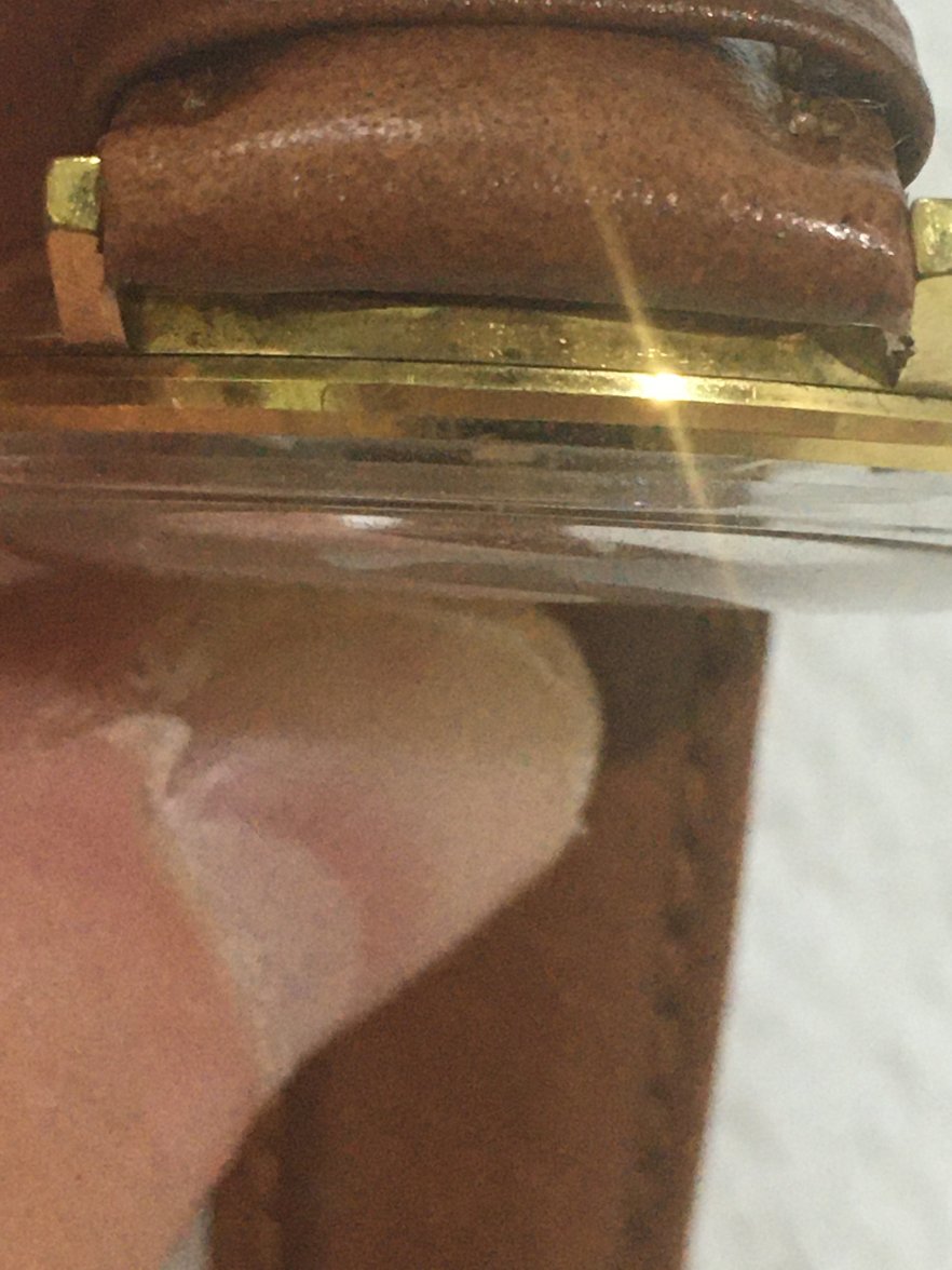
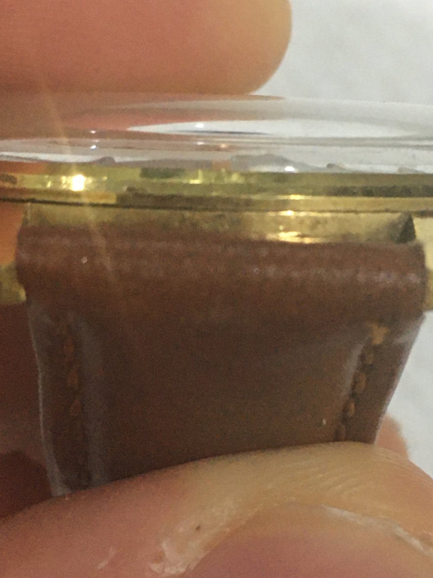
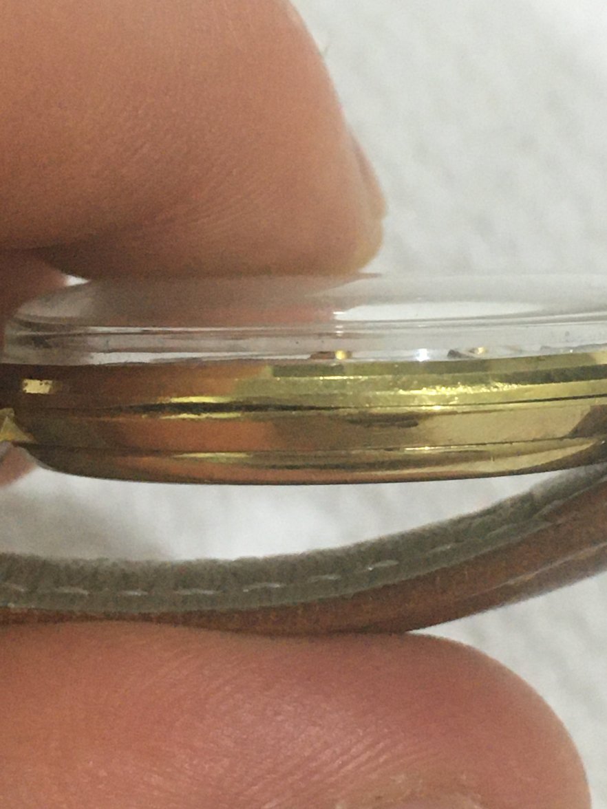
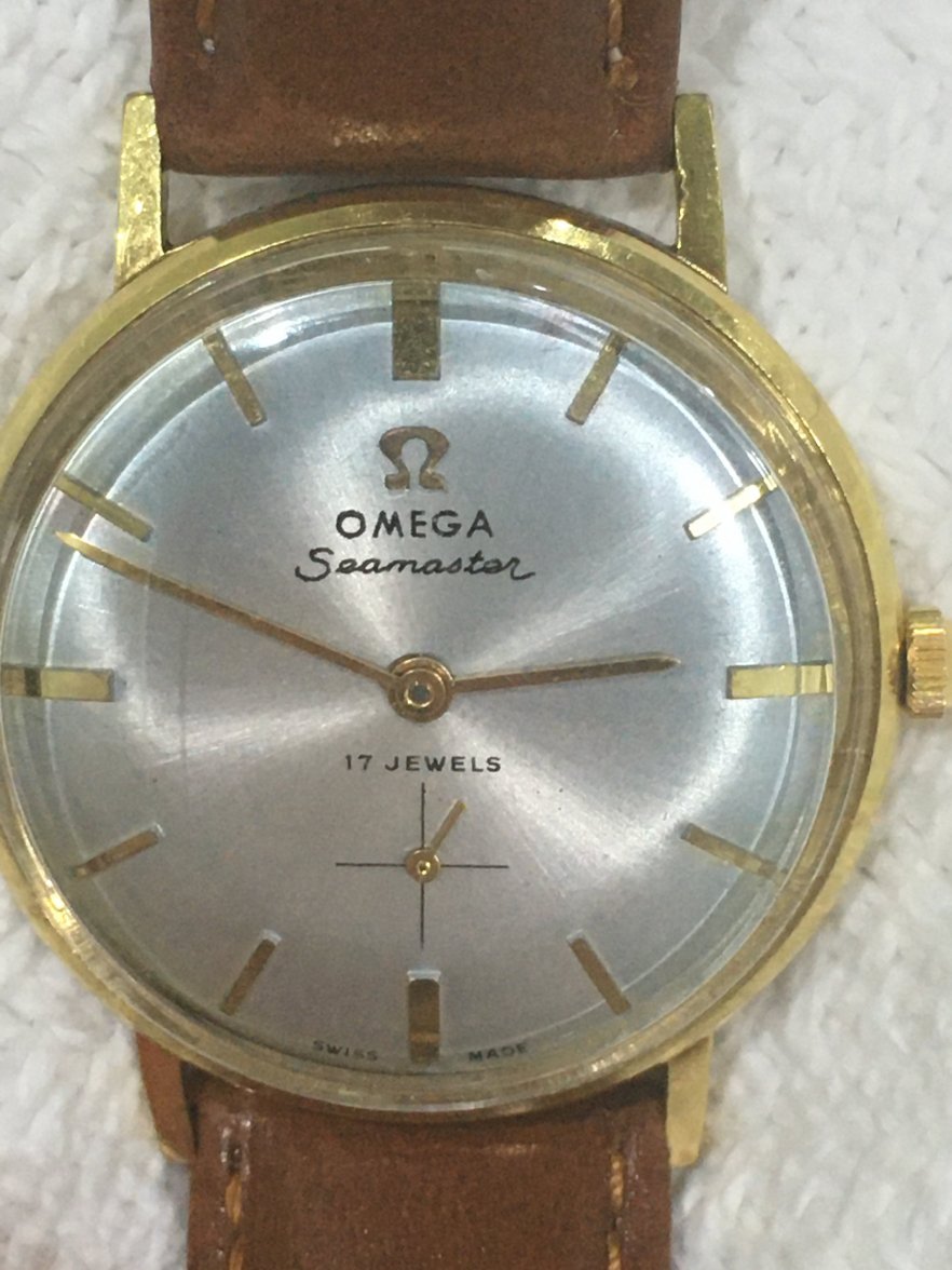
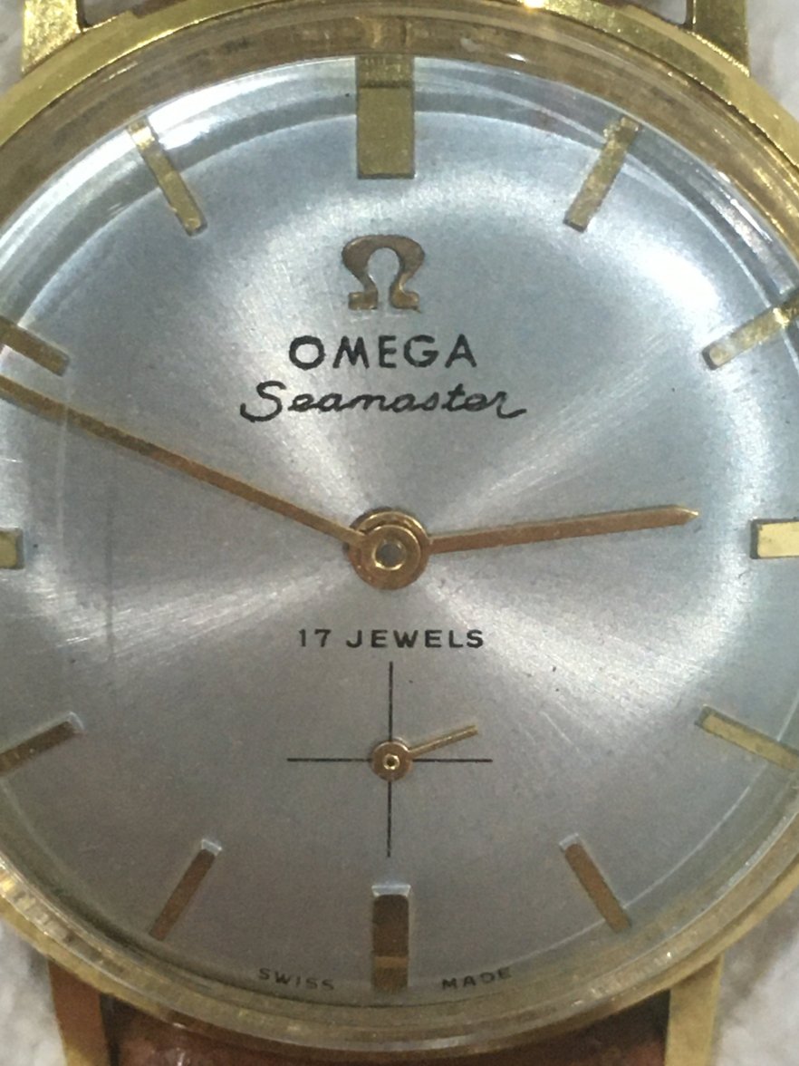
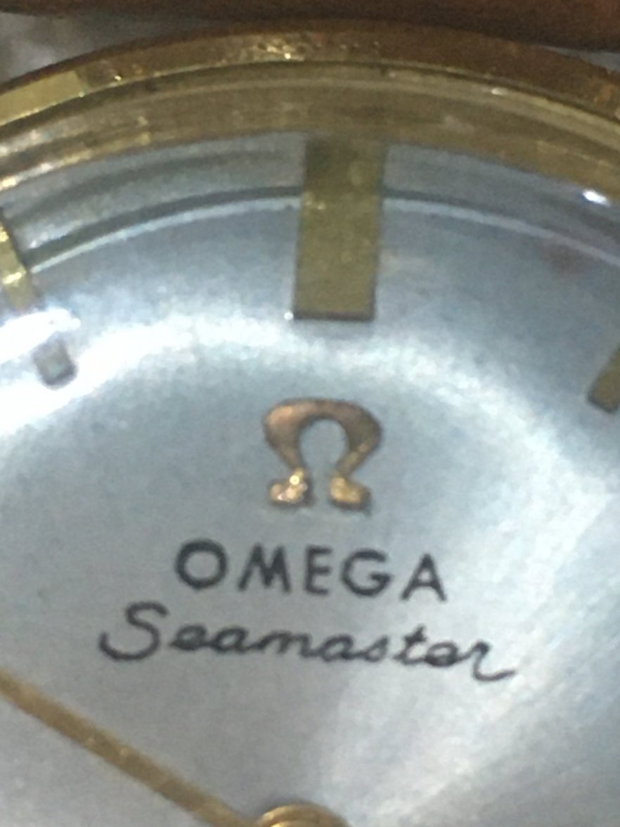
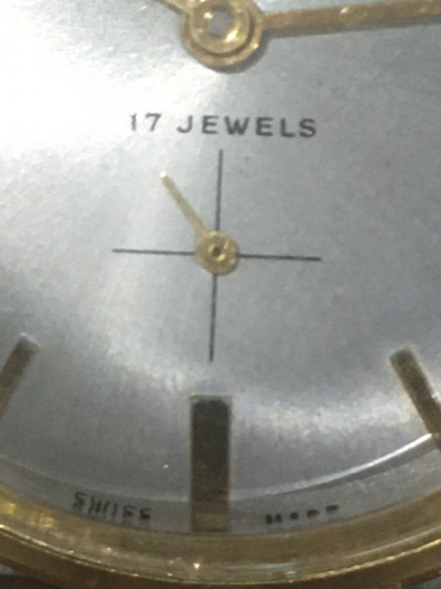
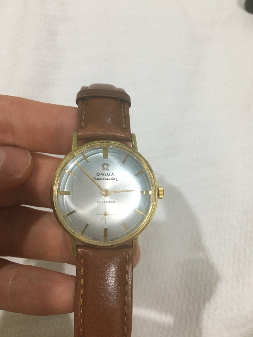
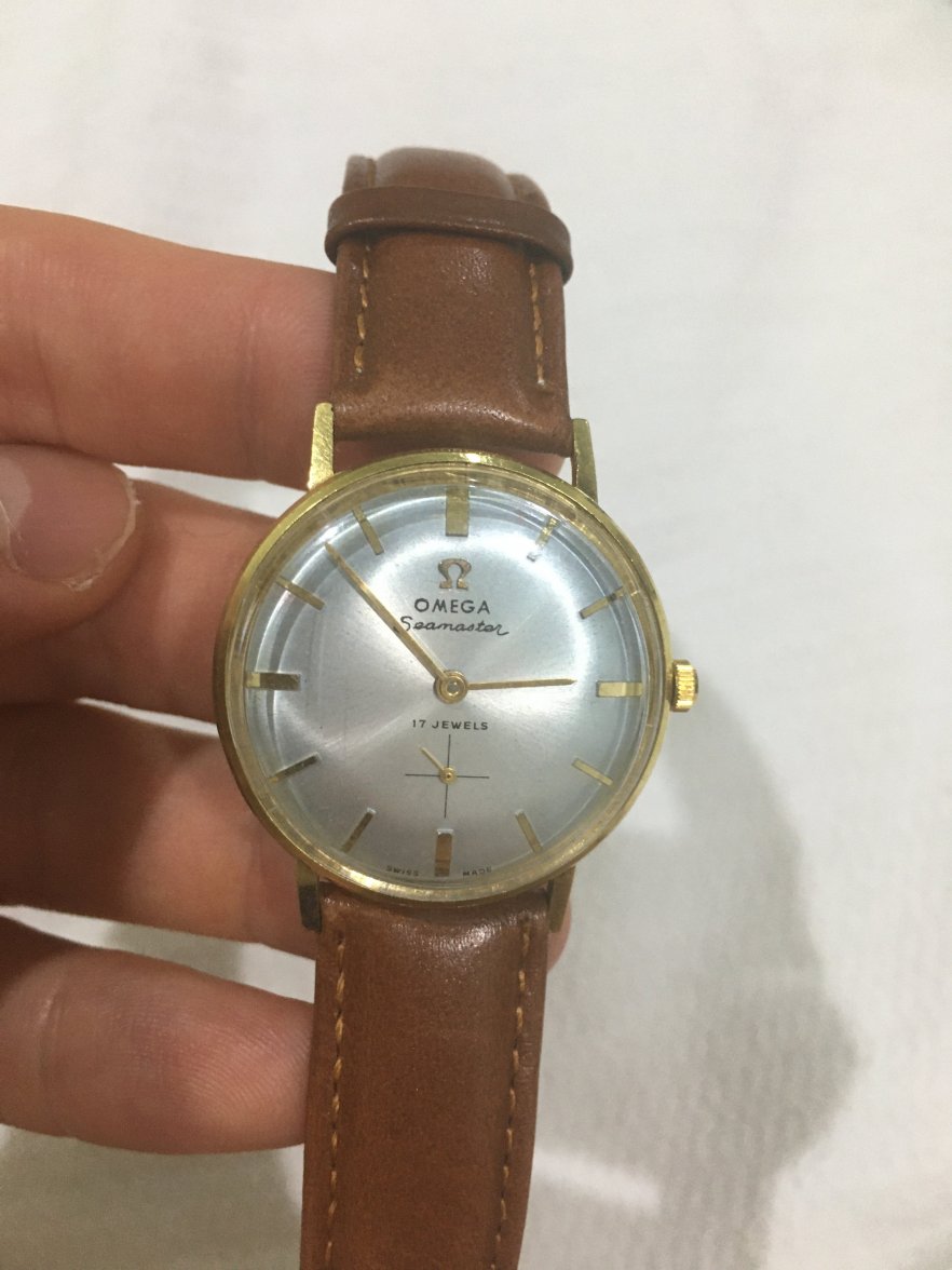
·Hi! I got this watch a while ago from my mother, and she says it was her father's. I told her recently how much I appreciate it, and I commented on how handsome the dial is. She thanked me and told me that I should try and see how much it's worth. I tried using this app from Chrono24 that identifies watches, but it wasn't able to ID the watch. I also skimmed through the year-by-year archives of pictures from Omega of their Seamaster's, but I couldn't find a picture that matched my watch. Would anyone here be able to help me? I've attached photos. Thanks!