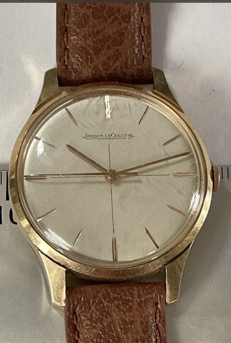
At first glance it appears to be a very nice example of a vintage JLC. But on closer inspection, I would say that there are questions about the originality of the dial. Those questions relate to the signature.
I admit to not being an expert, though I have probably owned >10 vintage JLC over the years, and have viewed hundreds in person. Like all manufacturers of that period, the signatures on the dial were not always consistent, as the printing was outsourced. But broadly speaking, I would say that the JLC signatures tended to be more consistent than most, and typically featured 'serif' characteristics.
Although better photos would be required in order to assess the dial with high confidence, the one shown appears to feature inconsistent serif characters. The T and L appear to have them, but most of the others lack the distinctive feature. Also, the G does not appear to be as round and smooth as those found on original dials. Finally, the small loop, connected both to the underline and the E on the right, appears to angle up at the corner of the lower 45º angle on the E, while original examples tended to angle to the right of that corner.
It is possible that the crystal is causing a fair amount of distortion in the OP's photo, but given what we have to go on, the signature does cause some concern. For comparison purposes, here are the OP's, followed by two that I am confident are original: