Help for Omega Cosmic

Posts
5
Likes
0
Hi,
This is my first post here so please bear with me (both for the questions and the quality of the pictures 😉.
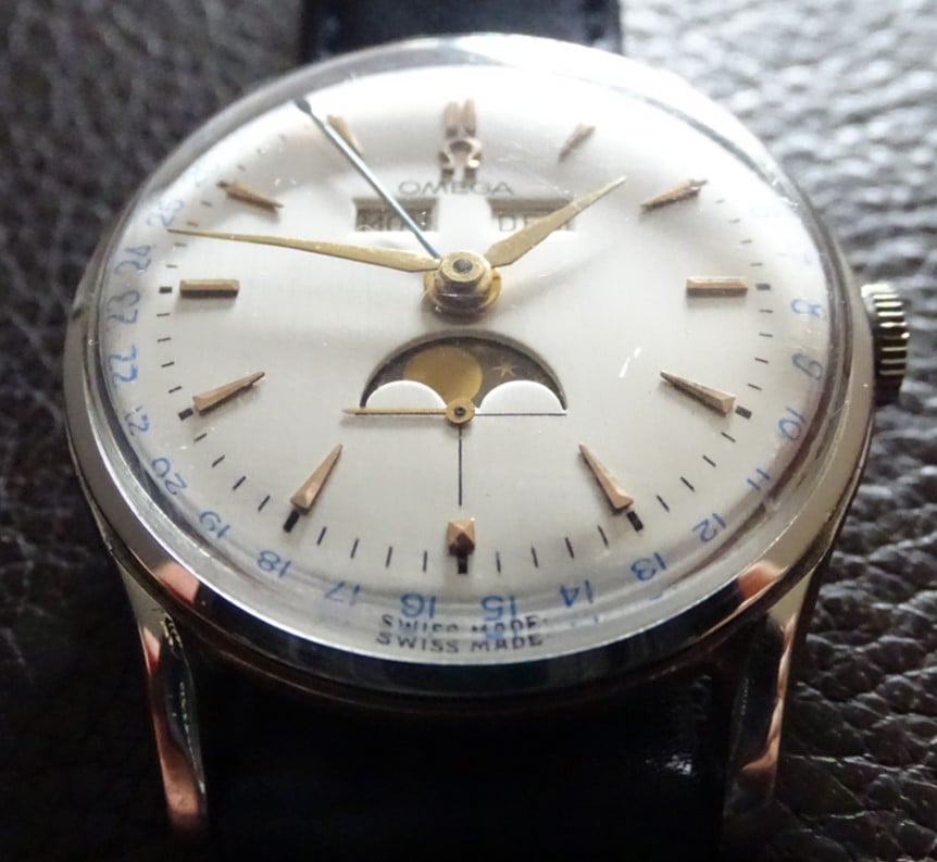
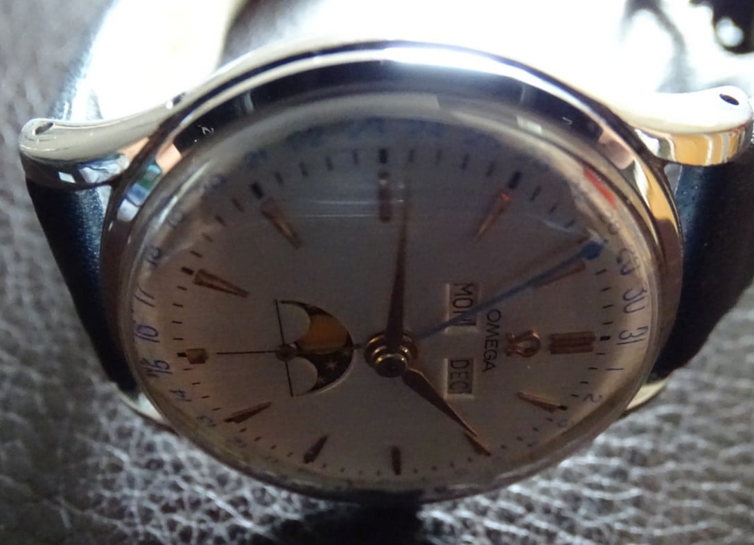
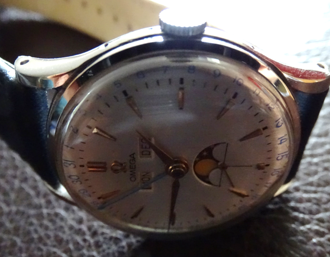
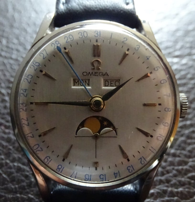
A few years ago I bouth this Omega Cosmic moonphase from the private collection of a jeweller. All the functions are in perfect working order. From the serial number (11mil), it should date around 1947 and case model is 2471-1, I believe.
I would like to have your opinions regarding the dial, as I did not find the same dial on the web. Is it original or repainted, and if repainted is it professionally done?
many thanks for your help!
 
Posts
1,561
Likes
12,262
Hello and welcome!

We need pictures of your watch. 😀
 
Posts
5
Likes
0
IMO, the dial is repainted.
Thanks! Can i ask what were the elements that gave it away?
 
Posts
7,540
Likes
34,617
Thanks! Can i ask what were the elements that gave it away?

The fonts of the logo and numbers are wrong, the minute hash marks also too heavily printed and incorrectly positioned and the general look and finish of the white dial itself doesn't look original.
 
Posts
12,046
Likes
20,922
I don't know the finer details of exactly how this dial should look but I can tell it's a redial by applying some basic principles.

Alignment 1 - minute marks and hours markers don't perfectly line up.

Thickness - minute hash marks appear too thick.

Alignment 2 - 'Omega' text is not perfectly horizontal but appears to be sloping.
 
Posts
12,775
Likes
17,345
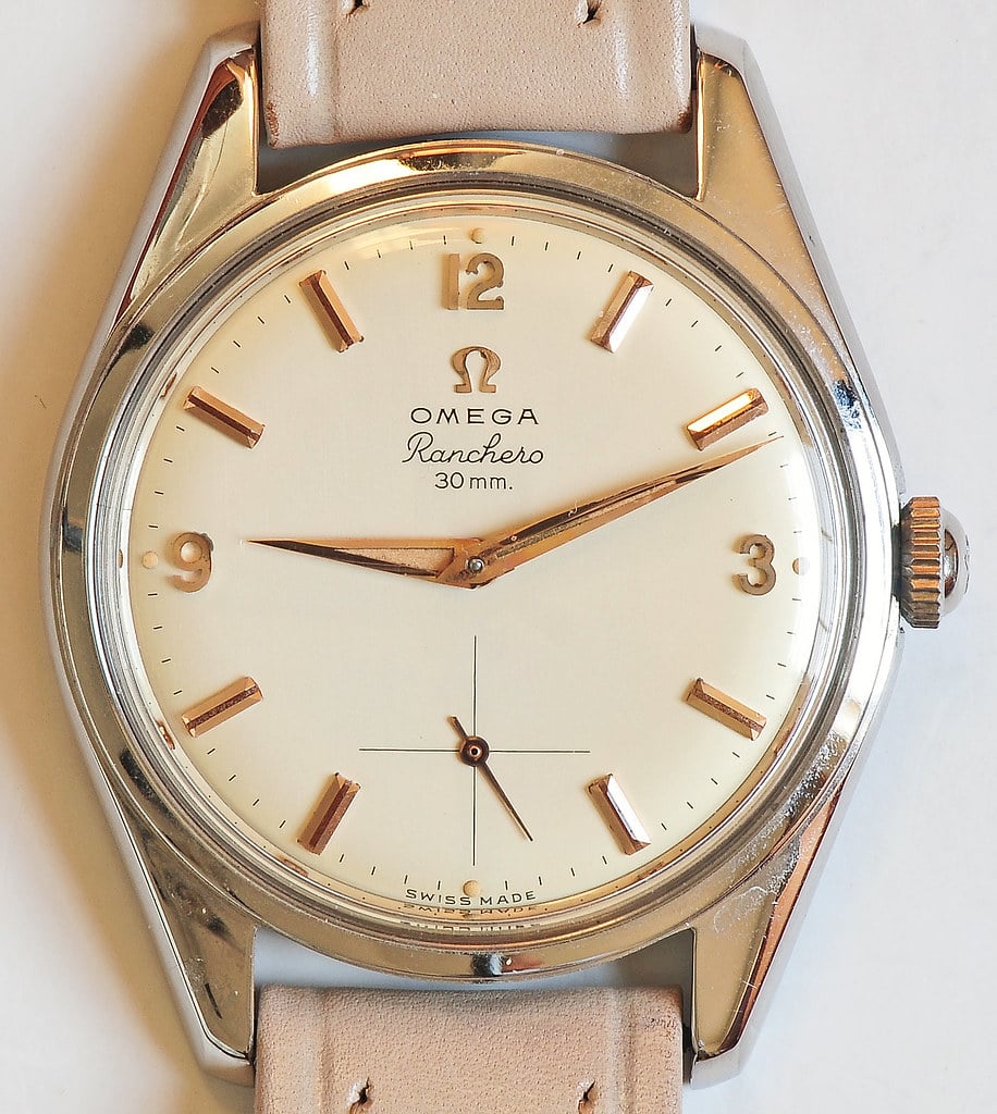
One last “tell”. Omega used natural lacquers up until the early 1960’s. These tend to yellow with age.

See this post for an example of what I mean:


https://omegaforums.net/threads/ranchero-records.113258/#post-1649548

Even a new old stock dial will be at least a little yellowed after 70 years. Call it “egg shell” or off-white if you prefer.

Any 1950’s Omega with a bright white dial should be suspect.
gatorcpa
 
Posts
5
Likes
0
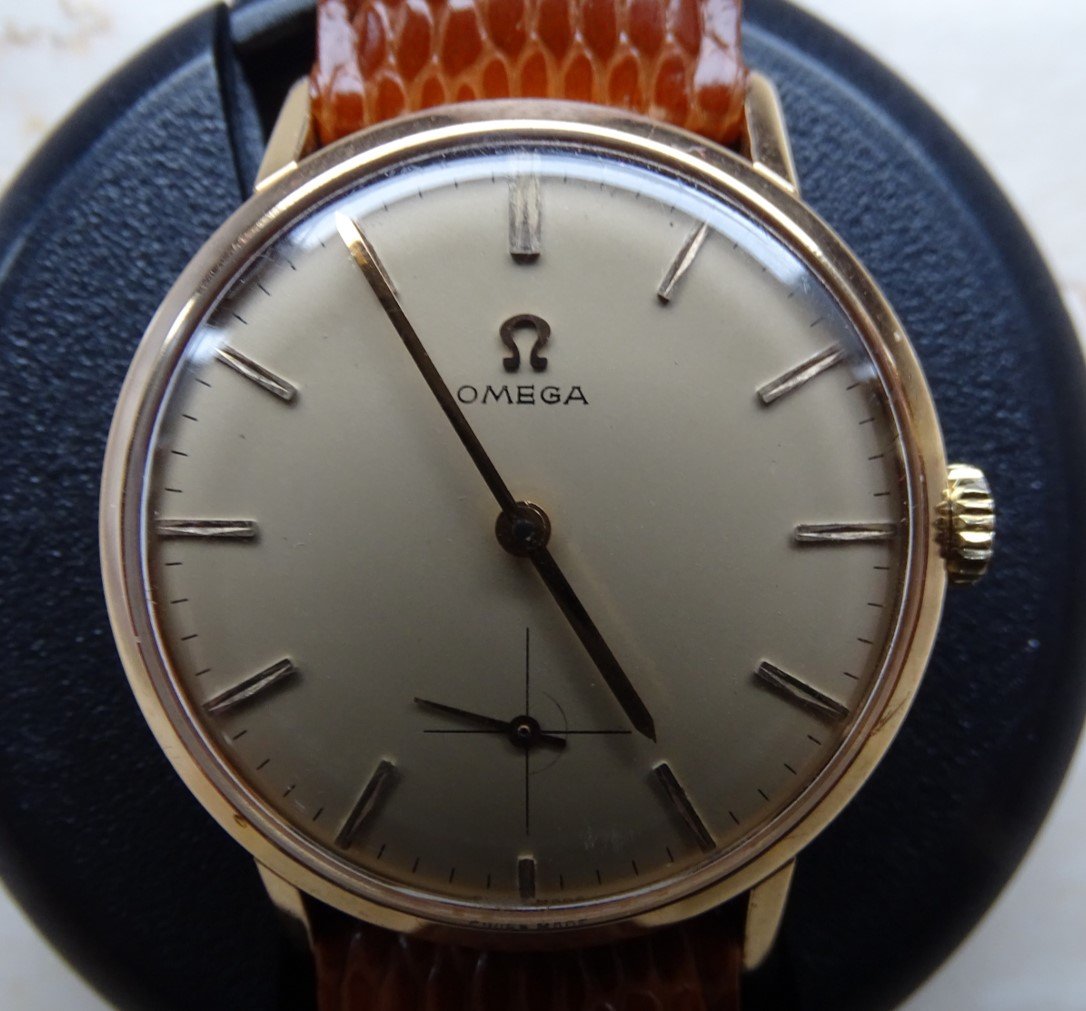
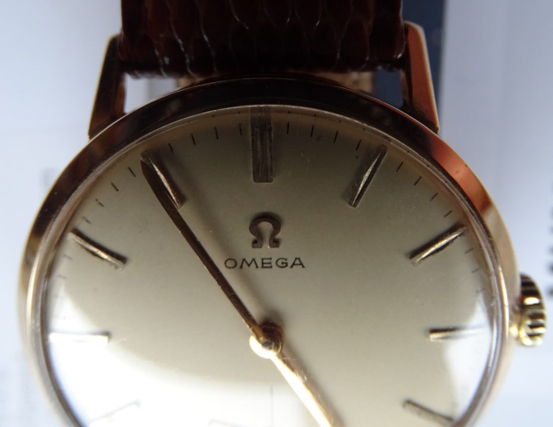
to follow up on this and to get some training, would you say that the somewhat heavy serif in OMEGA and the sometimes irregularly spaced minute marks on this 121.014 indicate a redial or does this look original to you?
 
Posts
591
Likes
2,930
to follow up on this and to get some training, would you say that the somewhat heavy serif in OMEGA and the sometimes irregularly spaced minute marks on this 121.014 indicate a redial or does this look original to you?

Hi and welcome! I am also starting in the hobby but IMO your assumption is correct and therefore this should be also a redial. The exagerated serifs for me look off.

Edit: wrong grammar
Edited:
 
Posts
7,540
Likes
34,617
Terrible redial. The font with the exaggerated serif as you note is a dead giveaway. Also the dial finish just doesn't look right. After viewing tens of thousands of dials over years these things become very easy to identify.
Edited:
 
Posts
5,842
Likes
9,081
You sound a liitle bit grumpy. Do you hate redials 🙄😎😲?
 
Posts
7,540
Likes
34,617
You sound a liitle bit grumpy. Do you hate redials 🙄😎😲?

Grumpy, moi? 😁 I just feel sorry for all the starry eyed Cosmic owners unaware that they are sporting a redial 🙁