Globemaster annual calender

Posts
2,152
Likes
3,809
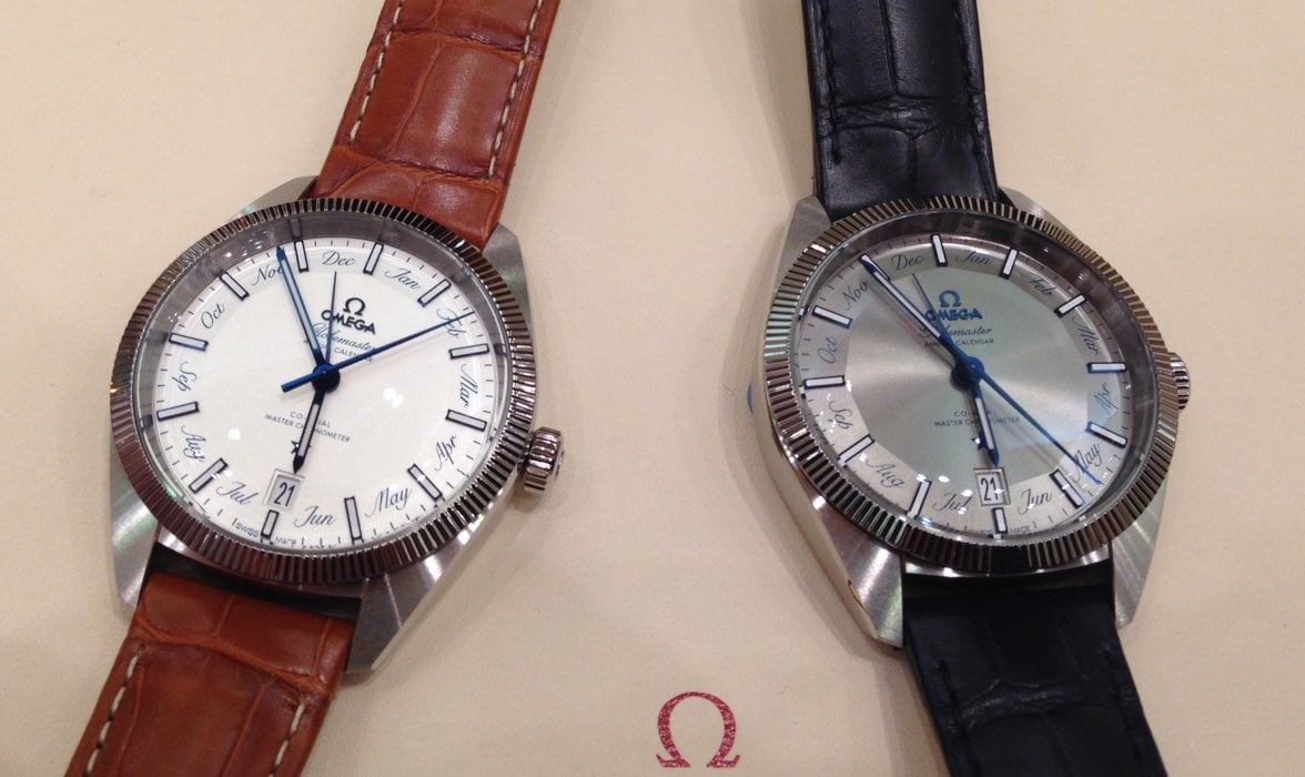
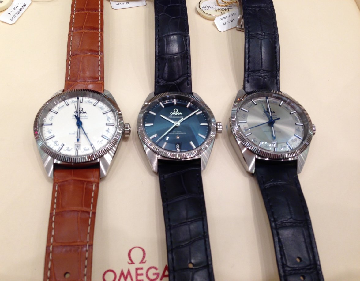
Hi Folks, I visited my local OB on Neuer Wall, Hamburg and had a couple of Globemaster Annual Calendars in my hands.

As one of those least impressed by all the photos so far I have to say it is much nicer live.

I will post some photos shortly.....
Great stuff Longbow, our resident Globemaster guru, looking forward to your photos!
 
Posts
393
Likes
483
I was at the Oxford Street store in London last week and they had the blue version in stock.
Lovely piece but I have spent too much this year so did not buy it........( maybe next year )
 
Posts
1,411
Likes
3,720
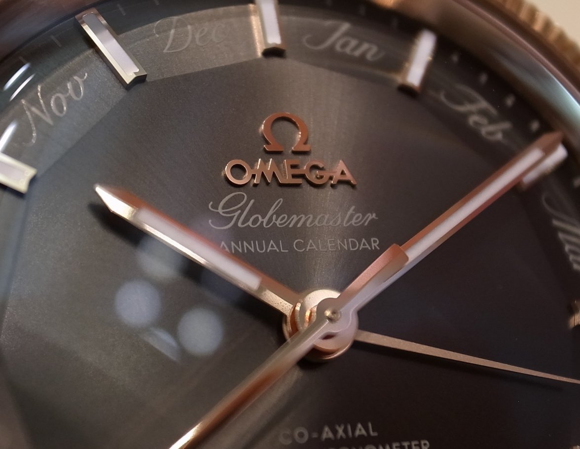
There are a whopping 21 words on the dial in at least 5 different fonts writings Did you guys notice the sudden mid shift change in the direction of the caligraphic style ? That bothers the hell out of me[emoji144] 0ce061b677568613a3a0fa621e15a9dc.jpg It also reminds me of the cursive italic style fonts on female body tattoos

Personally I feel Omega should take a page out of Seiko's Tuna Diver series on how to print multiple fonts on a dial without being intrusive
 
Posts
17,622
Likes
26,744


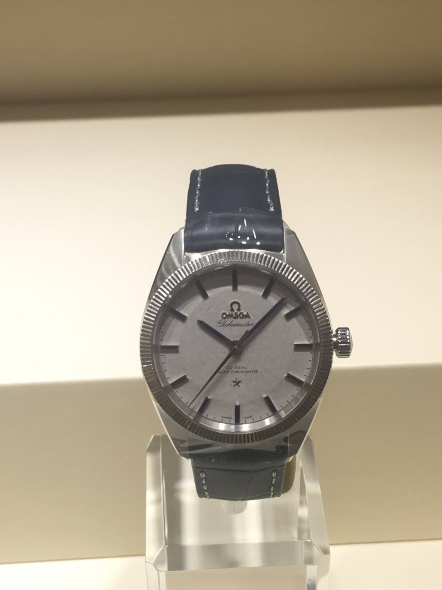
Took this at the OB when it hit, last year. Forgot to post it. I want it badly I'm a sucker for the silver dial.
Edited:
 
Posts
2,152
Likes
3,809
@Longbow did you play around with changing the date to see annual hand move from month to month?

I think the darker one is almost passable but I would not purchase it...also the annual calendar seems such a useless complication...if I forget what month it is I must have drunk way too much or it's time for a retirement home😉
Edited:
 
Posts
2,203
Likes
2,057
There are a whopping 21 words on the dial in at least 5 different fonts writings Did you guys notice the sudden mid shift change in the direction of the caligraphic style ? That bothers the hell out of me[emoji144] 0ce061b677568613a3a0fa621e15a9dc.jpg It also reminds me of the cursive italic style fonts on female body tattoos

Personally I feel Omega should take a page out of Seiko's Tuna Diver series on how to print multiple fonts on a dial without being intrusive

Yep, I think a mentioned "more fonts than a kids birthday party invitation" when first pics showed in Basel.
 
Posts
1,813
Likes
9,384
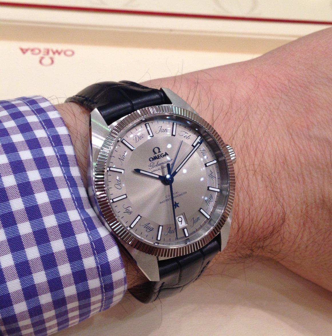
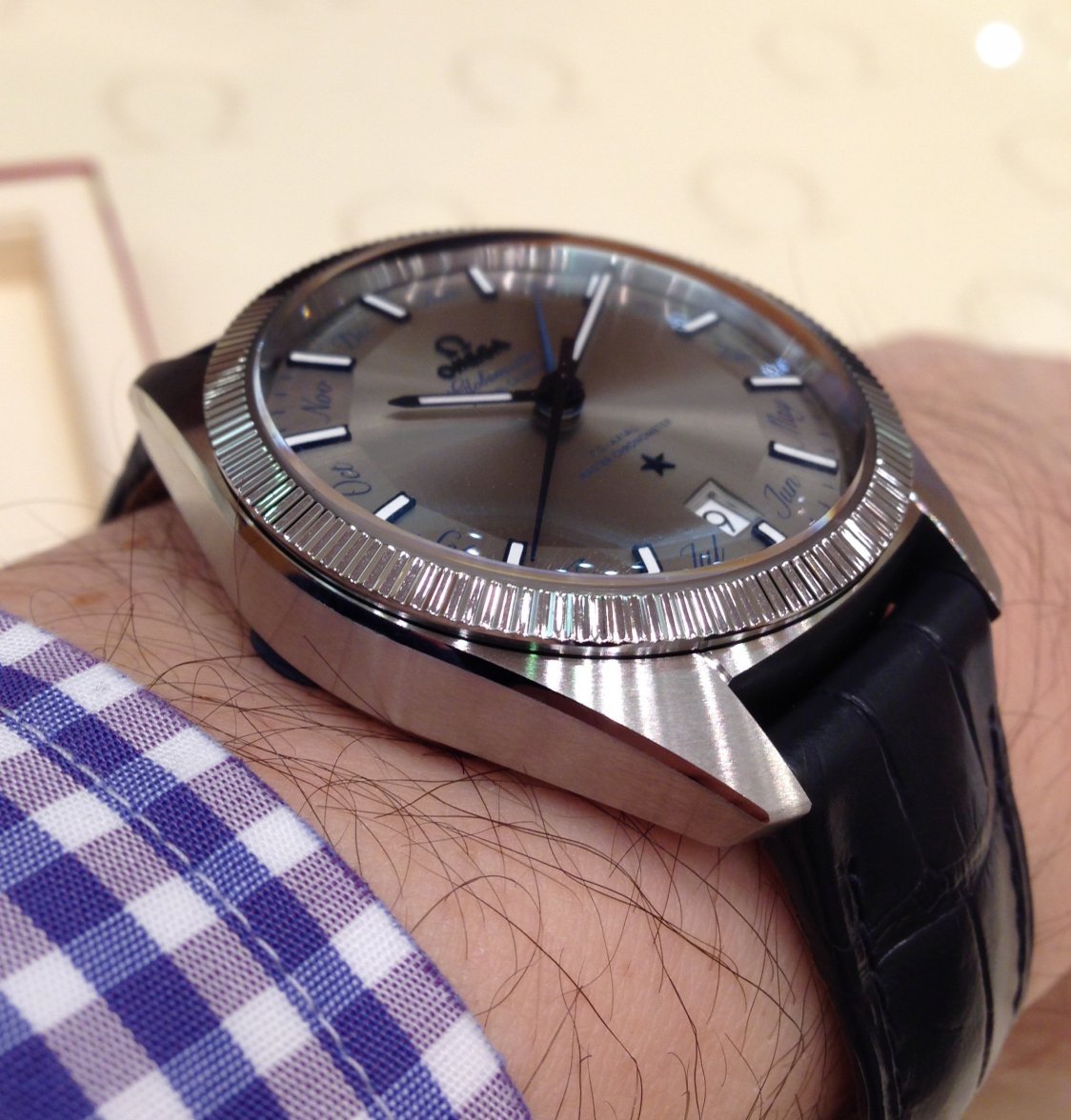
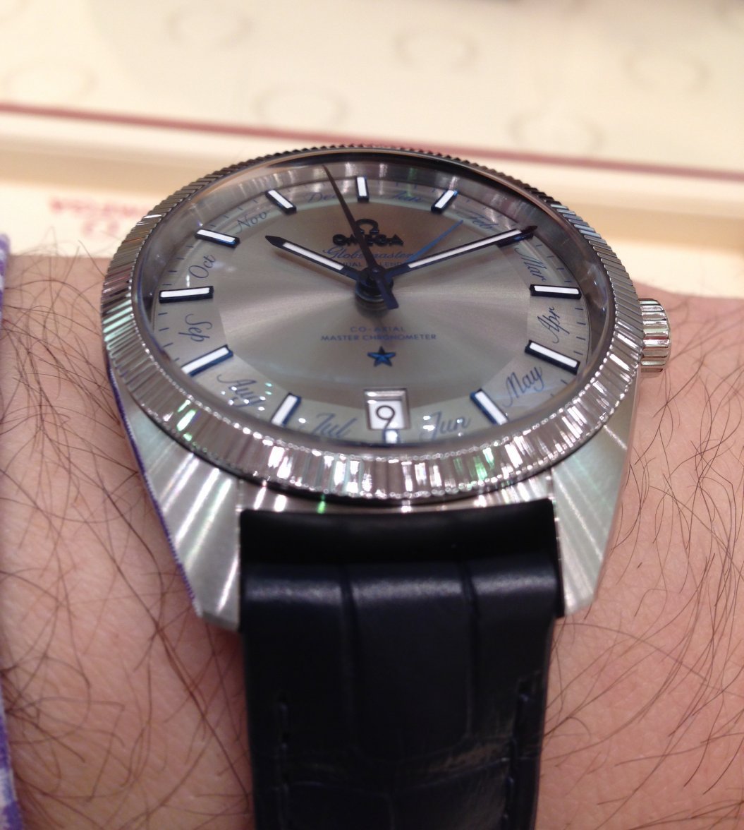
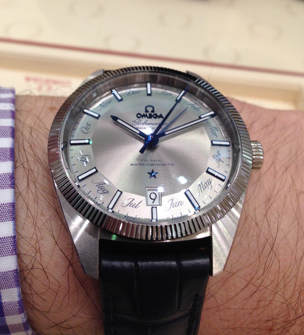
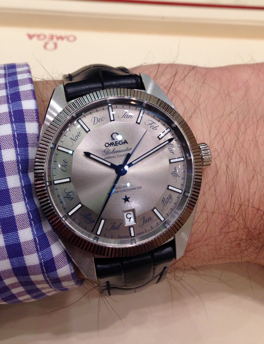
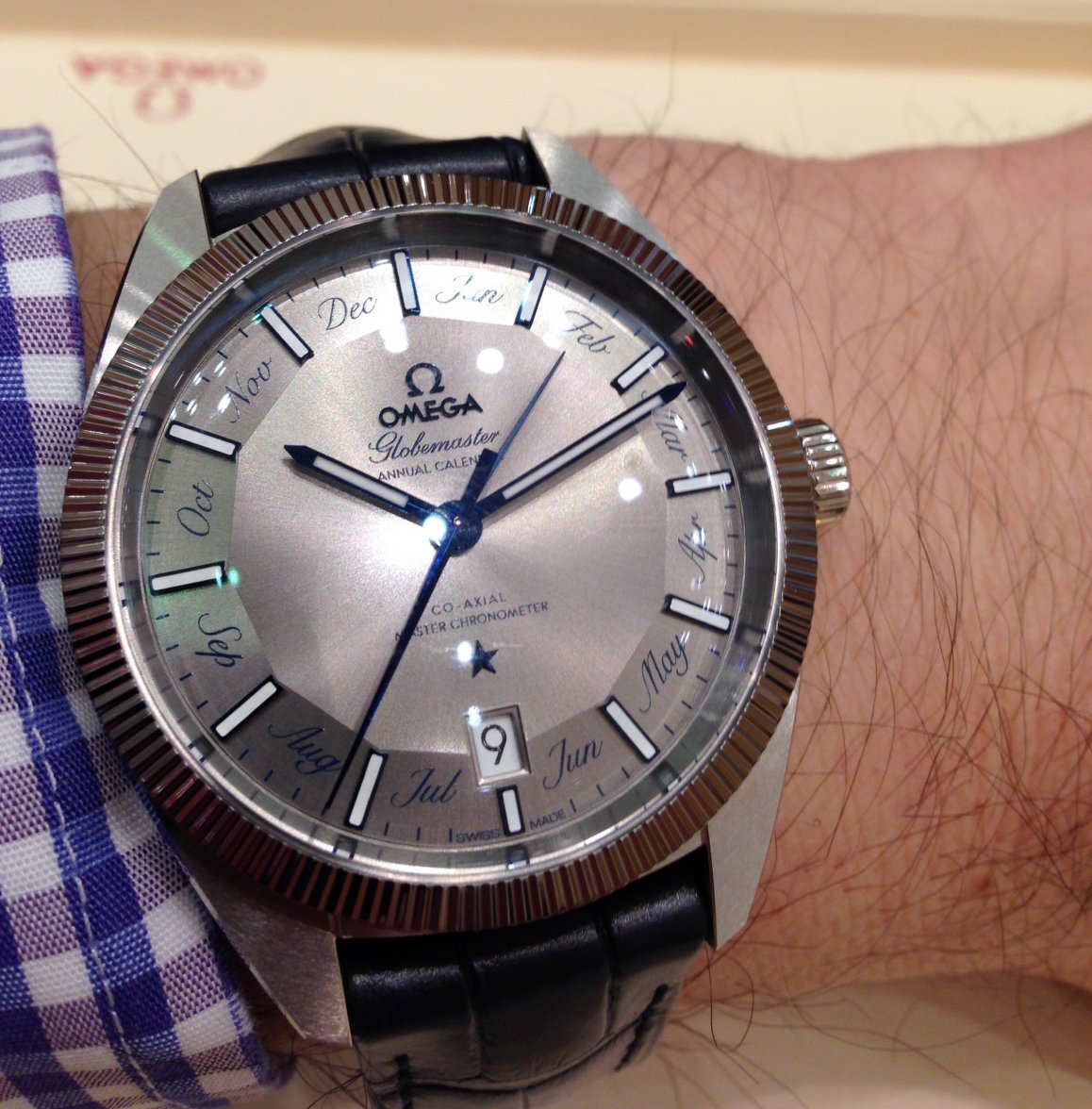
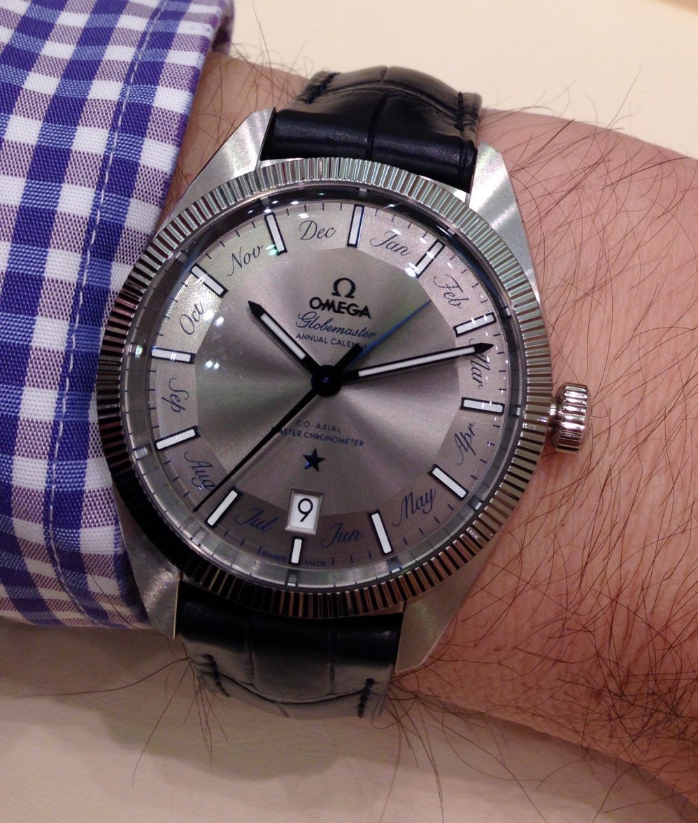
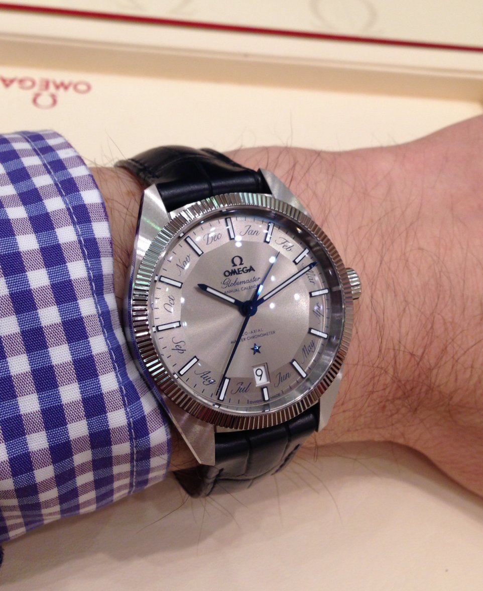
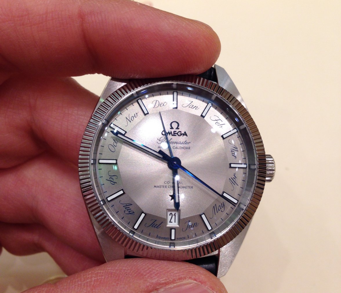
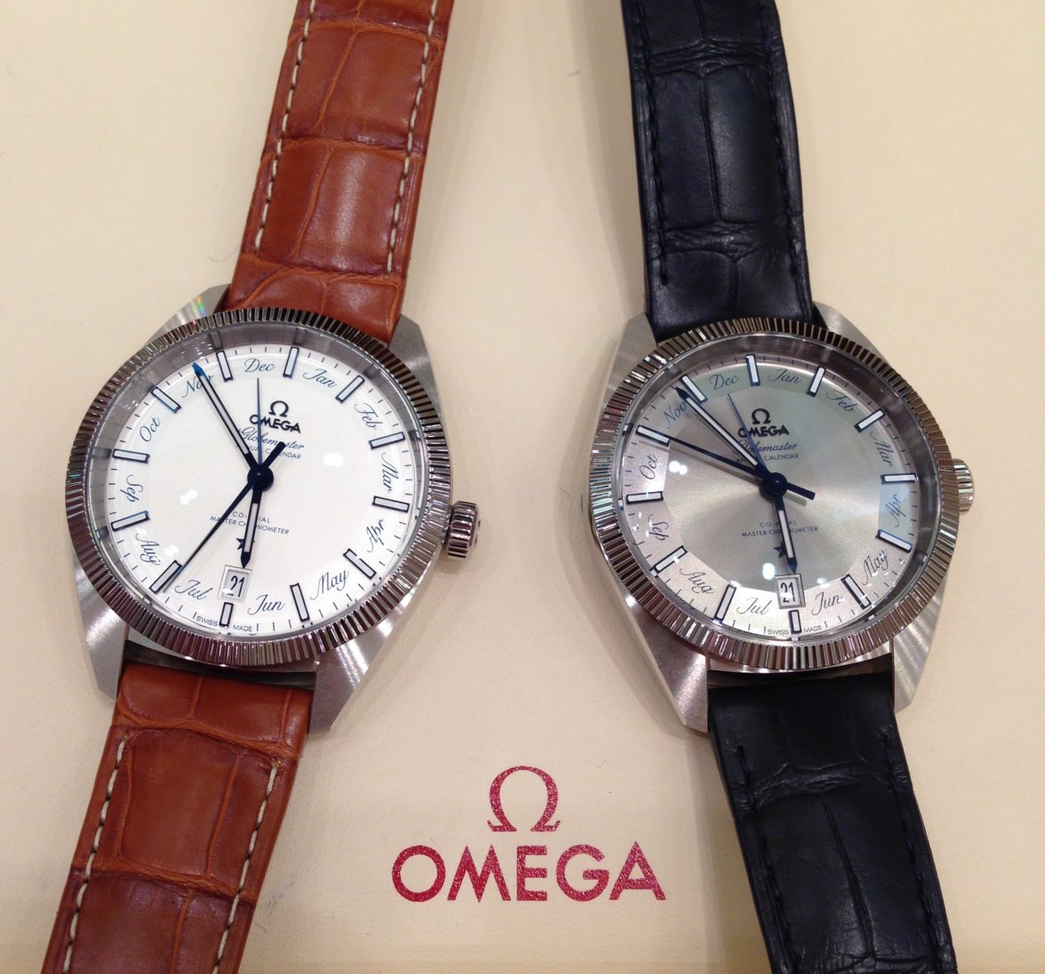
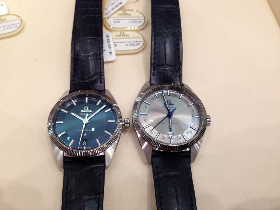
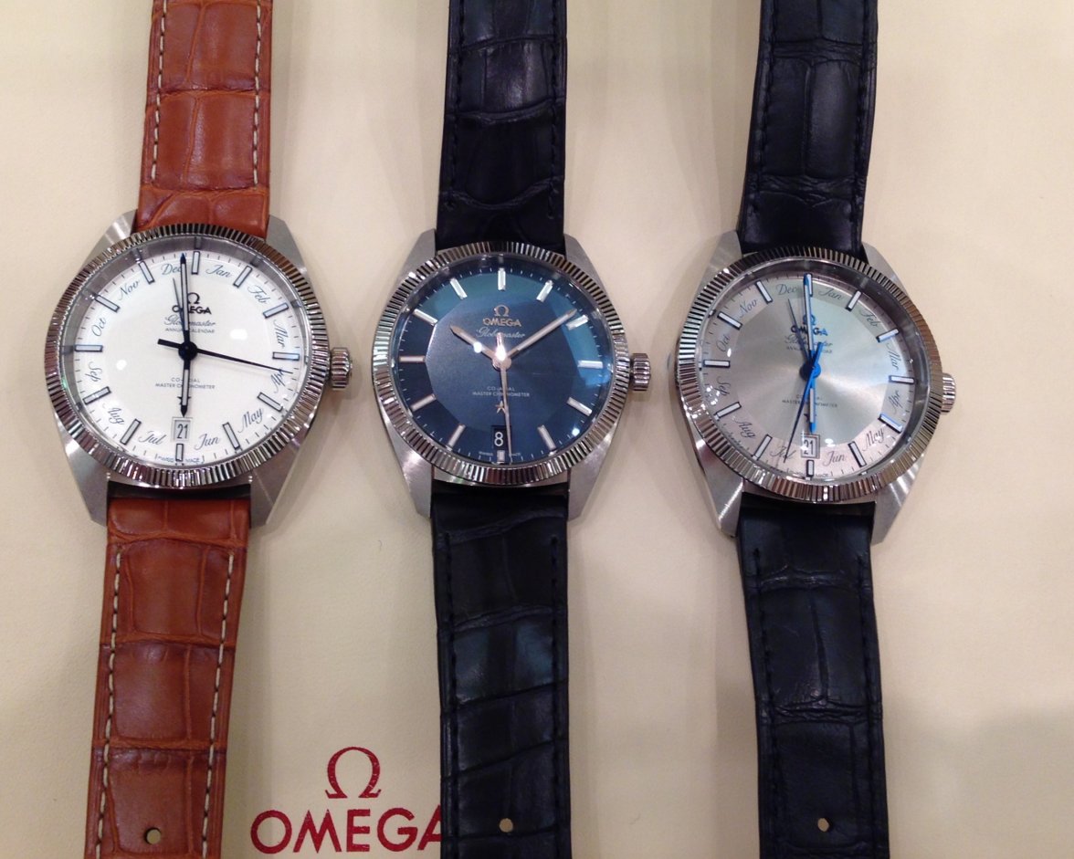
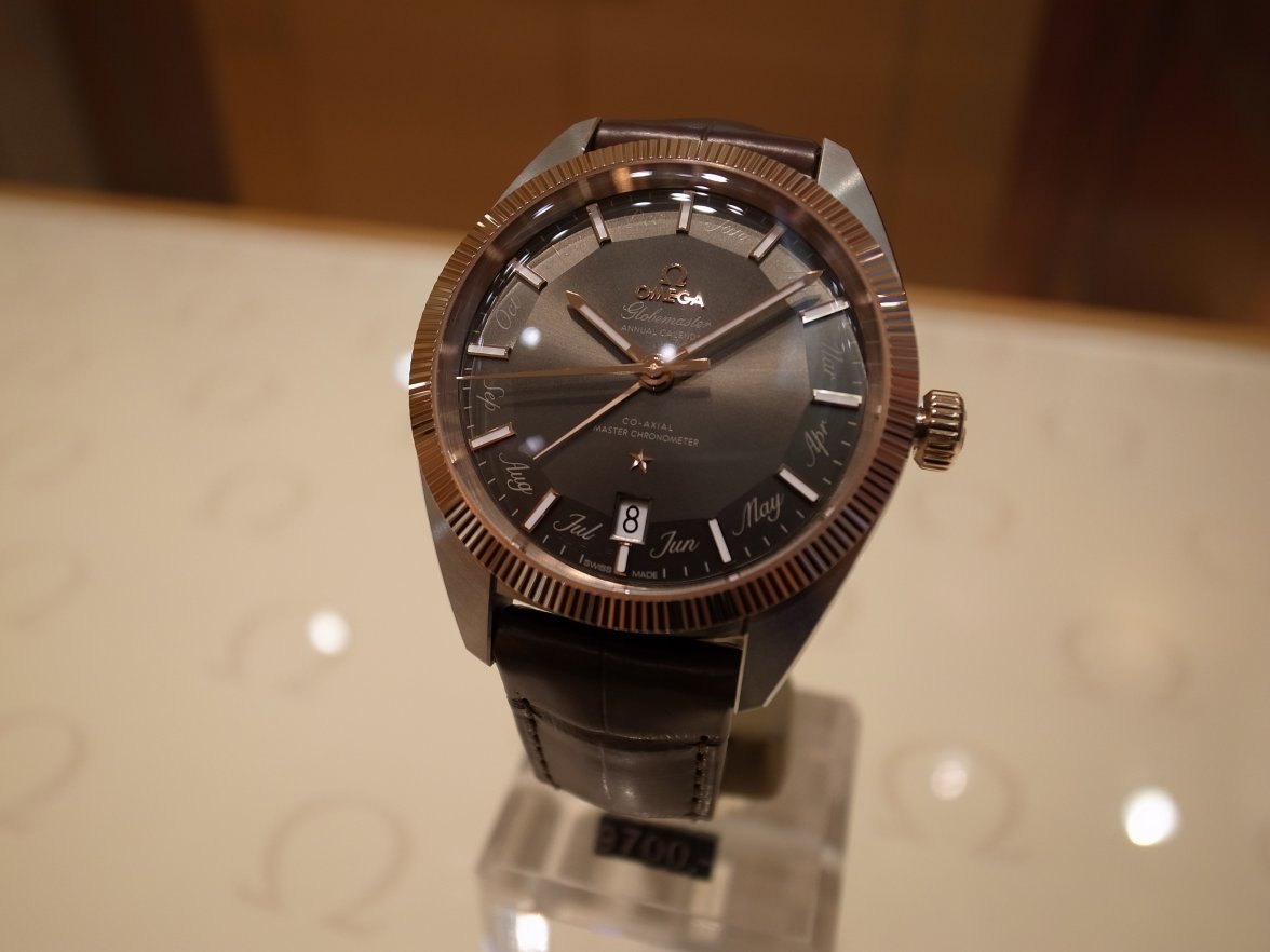
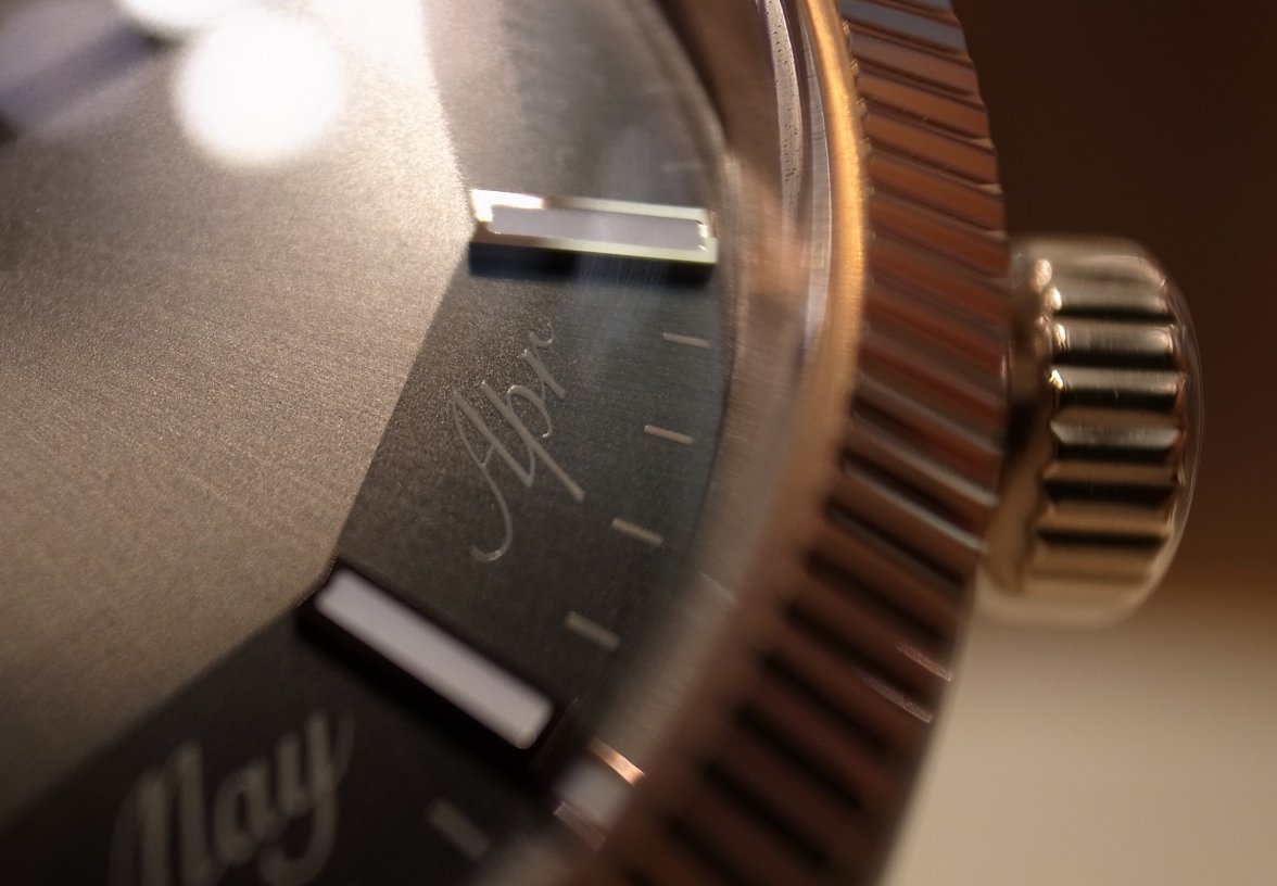
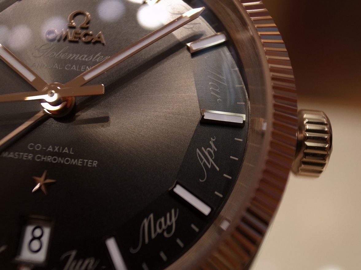
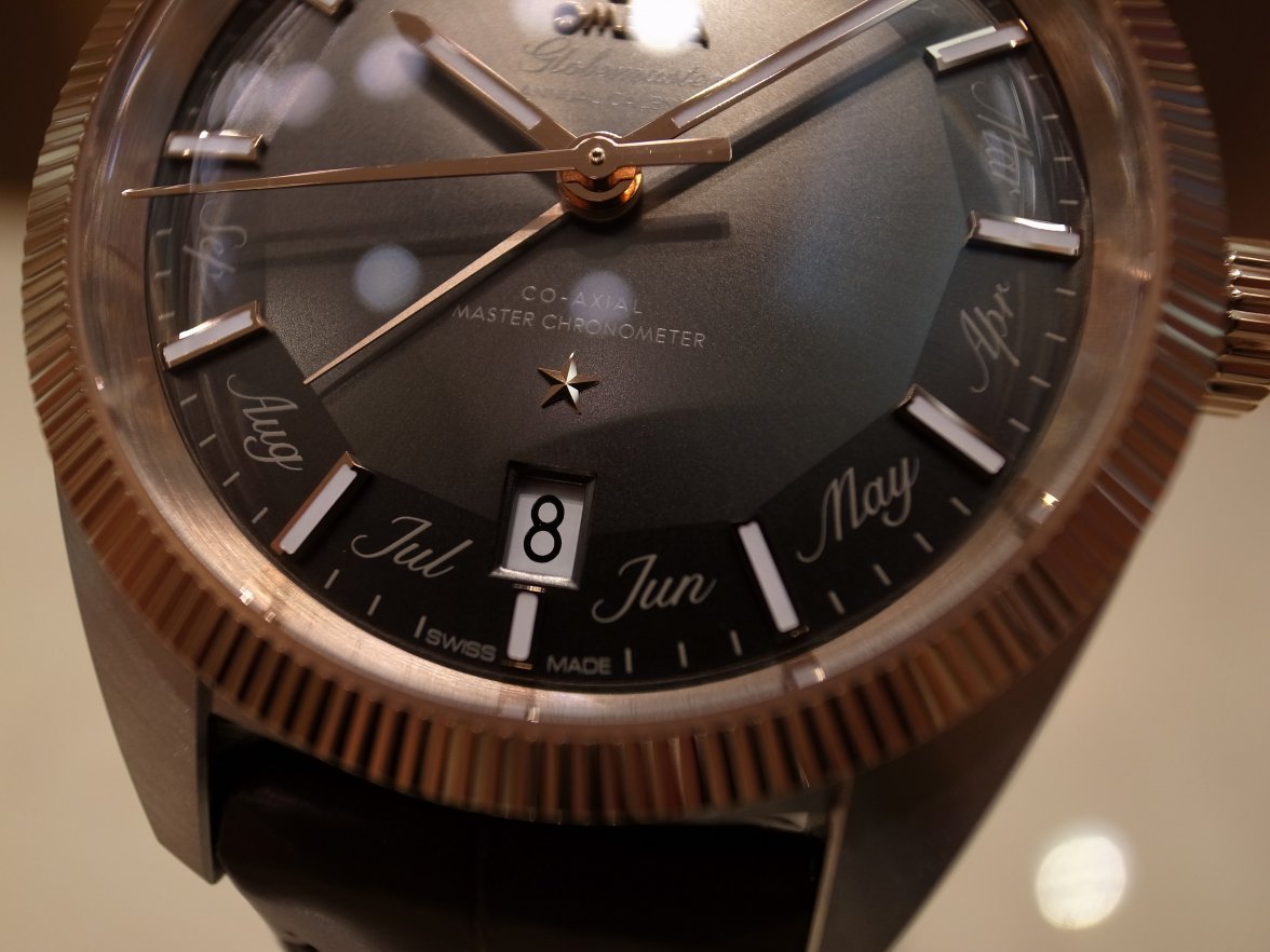
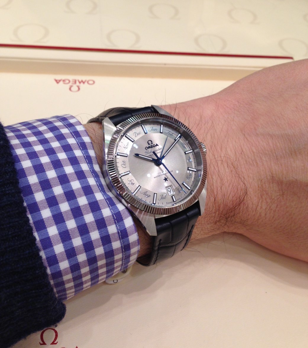
Globemaster Co-Axial Master Chronometer Annual Calendar (or GMAC for short), up close and personal


These were my initial reactions to the new GMAC after having two quite different examples in my hands at the Omega Boutique on Neuer Wall in Hamburg, Germany.


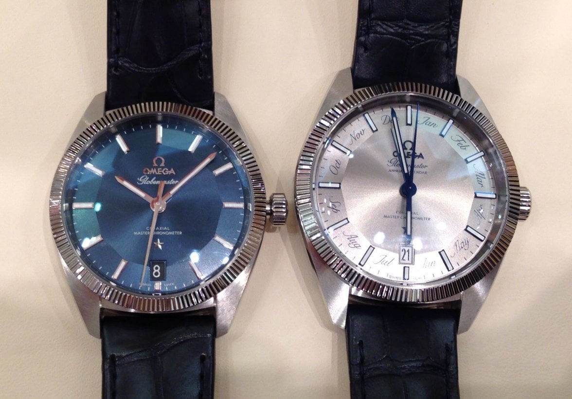
First up is the Model 130.33.41.22.06.001 i.e. Gray dial variant.

My very first reaction was not to pick up on the abbreviated month text, but rather to notice how comfortable the GMAC sits on the wrist (well on mine at least). This Globemaster has grown from the previous 39mm to 41mm and benefits from it in my opinion. Two millimetres doesn’t sound much and indeed it isn’t across the case, but what I did notice was the lug-to-lug length increase. The lugs seem more elongated, rather like those on the Seamaster 300M or Speedmaster ’57. The radially brushed finish on the lugs is more pronounced than on my regular Globemaster, which contrasts nicely with the highly polished edge bevel.


My focus was then drawn to the long tapered annual calendar hand. It is noticeable lighter (towards Azure) and more subdued than the hour, minute and second hands, which helps this pointer blend in better and sort of vanish to nothing as it approaches the edge of the central dial surface.


As far as I was able to tell the GMAC has a three position crown.

1) Fully inserted = normal operation,

2) 1st detent = Quickset for date wheel and calendar hand, clockwise for date, anti-clockwise for calendar…I may have that the wrong way round though

3) 2nd detent = Hacking seconds, hours and minutes adjustment. There did not appear to be a quickset for hours like on the smaller Globemaster.


So this is not a watch that wants to be quickly adapted to changing time zones. I get the impression it was designed to be part of a collection, stored in a safe and quickly brought to the right month, date and time when it finally gets to see the light of day. In the short time I got to play with the GMAC I didn’t test the 30/31 day capabilities of the annual calendar complication…maybe another time.


The gray dial model (like the blue 39mm GM) has a sunburst brushed dial finish, but the result is different. It creates a sort of spiral effect which you will only see when the watch is moving.

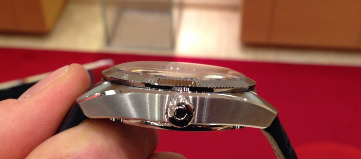
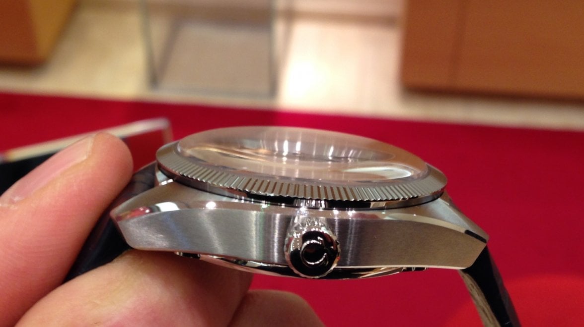
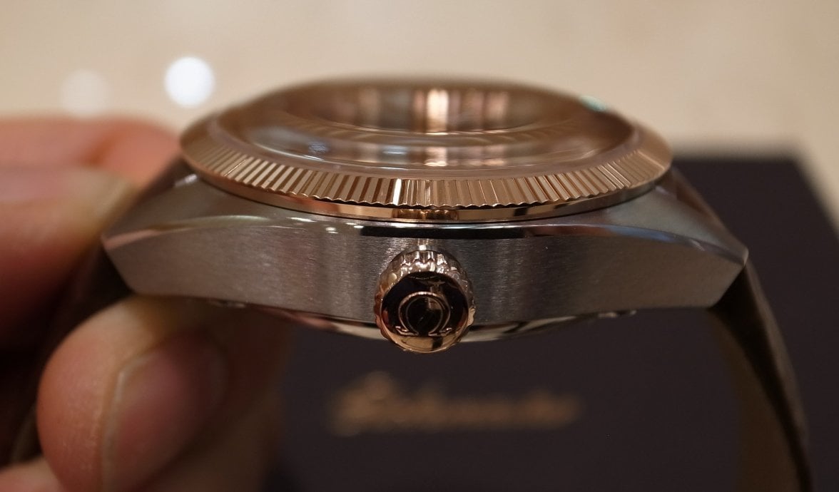
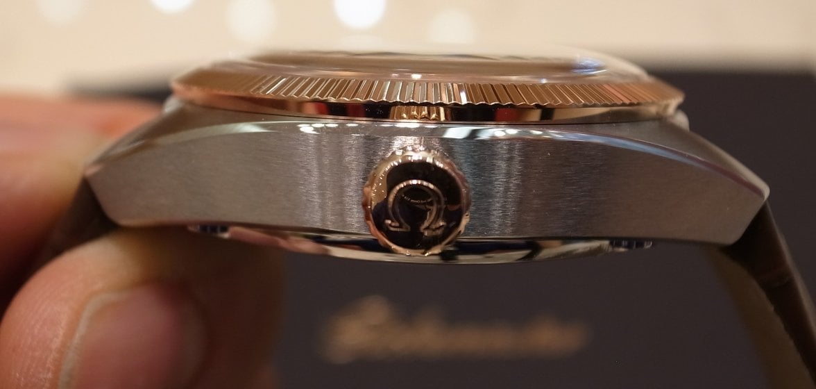
Looking at the case side-on, it has obviously grown a little thicker and looks somehow stubby, but nowhere near as pronounced as on the Seamaster GMTs; the previously long lugs now looking curiously shorter.


The most noticeable case-related difference between the smaller and larger Globemasters is the sapphire crystal. Where the 39mm GM has a very subtle curvature, the GMAC is clearly domed and I really like it! It seems warmer and has somehow lost those annoying multiple white rings that you see on flatter sapphire crystals (Hesalite Speedmaster aficionados will know what I mean).


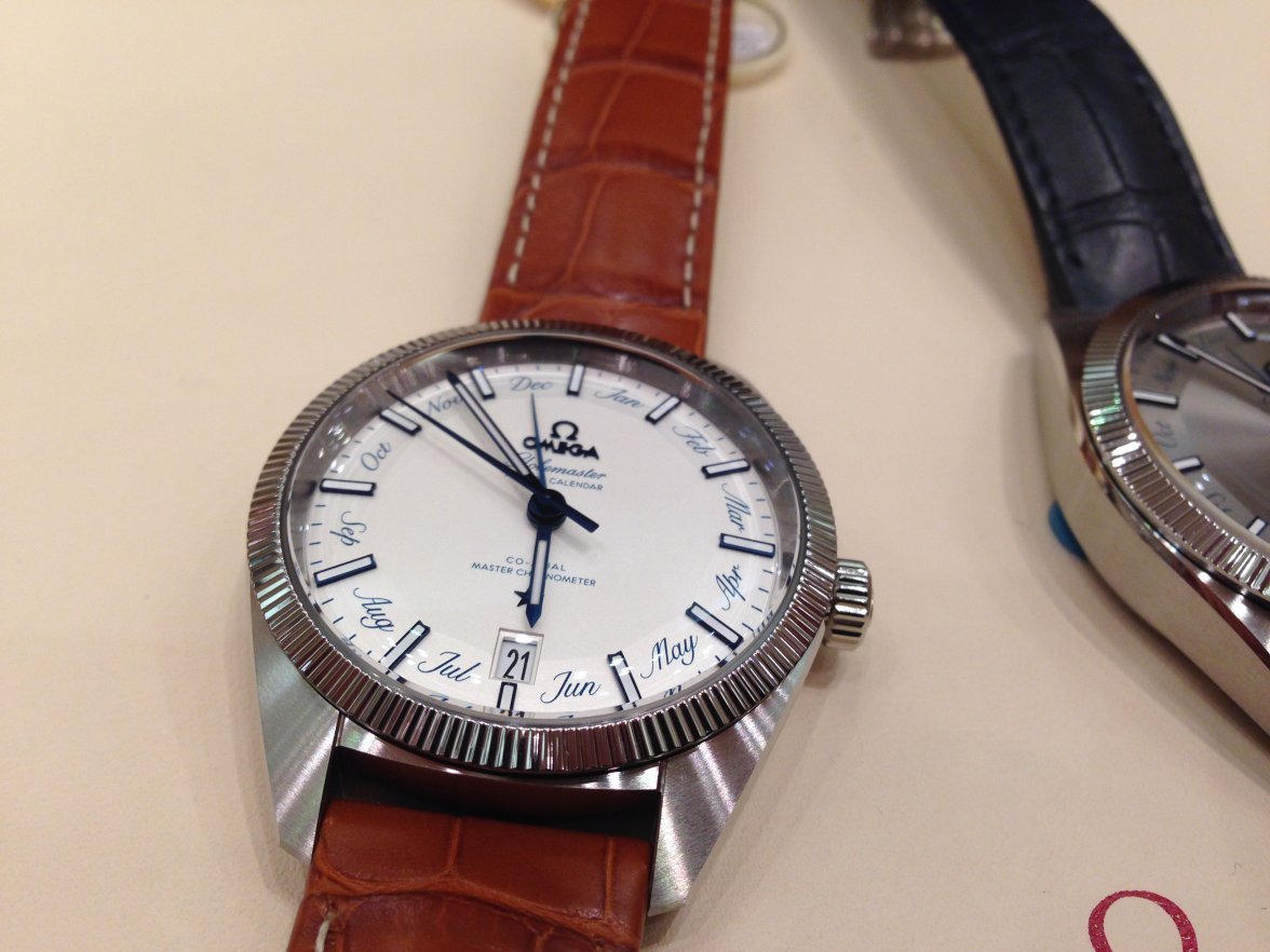
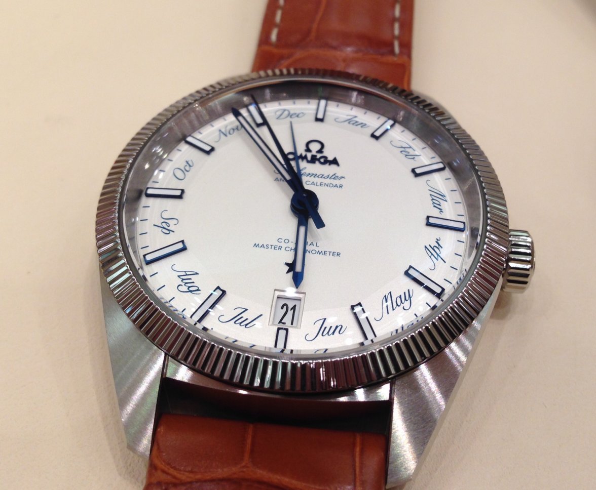
OK, I can hear you thinking “get to the important bit already; what’s with the ugly abbreviated month text poisoning the dial?” So, let’s put things into context. I’m a fully paid up member of the over 50s club, which means anything nearer than the end of my arm is a blur and consequently fine detail will be rather lost on me in the real world. Cameras (and eagle eyed youngsters) see things rather differently of course. So, yes, I think the text detracts from an otherwise super watch. Having said that the technical execution of that text is excellent, with a relatively narrow character width and colour that helps it to blend into the gray dial to some extent. This is most definitely NOT the case with the white dial variant.

My initial reaction to the white dial GMAC was something like shock. It is very “in your face”, which grates for someone more used to understatement. Here there is absolutely no attempt to hide the main “features” of the GMAC. There doesn’t appear to be any special surface treatment on the dial, it is just plain (enamel?) white. I was trying to think what this blue-on-white reminded me of? Sinn Porcelain or Dutch Delft pottery perhaps?


Comparing the white and gray GMACs alongside the smaller GM I still think the original is the best, but I must confess that the GMAC live is better than expected and I find myself warming to it. Is this just Omega fanboy talk? I can assure you that I really hated the idea of that “girly” text on the dial based on the press photos. I even turned up at the OB wearing my austere German Sinn 857 UTC, so well-armed for an objective comparison.


Strangely, now that I have slept on the results and had (almost) 24hrs to let the experience sink in I find that the white dialled GMAC is also OK. It’s sort of whimsical, contrarian. What is absolutely sure is that it picks up where the GM left off and adds an extra dollop of controversy on top to assert its status of solving a problem we never knew we had in a way we never knew was thinkable.


I suspect it will not be a big market success and predict that it will not stay in the Omega product portfolio for long…which begs the question “will people just buy it to speculate on future rarity?”


My overwhelming impression though was: here is the basis of a really great GMT model that doesn’t end up looking like an ice hockey puck on the wrist. Perhaps that was at the back of my mind the whole time while handling and viewing the GMAC.
Edited:
 
Posts
2,152
Likes
3,809
Excellent detailed post @Longbow ...I agree that a GMT complication for the Globemaster would be ideal, but I am not sure how they would work in the second time zone writing...as I think we have discussed before an inner dial approach similar to what they have done with the AT's might ruin pan dial equilibrium. Hope they can up with something!
Edited:
 
Posts
1,450
Likes
6,067
Thanks for the videos. They're such lovely watches.

It's probably a good thing there's no boutique or AD in my city, beacuse then I'd easily be able to see one in person.
 
Posts
1,813
Likes
9,384
@Longbow did you play around with changing the date to see annual hand move from month to month?

I have some new photos and videos to post later which clearly show how the Annual Calendar function behaves under various crown positions and rotations. I was a bit irritated by what I found on Hodinkee, so felt the need to set things straight.
 
Posts
2,152
Likes
3,809
I have some new photos and videos to post later which clearly show how the Annual Calendar function behaves under various crown positions and rotations. I was a bit irritated by what I found on Hodinkee, so felt the need to set things straight.
Great detective work agent @Longbow / Nick😀, your posts have been of great service to the OF. Looking forward to the new content.🍿

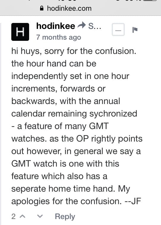
I saw online that Jack Forster got some stuff wrong on his hands-on review of the GM annual calendar, even calling the watch a GMT watch (!?!?), which he later corrected.

I normally like Jack's content and I think it does stand out from the rest of the Hodinkee content, but I have noticed a certain pandering by the almighty H for Rolex/Tudor (especially Tudor)....Omega seems to get less press space (positive or negative) than they should, based on their current raking in the industry, so this careless sort of review of an Omega watch does not really surprise me.
 
Posts
1,813
Likes
9,384
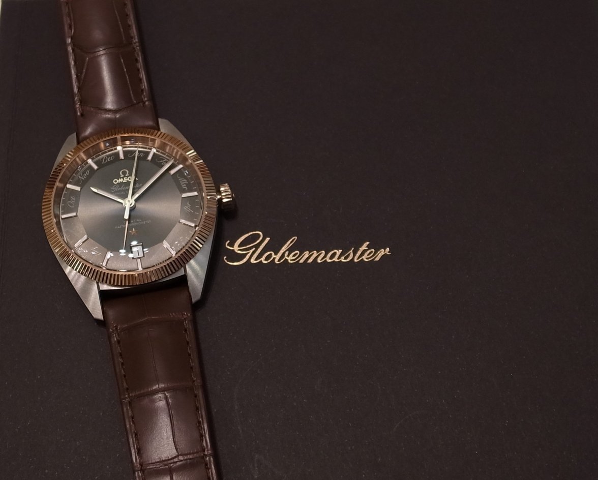
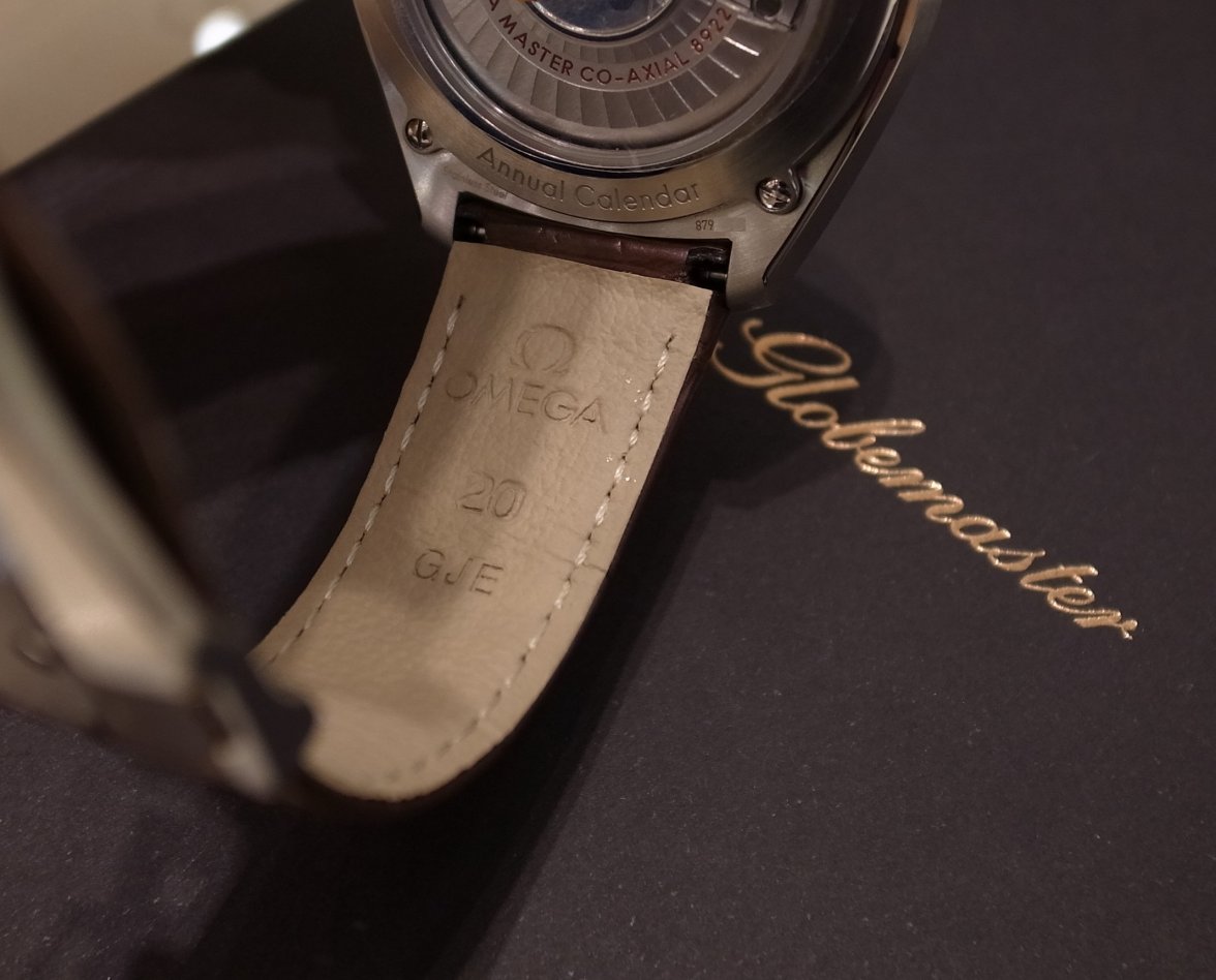
Before I sort out the videos how about some nice photos of the GMAC Ref 130.23.41.22.06.001 Sedna Gold and Steel on a brown leather strap?
[/ATTACH]
Edited:
 
Posts
2,152
Likes
3,809
Before I sort out the videos how about some nice photos of the GMAC Ref 130.23.41.22.06.001 Sedna Gold and Steel on a brown leather strap?
View attachment 323629

Thx for posting Nick.

I would not buy this watch but I do think the overall combination of colours is attractive and the watch has character...the thing that bugs me is the white date disc!

Not bringing the cyclops into discussion here, but I have started tolerating white dates on black dial Rolexes (eg. my BLNR) as they do have white font printing so there is some design coherence. For this GM annual calendar the white date sticks out like a sore thumb, completely incoherent with the rest of the dial...why not use a black one?
 
Posts
2,152
Likes
3,809
Thx for posting Nick.

I would not buy this watch but I do think the overall combination of colours is attractive and the watch has character...the thing that bugs me is the white date disc!

Not bringing the cyclops into discussion here, but I have started tolerating white dates on black dial Rolexes (eg. my BLNR) as they do have white font printing so there is some design coherence. For this GM annual calendar the white date sticks out like a sore thumb, completely incoherent with the rest of the dial...why not use a black one?
Actually I just looked again saw that the dial batons are white, so I suppose the white date does make sense after all. Sorry...bit of an allergic reaction above.
 
Posts
1,813
Likes
9,384
Great detective work agent @Longbow / Nick😀, your posts have been of great service to the OF. Looking forward to the new content.🍿

I saw online that Jack Forster got some stuff wrong on his hands-on review of the GM annual calendar, even calling the watch a GMT watch (!?!?), which he later corrected.

I normally like Jack's content and I think it does stand out from the rest of the Hodinkee content, but I have noticed a certain pandering by the almighty H for Rolex/Tudor (especially Tudor)....Omega seems to get less press space (positive or negative) than they should, based on their current raking in the industry, so this careless sort of review of an Omega watch does not really surprise me.
You mean this:-


To set the record straight...
a) The hour hand does not have quick-set capability, i.e. cannot be changed in hour increments.
b) The date and month can be quick-set.
c) As expected the date and month hand will jump correctly (e.g. 30th June to 1st July) at midnight for all months except February. If you do nothing it will keep going until 31st Feb.
d) The three crown positions are:-
Position 1 = normal operation crown fully inserted. Clockwise to wind, anti-clockwise does nothing (spins freely).
Position 2 = Quick-set: Clockwise rotation of crown for date, anti-clockwise rotation of crown for month. Note that the movement keeps running in this position; the seconds are not hacked. Also, changing the date beyond 31 will not increment the month pointer.
Position 3 = Hacked seconds, normal adjustment of hours and minutes. Note that in this position the date and month will jump as you adjust past midnight.

But this will all be clear once I've sorted the videos out.