- Posts
- 384
- Likes
- 2,905
omegawatchlover
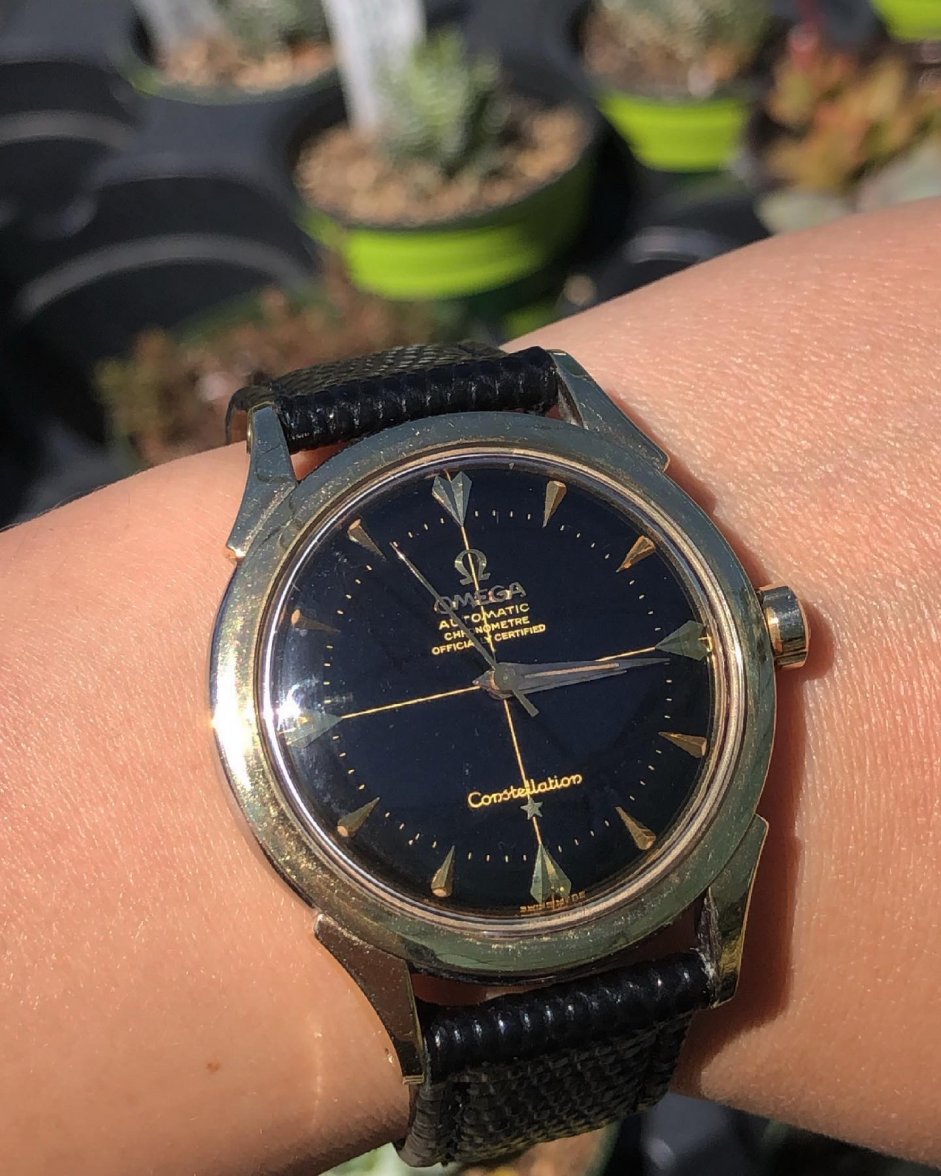
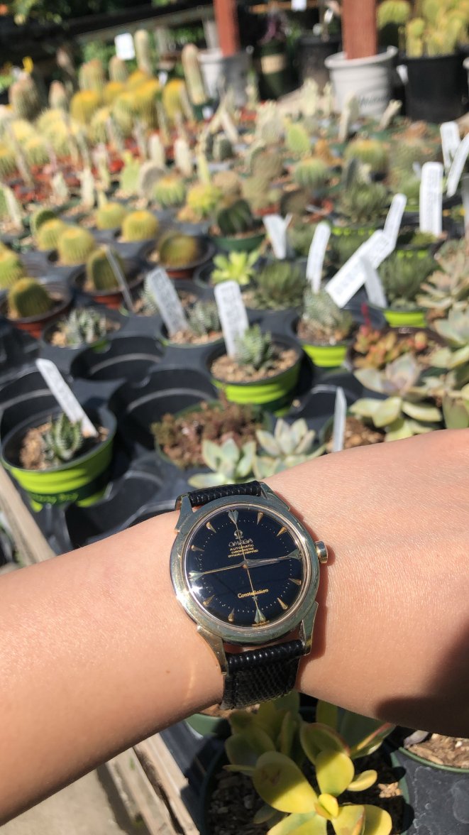
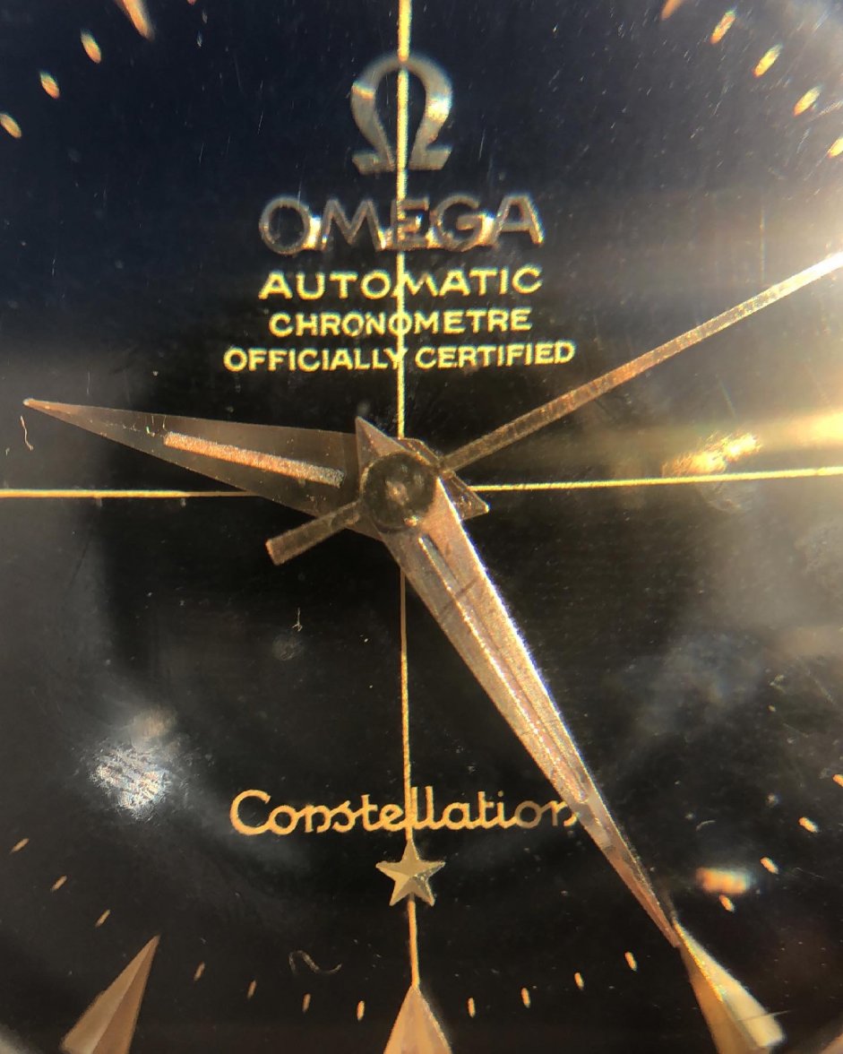
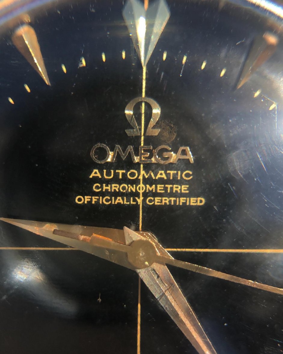
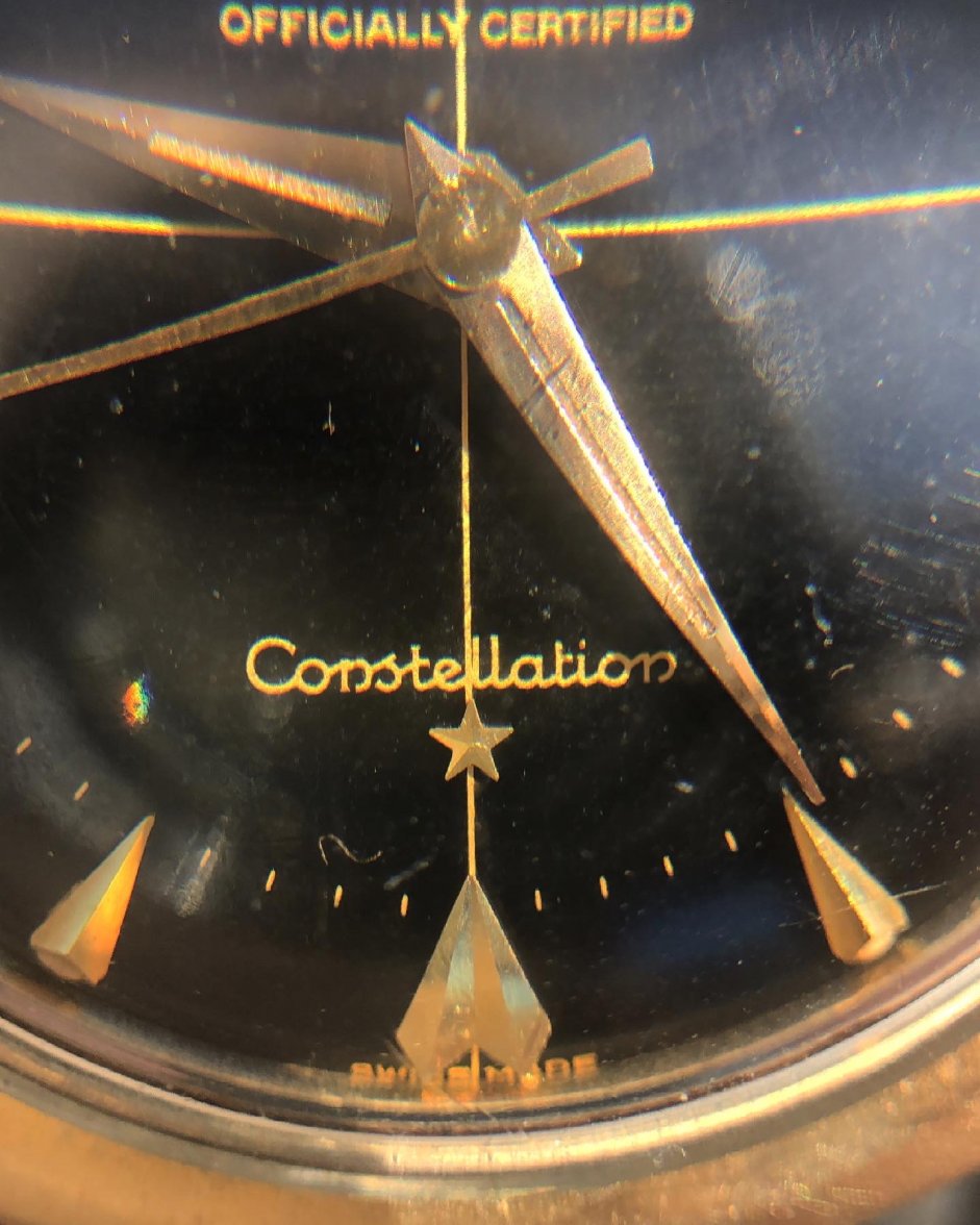
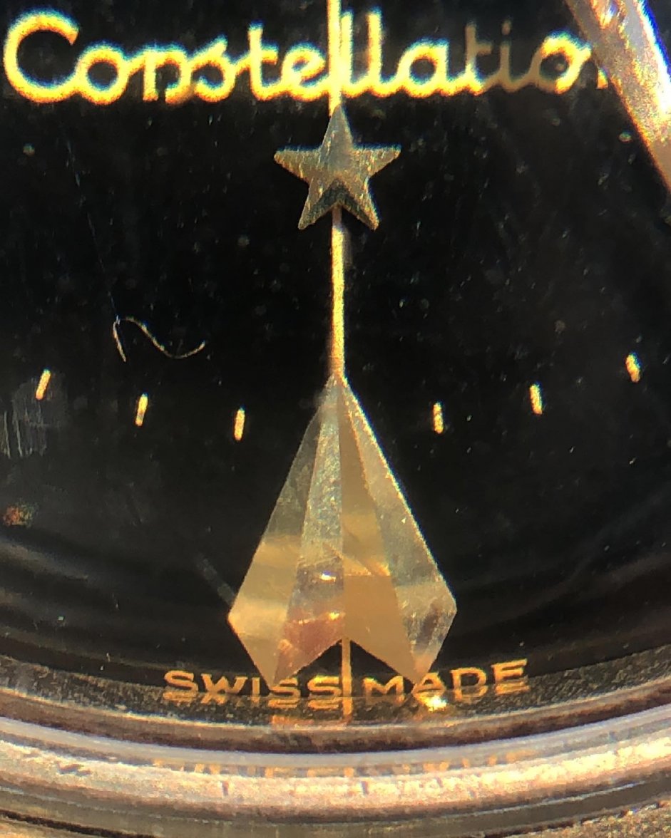
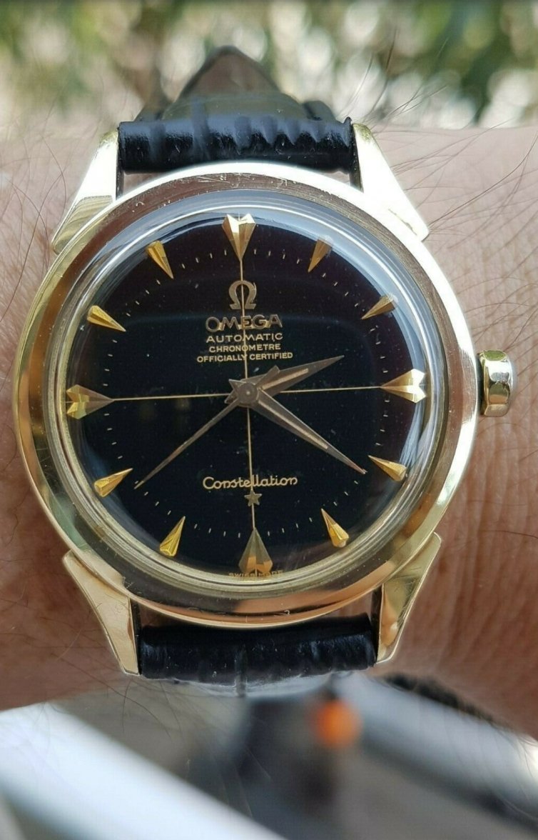
·As the title states, this is my gilt-y pleasure. This is the most beautiful watch I have ever put on my wrist. It stands out in my collection. I love how the gilt text shines so golden in the sun, how the 12,3,6,9 shark teeth markers pop out, and how the rest of the markers secretly have radium if you look close enough. Its gold has seemed to tarnished because of the radium, I think that is very cool. I know it's a dresswatch but I can't help it, it's going to be a daily!
Are black dials cooler than white ones? Maybe, just maybe 🥰
I have seen another dial just like this but in a stainless steel case on OF. Who else has a connie dial with this font? Took some macro shots which I know you guys will like! Thanks for reading.
And a heads up, I'm sorry but I cannot open the caseback at all. I have done it a bunch of times, this one is stubborn as hell. It has a snapback case. I suspect it is a 2852...? No bumping, it's a full rotor and is keeping great time.