- Posts
- 530
- Likes
- 5,244
Travelller
·~~~ SIDEBAR ~~~
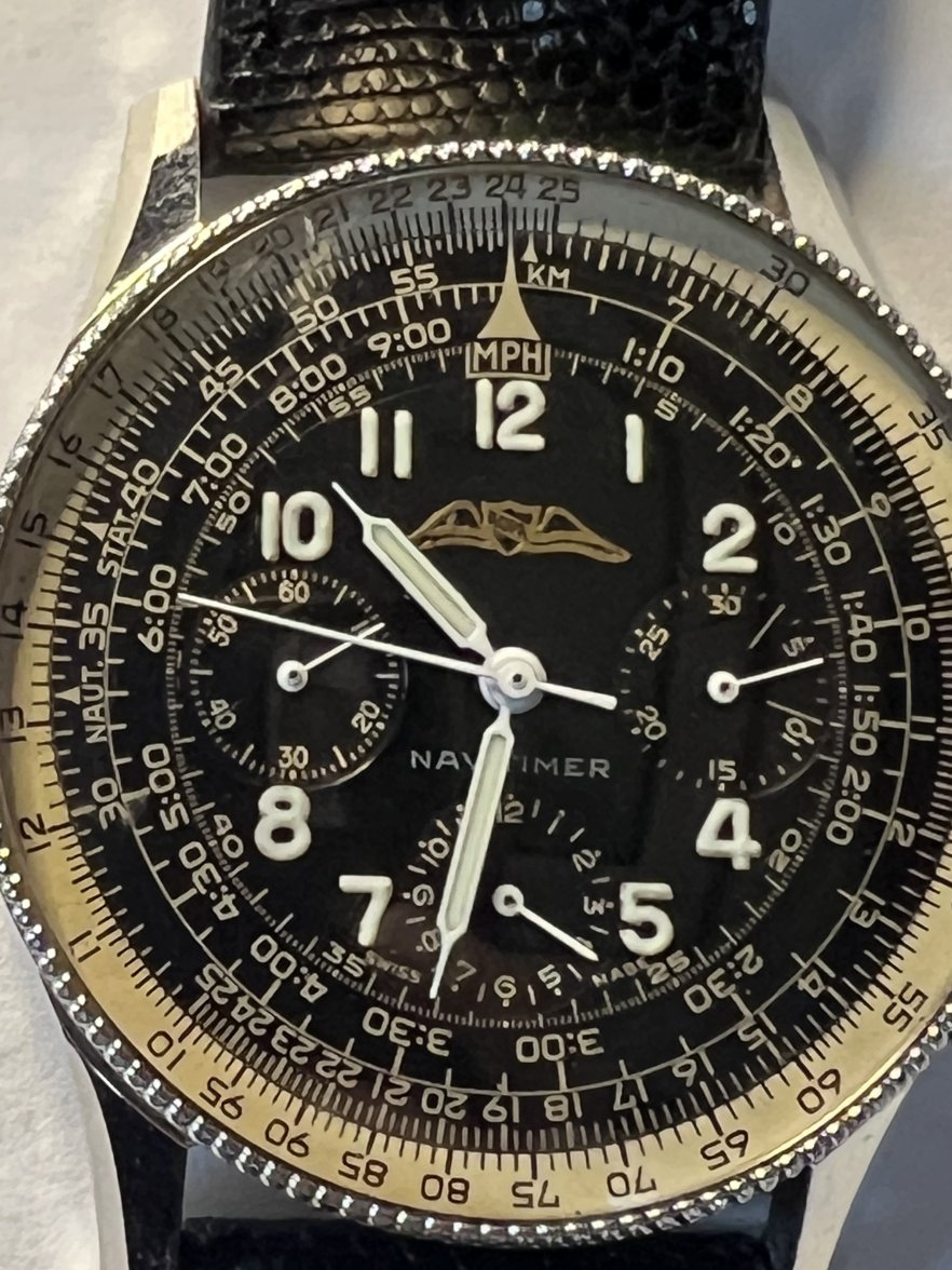
Since I took receipt of my TJ, I've been trying to "chart" the timeline to a finer detail than is available on Kurt's website or even the excellent new WatchBooksOnly's "Navitimer Story" . Among other discoveries is the fact that there are at least THREE versions of the standard (monochromatic) Navitimer TwinJet dial, all three (now) appearing in this thread 😎
The first version, AKA "Miles Davis", can be found on @321Only 's wrist:

It's characterized by the first set of fonts, which include a classic "G" in BREITLING as well as classic "V" in both GENEVE / NAVITMER (the bottom of the V is wide).
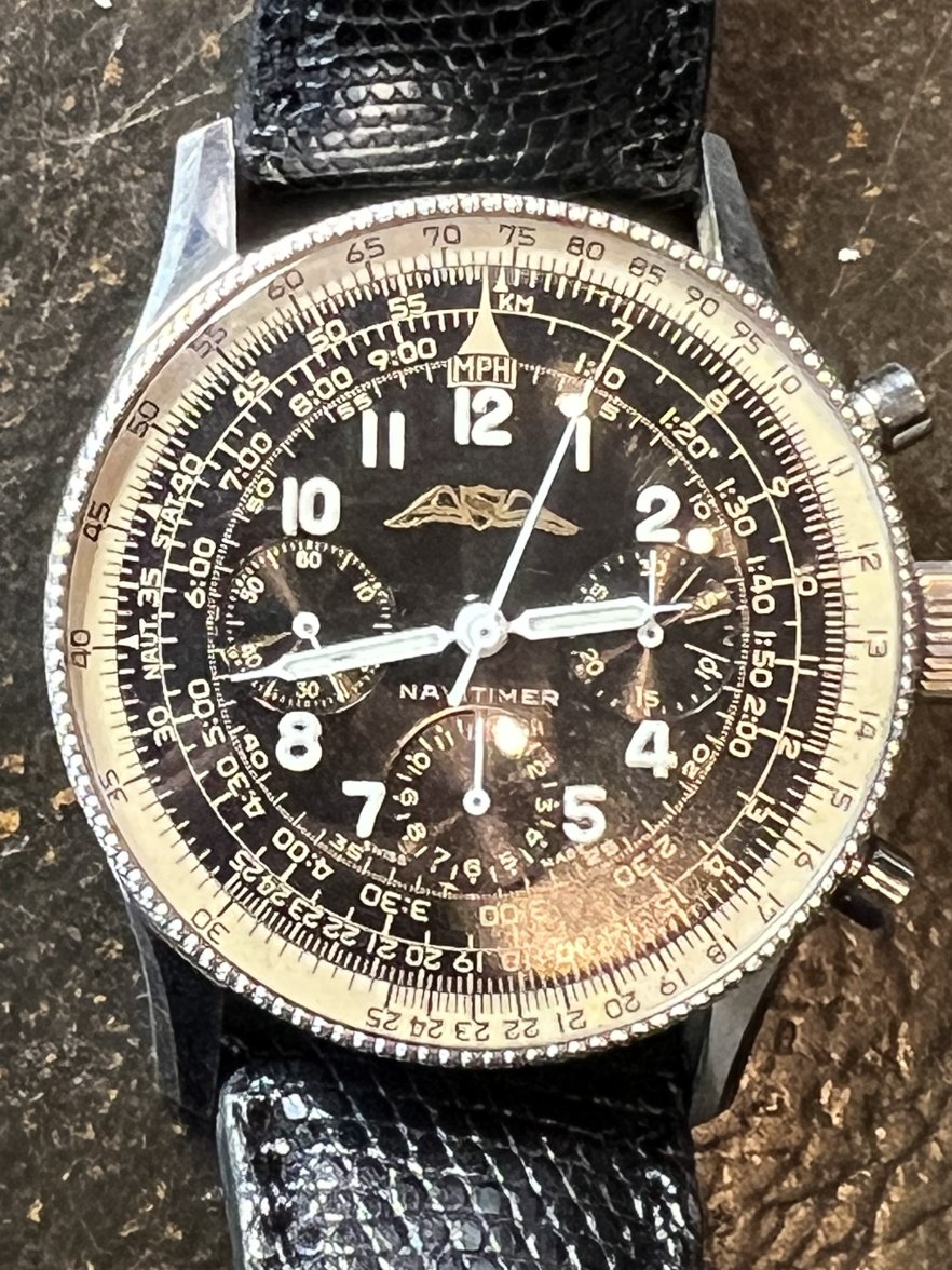
The second version can be found on the OP's ( @chronoboy64 ) wrist

and uses the next gen of fonts (flatter "G" in BREITLING as well as thinner "Vs" in GENEVE & NAVITMER.
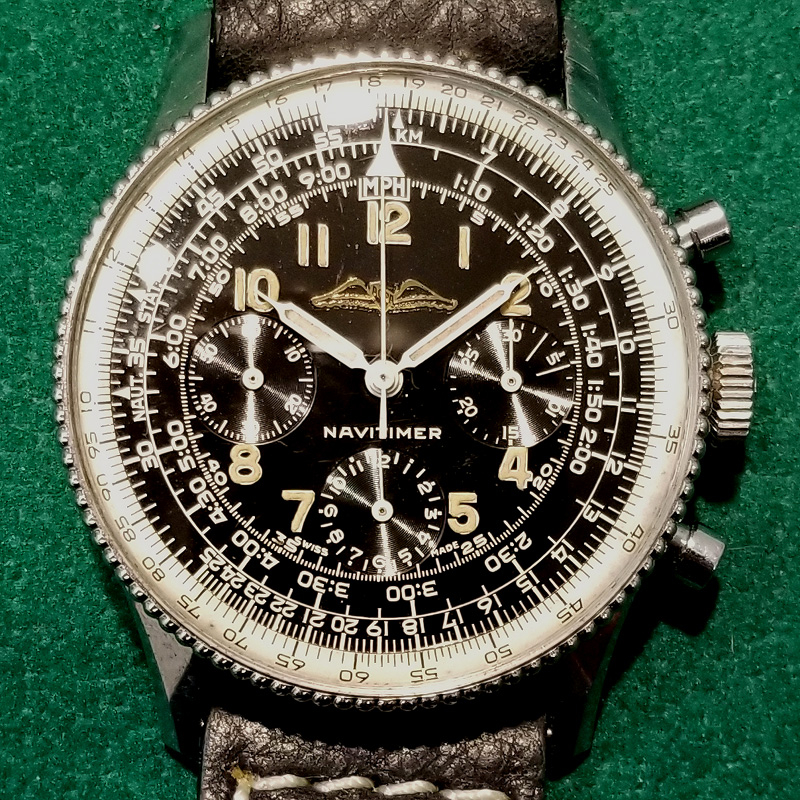
The third version can be found on my wrist and uses essentially the same fonts found on the next-gen "Box 10" Navitimers, characterized by a raised "T" in NAVITMER and a gap in the "SWIS S" (of Swiss Made)

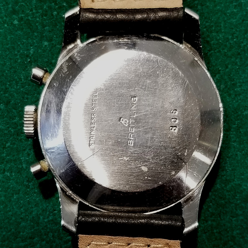
I was hoping the case number (10665nn - Feb. 1966) and user guide (for the 806, 1968 816 & 1969 1806) might give additional hints to dating my TJ but as it turns out, the cases were produced in large batches and there was no "FIFO" in place. Worse, the paperwork was added to the watch (&box) after the sale by the dealer, so... "anything goes" 😗
All I can say for sure is that it wasn't a 1964~65 and it came out before the 1967 Box-10, Fred's own being a wonderful example:

So my "clear-cut" theory has already been debunked as I just came across Kurt B's own 1967 Box 10 - sporting what I was calling 1st-gen fonts:

So now I'm at a loss as to why there are so many different fonts in use during roughly the same 1964~1967 period... 😵💫
I'd also like to think we can rule out "service dials" so early on...
Edited: