BREAKING NEWS - 50th Anniversary Apollo 11 in Steel Revealed
Tristanp
·To the moon
·Have I accidentally stumbled into a Rolex forum?
My order of decision-making starts with "Do I like this?", then moves to "Can I afford it?" and this one never gets past question 1.
Dear space-god-in-the-sky I hope that's not true...
Archer
··Omega Qualified WatchmakerOh well.... Not all of us move with the times.
I lived through the 80's once, so I don't need to go back to when TT was popular thanks. I love the music of that era, but the fashion was flashy/gaudy/over the top, and IMO shouldn't be repeated...unless of course that's your thing. You be you, man...
I don't just collect pieces I love or even like. But, whether they are relevant to my collection or significant, and you've guessed it 👍
I don't buy something I don't like just to make sure I have one for the sake of having one of everything.
blubarb
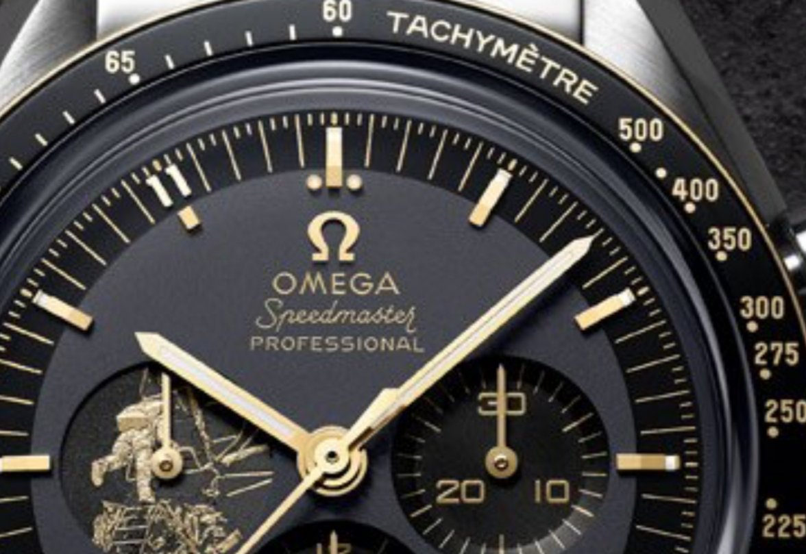
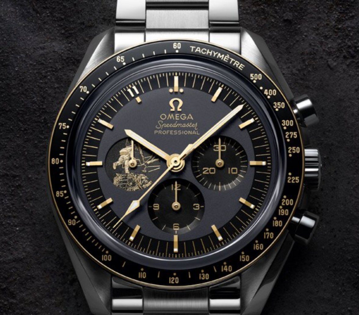
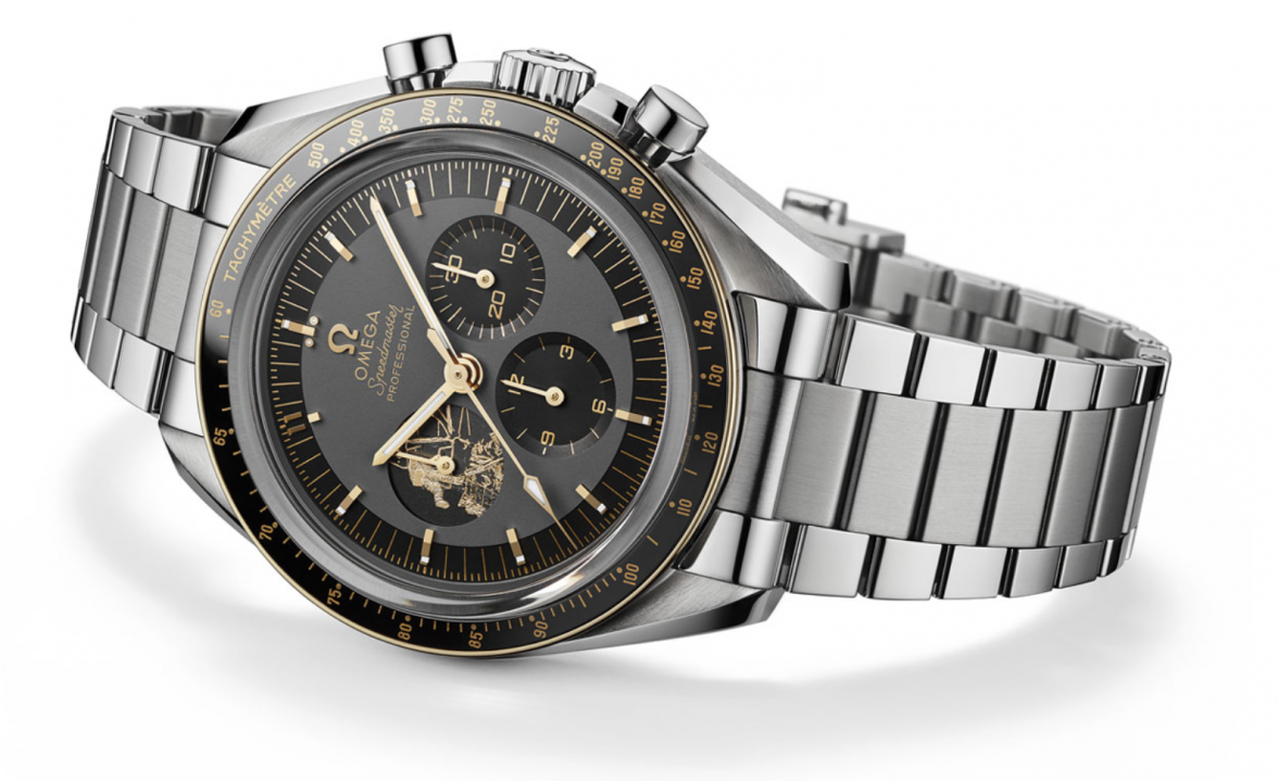
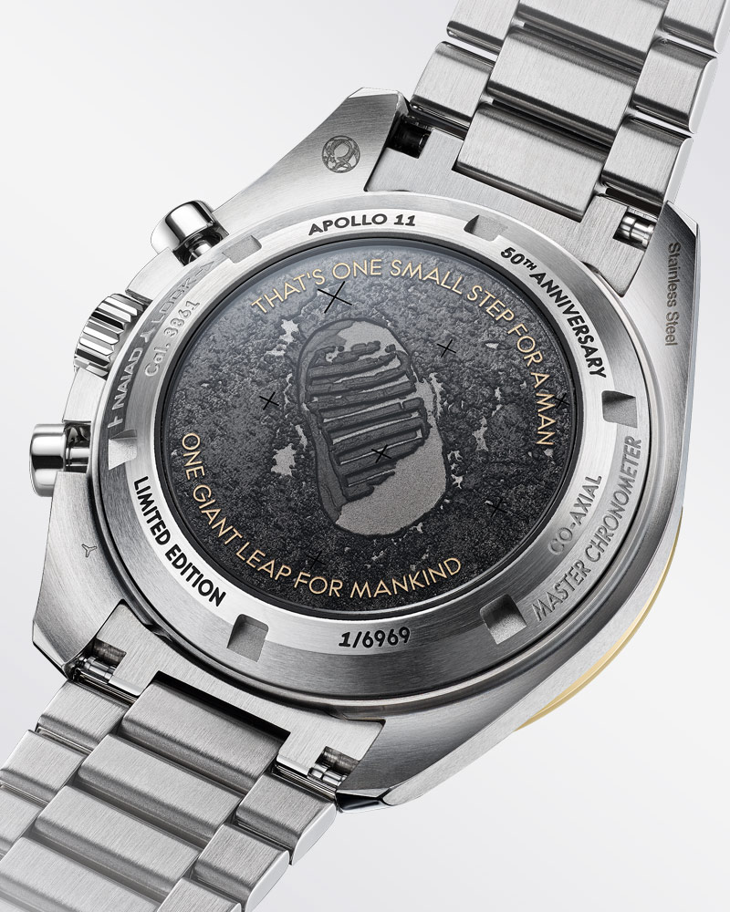
··IG: #blubarb19Well, I’m not convinced about this anniversary Speedmaster, but not too bad as far as a riff on the same theme goes. The price point is too high imho and I’m equally not convinced about the Co-axial driving it - Omega could have easily pressed their 321 into this to make it more representative as to Aldrin’s ST 105.012 . The so called Moongold ™ doesn’t do a thing for me. Will the front graphic be a pixilated transfer like the many other omega sundial transfers? And the gold print, for whatever reason, makes the A in omega jump out like a pop tart on the dial. I really don’t know what to think on this...I don’t mind the case back though. LE of 6969 - really? Why not 1969?
Edited:
CPRwatch
·I'm normally at the front of the queue of the doom mongers when it comes to LE editions of any watch , but this really is a special LE given that it's a 50th & how many of us can really say I will be here for the 100th . So take a breath , think about it & get one while you can with its minor imperfections . And who or what, has ever been the perfect finished item . I literally ran to my local AD when I saw what a great watch it is , just hoping I can pick one up . More power to omega on such a lovely watch & tribute to those brave men that went into the previously unknown .
- Posts
- 268
- Likes
- 139
Skier
·There are too many aspects of this release that I don't like to consider visiting my local AD to order:
- The two tone stepped dial. It may be the way the light reflects off the dial but the main part of the dial looks a dark grey, the stepped outer looks black.
- The 9 o'clock sub-dial image lacks elegance. Obviously it's a significant image but IMHO lacks subtlety and class.
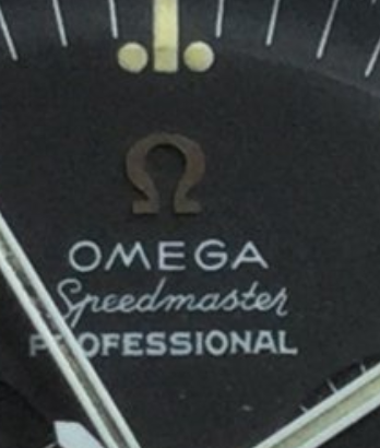
- The asymmetry of the 'OMEGA' font. The misalignment of the 'E' under the logo was the second thing I noticed when I first saw it. The seemingly large 'A' I hadn't noticed but have now and, I agree, it looks odd.
The bracelet, caseback etc. look beautiful and I'd be happy with the co-axial movement and even happier if it was an automatic. Heresy for some, I know.
chum_2000_uk
·Wow... They are really milking this moon landing thing aren't they...
Archer
··Omega Qualified Watchmakertyrantlizardrex
·I don't just collect pieces I love or even like.
Why on earth would you spend money on something you don't like?

Utter nonsense.
blubarb
··IG: #blubarb19stevec14
·I'm normally at the front of the queue of the doom mongers when it comes to LE editions of any watch , but this really is a special LE given that it's a 50th & how many of us can really say I will be here for the 100th . So take a breath , think about it & get one while you can with its minor imperfections . And who or what, has ever been the perfect finished item . I literally ran to my local AD when I saw what a great watch it is , just hoping I can pick one up . More power to omega on such a lovely watch & tribute to those brave men that went into the previously unknown .
We will see. But I’d rather have this than a tacky two tone Rolex. (My opinion only, no responses required)

 ROTFL
ROTFL