Taybharr
·Many of us, rightfully so, get a bit excited when we see blurry pictures of a potentially desirable watch. Blurry pictures paired with a bit of research and intuition can sometimes lead to landing a grail for considerably less than the market rate. However, like most things in vintage watches, this phenomenon is becoming more and more well known and being "arbitraged" from the market. Hodinkee recently featured a blurry Heuer Carrera in Bring a Loupe and it went on to achieve a strong price.
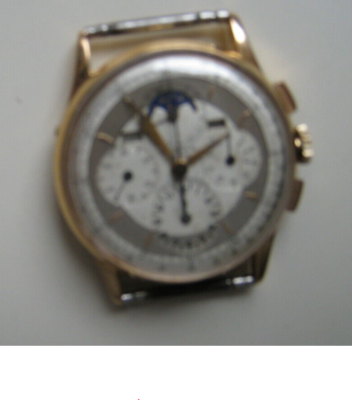
Here is the watch in question:
https://www.ebay.com/itm/VINTAGE-UN...HRONOGRAPH-18K-WATCH-NON-WORKING/153699575844
Poor quality photo and not much to go on, right? Let's look at another one...
Now we are getting somewhere. Still pretty poor quality but after taking a snip of the most in focus picture and blowing it up a bit we can see a number of issues. Most obvious issue is the thick nasty font on the 6 o'clock subdial. The font on the 3 o'clock subdial is also incorrect and the indices should be 5 minute, not 3 minute intervals as seen here. The moon face looks all wrong as well with poor, incorrect printing. Hands are the wrong style for this reference. I also wasn't able to find a two-tone example of this reference, but maybe they exist. I just can't find one on the web.
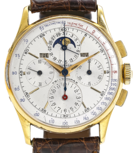
Here is a what the dial should look like, taken from Timepiece Chronicle's website (I realize this example is not very good condition, but it does look correct):
I also want to point out that this deception appears to be intentional. The seller states, "Sorry for the Poor Quality Phots's do to Glare." Complete BS. Most of the pictures have very little glare and glare should not prevent the camera from focusing. In addition, the most in-focus picture was taken from very far away.
Be careful out there.
This website may earn commission from Ebay sales.


