Any graphic designers here? Critique needed on a draft logo

Posts
4,970
Likes
15,189
Hi all,

As many of you know, I have a love for pocket watches. Not being able to find any quality lanyards that would allow me to wear a watch with jeans (vs a suit or vest with a chain), led to me designing and making leather pocket watch lanyards. This little side hustle has been going well, so I'm celebrating by getting a logo designed on Fivrr.

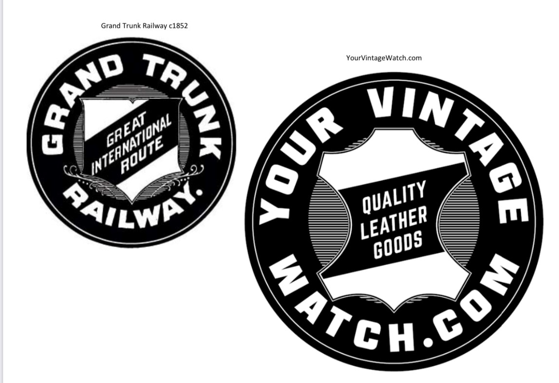
Most people get one of these lanyards for their railroad approved watches, and since I've been diagnosed with railroad nostalgia, I've drawn inspiration for the logo from the Grand Trunk Railroad's c1852 logo. I replaced the crest with the image of a leather hide - my lovely wife's idea. I've never gone down the road of a logo before, so any feedback would be welcomed. I'm really happy with how this is looking, my only hesitancy is how Your Vintage Watch aligns with things, the letters don't seem to follow the curve of the circle as evenly as the original GTR logo - thoughts on that? When finished, I probably will give this a distressed look (similar to a sample shown below), and maybe a colour version as well.

Thank you in advance for any thoughts or guidance 👍
 
Posts
2,487
Likes
3,955
Two things to watch when replicating vintage logos. First is negative space. The second is font kerning (the space between the letters.)
Surprisingly the oft misused adage "Less is more" does relate to these old designs.
-j
 
Posts
4,402
Likes
22,779
They only thing I can suggest is try doing "your vintage watch" in an arc up on the top and just centering ".com" down there on the bottom?
Do you follow? But I feel like that may make it a bit unbalanced.
 
Posts
3,478
Likes
8,004
"your vintage watch" in an arc up on the top and just centering ".com" down there on the bottom?
I like "your vintage" up top and "watch" centered below with .com as a very small subscript.
Plus add boobs and puppies.


Note: I am not technically a designer but I watched "Mad Men" all the way.
Edited:
 
Posts
2,587
Likes
5,646
I guess you’ve noticed, but your font has completely flat tops and bottoms, whilst the original font has tops and bottoms that are curved with the correct radius. That’s why yours looks a bit less natural.
 
Posts
4,970
Likes
15,189
I like "your vintage" up top and "watch" centered below with .com as a very small subscript.
Plus add boobs and puppies.


Note: I am not technically a designer but I watched "Mad Men" all the way.

LOL
 
Posts
5,339
Likes
18,561
It's pretty good, and you have some good suggestions.

I like your distressed look also. Not sure if you intended to keep those double white lines in the interior but they have a nice rail track motif. The leather hide is great too, very clean graphic and a clear message.

👍
 
Posts
1,043
Likes
6,214
“…the letters don't seem to follow the curve of the circle as evenly as the original GTR logo“

That is correct. Adjust the radius on your lettering to follow the circle. Also, as w154 mentioned, reduce the size of your font slightly and try to match the softer GTR font. The one you have now is a bit “shouty”.
 
Posts
1,070
Likes
3,717
I’m going to agree with everyone that advised you to modify the lettering so it curves with the circle. This will entail some graphics work in a program like Adobe Illustrator, which I pay a fortune every month to use. I’d be happy to work up a prototype for you if you aren’t in a huge hurry for it.

I’d also reduce the size of the skin in the middle and omit the borders so it’s just a white shape conveying the tanned skin concept more immediately. Consider also putting the
YOUR
VINTAGE
WATCH.COM
in the center image and another motto above and below, perhaps

(top) QUALITY LEATHER GOODS
(bottom) [Your City, Country]
 
Posts
16,762
Likes
47,436
As someone that has recently got a touch mark for a knife brand.

Think of something you may want to get a leather stamp made in the future. Cleaner the better

http://gelandangan.com.au/

the above website was where I got mine and has some good info.
 
Posts
4,970
Likes
15,189
I’m going to agree with everyone that advised you to modify the lettering so it curves with the circle. This will entail some graphics work in a program like Adobe Illustrator, which I pay a fortune every month to use. I’d be happy to work up a prototype for you if you aren’t in a huge hurry for it.

I’d also reduce the size of the skin in the middle and omit the borders so it’s just a white shape conveying the tanned skin concept more immediately. Consider also putting the
YOUR
VINTAGE
WATCH.COM
in the center image and another motto above and below, perhaps

(top) QUALITY LEATHER GOODS
(bottom) [Your City, Country]

thank you for your offer of help! I’m still making my Fiverr contractor suffer to the end on this, I’ll see if he can get it done
 
Posts
4,970
Likes
15,189
As someone that has recently got a touch mark for a knife brand.

Think of something you may want to get a leather stamp made in the future. Cleaner the better

http://gelandangan.com.au/

the above website was where I got mine and has some good info.

I saw your stamp in your other thread. Congrats! I’m looking forward to seeing that in use. Thanks for providing that website, good info in there.