An unique 1930 Universal Geneve watch - Shield On Dial Of Early UG Three Hander
Dre
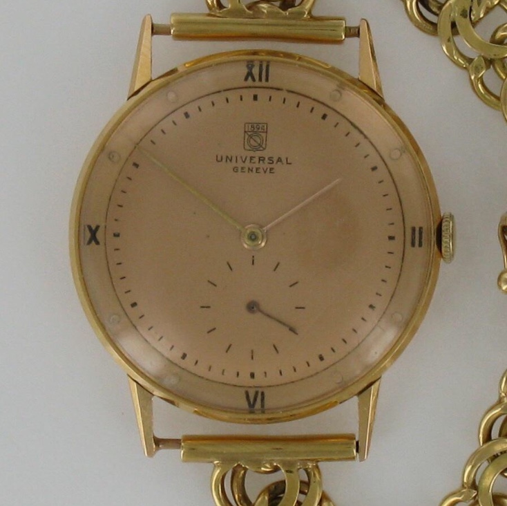
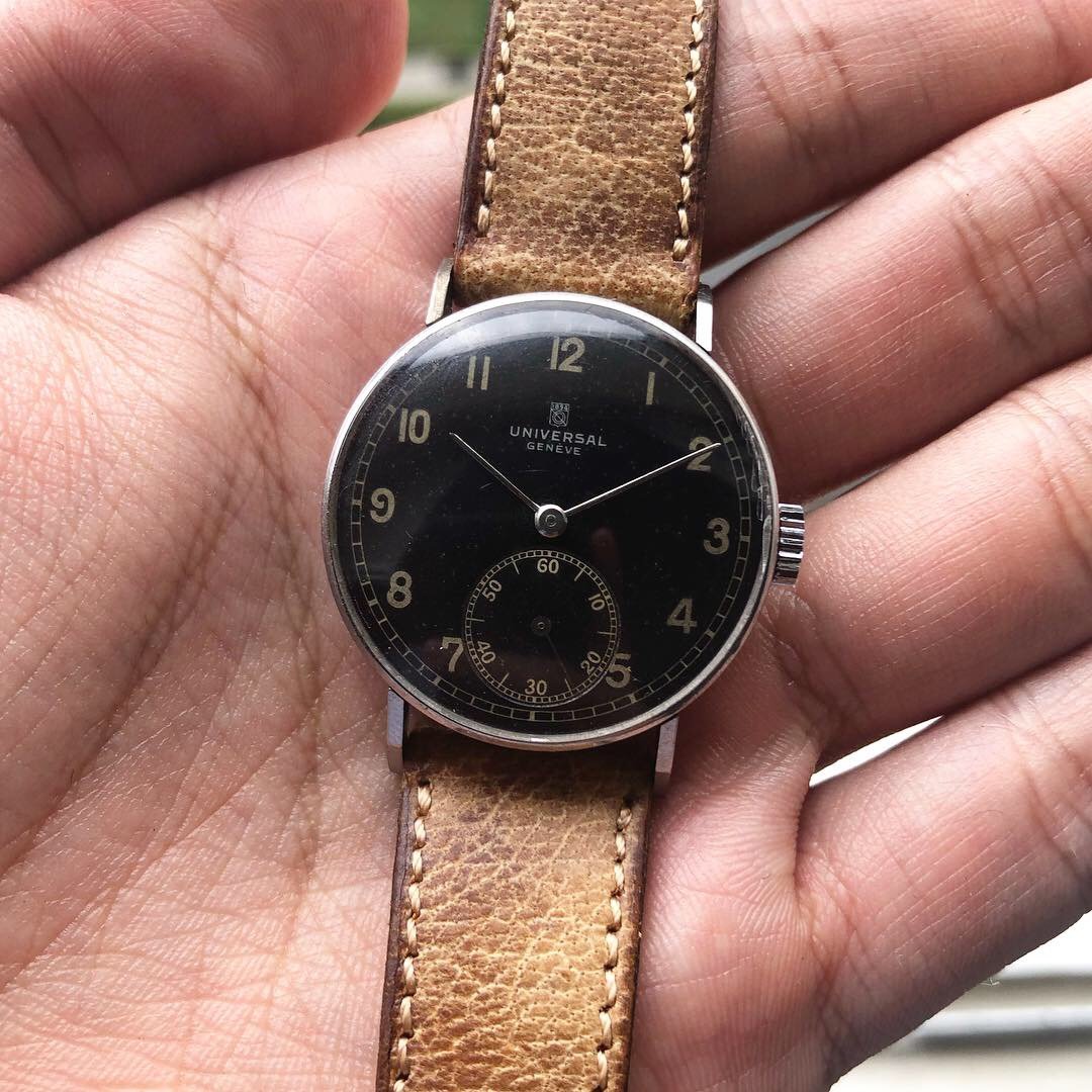
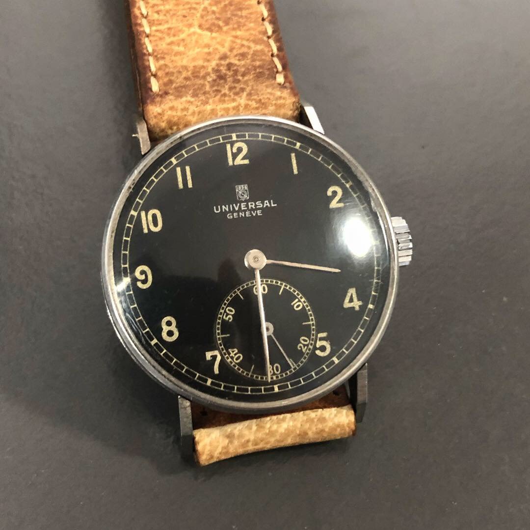
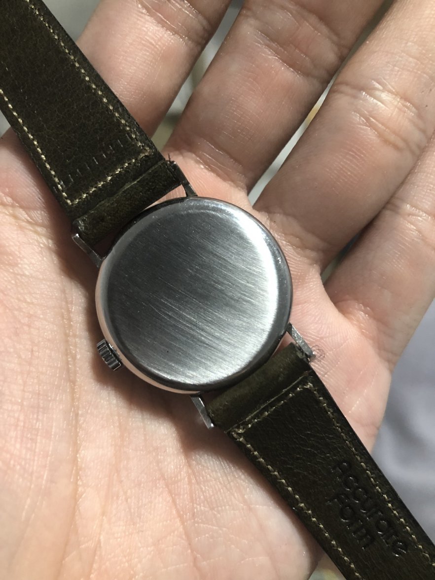
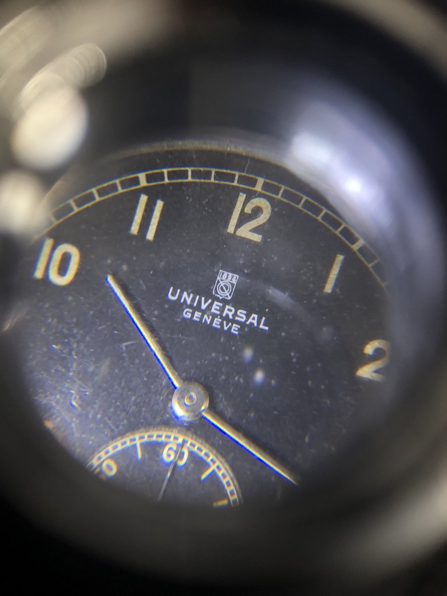
·New watch always excites me. This time it is a Universal Geneve gilt dial with steel case. It has the old UG logo printed. My research tells me that this logo was used by UG sometime in 1937, which allows me to date this watch to somewhere in the 1930s. I have no expertise to open the case back, so there isn't any shot of the movement.
Anyway, here are the photos. I would be delighted if anyone has more to share about it.
Thanks.
I just saw this thread after someone told me about it, 5 pages within a few days huh. The watch in question is used to be my watch, and after having it in person, worn it, and then sold it to a really good mate of mine, I believe the dial is 100% original. The watch is dated back to 1938, and it is quite common for UG watches in that period to have the UG shield logo on the dial.
jerryct
·I just saw this thread after someone told me about it, 5 pages within a few days huh. The watch in question is used to be my watch, and after having it in person, worn it, and then sold it to a really good mate of mine, I believe the dial is 100% original. The watch is dated back to 1938, and it is quite common for UG watches in that period to have the UG shield logo on the dial.
Woo! Honored to have your previous watch.
FREDMAYCOIN
·Much better than a catalog picture.
dantheman3u4i
·Always seems to amaze me...
bgrisso
·jerryct
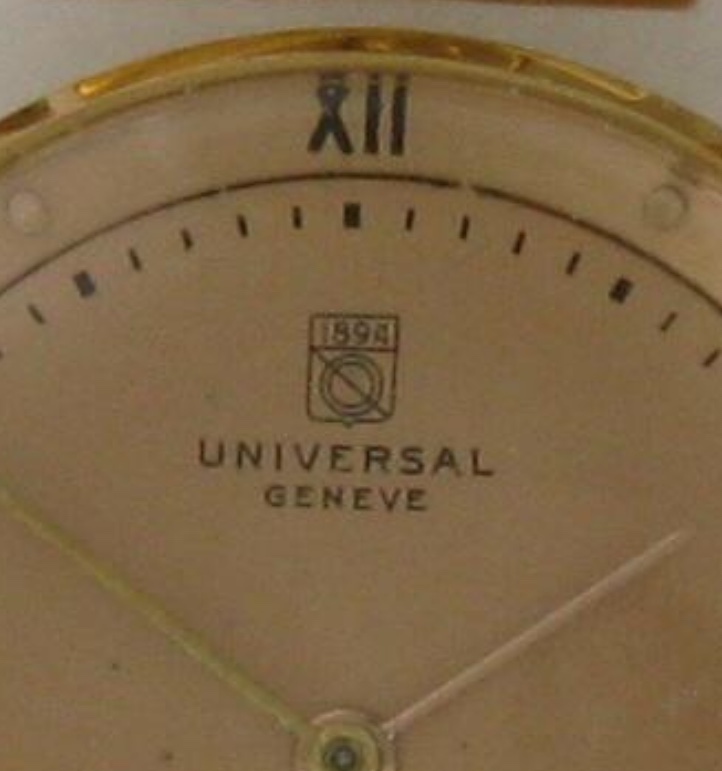
·So recently I received another comment that the font used on the E of the GENEVE below the logo is not consistent and therefore redial.
I have been zooming in to all the available photos here on this page. While there are perfect examples, there are also some with difference in the E.
What do you guys think?
I have been zooming in to all the available photos here on this page. While there are perfect examples, there are also some with difference in the E.
What do you guys think?
jimmyd13
·So recently I received another comment that the font used on the E of the GENEVE below the logo is not consistent and therefore redial.
I have been zooming in to all the available photos here on this page. While there are perfect examples, there are also some with difference in the E.
What do you guys think?
Asking the questions purely in order to improve my own education.
Vitezi
·I'm not sure you can place too much weight on 1940s UG font consistency. One of my favorite threads in this forum shows the variation in font on UG Pola/Polerouters produced a decade after your watch, circa early 1950s:
https://omegaforums.net/threads/pol...-a-brief-survey-with-some-observations.35888/
Some of those examples use the l'accent grave on the second "E" in GENEVE and some do not; some have a flat bottom V and some do not; most letters have serifs, but some are sans-serif. And this variation was just on one model..!
jimmyd13
·Some of those examples use the l'accent grave on the second "E" in GENEVE and some do not; some have a flat bottom V and some do not; most letters have serifs, but some are sans-serif. And this variation was just on one model
Thanks for taking the time to answer but (and not criticising P's watch but genuinely curious), are differing letters known on the same example? To my eye, that first E is different to the next two. Not just a missing or superfluous accent but a different font. The middle stroke is a different length.
Now, if it had been made in Birmingham I could understand it but this is a Swiss watch. The Swiss are, let's face it, pretty anal about details. I once knew a guy who was expelled from Switzerland for speeding ... and he'd been domiciled there for years. Are Universal Geneve the Brummie of the Swiss watch industry?
jerryct
·Thanks for taking the time to answer but (and not criticising P's watch but genuinely curious), are differing letters known on the same example? To my eye, that first E is different to the next two. Not just a missing or superfluous accent but a different font. The middle stroke is a different length.
Now, if it had been made in Birmingham I could understand it but this is a Swiss watch. The Swiss are, let's face it, pretty anal about details. I once knew a guy who was expelled from Switzerland for speeding ... and he'd been domiciled there for years. Are Universal Geneve the Brummie of the Swiss watch industry?
I do see the difference in the first E compared to the other 2. I agree with you on that point. But I have been screening through photos of other UG online and I too have spotted difference on the E. It’s watch making in the 1930s after all. I guess consistency wasn’t a main concern for the manufacturers then.
jimmyd13
·I do see the difference in the first E compared to the other 2. I agree with you on that point. But I have been screening through photos of other UG online and I too have spotted difference on the E. It’s watch making in the 1930s after all. I guess consistency wasn’t a main concern for the manufacturers then.
Tony C.
··Ωf Jury memberSo this is known and accepted? That's great to hear but I think it just makes me even more wary about buying a UG. It seems prime territory for getting burned. Or, I invest in a copy of Sala and read it (as well as everything online) for a year before I looking at buying.
It's worth noting that this type of issue is not at all limited to UG. During the early and mid-20th century, all watch manufacturers outsourced dials, and not only to one dial manufacturer. So, there were differences, some very slight, some more obvious. Some were related to fonts, while in others instances, notably Omega, there were lacquer "issues".
Now this does not mean that flaws can or should reflexively be chalked up to manufacturing issues, as it is important to distinguish between redials and original dials. The point is that flaws and variations did appear during those periods, and a fair percentage of them can be explained by much looser manufacturing standards, or consistency, than one would expect today.
Edited:
STANDY
··schizophrenic pizza orderer and watch collectorSo this is known and accepted? That's great to hear but I think it just makes me even more wary about buying a UG. It seems prime territory for getting burned. Or, I invest in a copy of Sala and read it (as well as everything online) for a year before I looking at buying.
Also noting Sala, like Omega,s AJTT have several watches that are worthy of the forums scrutiny
Woops
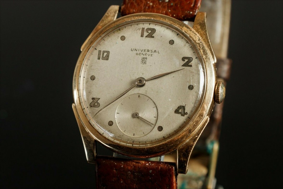
·Love it. That ‘8’!
jerryct
·
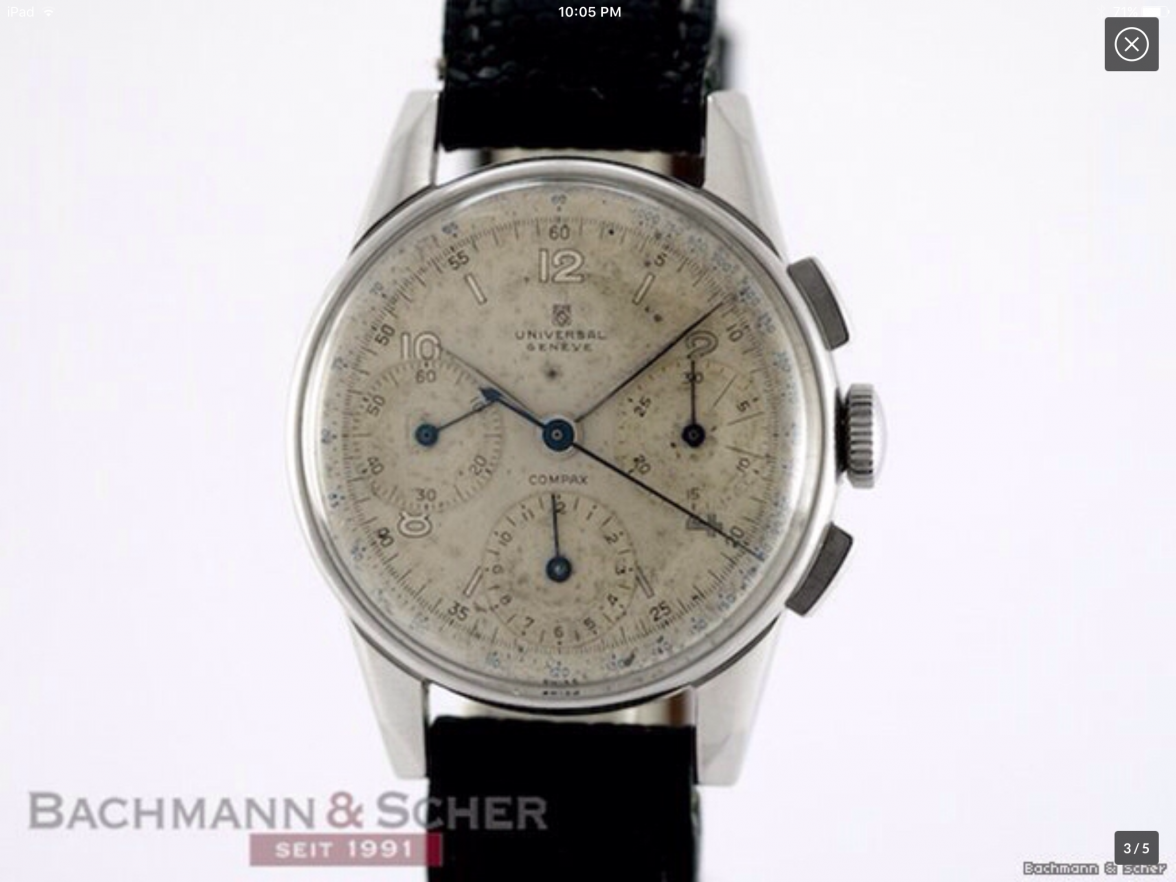
Woohoo. Another example with shield on dial.
Similar threads
- Posts
- 16
- Views
- 5K
