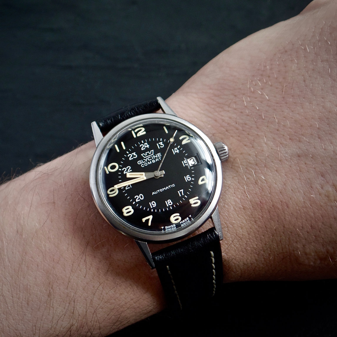
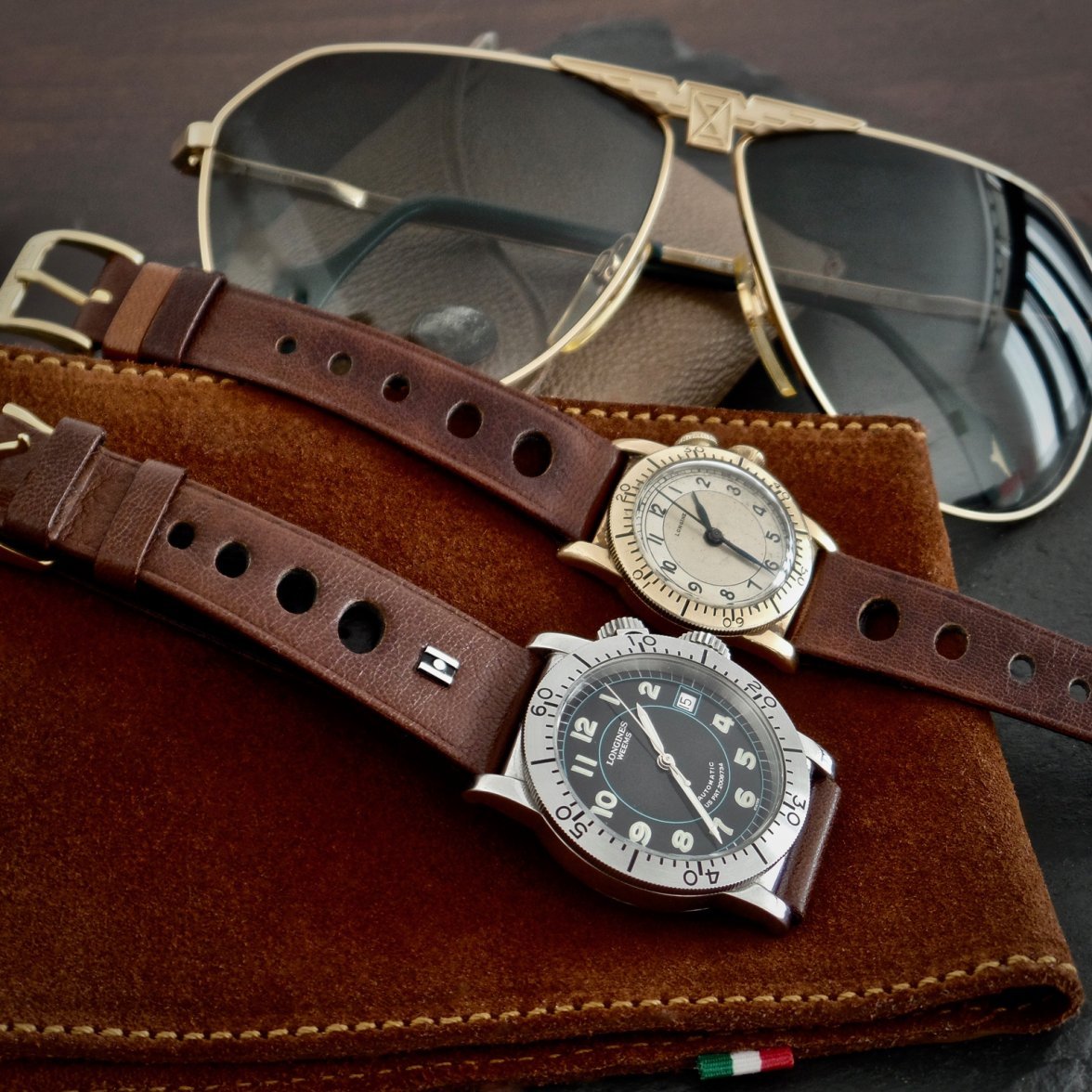
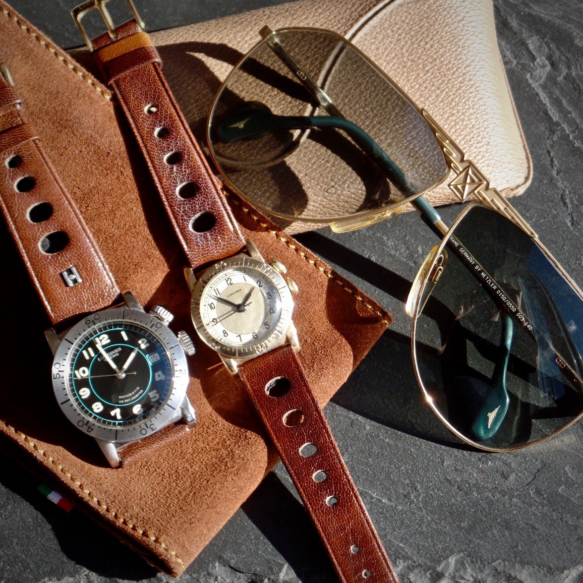
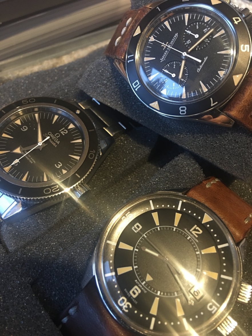
"Aged" lume: cheesy, or aesthetic high point?
ewand
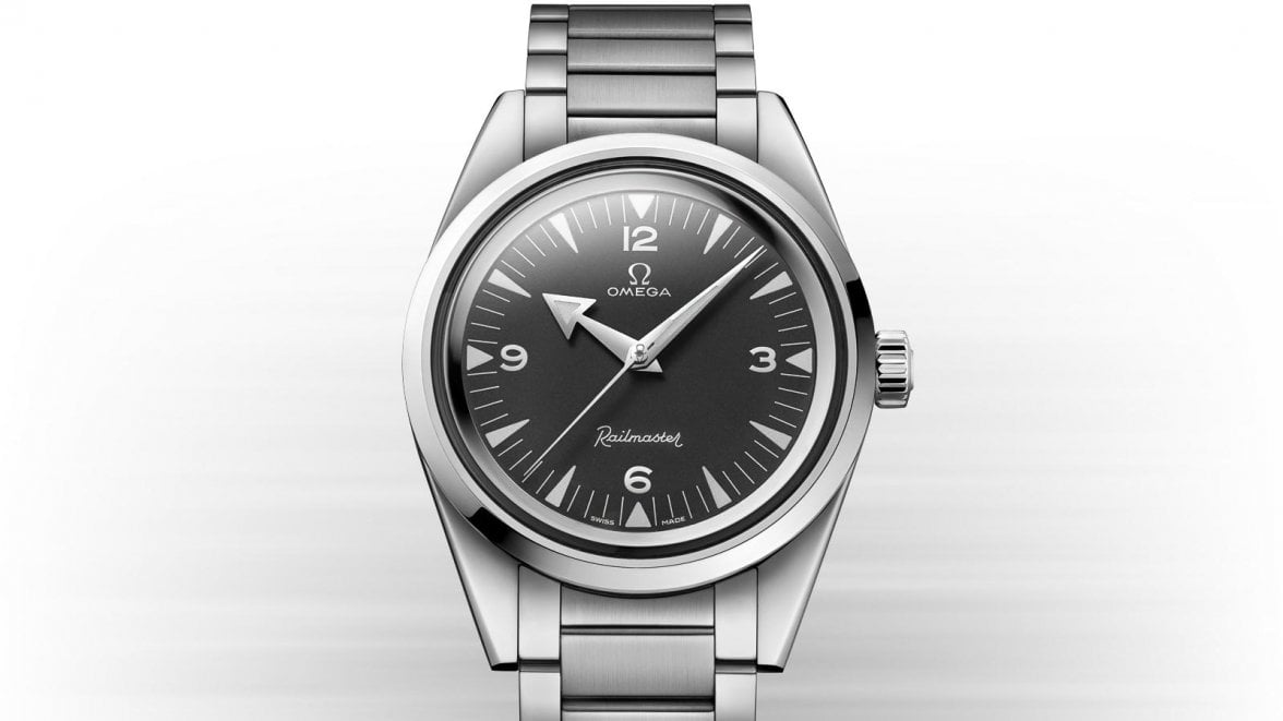
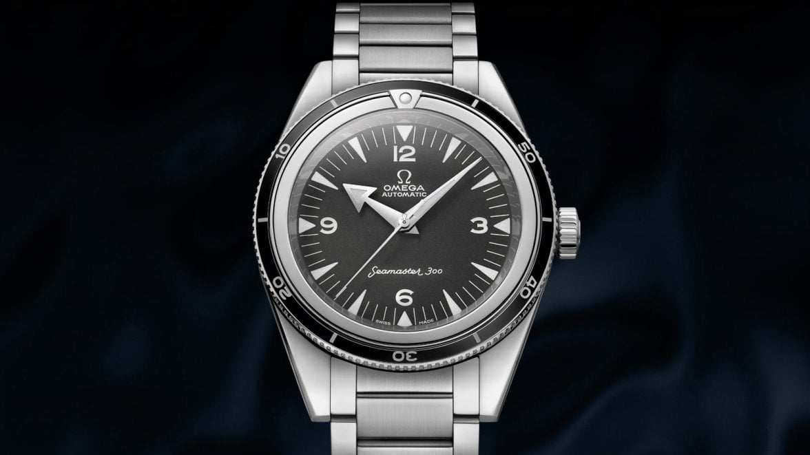
·I like it. I like the fact that Omega did it, more - if you look at a lot of "reissue" watches, they pay grudging homage to the original, but I think they seem to have done it well.
Check out the comparison of vintage 2915 vs new at http://www.moonwatchonly.com/omega-...niversary-limited-edition-back-to-the-origin/ and you can't help but think they've done a good job of copying the original...
Check out the comparison of vintage 2915 vs new at http://www.moonwatchonly.com/omega-...niversary-limited-edition-back-to-the-origin/ and you can't help but think they've done a good job of copying the original...
TheKomoman
·I was originally not a fan of it when it was done on the SM300, but for some reason fell in love with it on my Breitling Avenger in PVD. Go figure.
I think that sums it up well for me - it's not about whether they should or shouldn't it's one of aesthetics. If it looks good as part of the design as a whole I'm all about it. I think Omega did a nice job of giving it the spirit without taking it to the extreme of making it puffy or some other thing that was cross the line into trying too hard. As always.... YMMV.
micampe
·Davidt
·I really like it and also don't really consider it faux.
Any paint on the dial markers is a choice. Who says it has to be white. It's hard to be sure, but I don't think radium or 60's tritium was ice white when new.
Just like hands can be red, dials blue, grape or gold and straps a variety of colours. Yellow lume is just a design choice imo.
Any paint on the dial markers is a choice. Who says it has to be white. It's hard to be sure, but I don't think radium or 60's tritium was ice white when new.
Just like hands can be red, dials blue, grape or gold and straps a variety of colours. Yellow lume is just a design choice imo.
Foo2rama
··Nowhere near as grumpy as he used to be...One of mine is aged tritium. The tritium Sinn 903 from the 90's has brownish tritium from the factory lol.
Kazyole
·I don’t like to think of it as faux lume. It’s just color to me. I like vintage watches because of the warm tones of aged tritium, chocolate dials, ghosted inserts, etc. I think it’s neat (just conceptually) that watchmakers used to be using non-stable substances and that the watches have aged to look that way, but I really don’t care why the plots have gone golden. I just like that they have because the look appeals to me.
So now they use super luminova, ceramic bezels, etc. All stable materials. The modern sub or moonwatch that you buy today will still be bright white in 50 years. To me, that’s a bit of a shame. Soon there will be watches that are “vintage” that look brand new. As a vintage enthusiast, that kind of sucks.
So I’m happy that brands have realized that the preference exists and are catering to it. Sometimes it’s done badly, but sometimes (like these new 60th anniversary LEs), I think it’s done really well. I doubt I’d be as excited about the speedmaster if its markers were bright white. I think it would look to cold/stark, and I probably wouldn’t have ordered one. This is the first time I’ve ordered a new watch from an AD. It’s the first time I’ll be moving a vintage piece to make room for a modern one. I think when it’s done well, it can really help a watch. Seeing the mockups that @micampe did, I think omega made the right decision.
EDIT:
I've gone ahead and done a 5 minute edit of the speedy to remove the chocolate dial and colored plots


It'd be cool if they offered both as options, but I'd go for the warmer one every time.
So now they use super luminova, ceramic bezels, etc. All stable materials. The modern sub or moonwatch that you buy today will still be bright white in 50 years. To me, that’s a bit of a shame. Soon there will be watches that are “vintage” that look brand new. As a vintage enthusiast, that kind of sucks.
So I’m happy that brands have realized that the preference exists and are catering to it. Sometimes it’s done badly, but sometimes (like these new 60th anniversary LEs), I think it’s done really well. I doubt I’d be as excited about the speedmaster if its markers were bright white. I think it would look to cold/stark, and I probably wouldn’t have ordered one. This is the first time I’ve ordered a new watch from an AD. It’s the first time I’ll be moving a vintage piece to make room for a modern one. I think when it’s done well, it can really help a watch. Seeing the mockups that @micampe did, I think omega made the right decision.
EDIT:
I've gone ahead and done a 5 minute edit of the speedy to remove the chocolate dial and colored plots


It'd be cool if they offered both as options, but I'd go for the warmer one every time.
Edited:
alam
·oddboy
·omegadave
·Don't like extreme fake patina, but I also dislike the ultra-white lume on the modern Speedmasters. Looks too sterile and flat.
FullyWound
·🫨
I think it's stupid, and sums up everything that is wrong with "Modern" watches and brands I get the idea of ultra limited edition "heritage" models but when companies do nothing but produce "heritage" models what is the 🤬 point...
It seems a lot like Omega , Tudor , Longines etc etc ETC are basically saying HEY WE RAN OUT OF IDEAS AND WE ARE 🤬 LAZY *dont worry these idiots will buy anything that has our name on it!*
can you imagine what the collectors market will look like in another 50 years? (aged aged lume 😕 WHAT?) No its stupid Unimaginative and 🤬 lazy
OH DONT GET ME WRONG these are DAMN DAMN sexty watches i keep thinking YEA YEA id buy that its Filth yea i love it... then i try and asses WHY i like it... Oh... yea.. i like it because it looks like the vintage model that i love...
So YEA i get it if you have a vintage say Railmaster i would totally smash a re-edition for my day wear AND wear a Shirt
"My other watch is a 57"
Come to think of it Omega have missed a trick here they could seriously sell that.. then again they wouldn't think of it...

AH bite that controversy!
NO!
I think it's stupid, and sums up everything that is wrong with "Modern" watches and brands I get the idea of ultra limited edition "heritage" models but when companies do nothing but produce "heritage" models what is the 🤬 point...
It seems a lot like Omega , Tudor , Longines etc etc ETC are basically saying HEY WE RAN OUT OF IDEAS AND WE ARE 🤬 LAZY *dont worry these idiots will buy anything that has our name on it!*
can you imagine what the collectors market will look like in another 50 years? (aged aged lume 😕 WHAT?) No its stupid Unimaginative and 🤬 lazy
OH DONT GET ME WRONG these are DAMN DAMN sexty watches i keep thinking YEA YEA id buy that its Filth yea i love it... then i try and asses WHY i like it... Oh... yea.. i like it because it looks like the vintage model that i love...
So YEA i get it if you have a vintage say Railmaster i would totally smash a re-edition for my day wear AND wear a Shirt
"My other watch is a 57"
Come to think of it Omega have missed a trick here they could seriously sell that.. then again they wouldn't think of it...

AH bite that controversy!
Don't like extreme fake patina, but I also dislike the ultra-white lume on the modern Speedmasters. Looks too sterile and flat.
NO!
adi4
·To me it's purely aesthetic and just a different color of lume. No different than "worn-in" jeans, vintage looking leather straps, and elbow patches on new sweaters. If the overall look of it works, what's the issue?
STANDY
··schizophrenic pizza orderer and watch collectorIt's worth pointing out that
Maybe Omega has sorted out the vintage watch resurgence ( that they don't make any $ on ) by making new vintage looking watches 😗
Could they use these new aged looking lumes on vintage speedmasters and seamasters they service 😗
Maybe Omega has sorted out the vintage watch resurgence ( that they don't make any $ on ) by making new vintage looking watches 😗
Could they use these new aged looking lumes on vintage speedmasters and seamasters they service 😗
chows99
·Just a thought. If patina is so well coveted, can the watch makers use back the materials that can gain patina over time? Not as if the materials will compromise the quality of the watches.
Kazyole
·Just a thought. If patina is so well coveted, can the watch makers use back the materials that can gain patina over time? Not as if the materials will compromise the quality of the watches.
The industry will never move back to tritium because of the radioactivity/health concerns associated with it 🙁
Similar threads
- Posts
- 36
- Views
- 4K
- Posts
- 24
- Views
- 7K

