- Posts
- 2,074
- Likes
- 4,231
RevZMan123
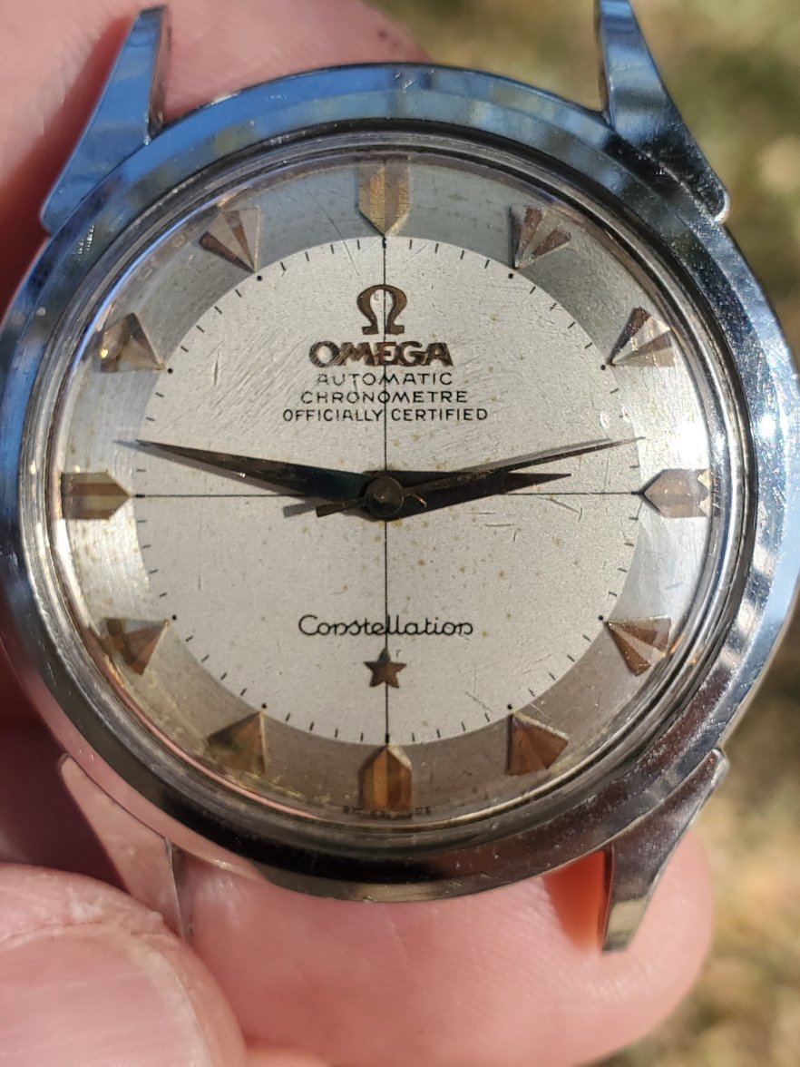
·I don’t know enough about these older ones to weigh in initially but I also thought the text looked fishy when I first looked at it. Glad someone else with more experience noticed. The I’s in “Officially” are super faded and the Y seems a bit too far away from the crosshair line. Really a lot of the lettering looks too small or a bit off. The theory that it was cleaned up and removed some of the print makes sense to me.