- Posts
- 2,074
- Likes
- 4,231
RevZMan123
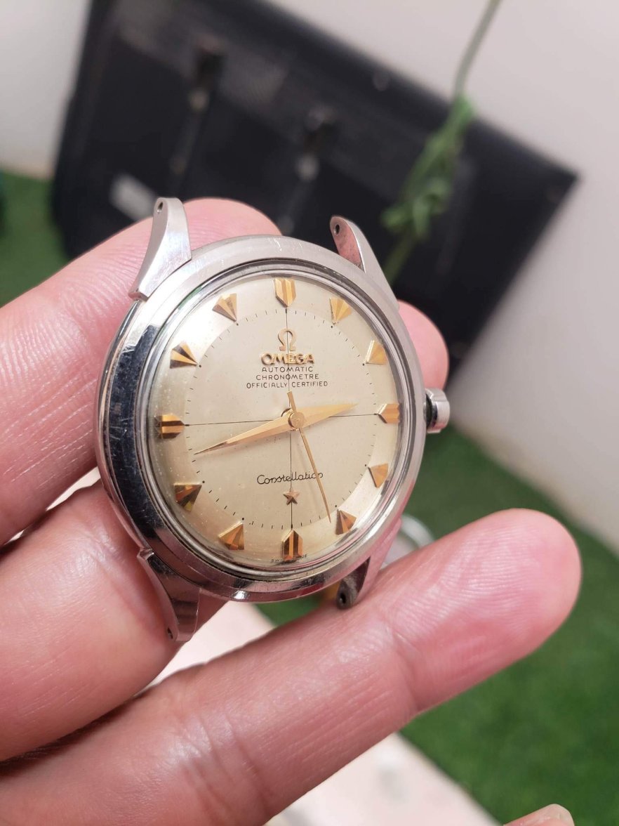
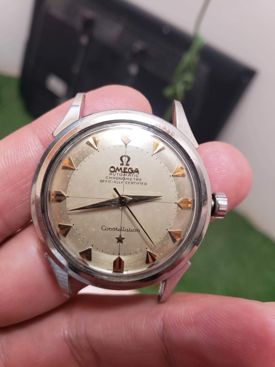
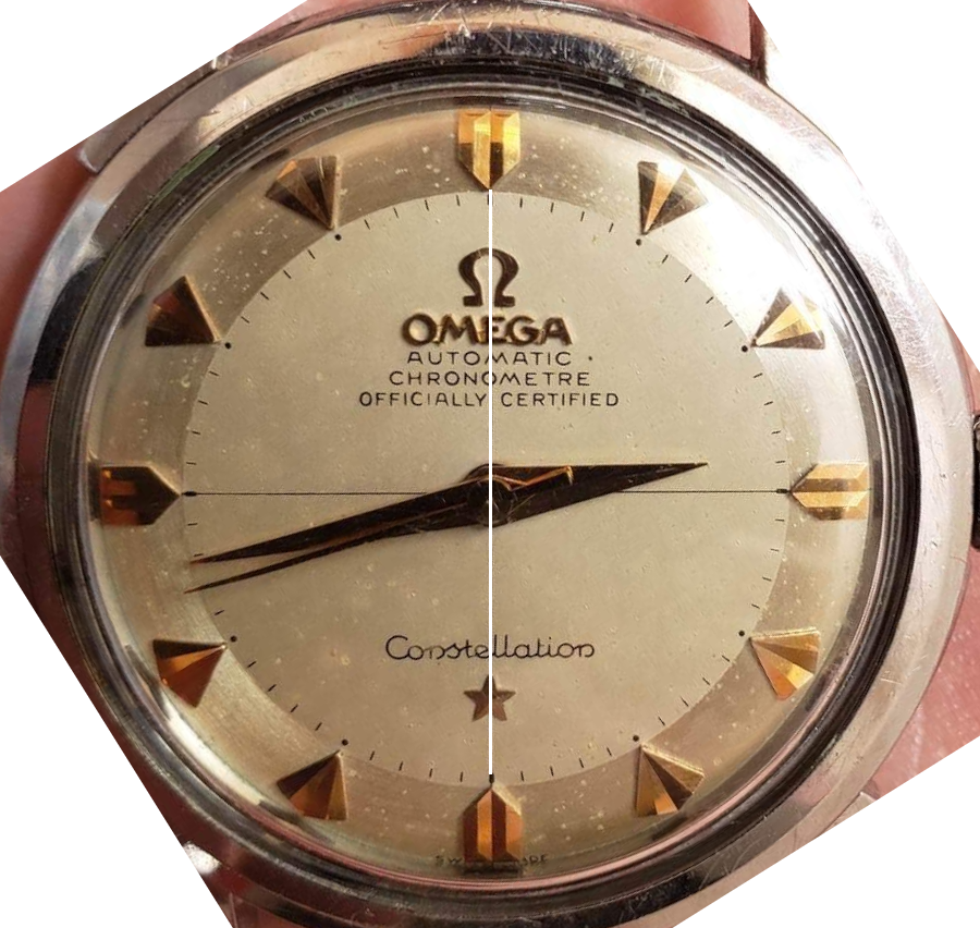
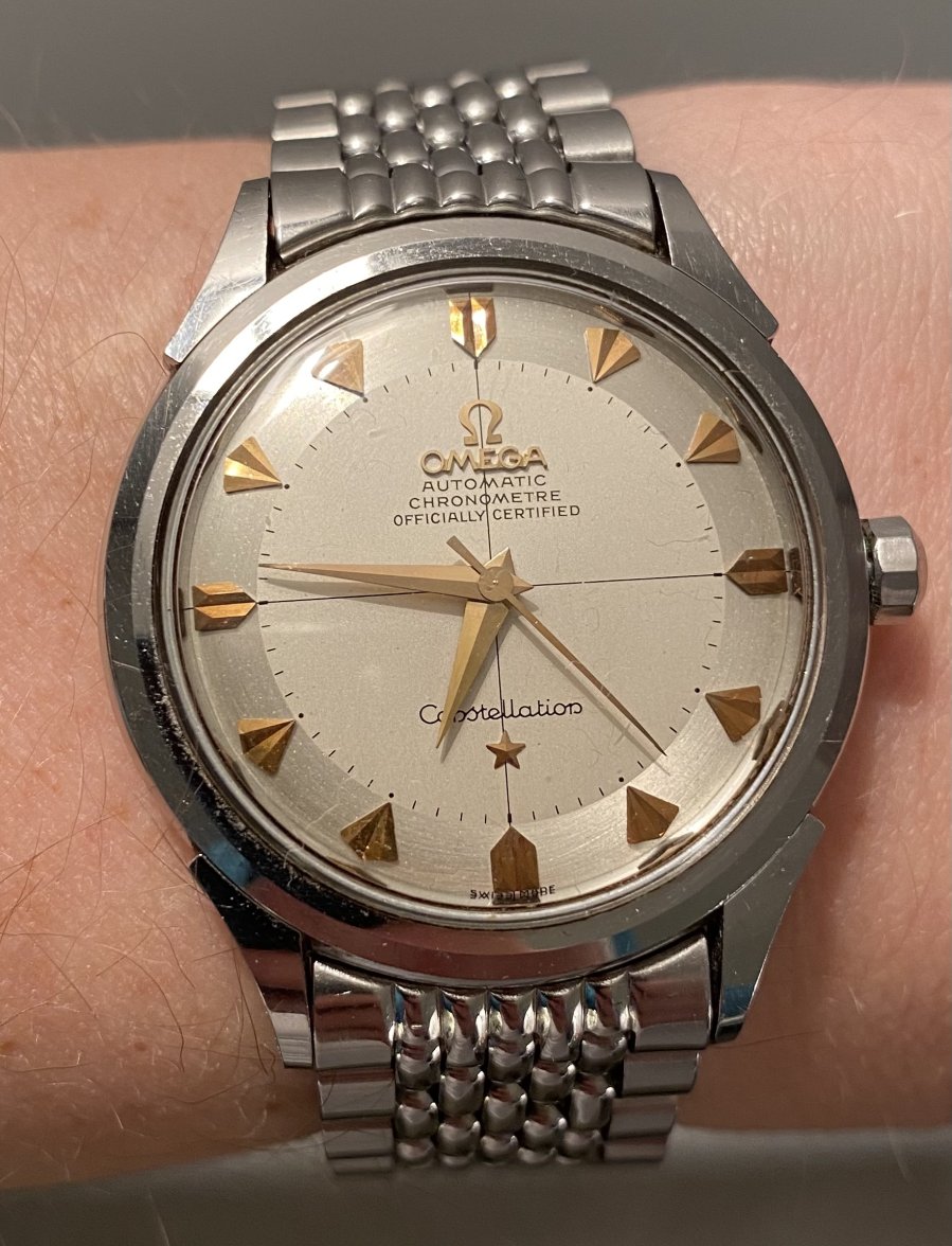
·I've been offered this SS no date arrowhead. It appears to be a 1st gen early model with the boxy As and sans serif font.
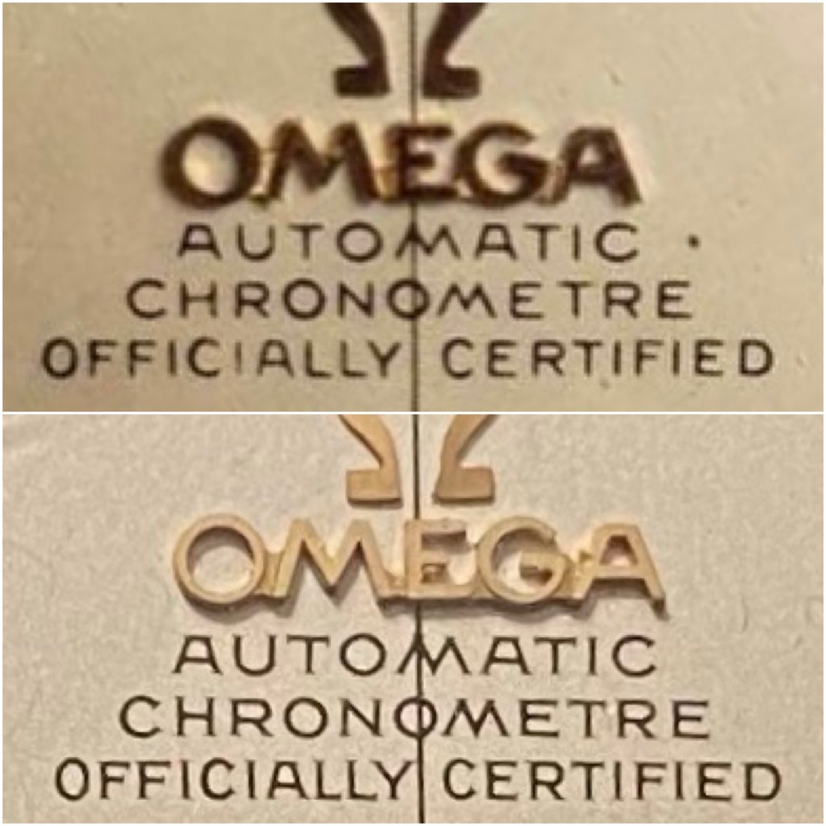
The things that caught my eye were the applied logo being off-center and the OFFICIALLY CERTIFIED line. Specifically the spacing between the wording and the location of the Y as compared to the vertical line.
I have seen others sold with the off-center logo.
I don't have a great pic of the SWISS MADE or the movement yet, which I'm told is a 505 but no pics yet or the back. But the SWISS MADE seems to be in a strange spot I don't recall seeing on Desmond's blog or in the REDIAL pdf.
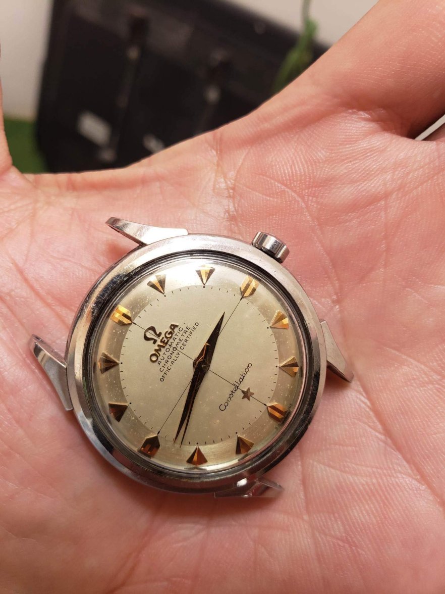
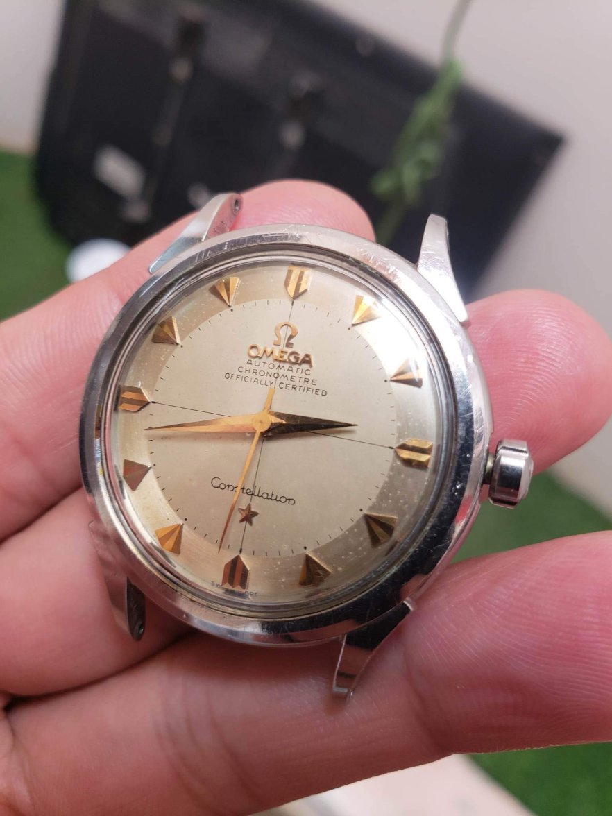
Edited: