- Posts
- 5,084
- Likes
- 15,690
eugeneandresson
·It seems like just a few weeks ago that I got to see last years novelties...
Lets cut to the chase and dive DEEP.

There has been some serious meme-age of these watches and some Rolex counterparts (i.e. Deep Sea in this particular model, the OP's and Daytona's below). Honestly though, in the flesh these are so much better in execution (I can't speak for the Daytona's, as those I have not had in hand, but the rest I have) on the points that have been allegedly 'copied'.

I never once thought 'Rolex Deep Sea'. The graduation from the bezel to the center of the dial is just fab - I was looking forward to see the orange/brown one, but that was not there. If you have ever put on a Rolex Deep Sea, you would undoubtedly have noticed that it looks and feels its proportions (I remember it looking/feeling mega-top-heavy, and too much for my wrist). The most surprising thing to me with the 'Ultra Deep' was the case. Whilst its a thick watch, they have made it feel compact on the wrist...as though the case shape/layout makes an optical illusion in 3D and appears smaller than it is (like Doctor Who's Tardis). It felt good on my wrist. And the new bracelet/clasp is fantastic (didn't take a pic of the clasp unfortunately).

And here is a ridiculous watch ... I absolutely love it ... when they made that gargantuan specimen in 2019, I too was hoping they would scale it down to 'human' proportions ...

I say ridiculous because it feels like nothing on the wrist...light as a feather. I think these will all sell well...

Love these lugs. Very much Tudor FXD ... I am surprised nobody has meme'd the crap out of Tudor(Rolex) for stealing this design 😉
And then there is this beauty.

This green is not suited to OB lighting. How can they even compare this to the 'Hulk'?! 🤦 It is nothing alike.

I don't gravitate toward these, so have not much to say about it, other than I like this green (and I don't like the 'Starbucks/Hulk' bezel green).

Then there was this beauty. I should have taken a pic of the movement as well ... beautiful.

Also worth noting (and I didn't take a pic, was too overwhelmed) : the crystal is domed. So when you look at the side profile, it is parabolic. Just lovely. Whilst the size suited my wrist, to me its shy of a home-run due to that size (40mm IIRC) ... it should have been round the 37mm mark. That silver dial though is a thing of great beauty...

I had zero desire to try on the white dialed DEEP.
Onto the Speedies.

These new Speedmaster 57's are very well executed ... especially the one with the sandwich dial. They have a similar movement to the Chronoscopes. The most outstanding part of them is the case-bracelet combo. They have bracelets like the Apollo 11 50th anniversary Speedmaster (so, 100% perfect), and the lug shape (should have taken a side-profile pic) is just beautiful : it reminds me of the new 321 ... but having a thicker base ... so the cutting is even more curved when looking into the lugs. It is just beautiful.


The bracelets are very very good. I am a fan. Being a regular Speedy wearer, I just couldn't get used to the dial layout and proportions.

These colored '57's left me a bit cold...

And then there was this 🥰 Definitely the pick of the batch for me (price-tag aside).

The bracelets are quite different (the polished central links, and the clasp is much bigger and a bit wider, so the taper too).


This one surprisingly left me colder then I expected...perhaps due to lack of bracelet, and perhaps due to this being a very nuanced green under unflattering OB lighting ... I would like to see it again ...

Wish I could have taken that box home!
Seeing these in the flesh has changed my opinion on the whole 'Rolex clone' meme-age regarding the OP's (I have seen those too, on multiple occasion). The colors and dials are nothing alike. Its difficult to put a label on these colors. Unlike the OPs' which are flat and monotone, these are dynamic and change. The 'saffron' color truly reminded me of saffron in reality (for those of you who cook...)...

Again, I should have taken more pics from different angles ... in some angles it was yellow ... in others with hints of orange. I wish Rolex did this with their OPs ... I felt nothing when I saw them (except for 1 color, the rest to me are just boring as hell in hand) even though I do prefer the cases and bracelets and dial layout/furniture of the OPs to these AT's.
The stand-out color to my current whims and fancies was this. I don't know what to call it and I can't remember the name, so I henceforth dub it the Aqua Terra 'Aperol-Spritz' for those who know the color (and taste) of that lovely cocktail which can't really be captured in photos ...


🥰🥰🥰


Just lovely.

The top row were especially interesting to me ... each one is a different color and like the 'Saffron' and the 'Aperol Spritz' each has its own unique color pallet.. I also found the 'Petrol' dialed one (feel free to submit your guesses which that is) pulling some strings. Omega outdid Rolex here with the dials IMHO.
My only problem with the Omega of new, and it has fast become the elephant in the room for me, is their price.
Hence why this one from last year still torments me, and I am not prepared to do a thing about it anytime soon ...

Lets cut to the chase and dive DEEP.
There has been some serious meme-age of these watches and some Rolex counterparts (i.e. Deep Sea in this particular model, the OP's and Daytona's below). Honestly though, in the flesh these are so much better in execution (I can't speak for the Daytona's, as those I have not had in hand, but the rest I have) on the points that have been allegedly 'copied'.
I never once thought 'Rolex Deep Sea'. The graduation from the bezel to the center of the dial is just fab - I was looking forward to see the orange/brown one, but that was not there. If you have ever put on a Rolex Deep Sea, you would undoubtedly have noticed that it looks and feels its proportions (I remember it looking/feeling mega-top-heavy, and too much for my wrist). The most surprising thing to me with the 'Ultra Deep' was the case. Whilst its a thick watch, they have made it feel compact on the wrist...as though the case shape/layout makes an optical illusion in 3D and appears smaller than it is (like Doctor Who's Tardis). It felt good on my wrist. And the new bracelet/clasp is fantastic (didn't take a pic of the clasp unfortunately).
And here is a ridiculous watch ... I absolutely love it ... when they made that gargantuan specimen in 2019, I too was hoping they would scale it down to 'human' proportions ...
I say ridiculous because it feels like nothing on the wrist...light as a feather. I think these will all sell well...
Love these lugs. Very much Tudor FXD ... I am surprised nobody has meme'd the crap out of Tudor(Rolex) for stealing this design 😉
And then there is this beauty.
This green is not suited to OB lighting. How can they even compare this to the 'Hulk'?! 🤦 It is nothing alike.
I don't gravitate toward these, so have not much to say about it, other than I like this green (and I don't like the 'Starbucks/Hulk' bezel green).
Then there was this beauty. I should have taken a pic of the movement as well ... beautiful.
Also worth noting (and I didn't take a pic, was too overwhelmed) : the crystal is domed. So when you look at the side profile, it is parabolic. Just lovely. Whilst the size suited my wrist, to me its shy of a home-run due to that size (40mm IIRC) ... it should have been round the 37mm mark. That silver dial though is a thing of great beauty...
I had zero desire to try on the white dialed DEEP.
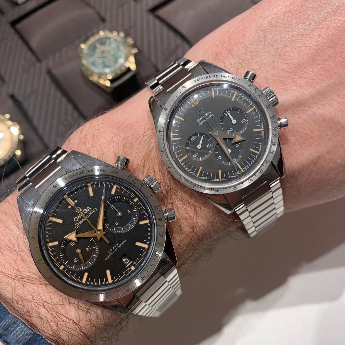
Onto the Speedies.
These new Speedmaster 57's are very well executed ... especially the one with the sandwich dial. They have a similar movement to the Chronoscopes. The most outstanding part of them is the case-bracelet combo. They have bracelets like the Apollo 11 50th anniversary Speedmaster (so, 100% perfect), and the lug shape (should have taken a side-profile pic) is just beautiful : it reminds me of the new 321 ... but having a thicker base ... so the cutting is even more curved when looking into the lugs. It is just beautiful.
The bracelets are very very good. I am a fan. Being a regular Speedy wearer, I just couldn't get used to the dial layout and proportions.
These colored '57's left me a bit cold...
And then there was this 🥰 Definitely the pick of the batch for me (price-tag aside).
The bracelets are quite different (the polished central links, and the clasp is much bigger and a bit wider, so the taper too).
This one surprisingly left me colder then I expected...perhaps due to lack of bracelet, and perhaps due to this being a very nuanced green under unflattering OB lighting ... I would like to see it again ...
Wish I could have taken that box home!
Seeing these in the flesh has changed my opinion on the whole 'Rolex clone' meme-age regarding the OP's (I have seen those too, on multiple occasion). The colors and dials are nothing alike. Its difficult to put a label on these colors. Unlike the OPs' which are flat and monotone, these are dynamic and change. The 'saffron' color truly reminded me of saffron in reality (for those of you who cook...)...
Again, I should have taken more pics from different angles ... in some angles it was yellow ... in others with hints of orange. I wish Rolex did this with their OPs ... I felt nothing when I saw them (except for 1 color, the rest to me are just boring as hell in hand) even though I do prefer the cases and bracelets and dial layout/furniture of the OPs to these AT's.
The stand-out color to my current whims and fancies was this. I don't know what to call it and I can't remember the name, so I henceforth dub it the Aqua Terra 'Aperol-Spritz' for those who know the color (and taste) of that lovely cocktail which can't really be captured in photos ...
🥰🥰🥰
Just lovely.
The top row were especially interesting to me ... each one is a different color and like the 'Saffron' and the 'Aperol Spritz' each has its own unique color pallet.. I also found the 'Petrol' dialed one (feel free to submit your guesses which that is) pulling some strings. Omega outdid Rolex here with the dials IMHO.
My only problem with the Omega of new, and it has fast become the elephant in the room for me, is their price.
Hence why this one from last year still torments me, and I am not prepared to do a thing about it anytime soon ...
Edited: