eugeneandresson
·Hi ΩF
As per usual, I grabbed the opportunity when it presented itself to me to go and see the new Omega novelties in the flesh. And here are some pictures with a few impressions. The focus is not always a hit in some shots .. sorry! It is quite a challenge taking pictures on a phone with a gloved hand. That said, the biggest drawback as you most likely know, is the lighting and shadows in boutiques, especially those without windows to let in the natural light. It is the worst for looking at watches, and even worse for photography. My local boutique has floor to ceiling windows, so great lighting under normal circumstances on the main floor, however whenever something that requires special attention happens (like showing off all the new watches), its usually down downstairs in the 'bar/chill zone'. I had an hour, and could have taken more pics, but as usual staring usually takes preference.
(This also goes to show what a great job the watch journalists do e.g. Fratello et al when photographing watches).
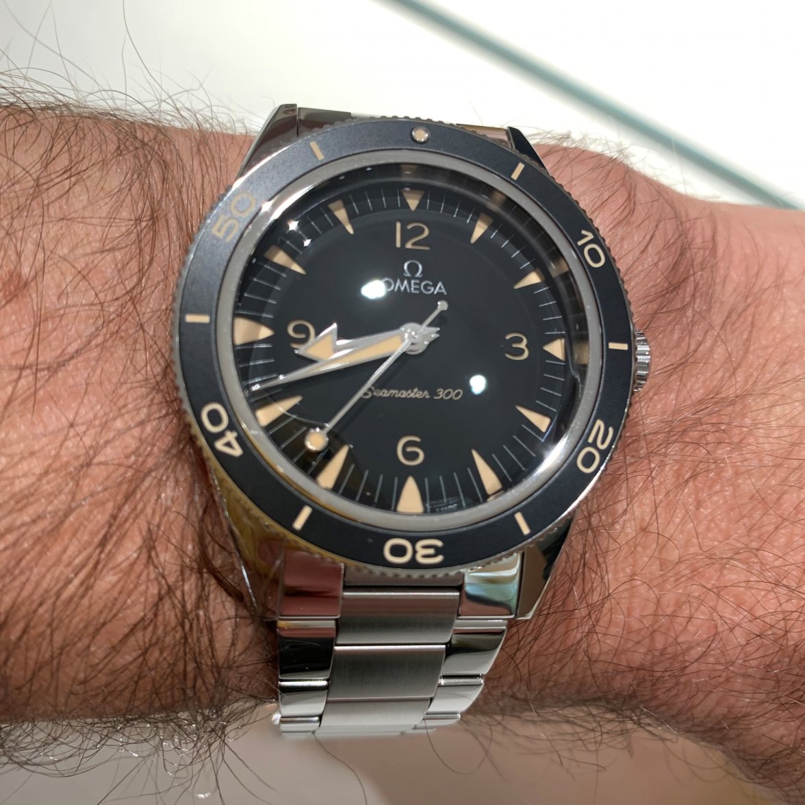
Bravo. These are (in my opinion) a huge improvement over the discontinued models. The immediate feeling I had was 'dimensions are proportioned correctly'...I always had the opposite feeling with the older ones...kind of a bit clunky in places. I like the aluminum bezel, and how its a match in color and texture to the anthracite dial. Top picture out of focus (sorry!). The lollipop is fab, and the layered dial is brilliantly executed and is something that will keep ones star-shaped-eyes busy IMHO.
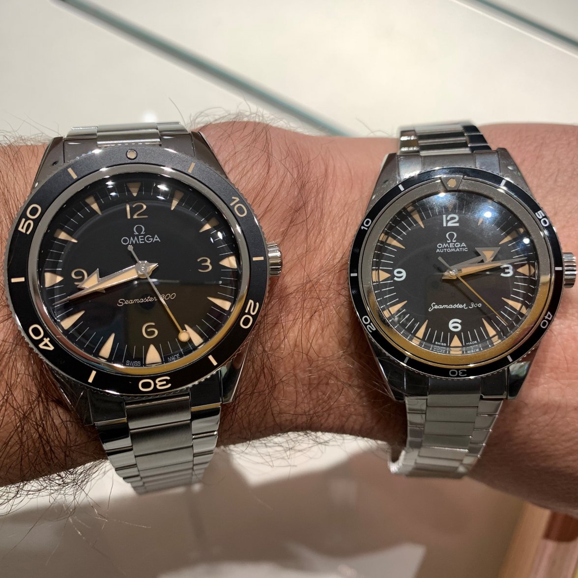
For this occasion, I wore my Trilogy (on Uncle Seiko flatlink) as the comparison, because, OG. Same same but quite different beasts (love my Trilogy!). The new bracelet is, like the watch, a huge improvement and very well executed. It has a nice taper, and is more refined than the old...it is not much thicker than the Uncle Seiko...it reminds me of the new 321 Speedy and Apollo 11 50th anniversary bracelets which are just a little bit thicker than the vintage inspirations, but a lot more solid/robust and well engineered. The clasp (didn't take pics) however is quite a lot thicker than the bracelet (reminiscent of the Trilogy clasps), but a lot narrower due to the taper. This may put some of you off...not certain it would bother me.
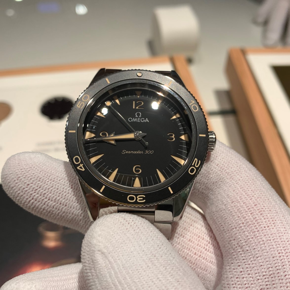
Better focus. That dial 🥰
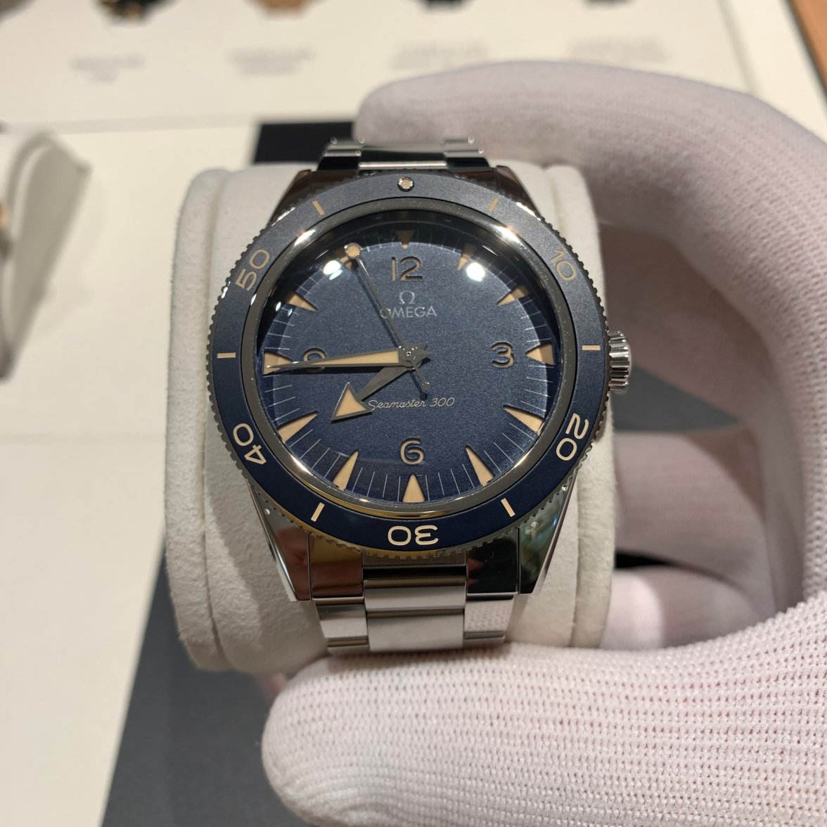
Onto the blue...
Also full 🥰...
I don't have a clear favorite and would have a hard time picking. The amount of black (and lack of blue) dials in my collection might sway me in this direction ...
And onto one of my top two picks of the new releases...
Out-of-focus (sorry!)...
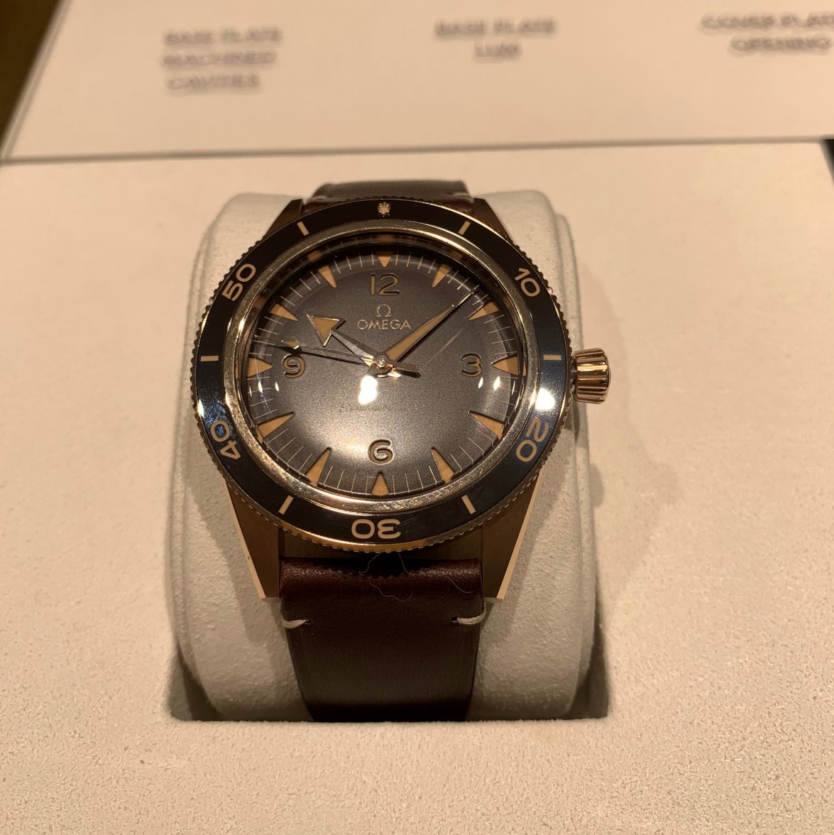
This is my pick of the bunch. Looks so good on my wrist, and with my skin-tone (and would be even better in summer). didn't take a wrist shot...didnt want to clip it in...
Horrible lighting!
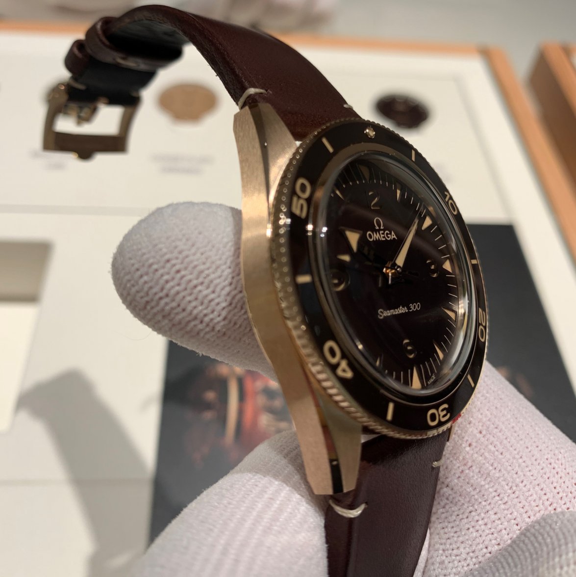
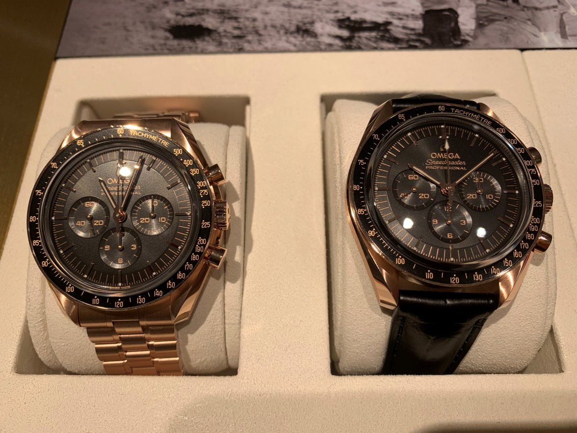
These photos (and the boutique lighting) don't do this watch justice. My impressions were that it is a stealth-watch. It feels more bronze than gold (perhaps because it has more bronze than gold in it). Would have preferred to see this one in natural lighting. I can't help to question the lack of a bracelet...
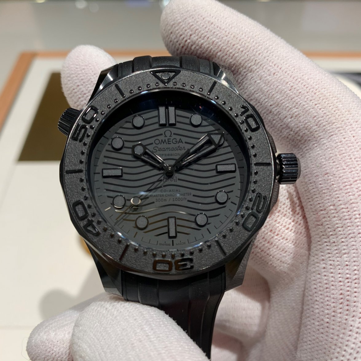
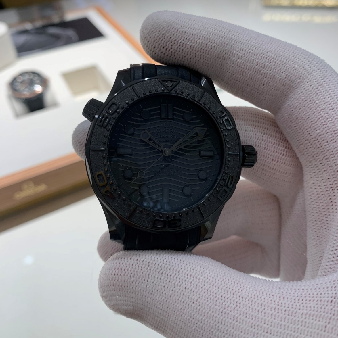
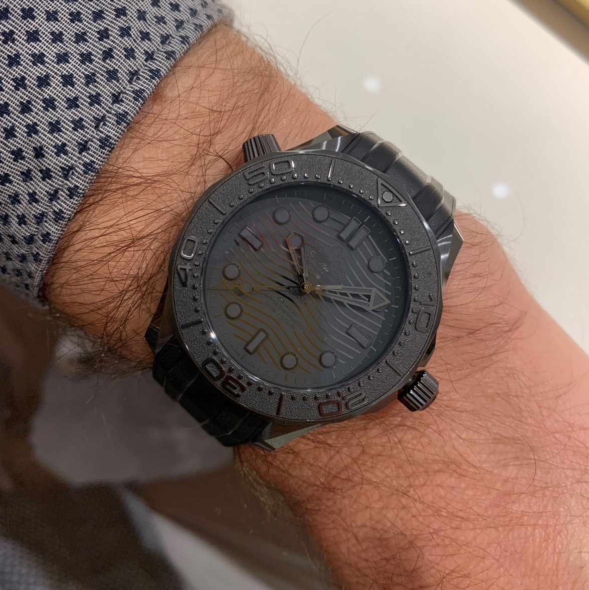
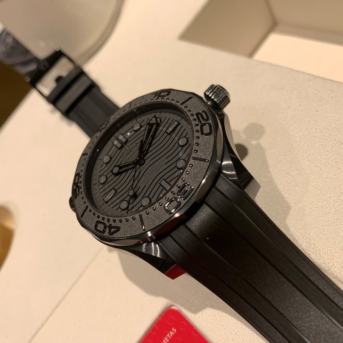
But for me the star of the show was this stealthy beast.
Even legible in shadow (IMO...can argue this point) - spot light vertical plane is behind the caseback in this shot, and my body is blocking out the other light sources, so is in full shadow. I find the contrast of the dial/hands/lume with their different shapes (and the waves) and tones really outstanding on this 'black black'...more so than on the black black speedy.
Face up, not catching light.
Face up, catching light.
100% 🥰 ... but that's just me.
The strap is very comfortable, but quite light in comparison to the head.
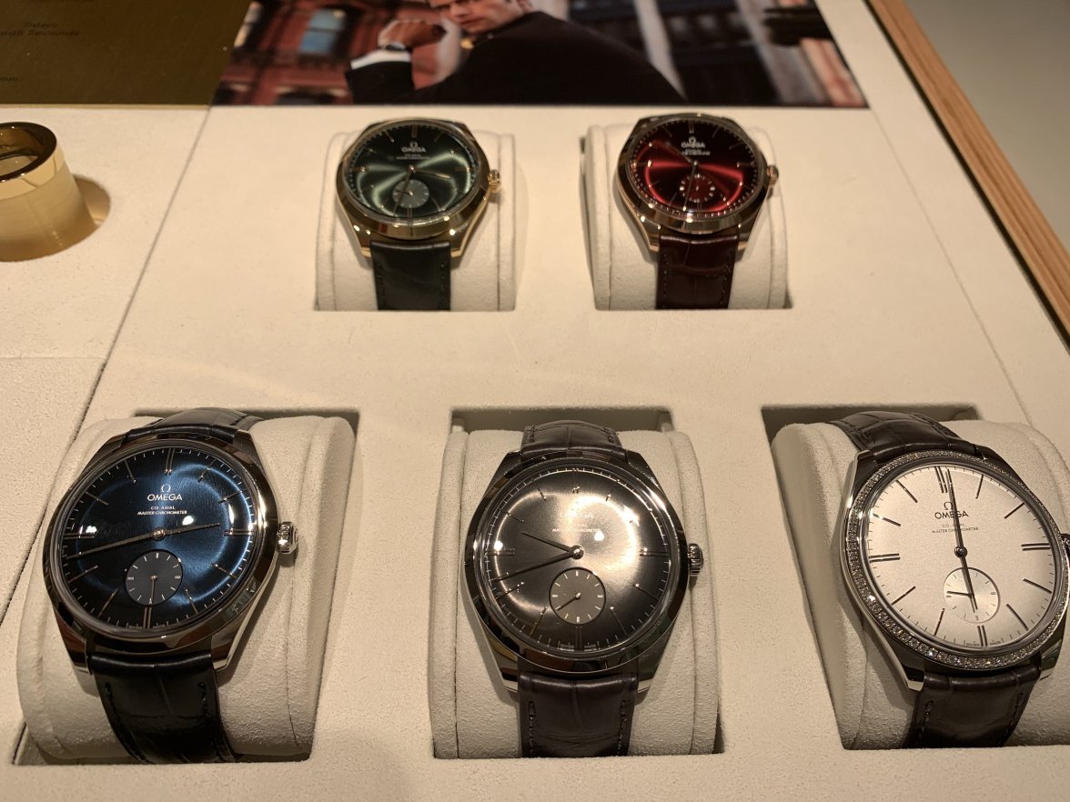
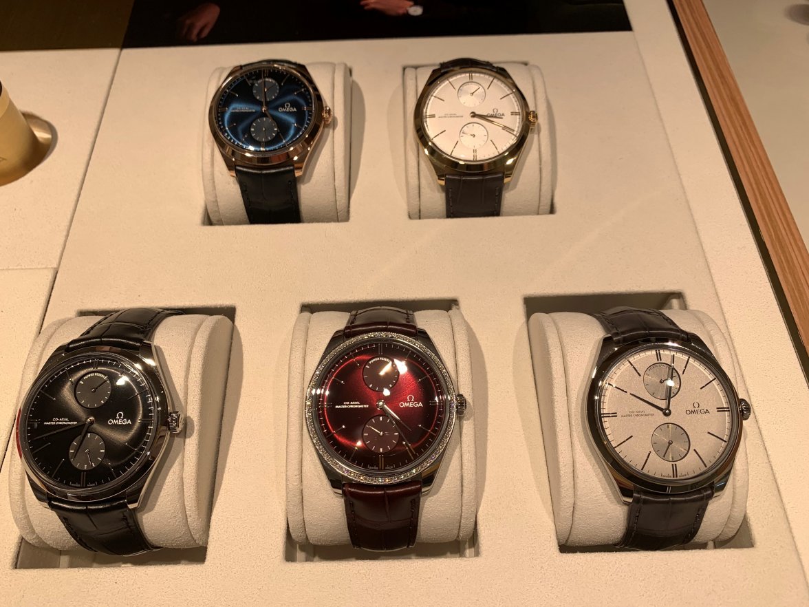
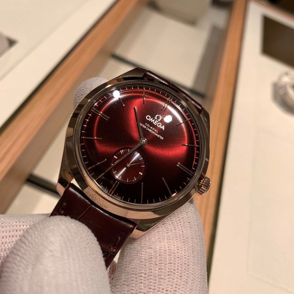
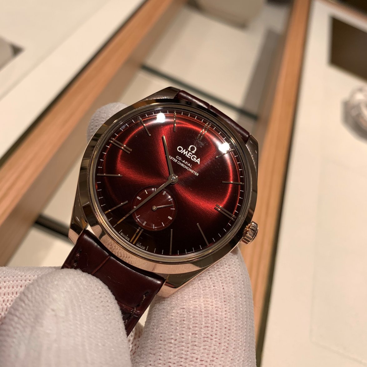
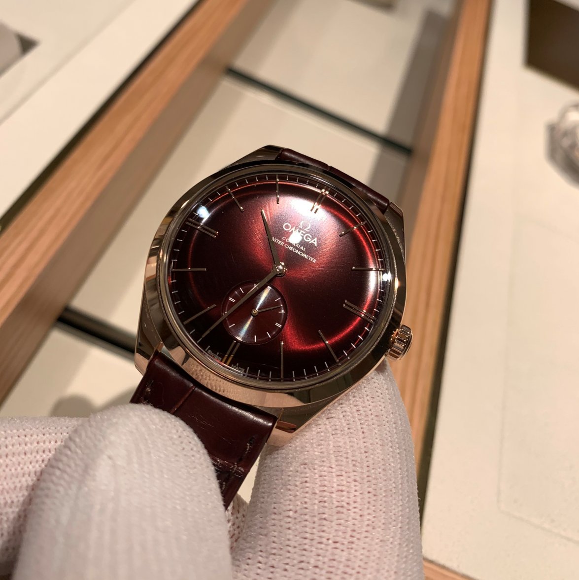
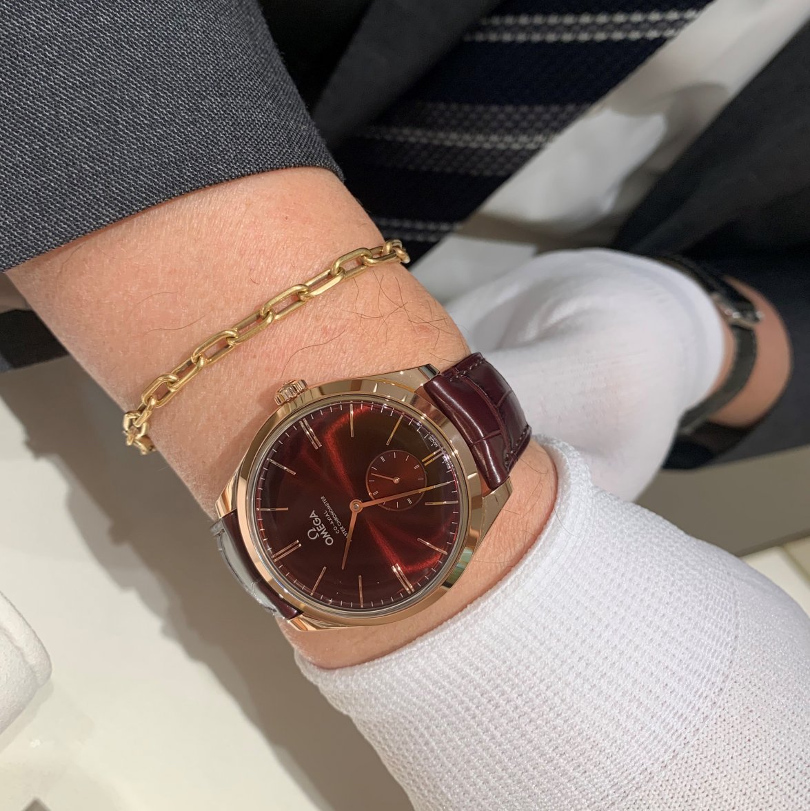
Then, because its always great having a show and tell, I was shown the following Deville Tresors with small seconds and Power-Reserve indicators.
Their dials like flirting with light and never look the same from a different angle. They are wonderful...
A golden bridge for the golden case...
One of my favorite staff members who loves talking watches, and showing his picks on the wrist...
The following sequence of shots are taken in the same position, but with slight rotation of the dial to attempt to highlight how it plays with the light...
My only take on these were : I prefer the central seconds. They look classic and timeless, yet modern (due to proportions and case shape)...they are however not watches for me.
The above watches have 65h power reserve (I may be off a bit, might be a bit less), and those with power-reserve-indicators are 80h. I did not look too much at these...they were much of a muchness...
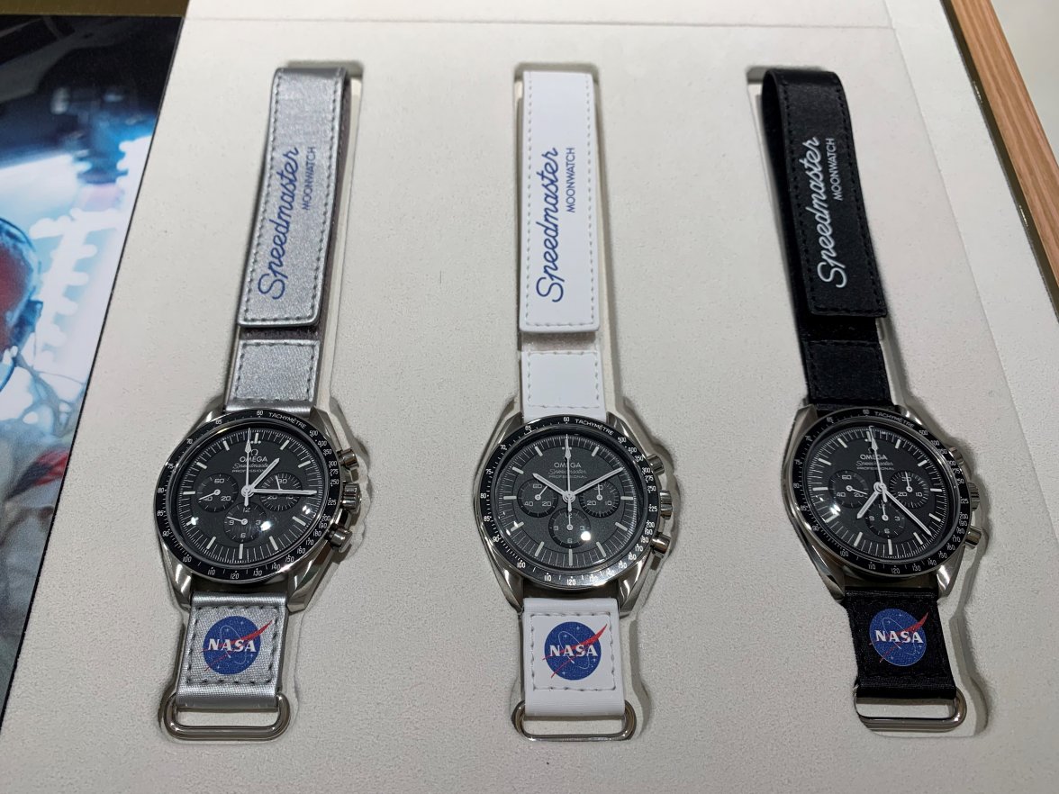
The Speedy straps...
Great straps, totally dislike the advertising. I jokingly (and honestly) mentioned this to management, and told them that unfortunately I do not have the matching underwear to pull off the straps...if I did, these would be for me.
Another impression I got (this is the second time I see the new Speedies) is : the 'Omega Speedmaster Professional' font jumps out to my eye...it feels more prominent than older watches...and the corrected 1/3 second division markings...both make a strange impression to my pedant eyes. I still haven't decided if it is good or bad...however I do really like the blacker step dials and the new cases and bracelets...
Then, just because I can't get enough of these...
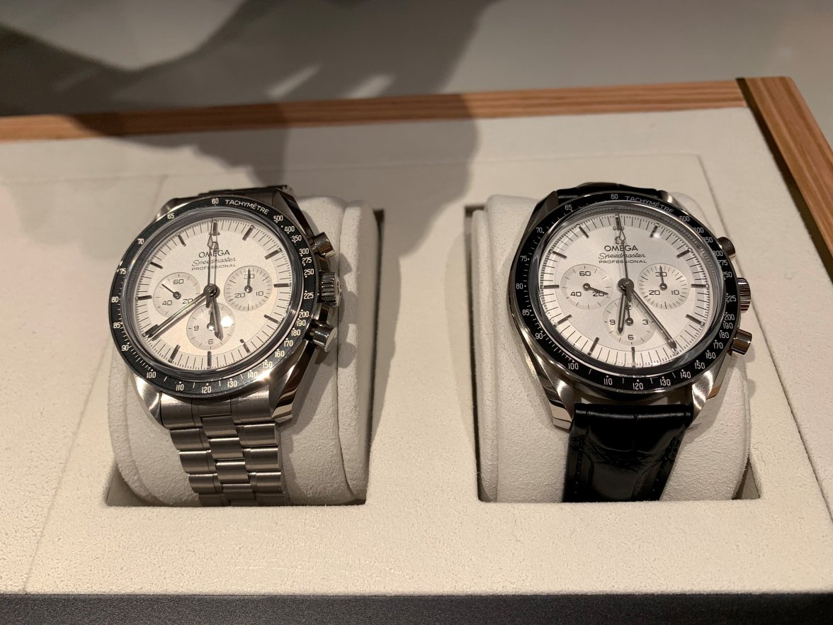
The Canopus Gold would be my pick.
Discussion with the Sedna gold was about different gold alloys and skin tone ... this particular model we felt best suited to a sunbathed-brown tan, and summer...however I think it looks great in the above shot on lack of tan...and just look at that dial!
As much as I love these, I feel they exist to simply reinforce my decision to jump on the A11 50th Moonshine Gold bandwagon (thanks to the ultra-influencers RJ and Mike for literally pushing that watch into my hands (and face 😁) at the last Baselworld #RIP ... which totally 180degree changed my opinion and made me order one the next day ... fickleness thy name is watchcollector 🤦)
The conversation was going strong at this point, and I hadn't seen one of these, so out it was with it...
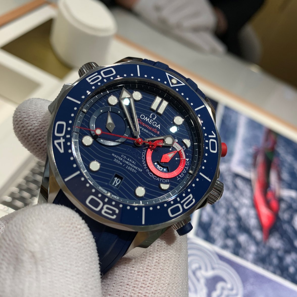
The lights do this no justice (like most).
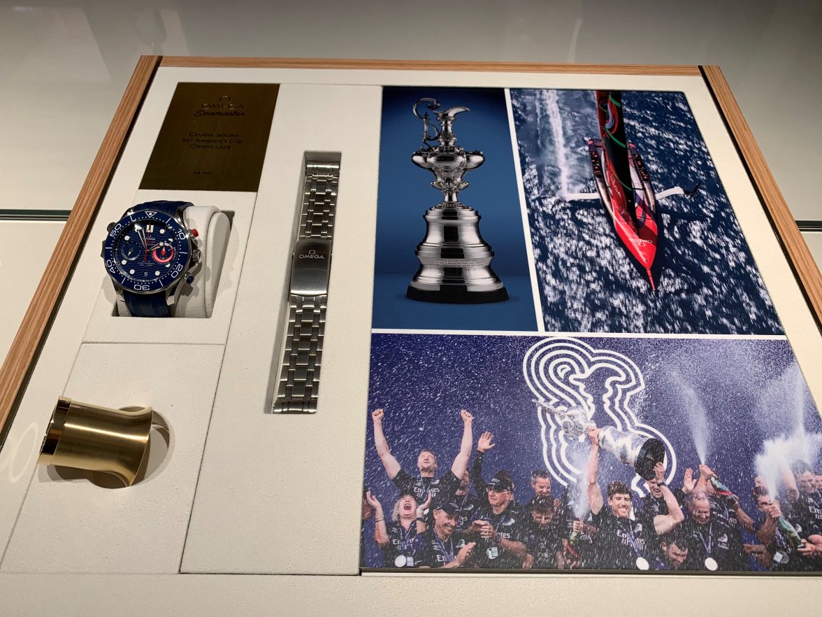
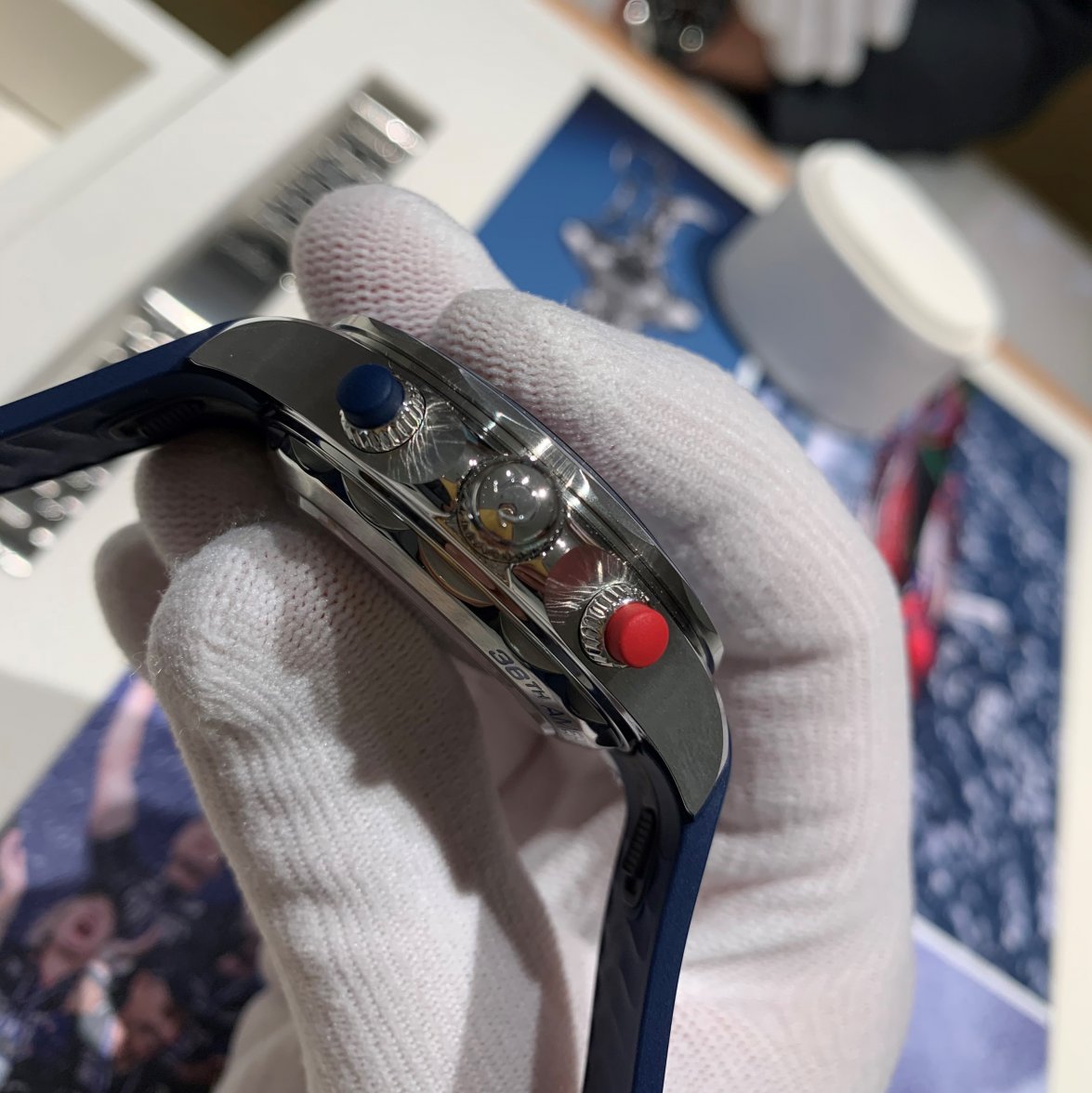
This is a neat beast of a tool watch packed with gadgets. I havent yet figured out what the disc under the 3 o'clock register does yet...it was one of the first things I noticed. Next cool gadget was the chrono lock (on the left...beneath the HeV, that I didn't think to photograph 🤦)...busy sailors can start their chrono and lock it so that working on deck will not mess with it...
Tried (and failed) to capture it properly...
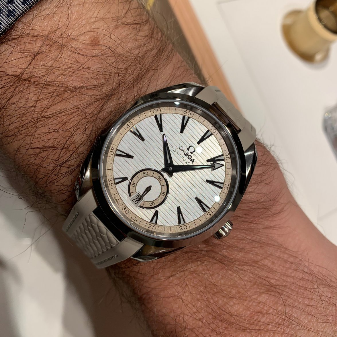
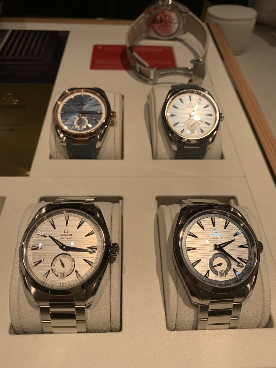
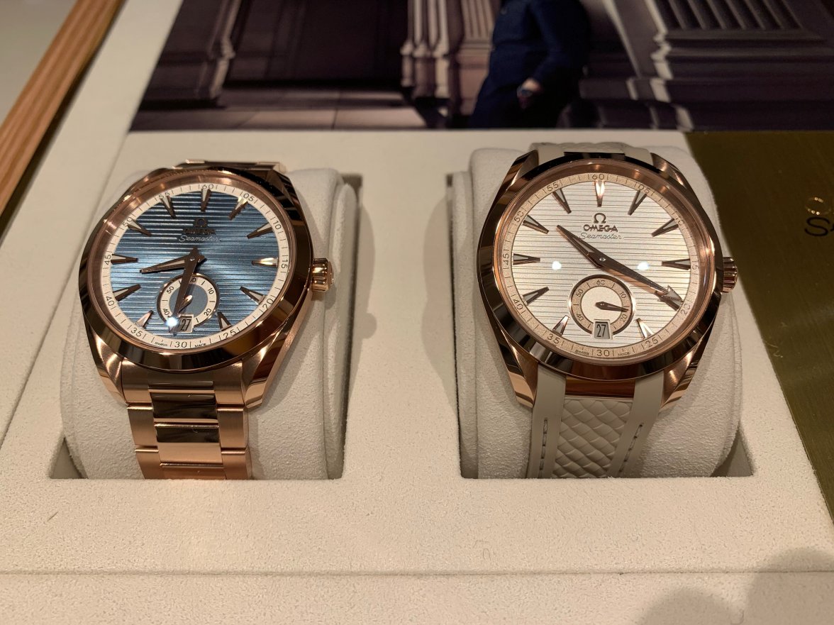
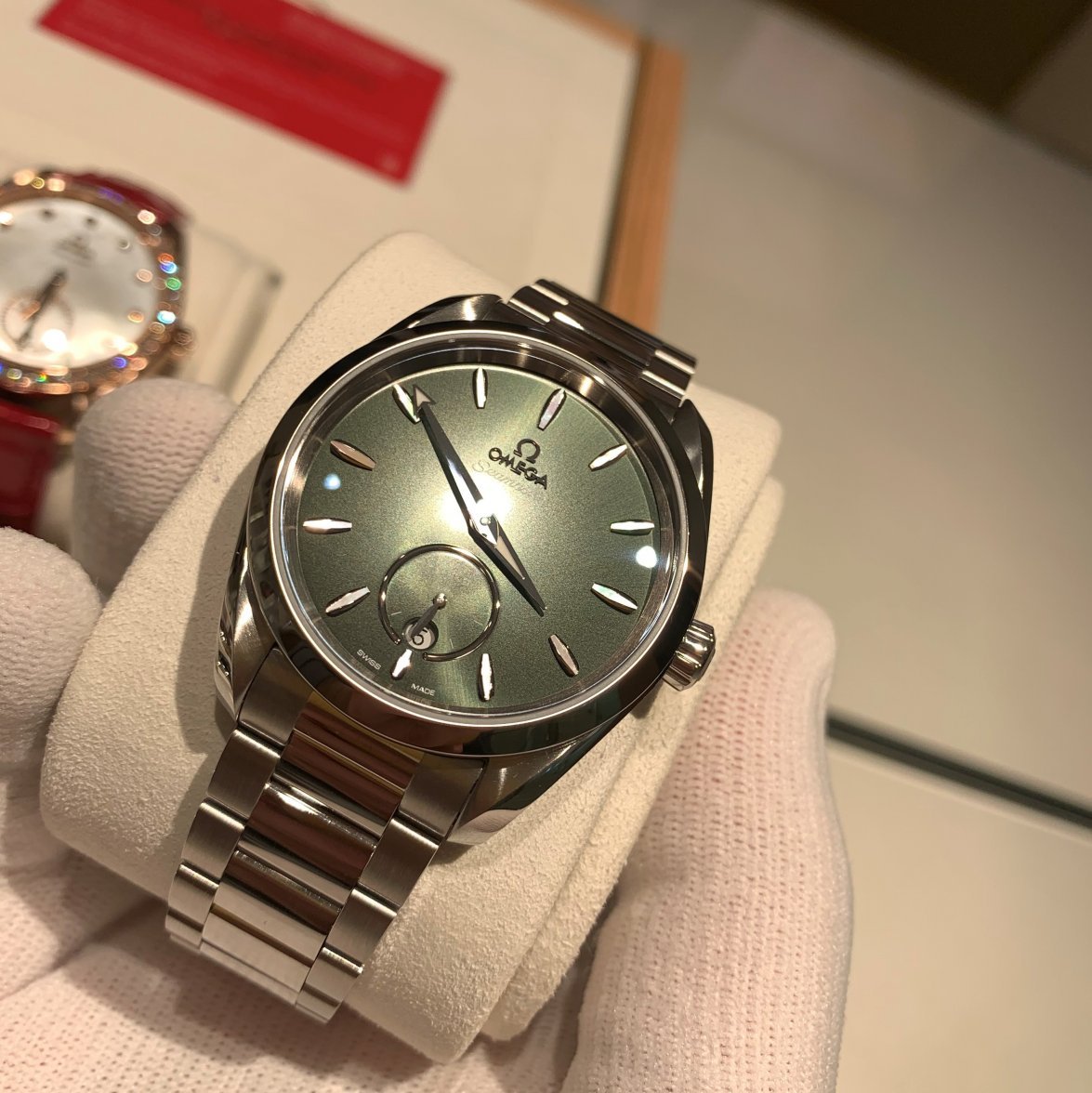
Apparently there are some new Aqua Terras as well...also with small seconds.
This was the most interesting one to me. I can't help to feel the date windows destroys the running seconds though.
...and same in gold...
Great watches...
And because I had 10 minutes left...something for the ladies!
And that was my hour, done.
Edited:
