- Posts
- 41
- Likes
- 9
LeBapt
·Hi everyone,
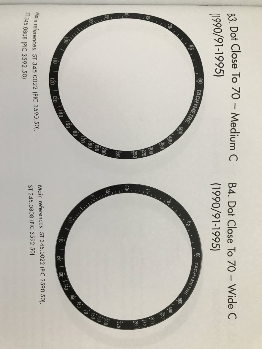
I have made some researches here and there but I am not sure of the answer about which one of the below 2 inserts would match a 1991 Speedmaster?
As per speedmaster101.com the 70 non serif would be period correct, but I am just not sure about the font of the word TACHYMETER which is bolder than the 70 with serif.
Any thoughts?
Apologize in advance but these are the cleanest pictures I can get with my phone.


Thank you
I have made some researches here and there but I am not sure of the answer about which one of the below 2 inserts would match a 1991 Speedmaster?
As per speedmaster101.com the 70 non serif would be period correct, but I am just not sure about the font of the word TACHYMETER which is bolder than the 70 with serif.
Any thoughts?
Apologize in advance but these are the cleanest pictures I can get with my phone.
Thank you
Edited: