o.m.e.g.a
·Hi,
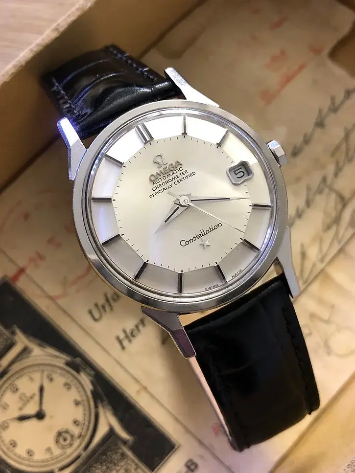
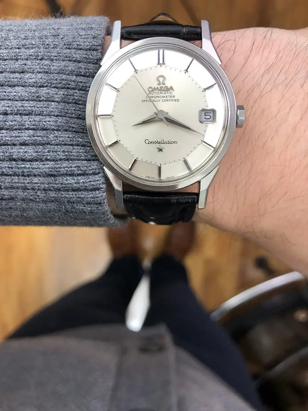
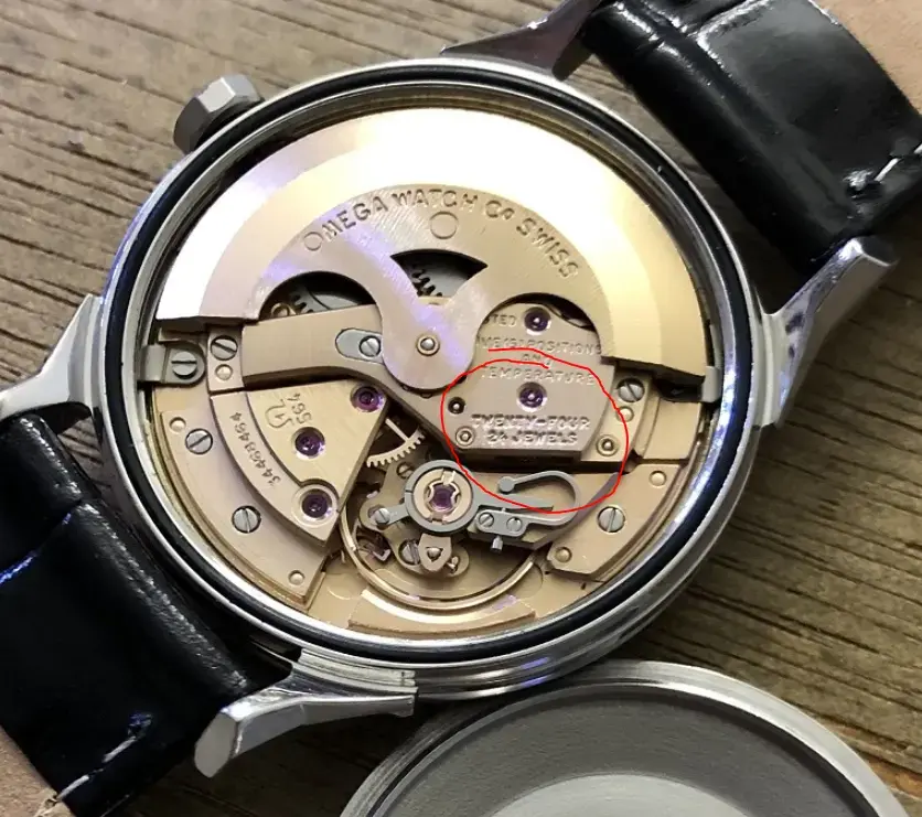
1/ "OMEGA" applied logo is very close to "Automatic".
2/ It practically runs over the 1st letter A.
3/ I'm under impression that "OMEGA" and "Automatic" and not really parallel. Distance between "A" in "OMEGA" and "C" in "Automatic" is larger than "O" in "Omega" and "A" in "Automatic".
4/ Any other tell-tales ?
ps. Edit: just correcting a typo.
Edited:
