- Posts
- 73
- Likes
- 223
Farrowla
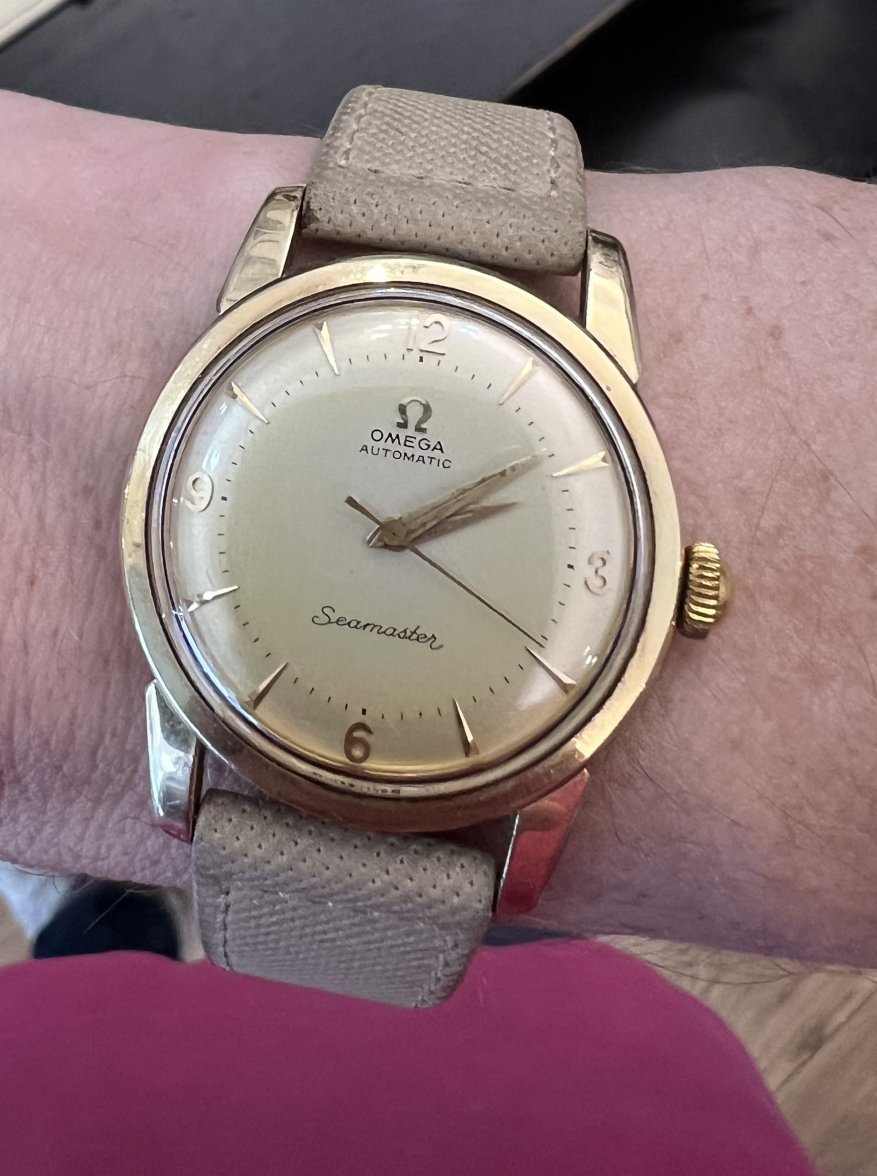
·Hi all. I came across this vintage Seamaster, described as late 1950s model - and with a 1,600 euros price tag.
I’m still very early in the research & learning stage - and trying to understand more. But from what I’ve picked up so far, the price seems very high. And is it me, or is the “S” in Seamaster wrong (ie not the coat hanger “S”)?
I’m still very early in the research & learning stage - and trying to understand more. But from what I’ve picked up so far, the price seems very high. And is it me, or is the “S” in Seamaster wrong (ie not the coat hanger “S”)?