Vintage 1950s Seamaster - dial query

Posts
48
Likes
167
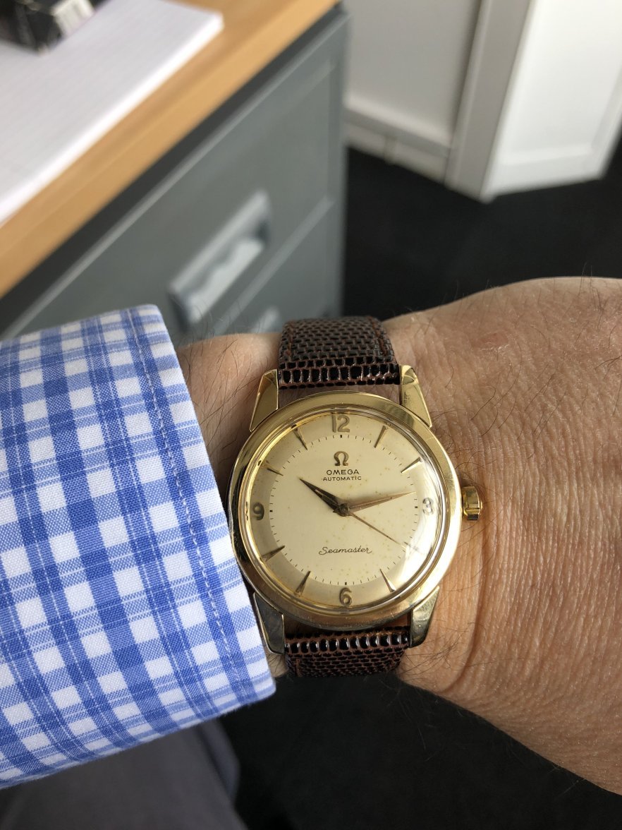
Hi all. I came across this vintage Seamaster, described as late 1950s model - and with a 1,600 euros price tag.

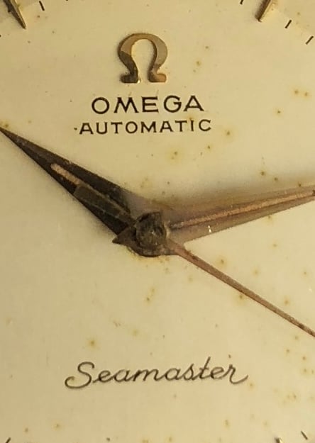
I’m still very early in the research & learning stage - and trying to understand more. But from what I’ve picked up so far, the price seems very high. And is it me, or is the “S” in Seamaster wrong (ie not the coat hanger “S”)?
 
Posts
10,870
Likes
19,071
That’s a legit dial with that ‘S’ but assuming it’s gold capped the price is ridiculous
 
Posts
48
Likes
167
That’s a legit dial with that ‘S’ but assuming it’s gold capped the price is ridiculous

Thanks. I just assumed all from this period came with the coat hanger. And it’s a steel case back…
 
Posts
54
Likes
41
the watch seems to be ok , the crown doesn’t looks right to me though . the watch is in decent condition but for a gold capped the price is extremely high . you can find similar ones for around 400-700 $
 
Posts
48
Likes
167
the watch seems to be ok , the crown doesn’t looks right to me though . the watch is in decent condition but for a gold capped the price is extremely high . you can find similar ones for around 400-700 $

Thank you. I think he saw me coming - full of wide eyed wonder! Lesson learnt
 
Posts
9,325
Likes
14,747
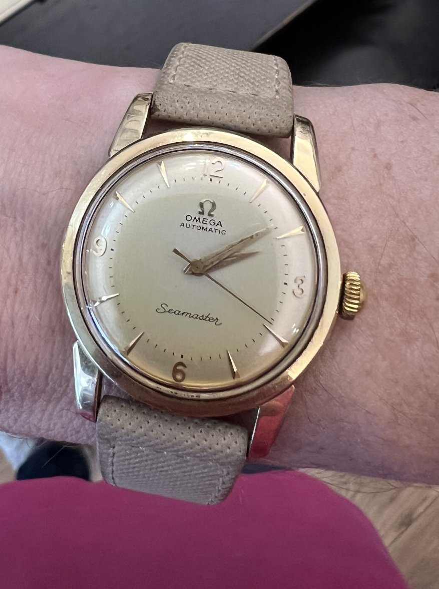
While the S is correct, I think it possible that it is a good redial. The S and e of Seamaster don't usually touch and also the top text is missing the usual serifs, though it's hard to be sure since the resolution isnt quite high enough. It may be original, but it may not. It also seems to be lacking the two tone ring round the edge which gives a kind of pseudo pie pan effect. Whatever, it is overpriced by a factor of 2-3. Here is mine, in solid 18K for comparison:

IMG_1121.JPG
IMG_1121 2.JPG
Edited:
 
Posts
48
Likes
167
While the S is correct, I think it possible think that is a good redial. The S and e of Seamaster don't usually touch and also the top text is missing the usual serifs, though it's hard to be sure since the resolution isnt quite high enough. It may be original, but it may not. It also seems to be lacking the two tone ring round the edge which gives a kind of pseudo pie pan effect. Here is mine, in solid 18K for comparison:

IMG_1121.JPG
IMG_1121 2.JPG

Thank you - and yes, it definitely did not have a two-tone dial. The dial also seemed a bit too clean to me given its supposed age. When you mention the serifs on the top text, do you mean the Omega logo?

Lovely watch by the way!

edit 1: just saw your close up and now I see what you mean.

Edit 2: i’m scrutizing the dial again and there seems to me a faint two tone as you described, but certainly not obvious.
Edited: