Type Crimes: Bad watch typography

Posts
2,869
Likes
14,685
I rather like well-done typography, especially on vintage watches. It's a joy when designers make thoughtful typeface / font decisions, and I wince when there are bad decisions. And bad decisions can be made for watches at any price point (yes, even Pateks). And good decisions can be made even for Kickstarter watches.

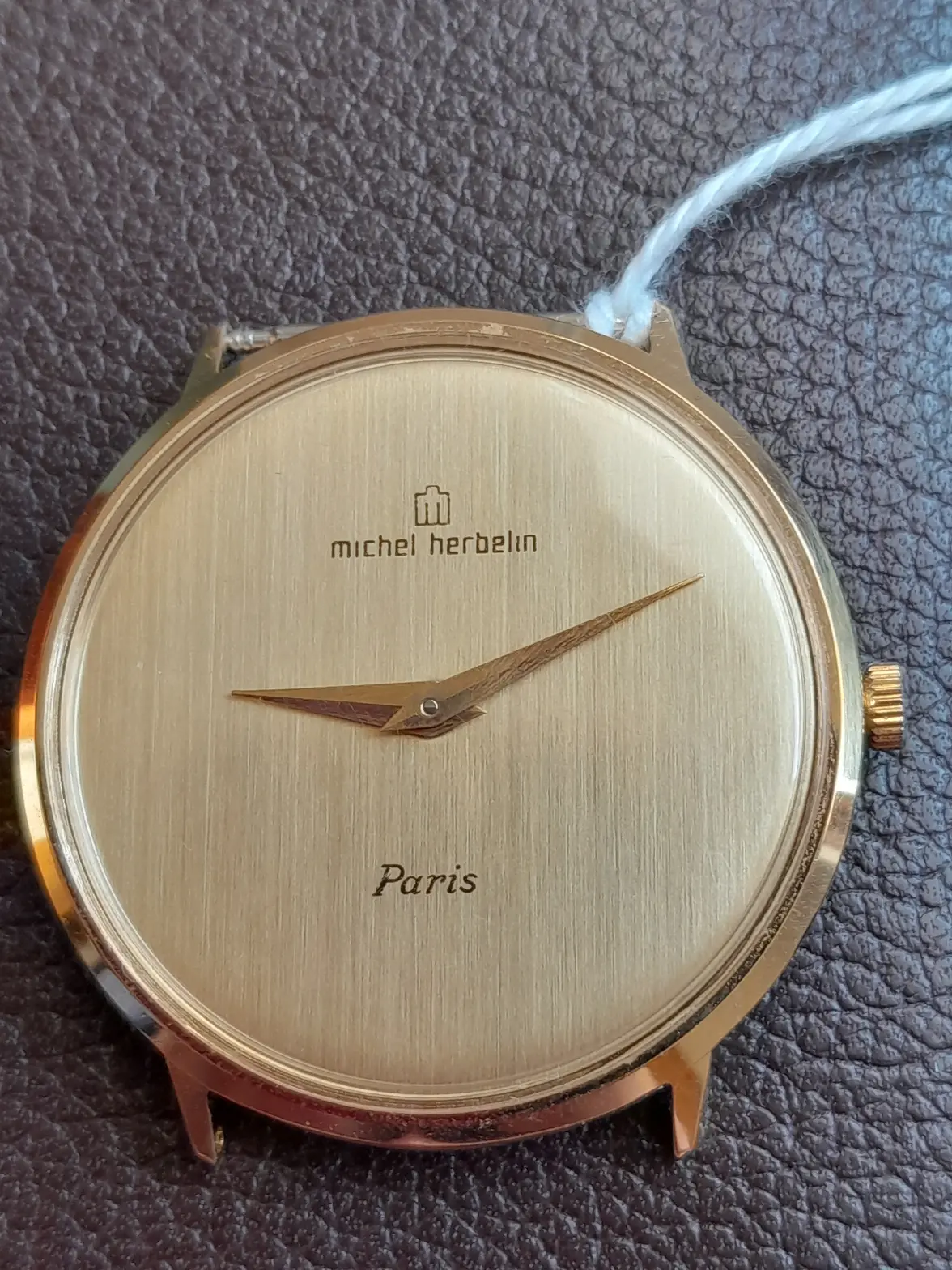
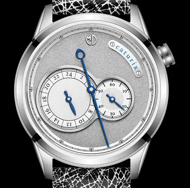
For example, the choice of typeface is quite decent even on a $350 Kickstarter regulator watch. (pic from MDwatches)


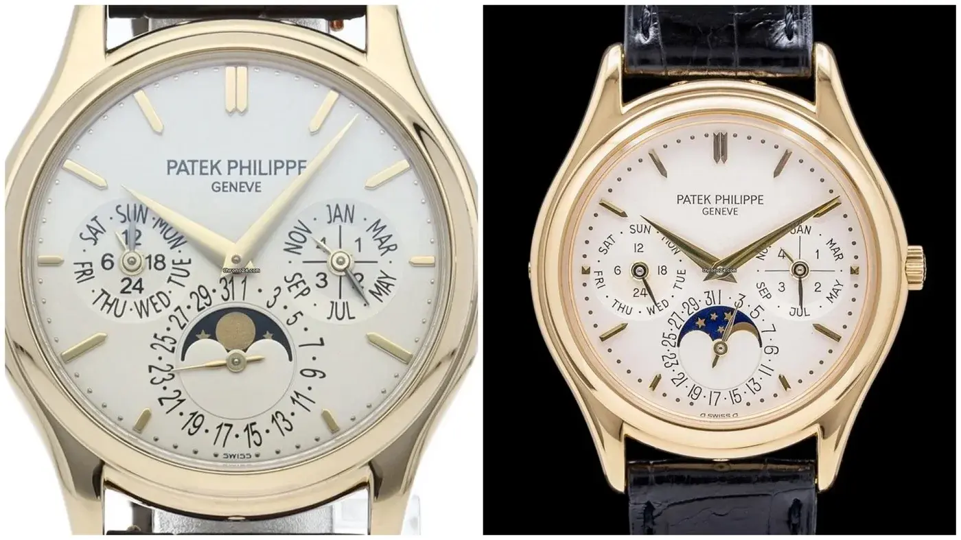
In contrast, on a Patek QP that is easily a 100x more expensive than the prior example, the typography can still be poorly done.

In the PP5140 (left) vs the PP3940 (right), the 5140 dial looks so much more crowded due to the choice of font. The fonts are too large, making the subdials look crowded (especially the left subdial). On the lower date subdial, the "5" and "27" are also smaller than the rest, which is just weird. In contrast the 3940 dial is so much more balanced in terms of choice of typeface and size of font. (pics from Chrono24)

In contrast, Lange pays a lot of attention to typography, as do several other brands.

So what other egregious typography crimes have you all seen previously, whether on vintage or modern watches? Would be curious to see!
Edited:
 
Posts
20,215
Likes
46,879
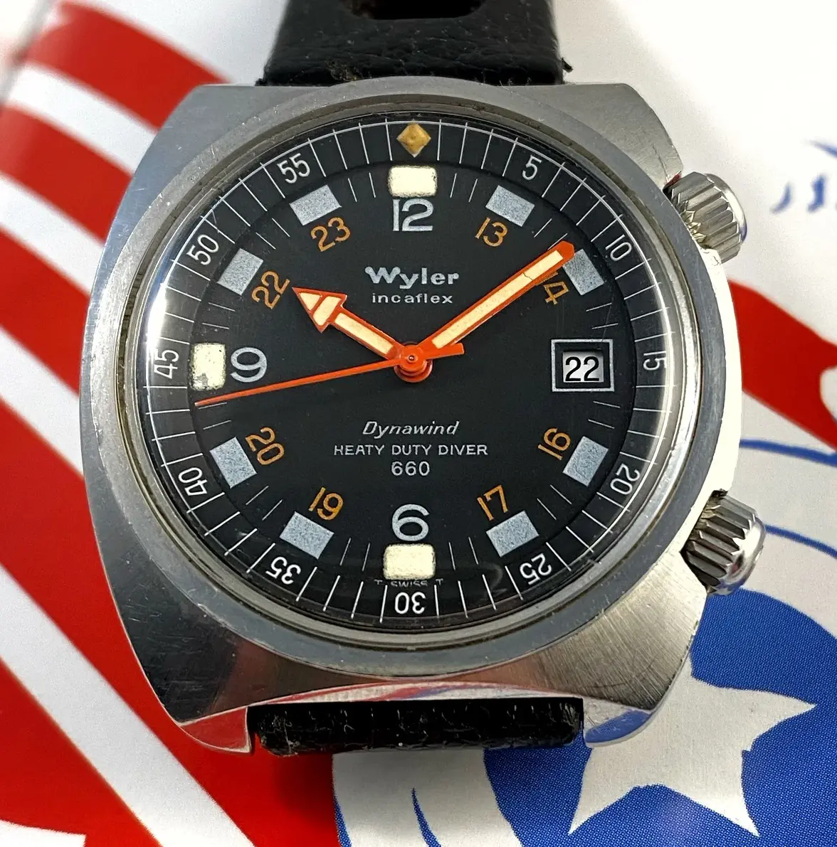
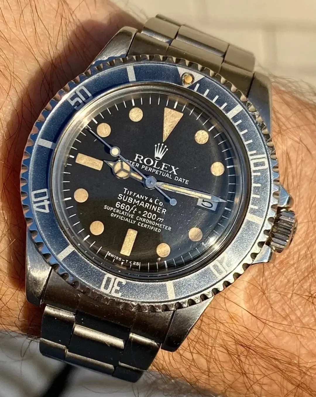
I don't know about bad typography, but how about a typographical error.

 
Posts
17,535
Likes
26,540
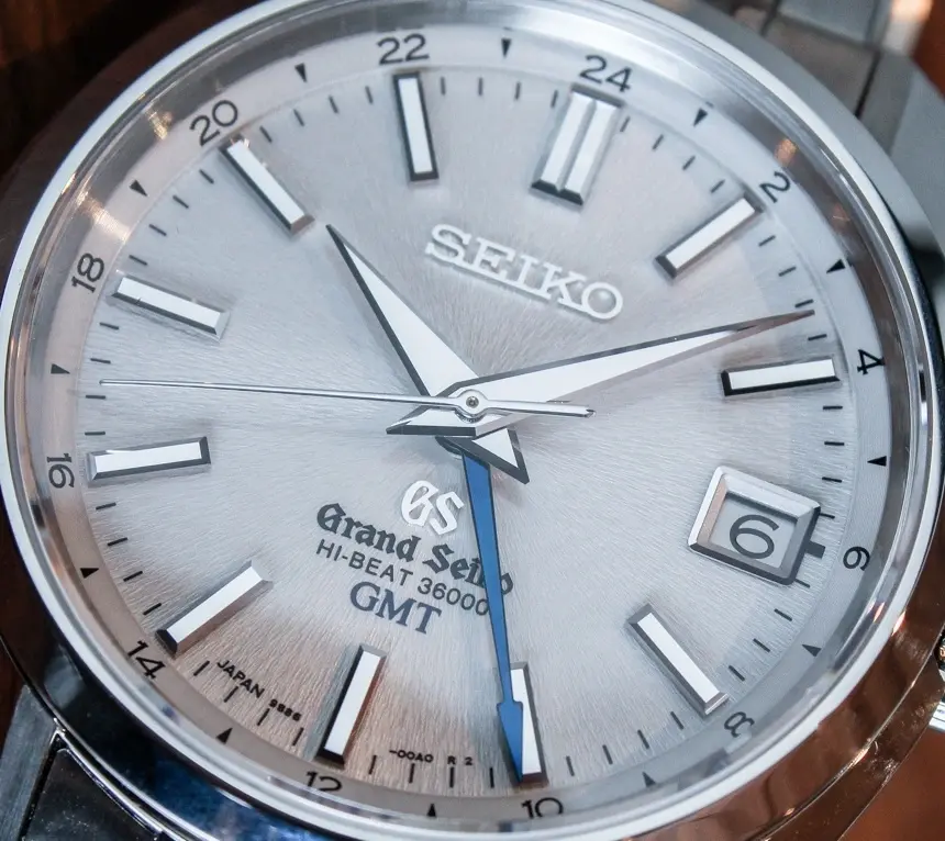
Looks at the Grand Seiko with 5 fonts on the dial and one is straight out of an 80’s DnD adventure.
 
Posts
2,869
Likes
14,685
Looks at the Grand Seiko with 5 fonts on the dial and one is straight out of an 80’s DnD adventure.
We need pics for this! 😀
 
Posts
2,869
Likes
14,685
This?
Good one! And if you include the "Japan" between 6 & 7 O clock, and the hour numerals, there are a mind boggling 7 typefaces on the dial ::facepalm1::
 
Posts
128
Likes
291
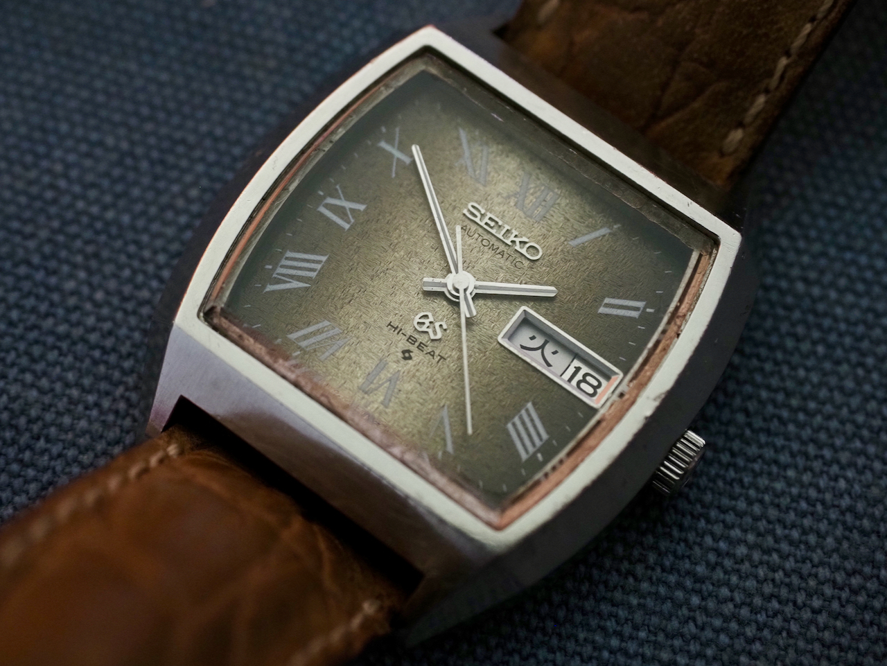
The vintage Grand Seikos seem to be better in this regard.


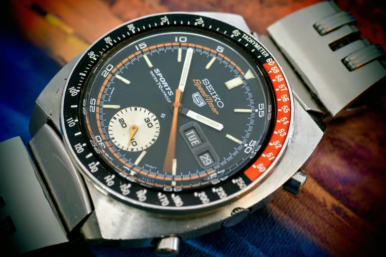
But looking through my old Speedtimer chronographs, it looks like they have been guilty of this for some time already!

 
Posts
16,229
Likes
44,671
I think this is an often overlooked issue in the design not just with typeface but with font choice for different functions and line weight.

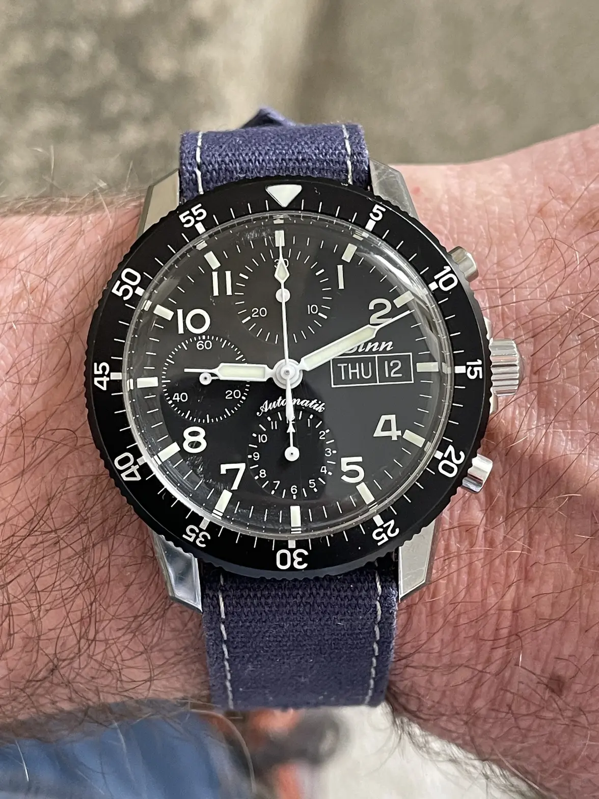
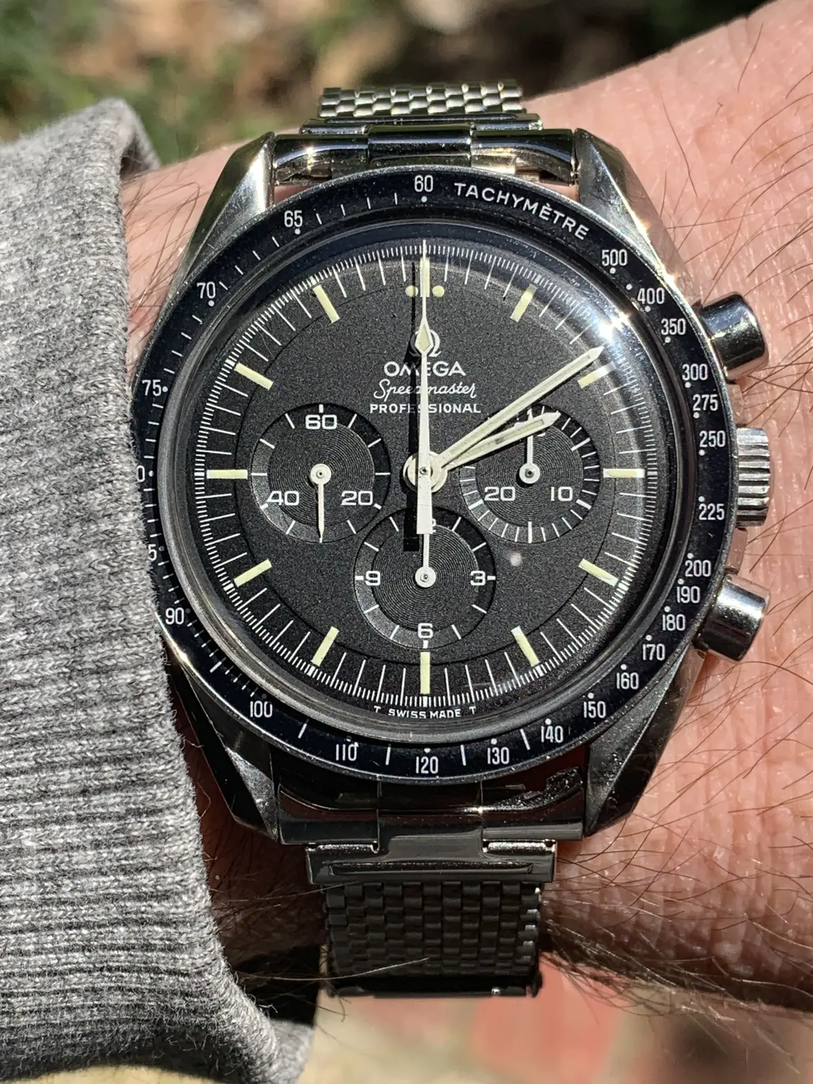
I find my Sinn 103 far more readable at a glance than my Speedmaster becuase they use different fonts for different functions as well as different line weights and syringe hands which lead the eye quickly to where they are pointing.


All I see on my Speedmaster is a sea of sticks.
 
Posts
17,535
Likes
26,540
Good one! And if you include the "Japan" between 6 & 7 O clock, and the hour numerals, there are a mind boggling 7 typefaces on the dial ::facepalm1::
Find one with a power reserve on the dial they sometimes have more.
 
Posts
27,357
Likes
69,752
Looks at the Grand Seiko with 5 fonts on the dial and one is straight out of an 80’s DnD adventure.
GS is IMO the worst for this...so spot on.
 
Posts
2,517
Likes
4,716
I think this is an often overlooked issue in the design not just with typeface but with font choice for different functions and line weight.

I find my Sinn 103 far more readable at a glance than my Speedmaster becuase they use different fonts for different functions as well as different line weights and syringe hands which lead the eye quickly to where they are pointing.


All I see on my Speedmaster is a sea of sticks.

That's interesting... I sometimes can't decide whether or not my Speedmaster is too busy of a dial, but when I look at that sinn I definitely don't think it is less busy. At all.
 
Posts
457
Likes
148
This?
I think it could just do with one Grand Seiko instead of all 3: Seiko, GS and Grand Seiko.

Grand Theft Auto print for GS

Afaik(from random articles) Seiko thought that gothic fonts are stylish and sophisticated hence why they picked it. Personally I am convinced but again it could be wrong trivia. Also the early fonts on the 5722 Grand Seiko(the ones that have Chronometer text on them) are like that. But then they dropped it for some reason.
Edited:
 
Posts
16,229
Likes
44,671
That's interesting... I sometimes can't decide whether or not my Speedmaster is too busy of a dial, but when I look at that sinn I definitely don't think it is less busy. At all.
The Sinn is busy as shit, but the different fonts and line-weights make is very quick to register at arms length, indoors, while on the move (me in the dark hallways at work running between appointments). I can’t read the Speedy at all under the same circumstances (just a blur of sticks) and end up looking at my phone to see if I have time to stop at the bathroom.