- Posts
- 2,923
- Likes
- 14,991
NT931
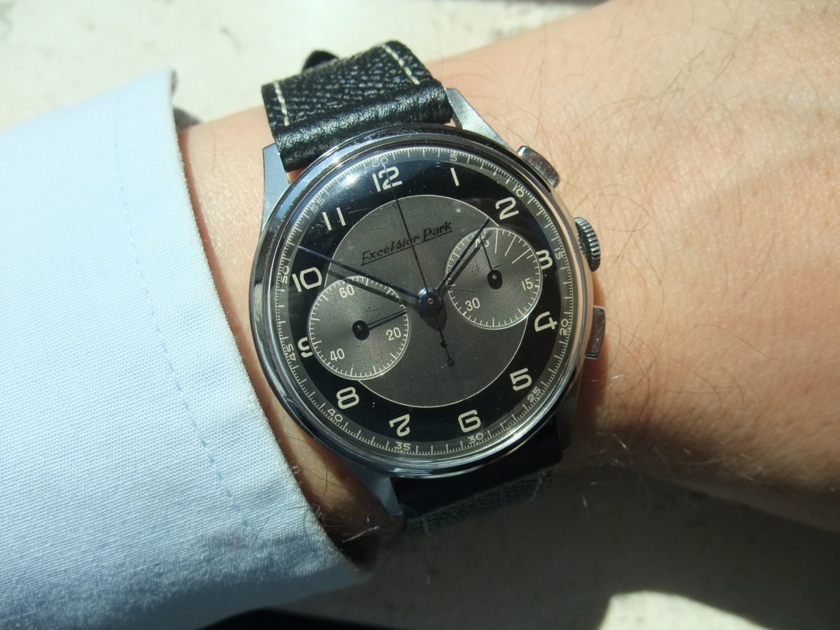
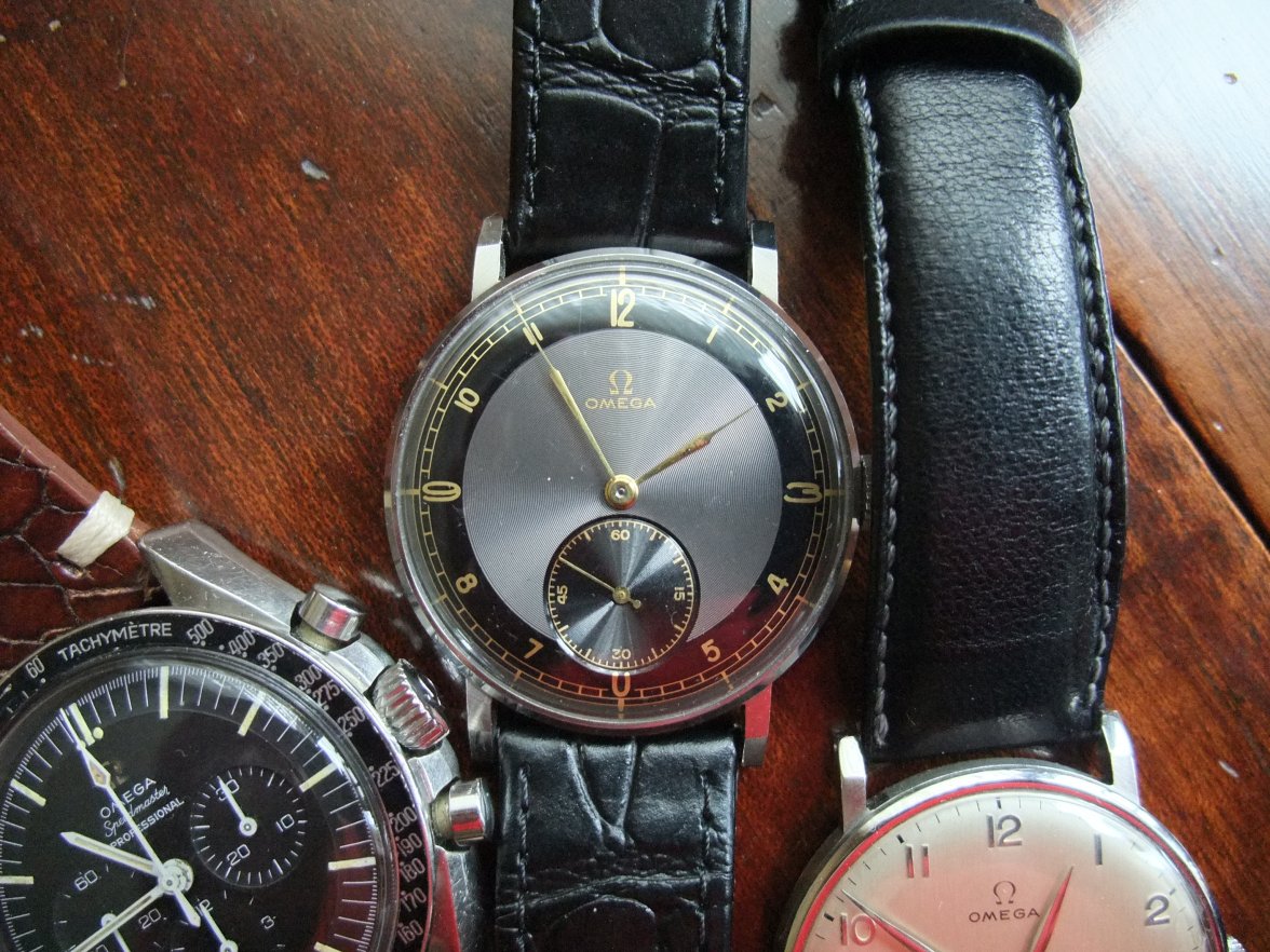
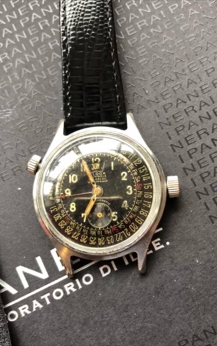
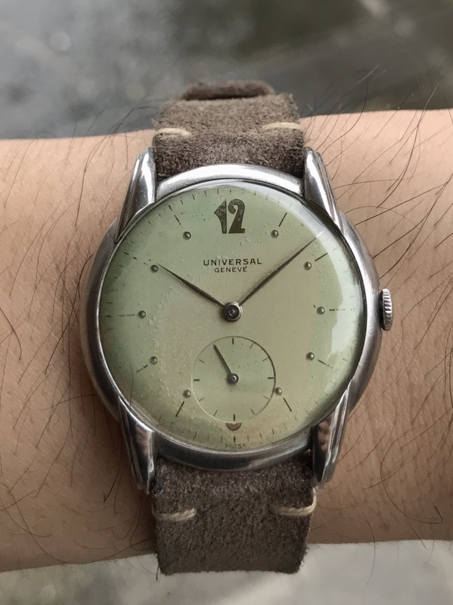
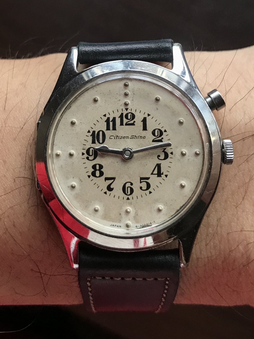
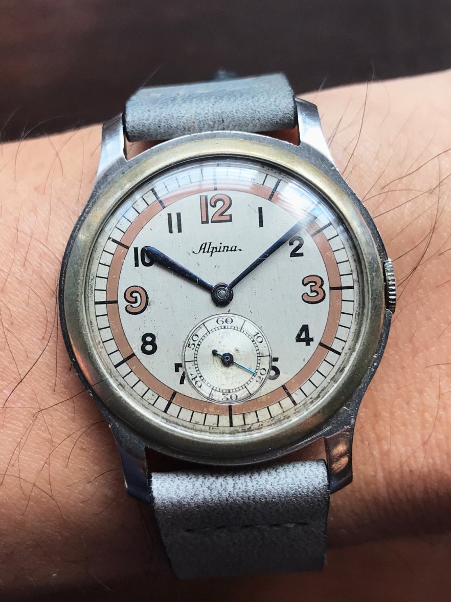
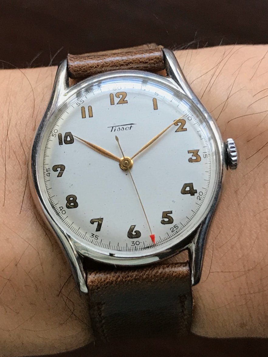
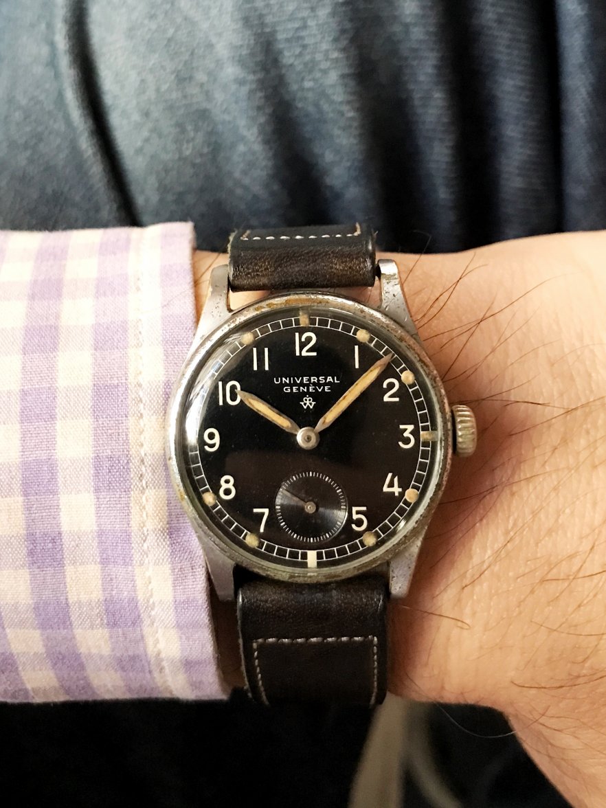
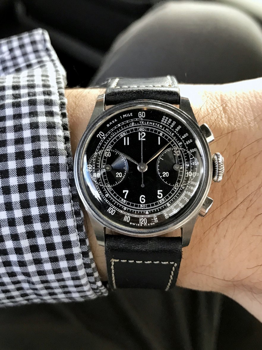
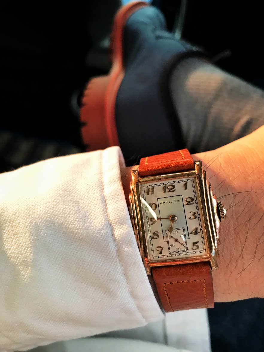
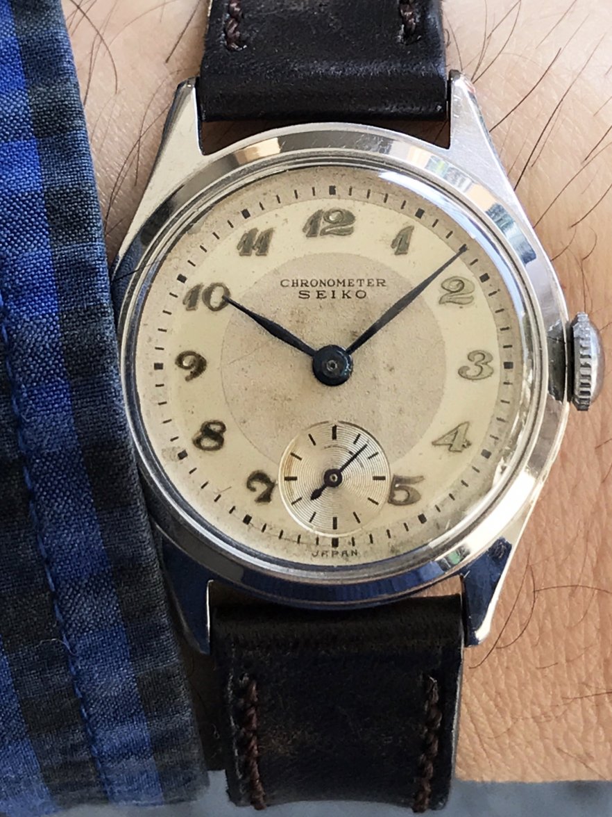
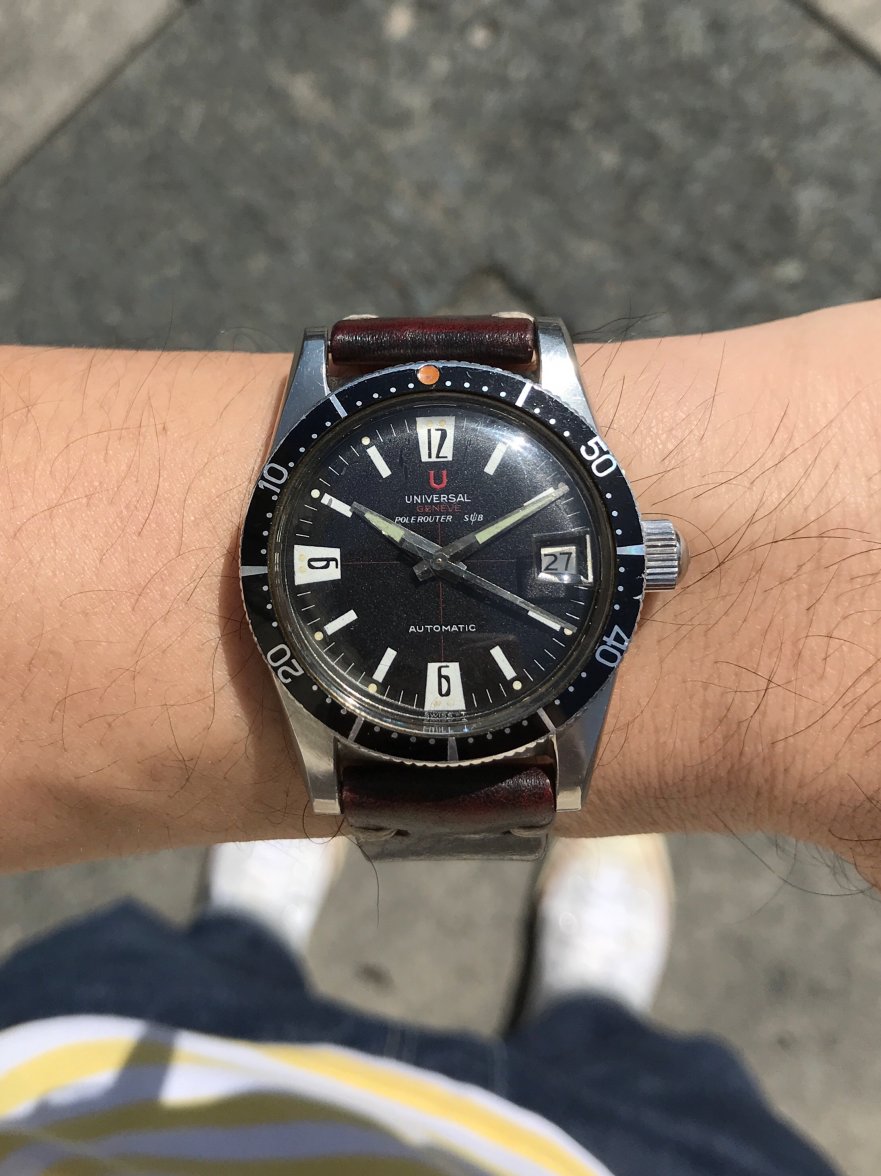
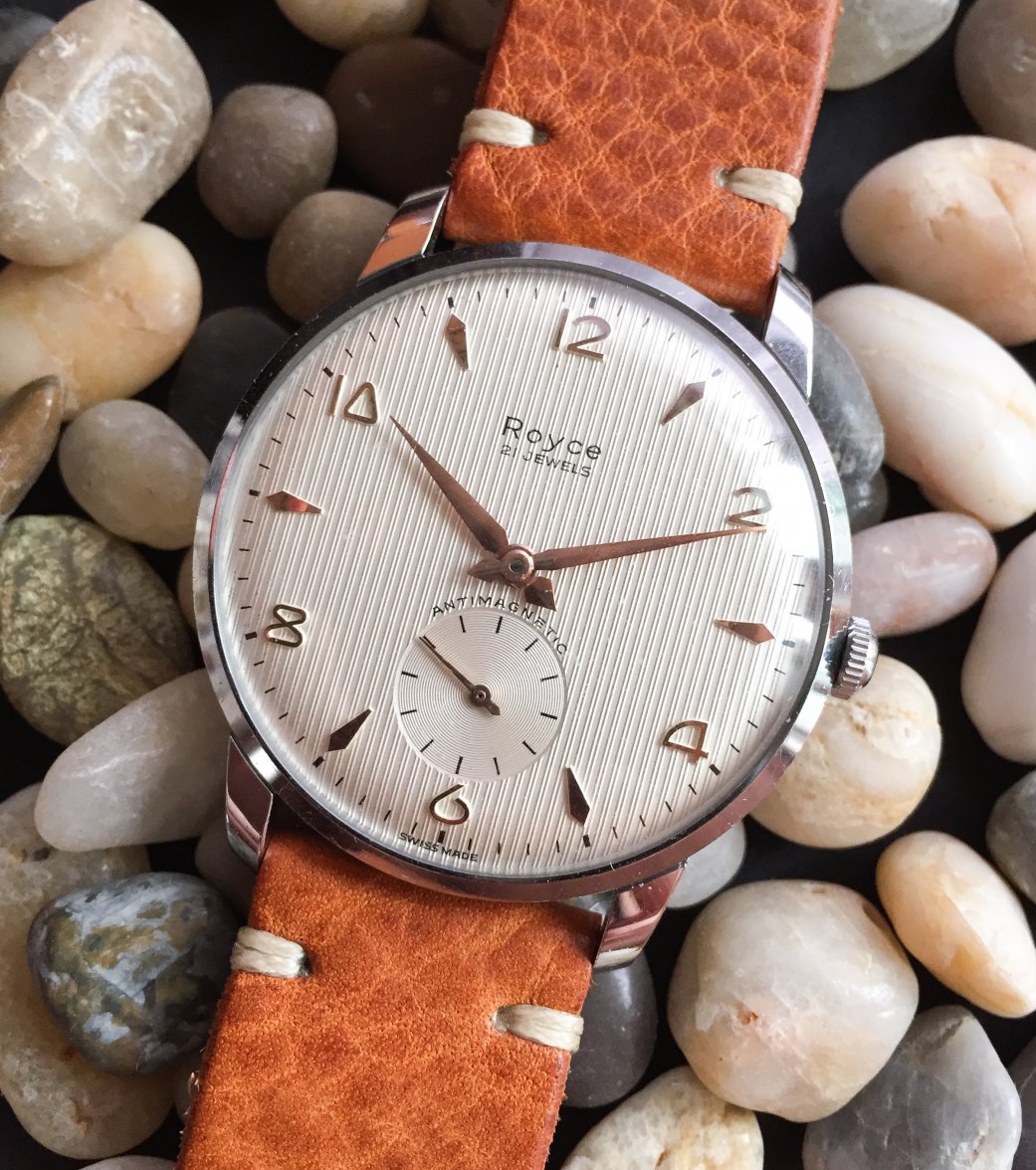
·I looked at my vintage watches with a new eye after watching the episode of Netflix's 'Abstract' where they featured Jonathan Hoefler, who designed a new typeface based on vintage watches (yes, the typeface on Hodinkee's infamous travel clock).
So I decided to take some pics from 4 vintage watches from 4 different brands, with 4 fonts for the number "4". All flat-topped "4"s but very different when you look at the details.
Would love to see other cool typefaces you guys have too!

So I decided to take some pics from 4 vintage watches from 4 different brands, with 4 fonts for the number "4". All flat-topped "4"s but very different when you look at the details.
Would love to see other cool typefaces you guys have too!
Edited:


.jpg")
.jpg")