Type Crimes: Bad watch typography

Posts
2,335
Likes
3,987
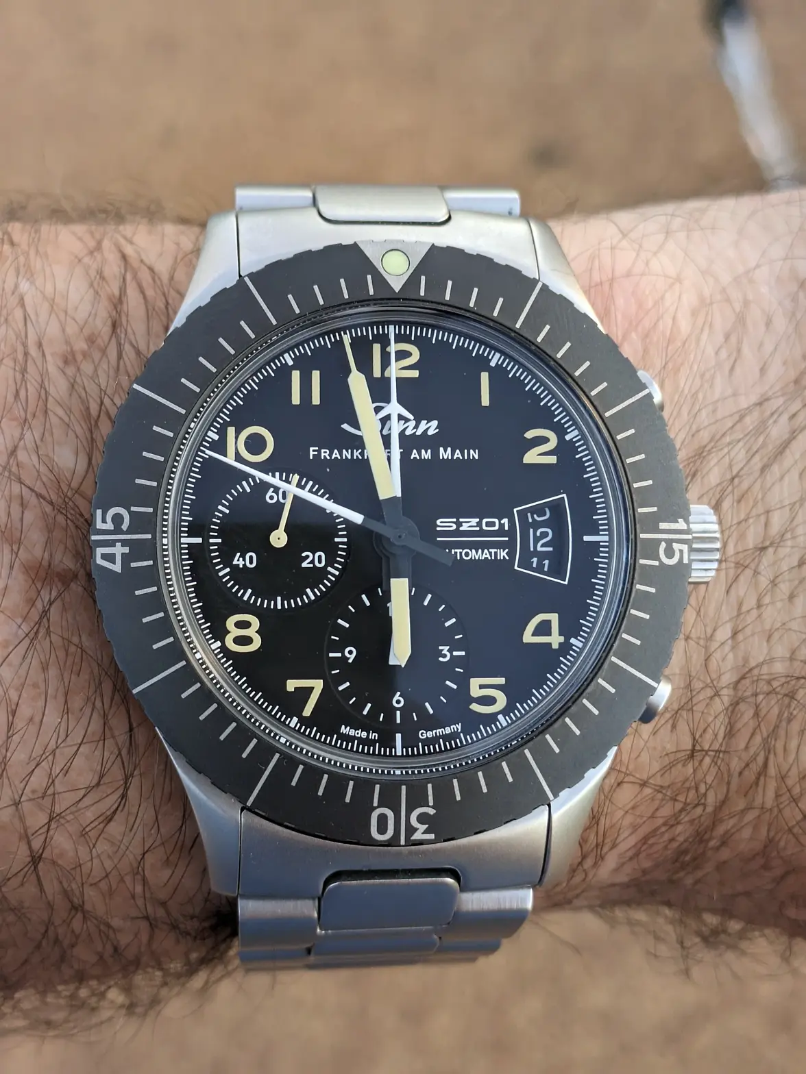
The Sinn is busy as shit, but the different fonts and line-weights make is very quick to register at arms length, indoors, while on the move (me in the dark hallways at work running between appointments). I can’t read the Speedy at all under the same circumstances (just a blur of sticks) and end up looking at my phone to see if I have time to stop at the bathroom.
I'd go so far as to say that the Sinn is as busy as shit after a dodgy seafood curry!.....indeed, not just busy, but persistently and urgently so!
Funny but I find the Speedie easy to read at a glance, which probably explains why it's the one watch that gets worn the most often, well that and it's one of the most comfortable!
 
Posts
3,267
Likes
21,639
This?
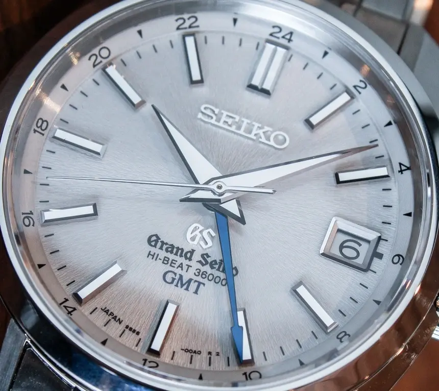
That GS is a bit much (why do all three: Seiko, GS, and Grand Seiko?!), but it is interesting to me that watchmakers often tend use a different font to call out each piece of information on the dial.


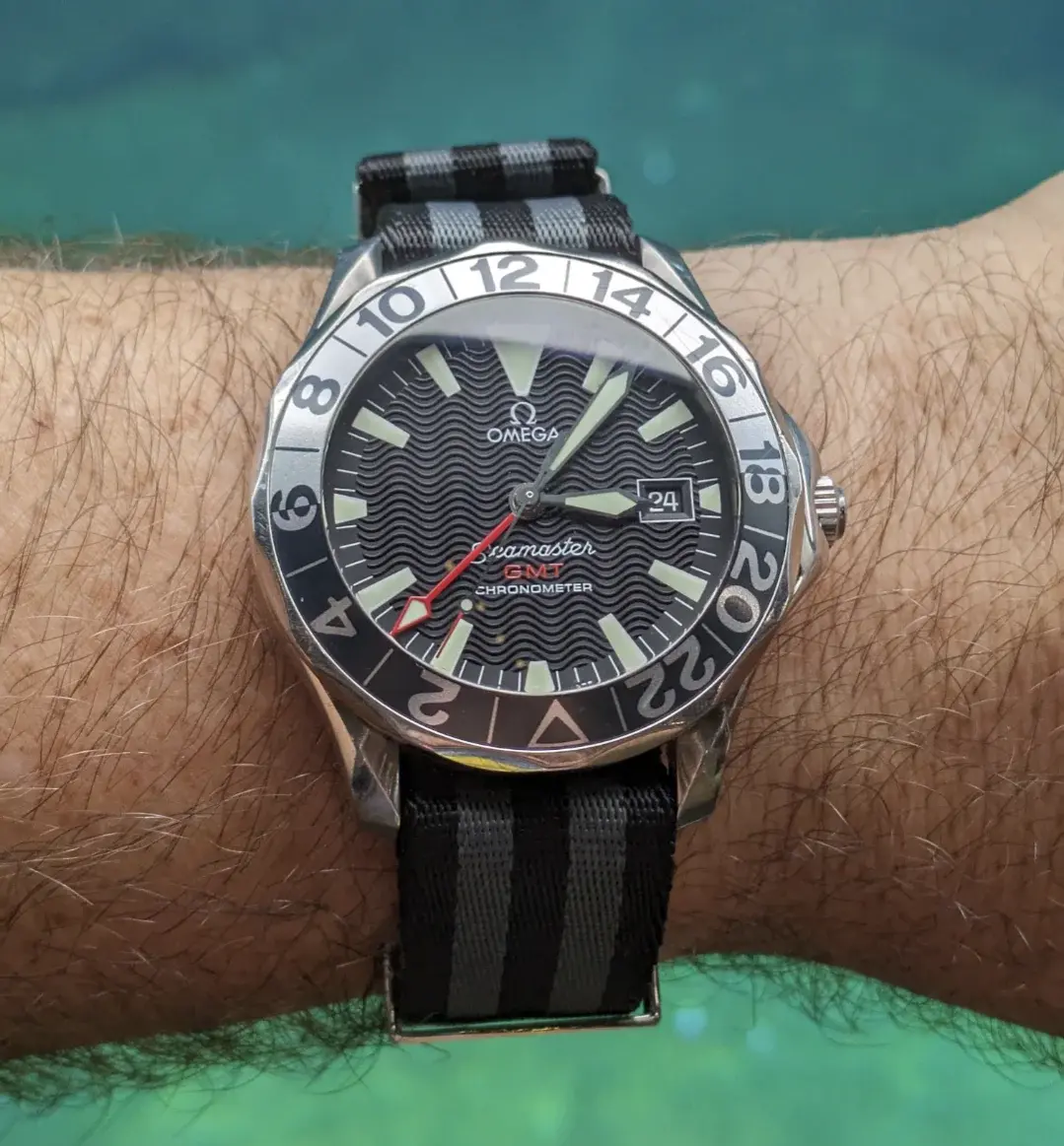
On my Omega GMT, there's a different font for the brand (Omega), the line (Seamaster), and the complication (GMT), and then they also added chronometer just in case I forgot I was looking at a watch, but I think that's the same font as GMT, with different kerning. Plus, I guess the bezel is a different font. I assume the idea is that different fonts will help distinguish the various bits of info and the clarify the hierarchy of the info, but it does start to seem a bit mad the more you look at it.


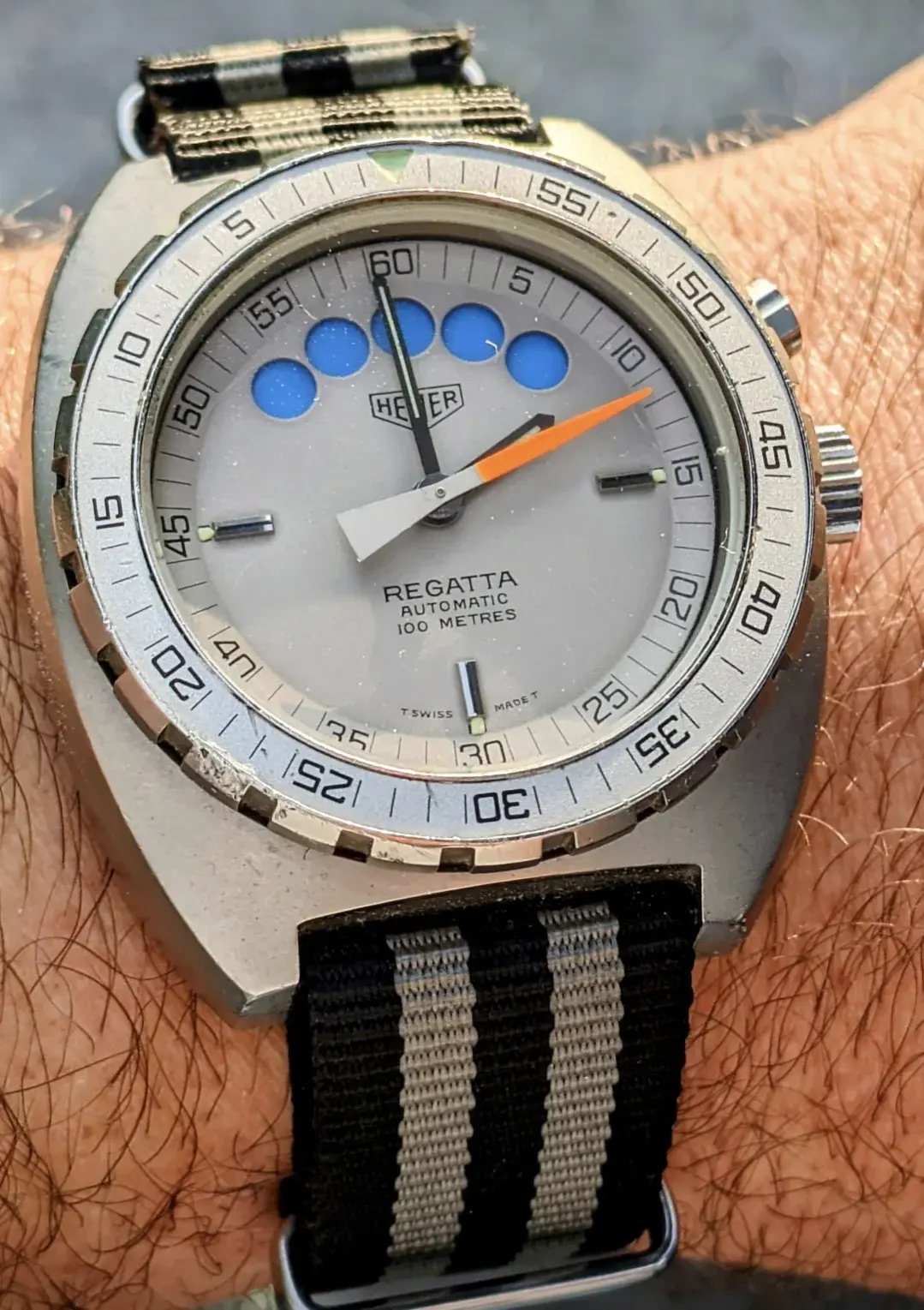
On the other hand, this Heuer has a lot of info - brand logo, 'regatta', depth rating, type of movement, the bezel, etc, but it looks like they are all the same font, or at least the same font family on the dial, and a different font on the bezel. To me, this is a cleaner design.


And since it came up, I'll toss in my vote for the legibility of Sinn dials: they can be busy, they aren't usually elegant, but they do tell time at a glance. The more I look at this thing, I think all the numbers are a different font (bezel, hours, sundials, date wheel, etc). I wonder if there's something intentionally , functionally inelegant about this: maybe your brain can better sort what numbers are related to each other if the fonts are different?
 
Posts
416
Likes
971

And since it came up, I'll toss in my vote for the legibility of Sinn dials: they can be busy, they aren't usually elegant, but they do tell time at a glance. The more I look at this thing, I think all the numbers are a different font (bezel, hours, sundials, date wheel, etc). I wonder if there's something intentionally , functionally inelegant about this: maybe your brain can better sort what numbers are related to each other if the fonts are different?

I definitely find this Sinn a lot more legible than the example discussed previously in the thread. I know it was mentioned the other works better on wrist but beyond a certain point it feels like information overload. I like simpler designs, negative space is golden.

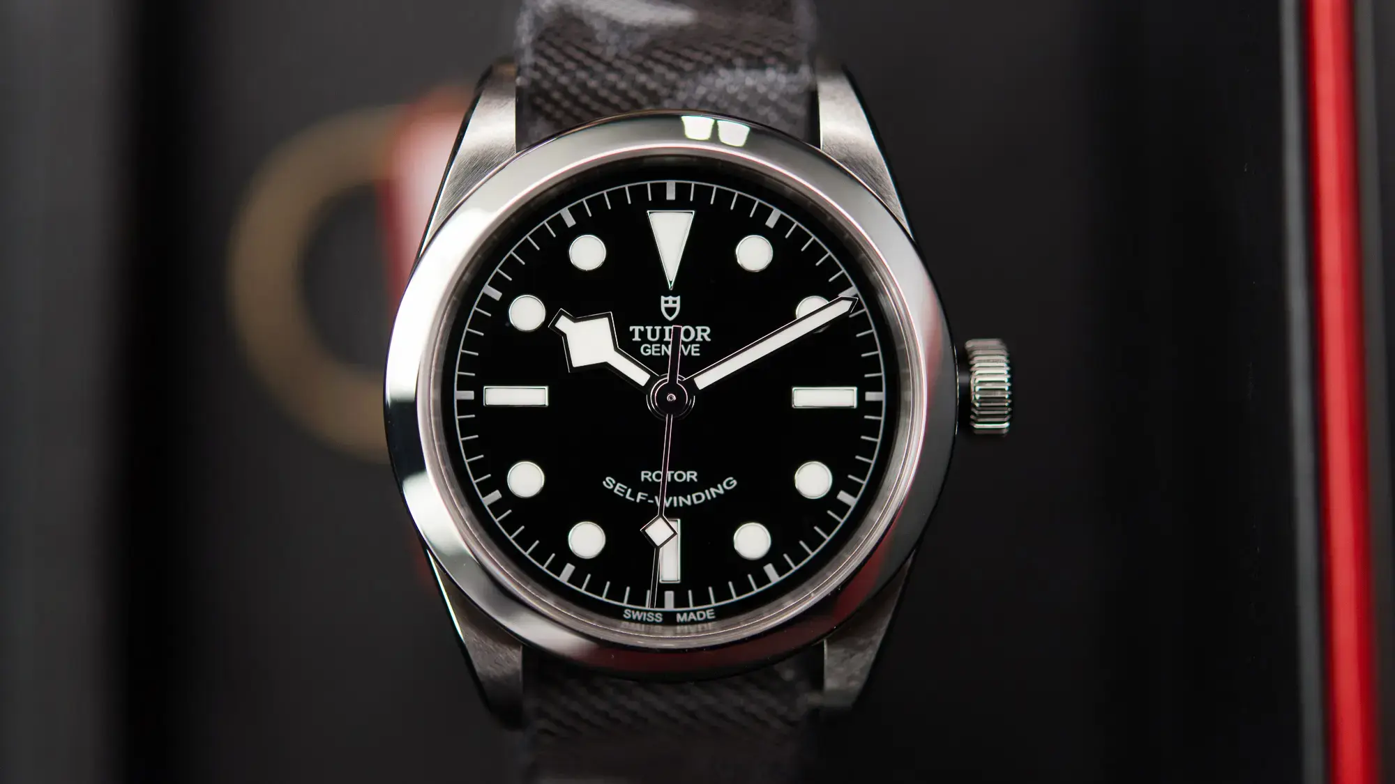
Typography in watches is pretty important to me. It's one of the aspects I don't like about a lot of modern Tudors. I like a lot about Tudor designs, but some of their type choices are really not for me. Subjective, of course, but I'm going to single out a specific one with apologies to any owners... the Black Bay 36. The "ROTOR - SELF-WINDING" is as bland as it is incongruous. The font is so generic it looks like a placeholder, and the smiley shape... oof. It also looks slightly vertically compressed. This isn't unique to this model, but it's otherwise such a clean dial, it stands out more here. Their actual brand wordmark though is totally fine.

 
Posts
2,880
Likes
14,747
I definitely find this Sinn a lot more legible than the example discussed previously in the thread. I know it was mentioned the other works better on wrist but beyond a certain point it feels like information overload. I like simpler designs, negative space is golden.

Typography in watches is pretty important to me. It's one of the aspects I don't like about a lot of modern Tudors. I like a lot about Tudor designs, but some of their type choices are really not for me. Subjective, of course, but I'm going to single out a specific one with apologies to any owners... the Black Bay 36. The "ROTOR - SELF-WINDING" is as bland as it is incongruous. The font is so generic it looks like a placeholder, and the smiley shape... oof. It also looks slightly vertically compressed. This isn't unique to this model, but it's otherwise such a clean dial, it stands out more here. Their actual brand wordmark though is totally fine.

ugh, you're right. The typeface is incredibly uninspiring!
 
Posts
182
Likes
150
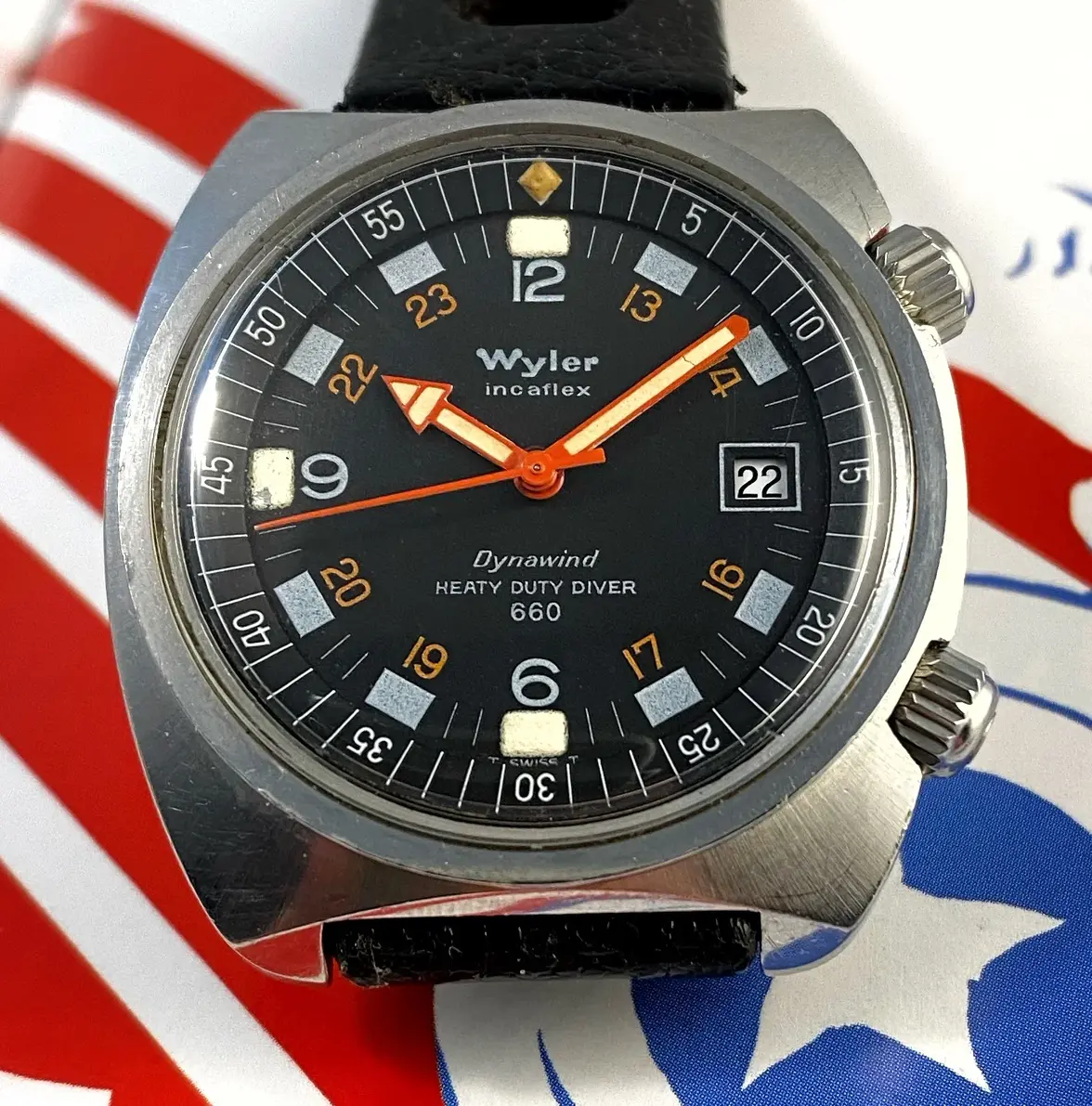
I don't know about bad typography, but how about a typographical error.

I wonder how many of the watches were sold before they realized the typo, and whether they even bothered to correct it.