The dressy-ish watch with the 6-o'clock subdial (a this-or-that query)
Annapolis
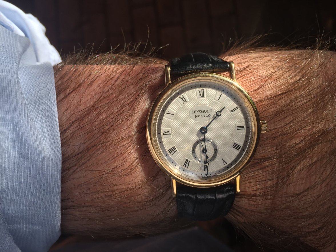
·Gorgeous piece but I just can’t get into Roman numerals.
ErichPryde
··Seamasters ForeverThe Lange and JLC of what you shared are the clear winners imo.
ErichPryde
··Seamasters ForeverGorgeous piece but I just can’t get into Roman numerals.
Roman numerals belong on sundials...
kgb
·HamDoctor
·As for me, I would rank the JLC firmly in first place - their moonphase is just gorgeous, and I find the design very "balanced". Not too thin an edge, making the watch feel substantial, but not "loud". The blue seconds hand ties in the moonphase with the rest of the design, everything is symmetrical, it's just a joy to behold.
The VC comes in a close second. The minute track and the subseconds dial work very well together, making the whole watch very reserved, very laid-back & classy, almost in a Bauhaus way.
I'd give the Rolex third place, it's balanced, reserved, the hands look really nice, overall a great dress watch that no-one ever is going to wear (because if you buy a Rolex, you're only going for a dress watch once in a million years).
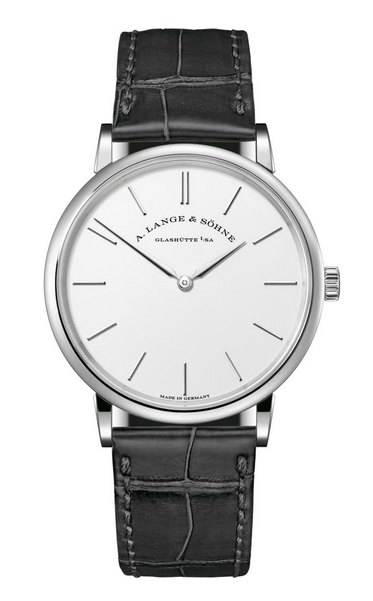
I'm surprised, however, by how little I like the A. Lange & Söhne. Something about the subseconds dial just doesn't gel with me, especially compared to how gorgeous the Saxonia Thin looks without it. For comparison:
As for the Omega, I wholeheartedly agree with @Tony C. that the subseconds dial atop a full arabic numeral isn't looking good. And the subdial on the Patek looks cheap, totally out of character.
Just my two cents ;-)
fibonacci
·Patek:
- I like the dauphine hands, generally my favorite style.
- I like the pearled minute track.
- The printed "subdial" is a bit jarring.
JLC:
- I like the moonphase.
- I don't really like the central seconds with date in the subdial. I'd prefer subdial seconds and no date at all.
Vacheron:
- I like the dauphine hands again.
- I find the applied logo charming.
- The two railroad tracks and the rectangular hour markers give off a "blocky" feel to me.
Lange:
- I bet it's very nice in person but in photos nothing in particular jumps out at me.
Rolex:
- The railroad tracks, hand style, coin bezel, and numerals all impart an "old timey" look that you probably either like or don't. It's not for me.
- I also don't like the font on the 9.
Omega:
- Lugs and crown seem wrong for the style.
- The feuille hands also don't seem to fit with everything else.
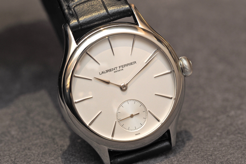
The JLC and Patek are both classics but neither is perfect to my eye. Vintage is great but there are very few vintage dress watches >35mm, if that's important to you. If we're throwing other things out, may I suggest Laurent Ferrier.
nitediver
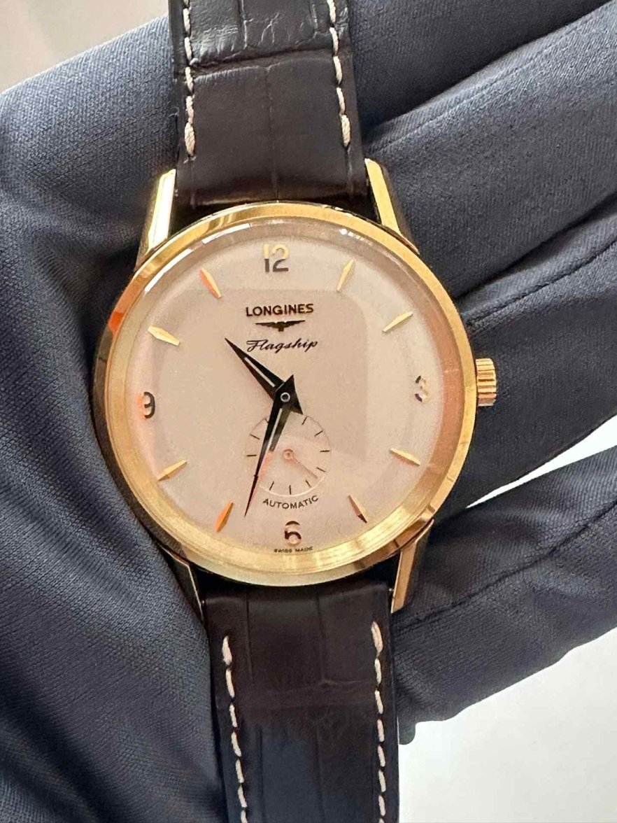
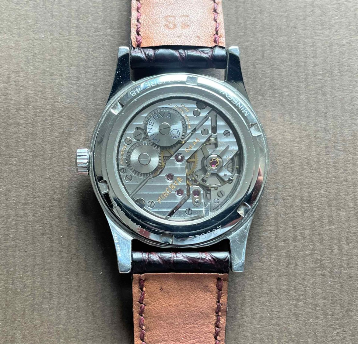
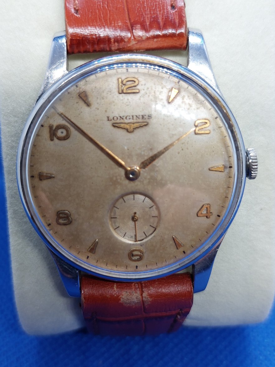
·I would Pick the Vacheron Constantin as my favourite of the bunch. If you would consider other options, i might present my two picks:
Longines flagship Heritage 60th anniversary, a limited edition of 60 pieces. 38.5mm solid yellow gold case and an automatic movement.
This Minerva Pythagore might not be to everyone's taste but the two-tone salmon dial is so charming, it has the vintage proportion of 34mm and a superb Cal.48 inside.
Evitzee
·One issue I have with many modern sub-second dial watches is the seconds dial rides too high on the dial because they use a movement that was originally designed for a smaller case size, spoiling the aesthetics. Of the watches pictured in the OP's post the JLC, Rolex and Lange have good proportions and look good. The Omega Seamaster's dial is too high, and the Patek Philippe is a disgrace (compare it with a vintage Calatrava), the VC is just about acceptable. If you look at the vintage watches pictured in this thread the sub-seconds dials have nice proportions and locations on the dial. Many of the modern issues use a small movement in a popular larger case size and let the aesthetics fly where they may. Proportions matter!
Edited:
Bruce235
·My favorites are the JLC and the Lange. I’m a sucker for that moonphase/date complication on the JLC and I love the blued hands on the Lange. For the simplest design I’d go for the Patek.
Also, I think Movado got simplicity and balance right on this Sub-Sea.
Edited:
ErichPryde
··Seamasters ForeverOne issue I have with many modern sub-second dial watches is the seconds dial rides too high on the dial because they use a movement that was originally designed for a smaller case size, spoiling the aesthetics... Proportions matter!
Exactly this. The JLC is the clear winner in terms of proportion, the dial is essentially perfect. The Lange is a close second but has more attractive hands. Originally I leaned slightly more towards the Lange, but the dial and simple, timeless markers coupled with an interesting complication make the JLC my pick. It's timeless.
Also, that dark blue alligator strap compliments the second hand and works well with the complication. It's a very well thought-out piece.
...[that] Patek Philippe is a disgrace...
Agreed. I can't believe it's a Patek.
Edited:
osterman
·dstern
·I know some of these are apples-and-oranges in terms of pricing, availability, current-or-past production, material, and (in the case of the JLC, anyway) complication.
But in terms of design concept, they're all pretty much the same: white/silver dial, leather strap, minimalist dial layout with a complication (usually small seconds) at 6. It's a design I really like.
The VC is the only one I've ever owned. Just wondering which among these folks like the most, with any notes on why, if people are so inclined. There are other things to consider (like diameter or what's going on on with the caseback), but I'm mainly interested in people's thoughts about dial aesthetics.
I never used to go for Lange, but I'm starting to lean toward that 1815...
timjohn
·ErichPryde
··Seamasters ForeverI
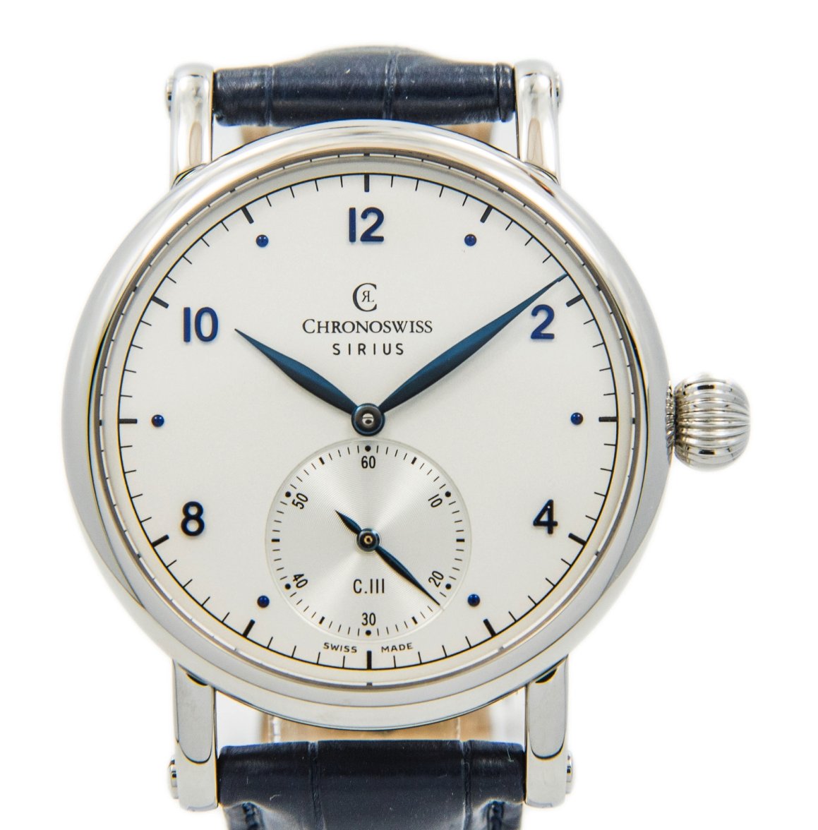
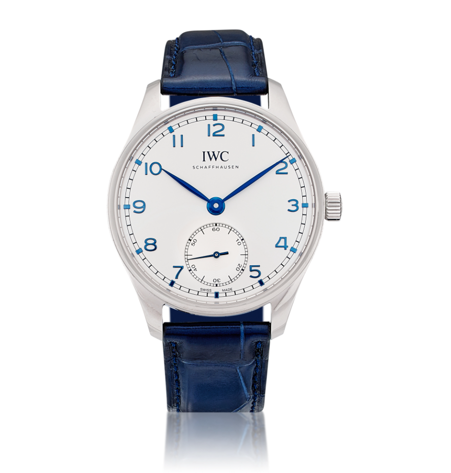
This one is not to my taste. I think the clasdic simplicity is undermined by the full set of numerals. And though the blued hands are lovely, I don't care for the blue numbers.
Silver hour markers dagger style and this would be dressed to kill. But then it wouldn't really be an IWC.
Annapolis
·A crappy MS Paint side-by-side of the IWC and Lange, as they're so similar. The IWC has applied numerals, which will always be divisive, and obviously Lange is a different level of watchmaking & hand-finishing---plus it's several mms thinner than the IWC and is manual wind rather than automatic. The lugs are a totally different design. Very different price-points, and Lange is white gold vs steel for the IWC. So this is totally apples and oranges in the important details. But just in terms of dial aesthetics...
I like them both, really, and might prefer how the subdial is handled on the IWC, where it doesn't slice the 6. I know that's an ancient tradition and not some fluke with the Lange, but it kinda bothers me sometimes. I think I'm still in favor of the Lange and would choose it if both watches were equivalent in all other respects.
I like them both, really, and might prefer how the subdial is handled on the IWC, where it doesn't slice the 6. I know that's an ancient tradition and not some fluke with the Lange, but it kinda bothers me sometimes. I think I'm still in favor of the Lange and would choose it if both watches were equivalent in all other respects.
Similar threads
- Posts
- 2
- Views
- 752
