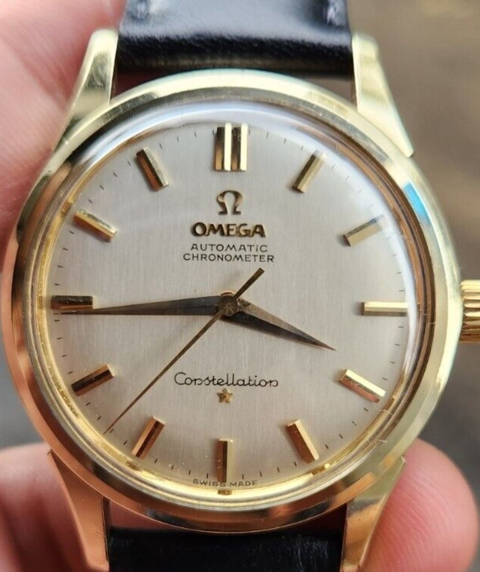
Star too close to font, is it a redial ?
MacoLR
·Hello, the star looks so close, but the graphic is really high quality, all the minut marks are really perfect and with a good assimetry with 5min gold mark.
In my opinion could be original.
In my opinion could be original.
Barclay191
·Star could be reattached on the dial. Everything else looks good IMO. I Think it's original.
GuiltyGear
·Is this a watch you're considering or you already bought? If you're considering, then consider also that other manipulations may have been done to the dial or the watch. In short, that star tells you that it's not a fully original dial and depending on the asking price, it may or may not be worth your time.
Barclay191
·I didn't buy or consider this, just wondering the star so close to the font. It's 14778 jumbo. Price is $1500. Thanks for your input.
qazwsx1
·Barclay191
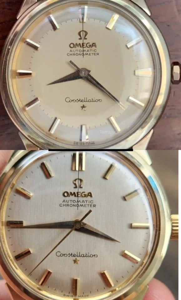
·The ref.14778 is the uncommon reference.
Please note the position of that star compared to my watch (ref.14778).
However, I believe that it’s the original dial.
Maybe picture from the backside of the dial can confirm this.
The ref.14778 is the uncommon reference.
Please note the position of that star compared to my watch (ref.14778).
However, I believe that it’s the original dial.
Maybe picture from the backside of the dial can confirm this.
lejaune
·You can't go by the star distance alone. Here are two examples of very different distances. Both from Omega website.
https://www.omegawatches.com/en-us/watch-omega-constellation-omega-ck-2648
and
https://www.omegawatches.com/en-us/watch-omega-constellation-calendar-de-luxe-ba-168-0006
https://www.omegawatches.com/en-us/watch-omega-constellation-omega-ck-2648
and
https://www.omegawatches.com/en-us/watch-omega-constellation-calendar-de-luxe-ba-168-0006
X350 XJR
··Vintage Omega AficionadoYou can't go by the star distance alone. Here are two examples of very different distances. Both from Omega website.
https://www.omegawatches.com/en-us/watch-omega-constellation-omega-ck-2648
and
https://www.omegawatches.com/en-us/watch-omega-constellation-calendar-de-luxe-ba-168-0006
Apples to oranges. The two watches you reference are from different decades.
DON
·Looks like the dial has a brushed finish. Some refinishers used a fine badger hair brush and painted a new finish on the dial in an up/down stroke
Applied Omega logo also looks a bit off. Bit of a tiny left lean
Applied Omega logo also looks a bit off. Bit of a tiny left lean
ecarpino
·Looks like the dial has a brushed finish. Some refinishers used a fine badger hair brush and painted a new finish on the dial in an up/down stroke
Applied Omega logo also looks a bit off. Bit of a tiny left lean
If you zoom the second picture, you can see it is a bit uncentered.
I would lean towards original but I cannot be 100% sure, I am a novice in this "science" 😀
Noddyman
·All looks fine, another vote for original dial.


