I don't think this stacks up. The 'special' watches, on which valuation goes bonkers are almost always aesthetically great, whatever the other factors such as rarity, technical innovation or a conceptual/visual link with something/someone culturally significant.
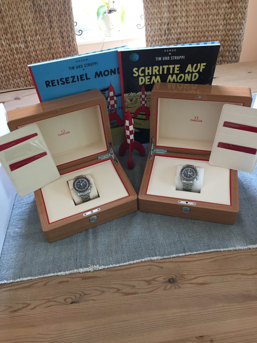
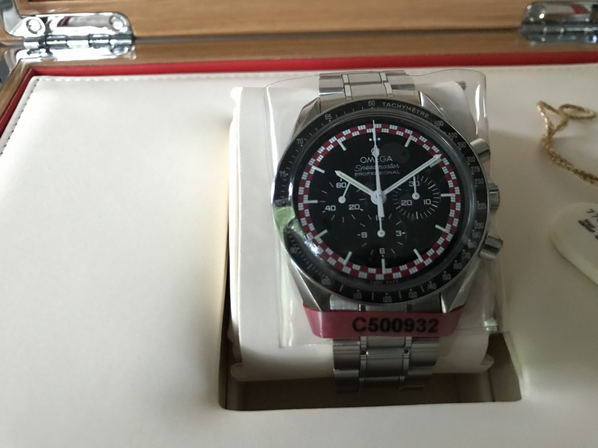
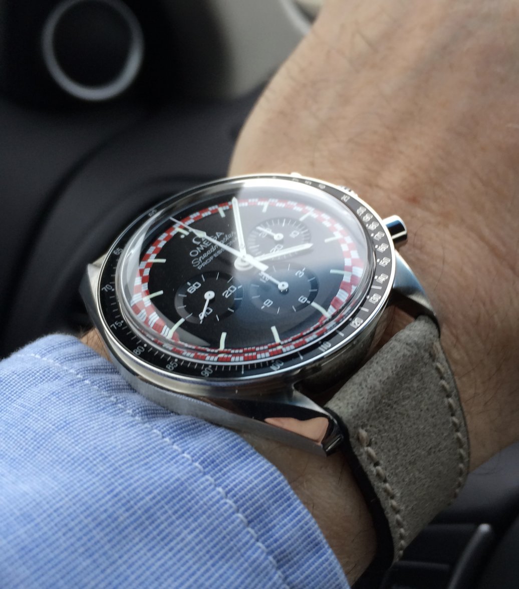
I had phases when I was pretty keen on acquiring a Tintin, but, the more I studied ads and their pictures, the more I realised that I was on a displacement activity - my underlying mission was to find and buy a Japan Racing. In comparison with that, the Tintin dial represents a concept only partially fulfilled. The red chequers are attractive, but stand-alone they don't do it for me, and I sense there should be another visual element carrying the red hue and providing a reference to the outside world. As someone showed us in a recent post, a depiction of that charismatic little stylised rocket somewhere on the dial would be perfect.
Given that we understand Omega were prevented from executing the design as originally envisaged, I feel that the situation would have been better salvaged if a different pattern band colour had been used, making the overall 'look' more harmonious - there's something a little brash about the contrast of full blooded red against stark white.


