Seamaster Diver 300M color question

Posts
50
Likes
154
Agreed with everything said. I own a AP Royal Oak and don't have as much attachment to it as I do the SMP300, albeit it's probably because it's my daily. I love everything about this watch including the size (6.25in wrists) and when I recently switched to rubber straps when I was in Hawaii, it completely transformed the watch and made me fall in love with it even more. I think 38-39mm case size would definitely be welcomed, but the 42mm is definitely not a deal-breaker for someone with smaller wrists.
Thanks! I just realized how long my post was. I just got a tad defensive because I fell in love with every aspect of this watch, but as I watched videos on youtube (literally every single one about this watch) I kept hearing the same talking points and to be honest, it seemed liked they weren't the youtuber's opinion per say...but more like they were just reiterating it as a negative talking point that some general committee agreed upon should be labeled as a "con" or "shortcoming". In the meantime, the 300m is on my wrist right now. And I love every part of it. Zero cons and zero complaints from me.
 
Posts
50
Likes
83
1. Helium escape valve

2. Skeletal hands

3. Clear caseback

4. 42mm size

5. The Bracelet

6. The Bezel

7. The waves

1. Looks good to me too. Will I ever have use for it? Probably not!

2. These I just love, very stylish.

3. This should be on all watches TBH. So nice to see. 😀

4. I love 42-44mm. Fits my big hands, so no issue.

5. It looks amazing. Never liked the older Omega bracelets.

6. This looks smashing. I hardly use it in practice thou.

7. This is what actually made me buy the 300 now.

I have no idea what is "true" to Omega, but I know what I like.
 
Posts
50
Likes
154
1. Looks good to me too. Will I ever have use for it? Probably not!

2. These I just love, very stylish.

3. This should be on all watches TBH. So nice to see. 😀

4. I love 42-44mm. Fits my big hands, so no issue.

5. It looks amazing. Never liked the older Omega bracelets.

6. This looks smashing. I hardly use it in practice thou.

7. This is what actually made me buy the 300 now.

I have no idea what is "true" to Omega, but I know what I like.
Pretty much summed up my thoughts on the main "controversies" about the 300m. Seems like we are in a similar train of thought! Only difference is I only own one of them and you have like...4 lol.

If I were to buy another 300m...I would most likely go for the NTTD Bond version...or the white dial black bezel version. Probably the bond version first. James Bond is one of my fav movie/book characters.
 
Posts
1,530
Likes
3,593
Can someone elaborate on why the skeleton hands of the 2018 line of SMP 300m gets so much hate? I know its a personal preference thing but from what I garner I am in the very small minority when it comes to the "controversies" over this watch (as listed below):

1. Helium escape valve - Although I will never use it, even though I scuba dive. I love the fact that the function exists on this watch and I like the character that the valve adds to the watch. It adds a unique look rather than a more plain and common case profile of other dive watches.
You won't be using the HEV when scuba diving.

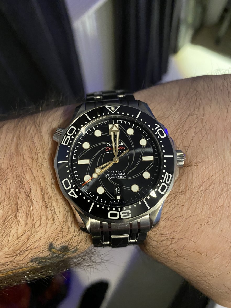
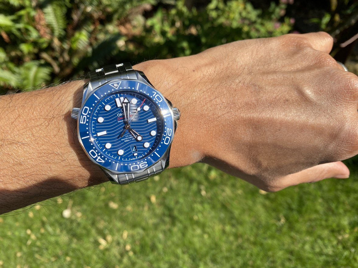
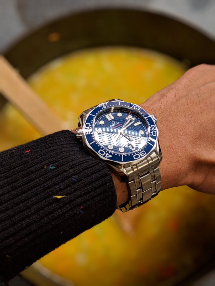
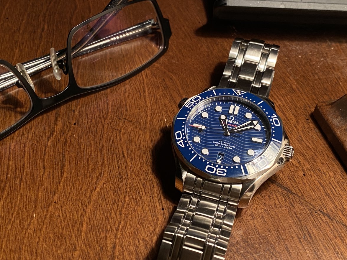
2. Skeletal hands - Different aesthetic. I like the window in the hands, and the lume highlighting the edges of it. Once again, its not a typical sword as seen on pretty much every other watch. I dont hear anyone Complain about Tudor's Black bay hands...that block look thing going on is a far bigger sin than these elegant yet broad skeletal hands.
The hands ruin the watch and imo a step backwards in looks and design and a leap backwards in terms of functionality on a dive watch.

3. Clear caseback - the movement looks amazing! Show it off! Besides, Omega putting out a 300m diver with a clear caseback is something pretty unique that other company's arent doing. I guess Omega could slim down the watch a bit and be boring like Rolex and have a steel caseback with no design features whatsoever.
While I don't mind the clear caseback it's not the best component for a dive watch.

4. 42mm size - Good grief the gripes I have heard about this! The 1 mm difference between the last generation and this generation seems to be one of the biggest complaints. 1mm is pretty miniscule but for many it suddenly created this hard wall that makes this watch not worth owning at all. I know I have a bigger wrist..about 7 3/4 inches but holy moly the griping over this.
Nothing wrong with the size of the watch.

5. The Bracelet - It looks amazing. and It doesn't look like it's from the 90's anymore. Yet people still find a way to complain that it doesn't taper like the Rolex SubM. Boohoo. The bracelet looks great, its not overly busy with design, yet its not too simple and has a good mix/composition if brushed and polished.
The bracelet is better than before, but still not up there with the best.

6. The Bezel - "Omg its soooo hard to turn with gloves or if your hands are wet!!!" Pfft. Is that really an issue on a day to day use? I would assume 99% of wearers don't even use the Bezel once in a week...let alone use it with gloves on or when their hands are wet. The scalloped edges are clean and stylish. The "stadium" look other watches have with big bold coin-edged bezels make them a chore to wear with long sleeves.
In terms of the design it's not fit for purpose on a dive watch.

7. The waves - *eye roll* Heaven forbid Omega is allowed to go back to what made this watch such a hit. Except this time they made it less busy and used LAZERS.
The waves imo are a welcome return.

There are other "controversies" I could list if i went back and watched every single review/unboxing of this watch on Youtube (which I have already at least once) But as I said at the beginning of my post, I am in the small minority. The HE Valve is awesome, I love it. The skeletal hands to me look amazing and I love their style. The clear caseback is neat as I can see the movement (or show it off to others). The 42mm size fits me well (and tbh a 44 would have been my choice in the color I got if I could have). The bracelet is a non issue and I think it looks/feels/wears great. The Bezel is a non issue with me. it has a positive click and I dont seem to have any issues manipulating it. And lastly, the waves. I love the waves. The wave design is what drew me to the SMP as a kid. I am happy I wasn't able to purchase one until a few weeks ago because had I bought the second gen watch with the solid dial, I would probably have a smidge of buyers remorse when the 3rd gen SMP 300m's came out.

I guess I am in the small minority....I love everything about this watch. Especially the parts people seem to hate on the most. This watch is my grail and I fear if I bought any other high end watch, that I it would feel like a waste of money as I'd rather be wearing my SMP everyday and It would break my heart to "cheat" on it haha.

One last thing. I do agree that if OMEGA wants to totally kill it with this watch, they should release a 38mm version of this watch. I saw a post or video where someone had done some photoshopping and created the SMP 300m to be 38mm and it looked great...and if released by OMEGA would be an instant hit top seller.
 
Posts
104
Likes
112
Love all the watches beautiful ..... but do not like the skeleton hands.🙁🙁
much more prefer sword hands myself 😀😀😀
 
Posts
50
Likes
83
I have a real good offer on a James Bond edition, but I'm actually not sure. It does not have the waves that I so like. :-/
 
Posts
50
Likes
154
”You expect me to talk?”
”No, Mr Bond, I expect you to die.”
Can you STOP?! Gosh...making me want to spend my savings on more Seamasters......
 
Posts
50
Likes
83
Can you STOP?! Gosh...making me want to spend my savings on more Seamasters......
”Hi, I’m Plenty.”
“But of course you are.”
😀
 
Posts
50
Likes
154
”Hi, I’m Plenty.”
“But of course you are.”
😀
"Do you think she's prettier than me?"
"Who?"
"You know who."
"Oh, the Italian bird. No, baby. She's rancid. I think you're shagadelic, baby. You're switched on. You're smashing!"

Wait....wrong spy movie...
 
Posts
50
Likes
83
"Do you think she's prettier than me?"
"Who?"
"You know who."
"Oh, the Italian bird. No, baby. She's rancid. I think you're shagadelic, baby. You're switched on. You're smashing!"

Wait....wrong spy movie...
Good one thou!
 
Posts
50
Likes
83
I ended up selling the 007-watch after all. It's a lovely piece, but I never found myself wanting to actually wear it. Oh well.
 
Posts
576
Likes
2,159
I just bought an earlier pre-owned blue 300M chronograph. My observations are:

I wasn't a fan of the hands I'd seen online. Once at the jewelers, though, they didn't bother me. Now, after a few days DD'ing, they aren't even noticeable.

The newer waves are often times much too prominent. They seem too deep and too widely spaced. In navy blue, however, they just about disappear unless there is a glancing low light, in which case the shallow depth and close spacing of the earlier waves appear as an intriguing texture, almost guilloche in appearance.

Finally, color. The watch face is decidedly navy blue, even in bright sunlight. I love it. There is a subtle difference between the bezel which is a bit lighter. The deep color is rich, and as mentioned conceals the prominence of the waves to a degree, which is a good thing. Add in the bright red subdial and seconds hands and it is an amazing combination.

This is just my opinion. I know, everyone has one! 😁
Seamaster-300.jpg
Edited:
 
Posts
50
Likes
83
I just bought an earlier pre-owned blue 300M chronograph. My observations are:

I wasn't a fan of the hands I'd seen online. Once at the jewelers, though, they didn't bother me. Now, after a few days DD'ing, they aren't even noticeable.

The newer waves are often times much too prominent. They seem too deep and too widely spaced. In navy blue, however, they just about disappear unless there is a glancing low light, in which case the shallow depth and close spacing of the earlier waves appear as an intriguing texture, almost guilloche in appearance.

Finally, color. The watch face is decidedly navy blue, even in bright sunlight. I love it. There is a subtle difference between the bezel which is a bit lighter. The deep color is rich, and as mentioned conceals the prominence of the waves to a degree, which is a good thing. Add in the bright red subdial and seconds hands and it is an amazing combination.

This is just my opinion. I know, everyone has one! 😁
Seamaster-300.jpg
Very nice looking piece! 😀
 
Posts
234
Likes
153
The blue is amazing. It can go from a dark dull almost black dial to a cartoonish blue that really pops and catches your eye. I find myself staring at it all the time.
 
Posts
17
Likes
4
I didn't mean to leave you Seamaster out. It's just so FANCY.
Some beautiful Seamasters in this thread! I'm such a big fan of this line of OMEGAs - I think they give you the best bang for your buck. I actually just came across this article about some of the top dive watches you can buy for under 5k and no surprise the Seamaster is on there. Here's the link if anyone is interested: https://www.bobswatches.com/rolex-blog/buying-guides/best-dive-watches-5k.html

"The current iteration of the Seamaster Diver 300M swept into town in 2018 and completely stole the show with updated movements, an etched wave pattern on the dial, a conical helium valve, and overall perceived superiority. But here’s the thing: those gloss ceramic dials were criminally underrated. They hung around for just a couple of years, and yet the look is an enduring one."

Super interesting and informative read!
 
Posts
9,739
Likes
54,485
Some beautiful Seamasters in this thread! I'm such a big fan of this line of OMEGAs - I think they give you the best bang for your buck. I actually just came across this article about some of the top dive watches you can buy for under 5k and no surprise the Seamaster is on there. Here's the link if anyone is interested: https://www.bobswatches.com/rolex-blog/buying-guides/best-dive-watches-5k.html

"The current iteration of the Seamaster Diver 300M swept into town in 2018 and completely stole the show with updated movements, an etched wave pattern on the dial, a conical helium valve, and overall perceived superiority. But here’s the thing: those gloss ceramic dials were criminally underrated. They hung around for just a couple of years, and yet the look is an enduring one."

Super interesting and informative read!
As an owner of the “criminally underrated” gloss ceramic dial pre-2018 version of the SMPc, I can attest that it is a stunning watch which I chose to buy after comparing it to the newer version. At 41mm, it’s a bit smaller than its successor as well as a bit thinner. Although it’s a functional diver’s watch, the gloss dial gives it a classic look that is more reminiscent of a dress watch than a tool watch and it pairs well with everything from jeans and a t-shirt to a traditional business suit. Although its caliber 2500d co-axial movement is not a master chronometer, it is nonetheless a proven, reliable and highly accurate workhorse - mine averages -.8 SPD after two years of daily wear. It was also a tremendous bargain, could be had for under 3k on the grey market, and has retained its value very well. The new version of the SMPc is a fantastic watch, but I’m glad that I went with its immediate predecessor. No regrets.
 
Posts
3
Likes
0
I have owned the blue, black and now getting the white. I did a comparison side by side of all three and the white with the black bezel and black hands and other black parts of the dial in my opinion looks the best. Also, the red on the Seamaster logo as well as on the tip of the second hand really adds to the many nice contrasts of the white model. In a side by side comparison the blue dial and blue bezel just seem to run together whereas the white dial with black bezel just pops.
Totally agree getting one in Jan on the black rubber strap. Just a great classy daily wearer imo