SAS Polarouter - Black Dial

Posts
9,596
Likes
27,692
I agree that judging whether the text is correct is easier said than done. There is very little consistency in the text in early Polarouters/Polerouters as shown by the table in this incredible post by @Severin

https://omegaforums.net/threads/pol...-a-brief-survey-with-some-observations.35888/

An amazing ressource 👍

How do you like the accent grave on your dial?


Gold text on a black dial will be printed.

By the way, can I see an inkling of gold "Swiss" text just above the chapter ring to the right of the central hour marker? Or, having looked at this dial for so long, am I beginning to see things?

Good to know about the gold text...

I think you're starting to see things, yes 😁
There are some scratches, but gold text would surely be visible.
 
Posts
1,200
Likes
3,041
I think I'm comfortable with the accent grave.

@Severin concluded that there were no patterns with regards to the accent grave. He did conclude that it did not appear on any of the Polarouters but I don't quite understand this as examples 9 and 10 in his table seem inconsistent with that conclusion.
 
Posts
1,200
Likes
3,041
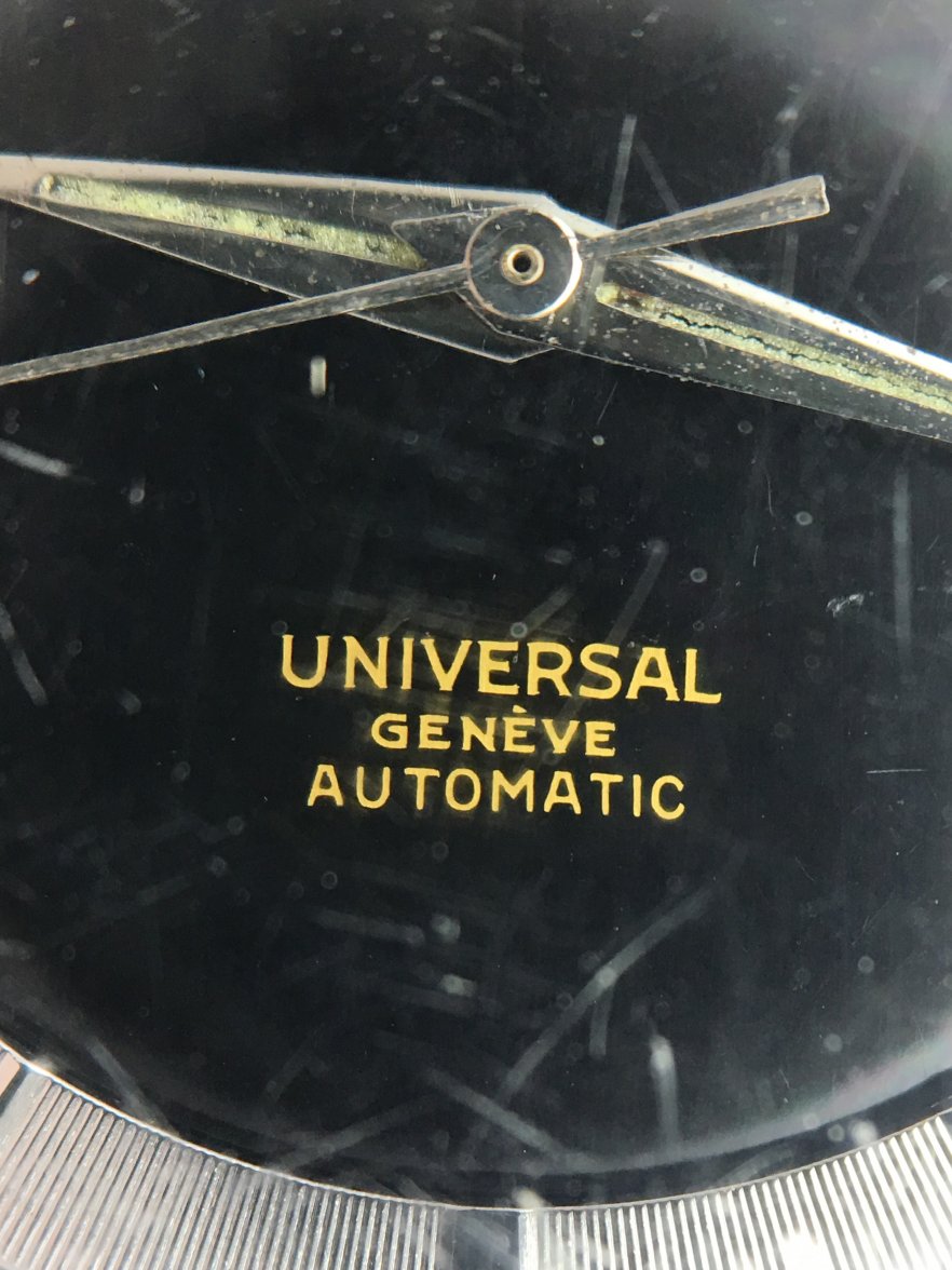
The two glaring anomalies are the lack of "Polarouter" text and the different ordering of "Universal Geneve" and "Automatic".

On the one hand, if this is a genuine SAS watch then I can offer no explanation as to why this dial is different to the white dialled versions.

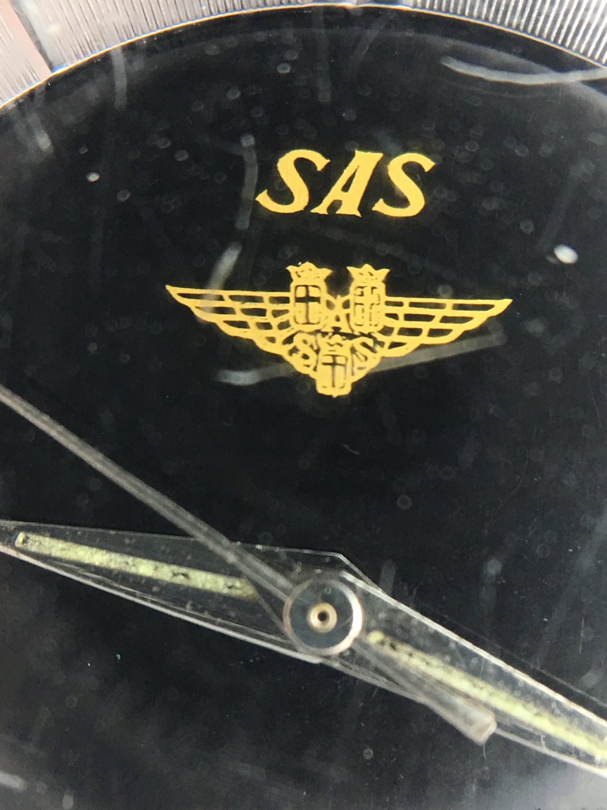
However, I also ask myself, if someone is capable of creating such a sophisticated fabrication of the emblem and SAS text, as well as the font and alignment of the text in the lower half of the dial, why would they have made glaring errors like omitting text or putting it in a different order?
 
Posts
1,433
Likes
3,010
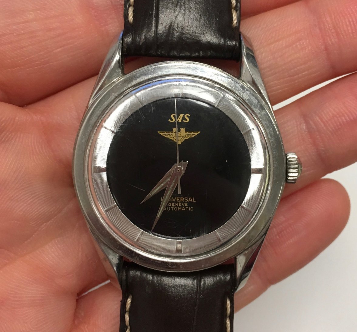
I recently acquired this.

The text looks right in terms of font and quality of printing and it is perfectly aligned with the printed SAS logo, which seems to be of a consistent colour and quality of printing. It has narrow chapter ring markers and a serial number (1684xxx) that is sufficiently early and I think dates it to a time when the Polarouter was changing to the Polerouter. Case reference is 20217-4.

My slight concerns are that I've not seen one with a black dial and the dial is missing the "Polerouter" text.

My instinct is that it is genuine. What do people think? This is the only photo I have currently. I can provide more photos when the watch arrives.


Although a good attempt, it looks like a redial to me ...

My reasons are as stated, inconsistencies with font and emblem and missing bits like Swiss. More importantly, the mixing of the guild finish with the silver hands and chapter ring makes it look odd, too odd.

It just doesn't Look right to me ...
 
Posts
1,200
Likes
3,041
I agree that things "looking right" is important. I suppose it was mainly that instinct that drew me to the watch in the first place.

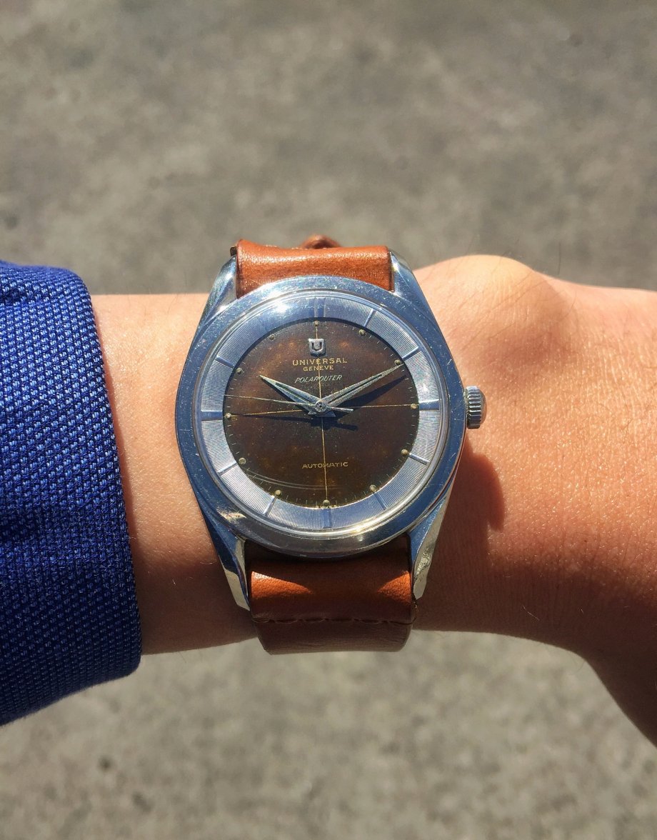
With regards to your point about the mix of the gilt dial and silver hands and chapter ring, it is worth noting that a 20217-4 Polarouter (which is exactly what I think mine is, just with a different dial) had silver hands and chapter ring but also had gilt or gold text (other than the Polarouter text) and a gold crosshair as illustrated below.

 
Posts
3,231
Likes
13,993
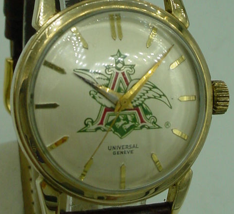
Rather than a Polarouter/Polerouter, could the OP watch simply be a company service watch? Here's an example of a dial UG did for the beer company Anheuser Busch, circa 1952...note text placement in the lower half of the dial.

(thanks)
 
This website may earn commission from Ebay sales.
Posts
1,931
Likes
22,752
I agree that things "looking right" is important. I suppose it was mainly that instinct that drew me to the watch in the first place.

With regards to your point about the mix of the gilt dial and silver hands and chapter ring, it is worth noting that a 20217-4 Polarouter (which is exactly what I think mine is, just with a different dial) had silver hands and chapter ring but also had gilt or gold text (other than the Polarouter text) and a gold crosshair as illustrated below.


I believe that is my watch, and I believe the crosshair was originally white which then turned “tropical” as with the rest of the dial.

 
Posts
1,200
Likes
3,041
Rather than a Polarouter/Polerouter, could the OP watch simply be a company service watch? Here's an example of a dial UG did for the beer company Anheuser Busch, circa 1952...note text placement in the lower half of the dial.

(thanks)

The fact that it could be an actual SAS dial but not necessarily connected with the first flight in November 1954, does seem to be a possibility. As I understand it, the relationship between UG and SAS continued for some years.

The serial number of the watch, 1684xxx, suggests it was manufactured around the same time though and in early 1955 at the latest.
 
This website may earn commission from Ebay sales.
Posts
1,931
Likes
22,752
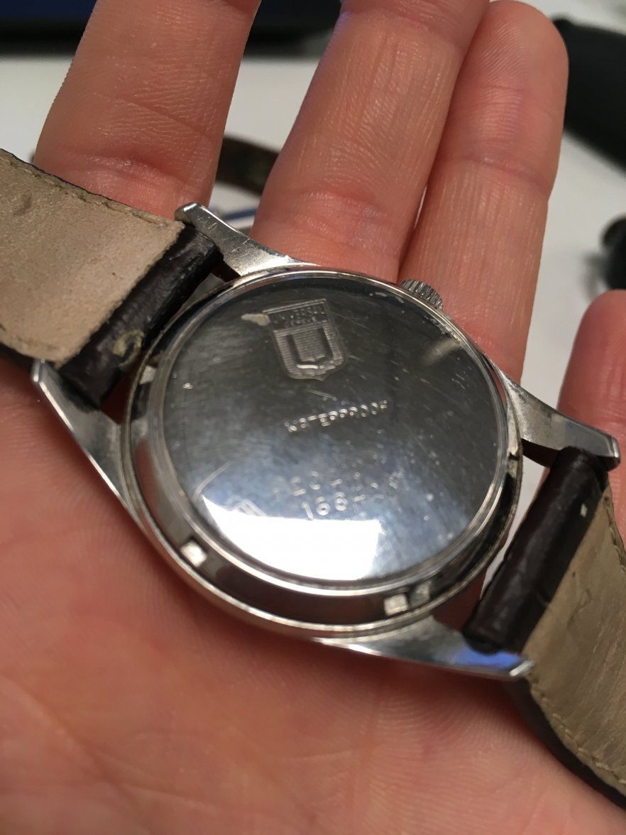
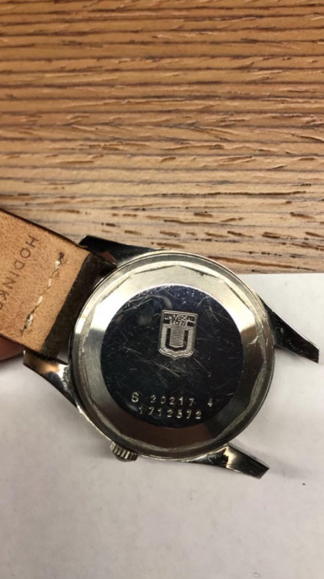
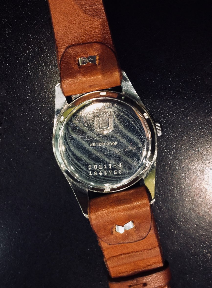
Can you please post a caseback photo that shows the serial and case ref?
 
Posts
1,200
Likes
3,041
I believe that is my watch, and I believe the crosshair was originally white which then turned “tropical” as with the rest of the dial.


Beautiful, thanks.

But the "Universal Geneve" and "Automatic" text was gold from the outset?
 
Posts
1,200
Likes
3,041
Can you please post a caseback photo that shows the serial and case ref?

Sorry, terrible photo but this along with written confirmation of the numbers was enough with the limited time that I had.

 
Posts
1,931
Likes
22,752
Beautiful, thanks.

But the "Universal Geneve" and "Automatic" text was gold from the outset?

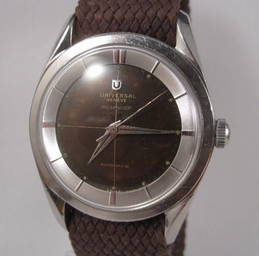
Not gold initially, below are some examples on Polarouter where the dials are still black.

maxresdefault.jpg Screen_Shot_2017-04-16_at_10.24.26_AM_large.png

Sorry, terrible photo but this along with written confirmation of the numbers was enough with the limited time that I had.


Thanks! Can't wait to see your high-res photos when you get it!
 
Posts
1,200
Likes
3,041
The second of those is definitely a 20217-1 rather than 20217-4. Not sure about the first as the dial looks to be a 20217-4 dial but the chapter ring with wide hour markers is not right.

I suspect you're right though that the "Universal Geneve" and "Automatic" text on both versions initially starts off a creamy shade (it's definitely different to the "Polarouter" text) rather than being gold.
 
Posts
26
Likes
79
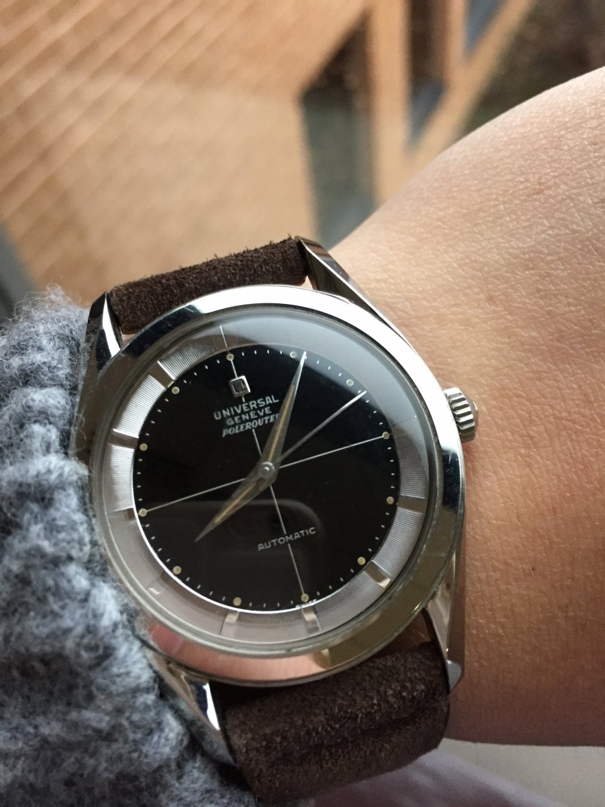
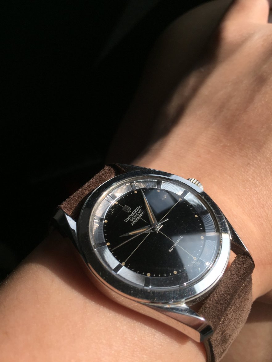
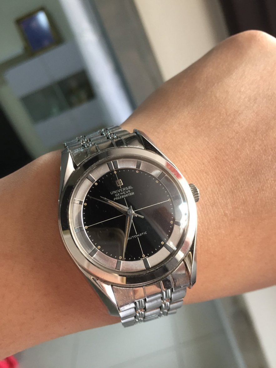
Few pictures of my 20217-4 as reference. Crosshair and texts all look white to me.

 
Posts
26
Likes
79
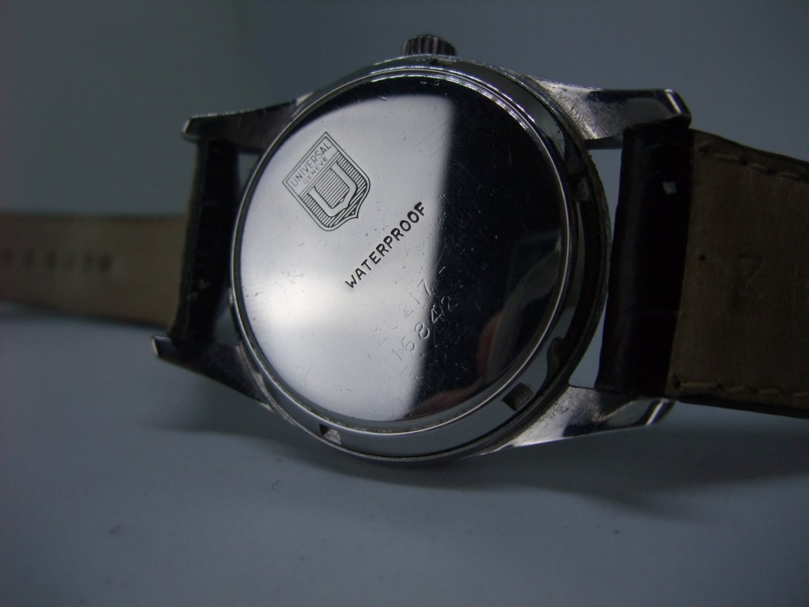
Worth noting that your watch has a screwback case and "Waterproof" stamping on it though.
 
Posts
1,931
Likes
22,752
Worth noting that your watch has a screwback case and "Waterproof" stamping on it though.

Well look who decided to comes out from the hiding 😉

Cheers for pointing this out, made me check on my Polaroter and my watch is actually 20217-4 as well.


So same ref and caseback style with the watch in question, though my watch has an earlier serial.
 
Posts
1,200
Likes
3,041
I think both case backs are ok. As I understand it, the earlier case backs had a screw back with 6 keys and then it changed to a dodecagon screw back case.

The 20217-6 SAS Polarouters I've seen have the screw back with 6 keys and are marked "Waterproof" as mine is.
 
Posts
1,200
Likes
3,041
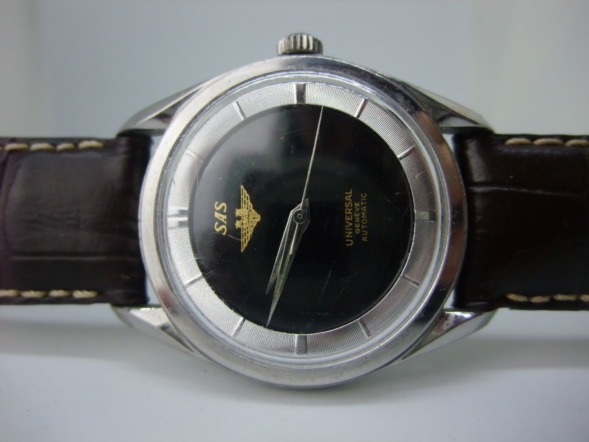
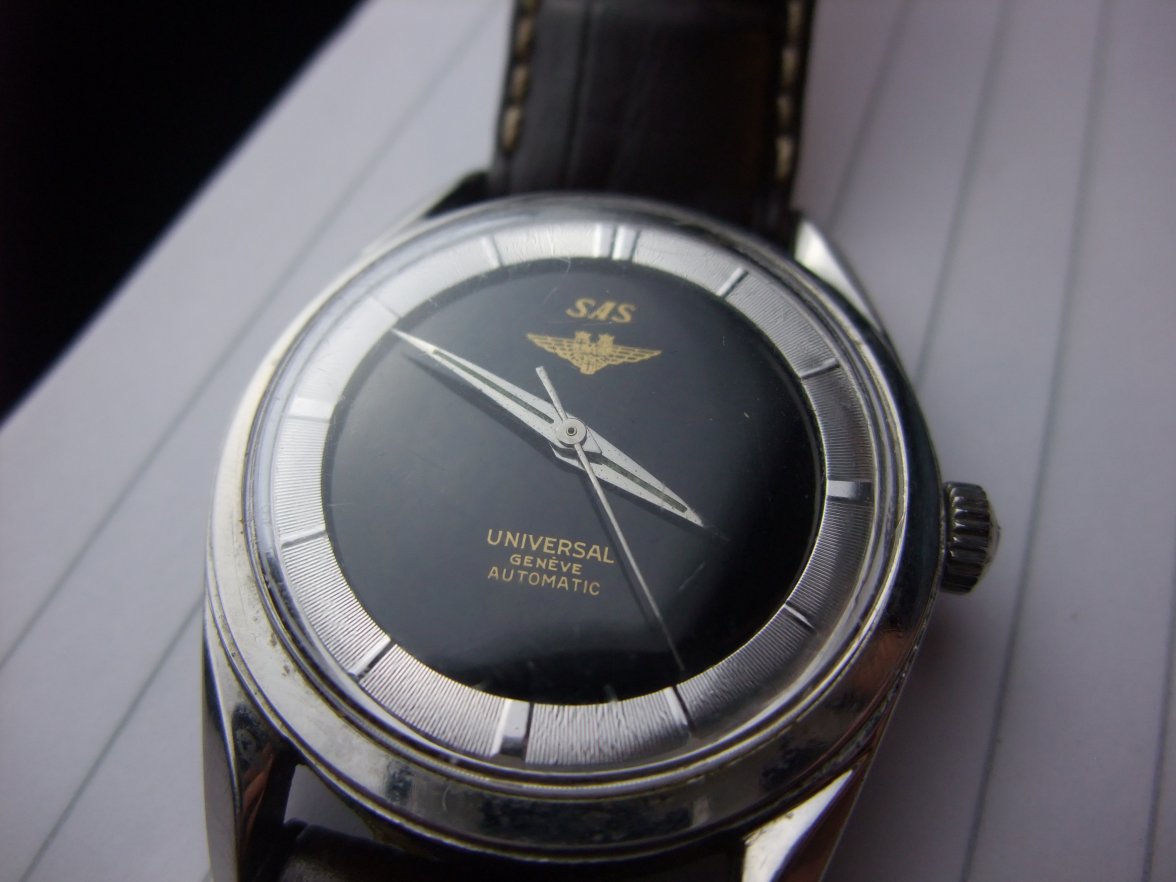
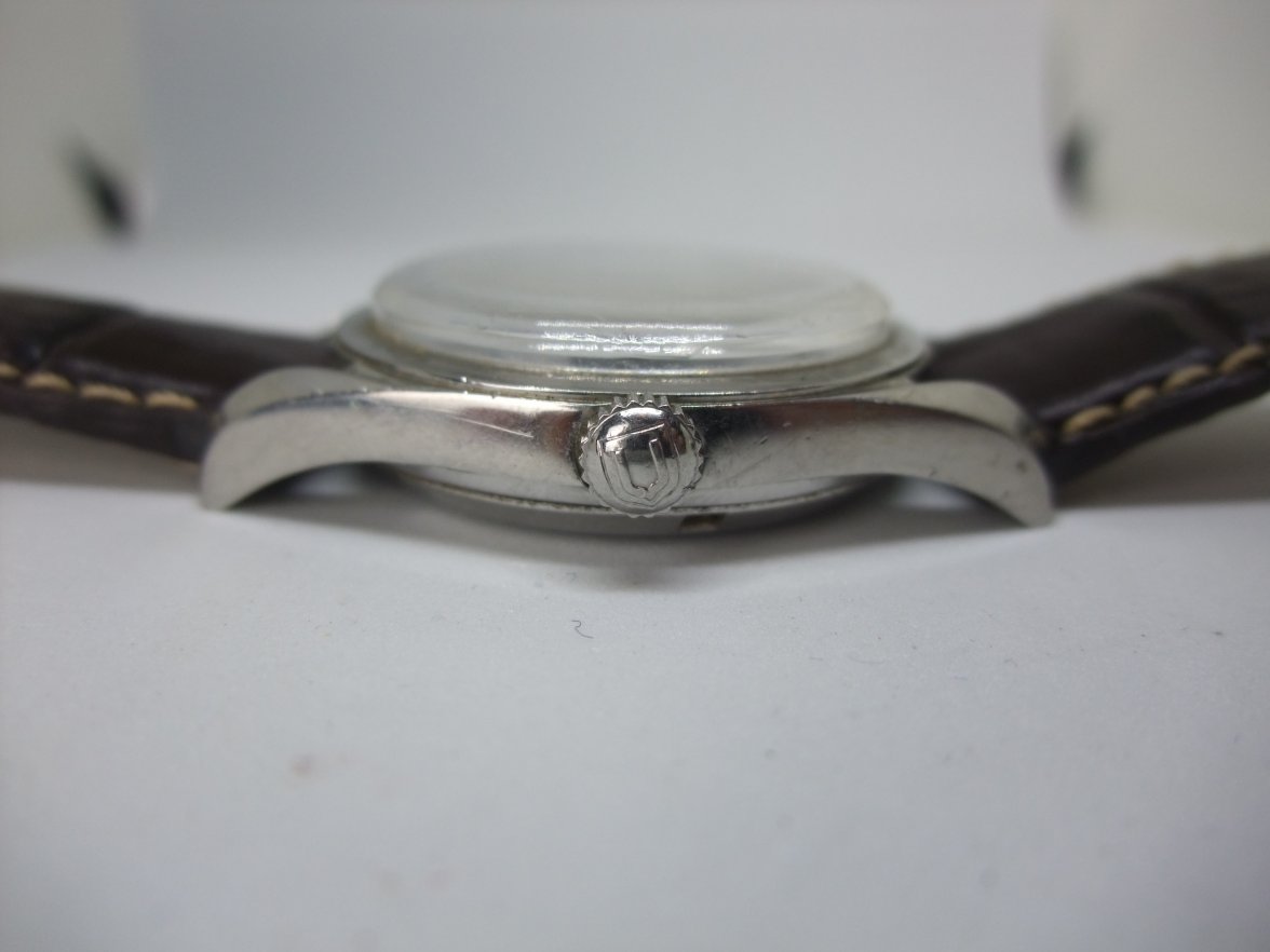
Having now seen and handled the watch, I am much more confident that it is a genuine Universal Geneve SAS dial and not a fabrication. If it were not such a potentially rare watch, I would not have thought twice about the authenticity of the text or the emblem - it looks great to the naked eye and I think also stands up to scrutiny under a 10x loupe. The gold text looks amazing against the deep black dial.

I've taken lots of photographs and added below, those which I think are useful. The macro photos of the dial are difficult to capture because of the badly scratched crystal and the tendency of the camera to focus on the scratches rather than what I am trying to capture. Please bear in mind when reviewing the macro images that we are probably scrutinising the watch to a greater degree than many that are discussed on this forum. I suspect that irregularities could be seen on text from nearly all early 1950s Polarouters/Polerouters.

The numbers on the case back look fine but are a little faint. They are easily read with the naked eye when the light is at the right angle but not easy to capture with a camera. I've not yet removed the caseback but I can feel that it is a bumper movement when moving the watch around.

I would very much welcome your views.

 
Posts
9,596
Likes
27,692
I have to say that none of the points I thought gave cause to concern has been addressed properly, IMO.

Dial colour not seen previously on a SAS Polarouter (right?).
Text of a type not seen previously.
Missing "Swiss" and "Polarouter".
Lumed hands on dial without any lume dots.
Print quality low.

The fact is that pretty much every point of visual interest on this watch is an exception to what is considered the norm. Adding to that, I feel that the overall presentation of the dial is just... I don't know how to put this in a different way than "clumsy". That gold ink applied in rather heavy manner on the black dial makes for an unelegant look which I just don't associate with UG, least of all the other SAS Pole/arouters I've seen here.

The only reason I am not expressing myself more confidently is that I am not that into UG, but what I know from assessing vintage watches in general enough inconsistencies are evident for me to, personally, judge this one out.
 
Posts
66
Likes
110
Having now seen and handled the watch, I am much more confident that it is a genuine Universal Geneve SAS dial and not a fabrication. If it were not such a potentially rare watch, I would not have thought twice about the authenticity of the text or the emblem - it looks great to the naked eye and I think also stands up to scrutiny under a 10x loupe. The gold text looks amazing against the deep black dial.

I've taken lots of photographs and added below, those which I think are useful. The macro photos of the dial are difficult to capture because of the badly scratched crystal and the tendency of the camera to focus on the scratches rather than what I am trying to capture. Please bear in mind when reviewing the macro images that we are probably scrutinising the watch to a greater degree than many that are discussed on this forum. I suspect that irregularities could be seen on text from nearly all early 1950s Polarouters/Polerouters.

The numbers on the case back look fine but are a little faint. They are easily read with the naked eye when the light is at the right angle but not easy to capture with a camera. I've not yet removed the caseback but I can feel that it is a bumper movement when moving the watch around.

I would very much welcome your views.


I can confirm, this is a legit dial. I have one too on a gold case. Great, great find. I thought I had the only one ever but turns out there's more. Can I ask where you found it?

Thanks