- Posts
- 11
- Likes
- 0
Whoknows
·Hello everyone.
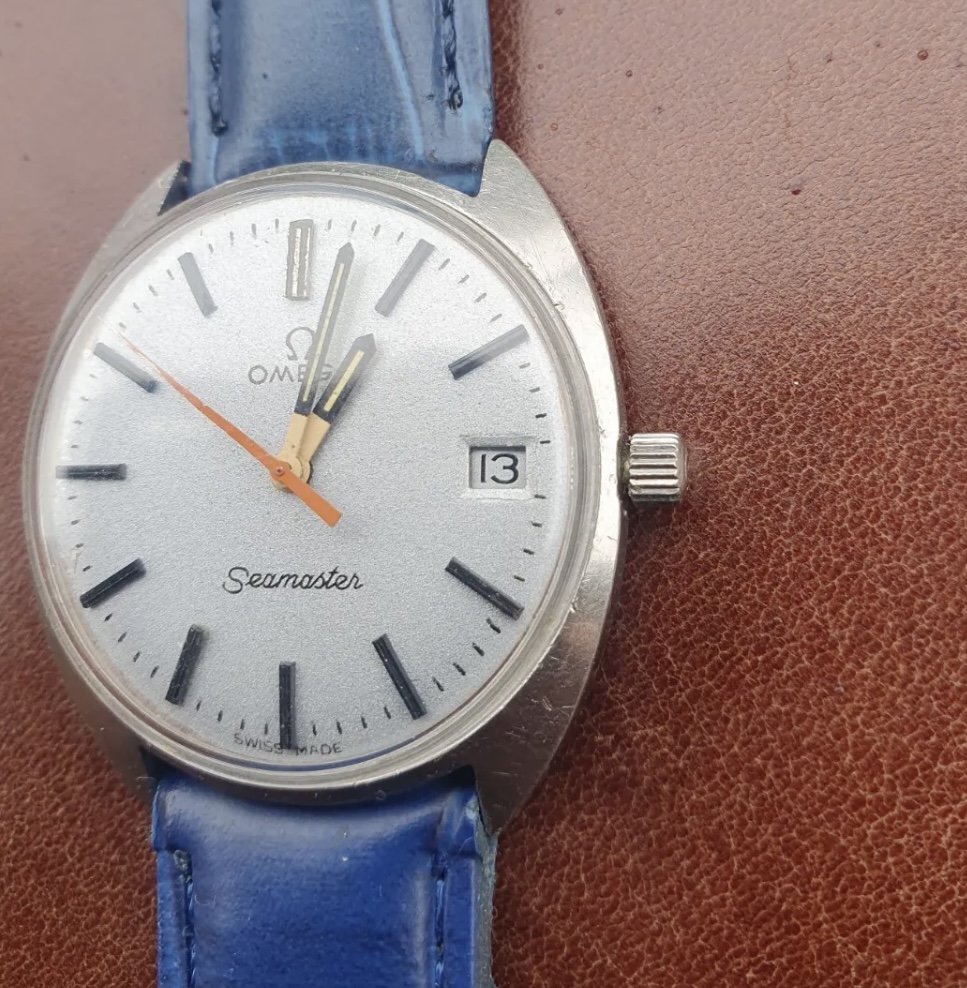
Can anyone confirm whether this is a redial (this is what I’m leaning towards)…
Struggling with this one a bit as it is a textured dial hence the spacing/cursive won’t always be perfect even when in original state.
It was listed on eBay and ended today but I didn’t pull the trigger on it due to my suspicion of it being previously restored. I couldn’t find any Cosmics with this set of coloured hands either.
Any thoughts? Hour and minute hands look sloppy, or is it just me? Hoping I can educate myself a bit more for my future purchases!
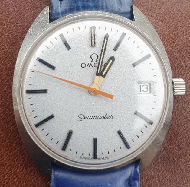