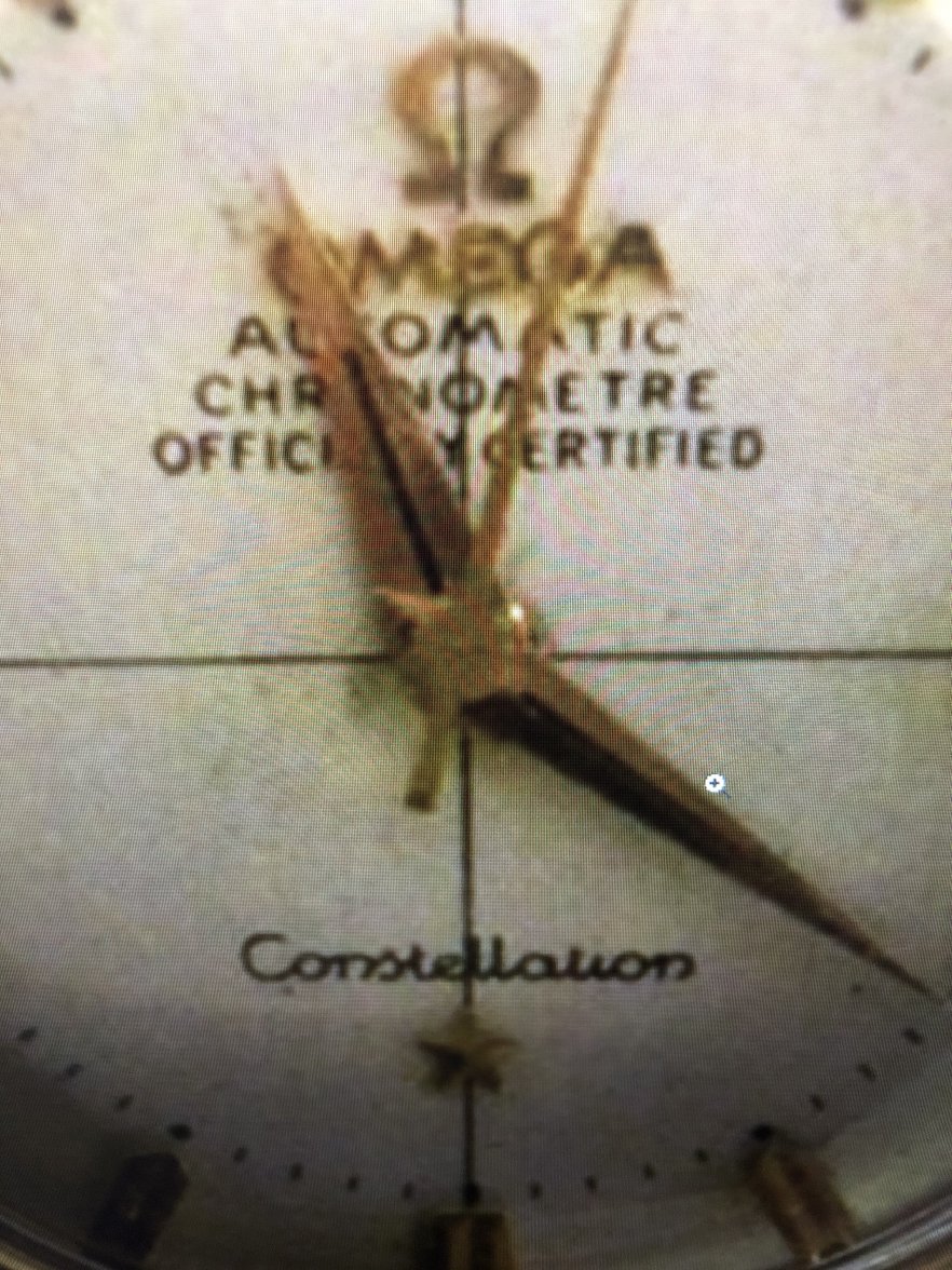
R Posts 178 Likes 293 Robbyman ·Jun 16, 2020 Hi everyone, I was offered the watch below (apologies for the bad picture but I zoomed in as close as I could on the letters). Could I ask if anyone thinks the letters have been tampered with? Many thanks, Rob
Posts 1,372 Likes 2,000 connieseamaster ·Jun 16, 2020 The font definitely looks thick and clunky. I'd wait for a few more to chime in though
Posts 9,588 Likes 27,697 ConElPueblo ·Jun 16, 2020 connieseamaster The font definitely looks thick and clunky What she said. The crosshairs are too thick and seem to not be fully drawn. The placement of the hour dots at 5 and 7 is also easy to spot as being wrong, even with this picture 😀
Posts 24,593 Likes 54,620 Dan S ·Jun 16, 2020 The minute marks look terrible from what I can see. In general, you should try to post more and better photos.
Posts 6,457 Likes 9,985 Peemacgee ·Jun 17, 2020·Purrrr-veyor of luxury cat box loungers Poor picture quality aside, put me down for a redial too.