I respectfully disagree: in my opinion, almost all the letters of the logo are different from what we are used to see on Longines' dial from that era.
But well, that's me, I can be obviously be wrong 😀
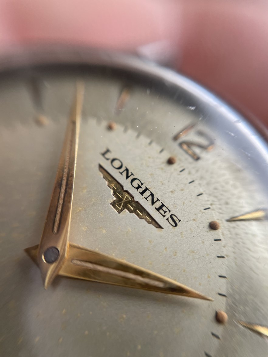
I have added a couple more examples for comparison. Of course, the limiting factor when studying photos is resolution, and the lack of resolution on the photo provided by @Andsan is making the letters look thick and a bit crude. However, I think you will find that all four examples are slightly different (note the S) and yet all share the similar design and essence. The top right example (from @hejsam) has similar Ns to the bottom right example, but each has a different S. The top right example has similar Ns to the bottom left example (from @Andsan), but each has a different S, as well. I will admit that the rounded and relatively symmetrical S of the example from @Andsan is not my favorite. But I suspect that a photo of higher resolution would reveal that the signature conforms to the quality and aesthetic standards of a correct Longines dial from the period.
Good point @DirtyDozen12.
Dials posted by @Andsan and @hejsam are very nice as a whole, but logo seems to me different from this one, which is in my opinion the original one we see on mid 50s Longines:
Now I see that also the dial's font posted by @bubba48 looks different to me, but at the same time he claims the OP's dial original.
I know him as an excellent and expert collector, much more than I am, so you can definitely trust him 😀
Good point @DirtyDozen12.
Dials posted by @Andsan and @hejsam are very nice as a whole, but logo seems to me different from this one, which is in my opinion the original one we see on mid 50s Longines:
Just to be clear, Longines did produce dials in the 1940s and 1950s with sans-serif signatures. Such dials are well-documented and have been discussed before on this forum by members such as @Syrte. Here are just a few more examples below:
Oh yes, I recall that interesting thread.
Simply, this one does not seem to me an original sans serif logo because this watch seems to me a typical mid 50s Longines dial which presents almost always another font style.
But, I repeat, that's my feeling.
We don't have to convince each other 😀
Oh yes, I recall that interesting thread.
Simply, this one does not seem to me an original sans serif logo because this watch seems to me a typical mid 50s Longines dial which presents almost always another font style.
But, I repeat, that's my feeling.
We don't have to convince each other 😀
Here is yet another example of a ref. 6555 with a very similar signature to the watch that was posted by @Andsan. The more you search, the more you will find.