Redial?

Posts
30
Likes
8
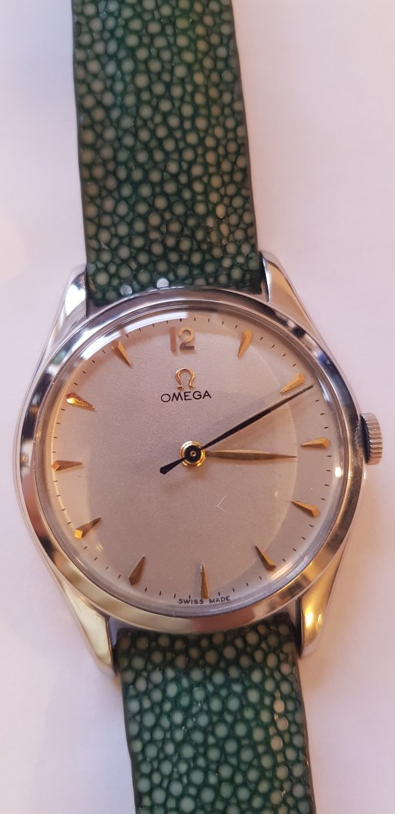
Hello forum. I wonder if you chaps can help me with some of your terrific knowledge (grovel). I have had this nice watch for some time now. It has been well looked after considering its age, but i was recently told by a watch repairer that it has had work done to the dial. I've stared for what seems like hours through my loup and squinted long and hard but it looks ok to me. Maybe the 'O' in omega is small? The 1 at the midday mark looks a bit askew, but i may now be imagining things. Please can I get some help here. I am becoming obsessed. I hope the photo is ok.
Thanks,
Colin H.
 
Posts
3,133
Likes
5,561
Redial, though a lot better than most. Compare the Ss in Swiss and look how the E in Made drops.
 
Posts
30
Likes
8
Wow. That's great info. Thanks for that. It's still a sweet little thing even if it has now lost some dignity.
 
Posts
8,353
Likes
68,593
She’s old. Just think of it as a bit of lipstick, rouge and hair tint.
 
Posts
103
Likes
96
O looks heavier on the right Omega and the letters all appear too rounded at the edges.
 
Posts
30
Likes
8
O looks heavier on the right Omega and the letters all appear too rounded at the edges.
Thanks for that. The O was worrying me - looks a bit flat - so your advice there helps my 'learning curve' considerably. Can i ask what you mean by the edges being rounded? Im missing the point there.
All info from this chat is really helping me get to grips with this hobby - all comments are most gratefully received.
 
Posts
103
Likes
96
Sure - most vintage Omega have a serif logo. Serifs are the little flourishes at the tips of the letters. See example with highlights below. These are super hard to recreate on a redial. Do you know the reference #, movement caliber, or year of the watch you posted? That bit of info makes it much to find appropriate examples for comparison

 
Posts
284
Likes
334
Another way to tell is the consistency of the minute markers. Not sure if its distortion from the crystal, but comparing your 2nd and 3rd pics it looks like the minute markers aren’t consistent, i.e., some look heavier and thicker than the others, while some look just a tad bit longer. On an untouched dial, especially a vintage reference, these should generally be consistent throughout as silky thin, perhaps a little faded due to age unless it lived its life as a safe queen.