Redial Constellation?

Posts
94
Likes
64
Nice Sunday OF!
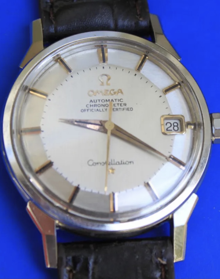
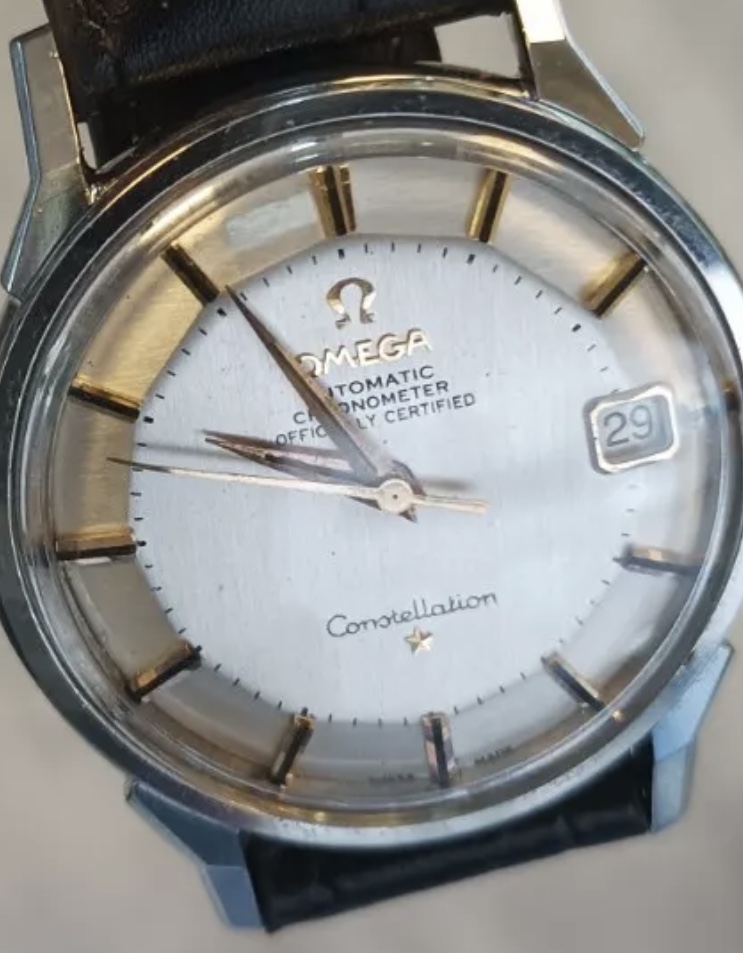
What are your thoughts to this 168005?
The “Constellation” looks good, but the other text?! Missing serifs?!

Seems also polished.

What do you think about?
 
Posts
498
Likes
407
Redial. Look at the placement of the minute markers and how they’re inconsistent around the face. Also the font is wrong for Constellation. The n at the end of the word should flick inwards.
 
Posts
216
Likes
169
Even with my limited knowledge I was going to vote for a redial, based on the font, with the Ms having vertical legs.
Anyone kindly advise if an authentic constellation font ever has vertical legs?
 
Posts
85
Likes
42
jesus, you guys have great eyes spotting redials, i had to check and compare it to my own constellation's font.
the last N in constellation is also not same as the original.
 
Posts
5,723
Likes
8,894
Dug Dug
Even with my limited knowledge I was going to vote for a redial, based on the font, with the Ms having vertical legs.
Anyone kindly advise if an authentic constellation font ever has vertical legs?

yes, check out the link to Desmond’s I posted earlier