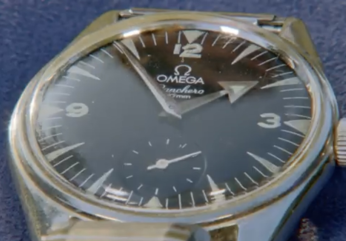
Anyone else think the dial looks odd? The 1 in the 12 is short and the OMEGA looks like a modern font.
Can't comment on the font but even my wife said what's wrong with the 12 ? Looks like proper crystal as you can see logo in centre
@prontoprint -- Look at the bottom of the 1 and the 2 ... the 1 seems a little short. And the 12/3/9 are lumed, which is not the case for Racheros as far as I've seen. Compare the fonts to this: Very different.
@t_swiss_t Just had a quick glance at some original, and vouched for, Rancheros in this group , and agree something is definitely weird. The one's I've looked at have the elongated and rather slender Omega logo . This one seems more squished. Good spotting PS Maybe this is why he got it for £4 ;-)
I know nothing about Omega but this subdial is a clear sign of a redial no matter what brand you’re talking about. This BBC guy was being sweet with the owner; no way anyone is paying 3000 GBP for this. Still much more than 4 pounds though... can’t go wrong with that.
Great story . He was sure happy about the return of his investment. To me dial and hands looks relumed for sure. He probably serviced this watch a dussin times considerg he wore it for 60 years. It was a part of the regular service procedure especially back in 50-60s to relumed the watch. I wouldn't mind owning it anyhow