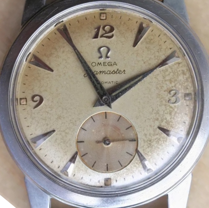
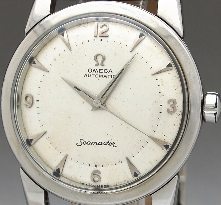
the font of the first S in seamaster on the first watch looks more legit to me for an early 50's watch. The lower curve on the second one looks more like 60's era.
the font of the first S in seamaster on the first watch looks more legit to me for an early 50's watch. The lower curve on the second one looks more like 60's era.
Both are seen throughout the 1950s. There have been similar threads on here showing several round S examples. There is no hard and fast rule on which S is right at any given point in the '50s, in fact if anything the coat hanger is more rarely seen.