Opinions on Dynamic Racing Dials?

Posts
10
Likes
1
Good afternoon
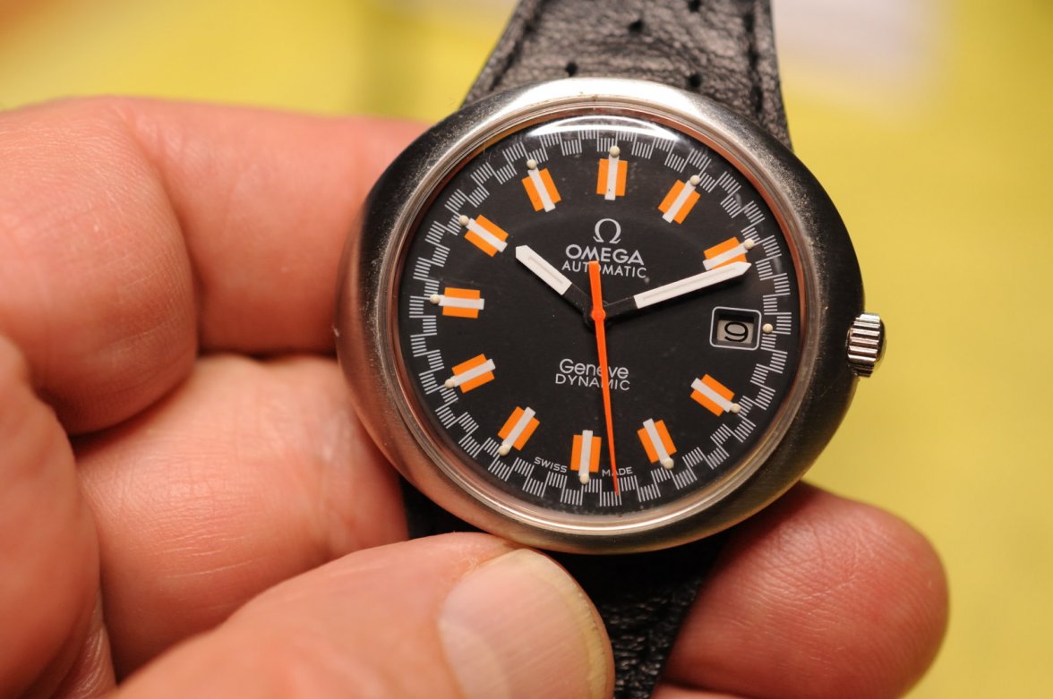
I would like to purchase a Dynamic Racing Dial but am concerned with the recent proliferation of kits and fakes/redials. I have found https://www.ebay.it/itm/Omega-Dynamic-1969-rare-Racing-dial/173763130423 which seems to pass my sniff test but was wondering if someone with more experience could validate my assessment?

Also I really like https://www.ebay.com/itm/Omega-Gene...matic-Authentic-Mens-Watch-Works/223357223167 but I'm fairly sure that is a redial based on the typeface, lack of lume plots, and somewhat uneven printing.

https://www.ebay.com/itm/Omega-Gene...less-St-Auto-Original-Band-Clasp/173728817289 is interesting. I emailed with the seller who says as far as he knows it is original, but the misaligned lume plots and oddly large text seems off to me.

Thanks for any replies!
 
This website may earn commission from Ebay sales.
Posts
3,773
Likes
20,189
I tend to think the first one is genuine also, the second is not and, I embarrassed to say, or not, I bought one almost exactly like the third when I was a noob. A watchmaker I used, who worked at Omega facility in the late 1970's and early '80s said he thought it was genuine when I expressed my concerns, especially about the lume plots and the pointed "A" in AUTOMATIC. His response was "Omega cut all kind of corners in the Quartz Crisis" or words to that effect. I still am not convinced.

My watch:

The picture from eBay:

s-l1600.jpg

In any case I would personally pass on all 3 of those.
 
Posts
10
Likes
1
I tend to think the first one is genuine also, the second is not and, I embarrassed to say, or not, I bought one almost exactly like the third when I was a noob.
.....
In any case I would personally pass on all 3 of those.

Thank you very much for your thoughts. I will follow your advice and pass.

Something I am interested in is the è in Genève on yours vs the ebay one in the third example. Unfortunately your seconds hand is covering up exactly that spot so I can't compare them myself. Unrestored dials seem to have a definite vertical space between the diacritic and letter, while reprints almost merge the two because the typeface is wrong.

I think you were correct in second guessing the watchmakers thoughts - why would Omega (purposely) produce the same dial with notably different lettering, even if Japan was eating their lunch at the time?

And one last housekeeping thing: Is it against protocol here to follow up in this post with other Dynamic Racing Dials I am interested in, or should I create a new post every time?
 
Posts
3,773
Likes
20,189
Thank you very much for your thoughts. I will follow your advice and pass.

Something I am interested in is the è in Genève on yours vs the ebay one in the third example. Unfortunately your seconds hand is covering up exactly that spot so I can't compare them myself. Unrestored dials seem to have a definite vertical space between the diacritic and letter, while reprints almost merge the two because the typeface is wrong.

I think you were correct in second guessing the watchmakers thoughts - why would Omega (purposely) produce the same dial with notably different lettering, even if Japan was eating their lunch at the time?

And one last housekeeping thing: Is it against protocol here to follow up in this post with other Dynamic Racing Dials I am interested in, or should I create a new post every time?
As to protocol, that's entirely up to you. If it makes sense and has a continuity of purpose I would continue the thread.

Here's a comparison for you between the dial I posted earlier and another racing dial I have from an older Dynamic. The blue dial is over a cal. 565 and the black over a 1011 (if I recall correctly) and the cases are different. You will see the script on the blue dial is more what one expects; a flat top "A" and the serifs on "DYNAMIC".


I would imagine there is around 7 years difference in these dials - assuming the black dial is actually legit...
 
Posts
233
Likes
394
I agree that the 2nd and 3rd ones are definitely re-dials. The first one looks OK but it isn’t the best photograph and when you zoom in some of the lettering looks a bit uneven. It may be the resolution of the photograph but it would concern me a bit.
 
Posts
2,183
Likes
16,891
not sure if this is counts without orange on the markers, an old macro shot.....shows the flat top As and accent grave.
 
Posts
10
Likes
1
One original dial that I used to own

Very handsome, thank you for the verified example that we can all use for reference in the future.
 
Posts
10
Likes
1
I agree that the 2nd and 3rd ones are definitely re-dials. The first one looks OK but it isn’t the best photograph and when you zoom in some of the lettering looks a bit uneven. It may be the resolution of the photograph but it would concern me a bit.

I thought the same thing regarding the first one after staring at it for while, specifically the 'E' in Omega in the first picture has a left-to-right downward sloping horizontal bar at the bottom of the letter. However upon viewing other pictures, I think that specific call out can be explained as crystal distortion. Was there an additional area(s) you could point out that concern you, so we can learn?
 
Posts
10
Likes
1
not sure if this is counts without orange on the markers, an old macro shot.....shows the flat top As and accent grave.

Excellent, it definitely counts as a valid known-good reference piece in my book! Thank you for sharing it for the future.