Jones in LA
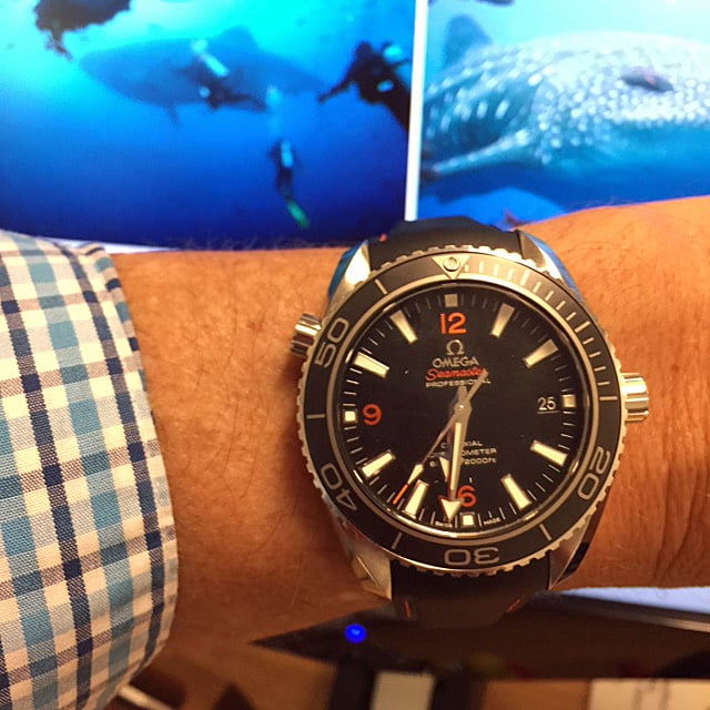
··Not in LA anymore.I was going through some old wrist shots that I had posted nearly four years ago and grimaced at the pathetically poor quality of many of the shots. It was like I just didn't care. Here's an example from this period:
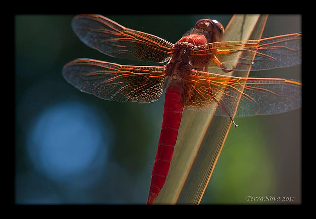
It's not like I was a crappy or particularly careless photographer -- I've always had a keen interest in photography and usually put a good amount of effort into composition, framing, and post-processing in order to achieve a pleasing result. Here's a photo I posted to my Flickr account about eight years ago, and I know there was a lot of post-processing involved to get the final result.
I'm still scratching my head trying to figure out why I didn't find it worthwhile putting in just a little more thought and effort before posting a wrist shot on a forum like this.
I don't think I had a single, revelatory flash of light telling me that I need to make better wristshots. It was just a gradual process of seeing others' watch photos and appreciating the effort that must have gone into making the best of them, and then trying to make improvements to my own photos.
For a while I went so far as taking .RAW images exclusively and working with them in 16-bit colour before converting the final result to .JPEG. Eventually, though, I developed a (relatively) straightforward workflow for producing visually pleasing (to me, anyway) photos just using .JPEG images taken with a cellphone. And now I'd like to share this workflow with you.
Before going through my workflow, which is mainly post-processing, I'd like to say a few things about getting better shots to work with in the first place. In no particular order, here are things I'm mindful of when taking wristshots:
* Improve the composition by snapping photos when the watch's hands are not covering details on the dial that you think are interesting.
* Close-in, tightly framed shots are best for showing interesting details of the watch.
* Be careful with reflections on the crystal and don't hesitate to re-orient the watch if reflections hide detail that you want to show in your photo. Caveat: sometimes reflections can actually make a shot more interesting if their location and extent are carefully controlled.
* Get rid of as many visual distractions as you can, before taking the shot, like dust particles and lint.
* And make sure the #@$%& camera is focused.
-----------------------------------------------------------------------
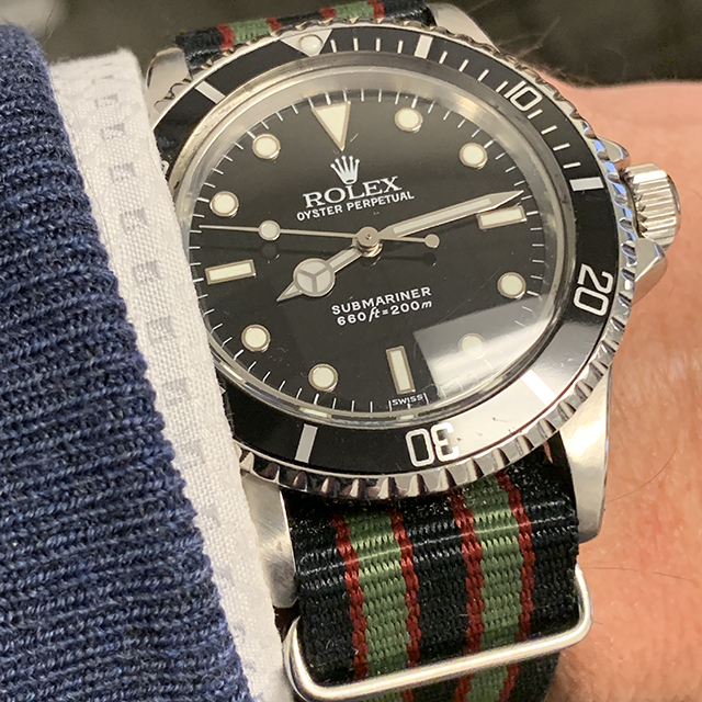
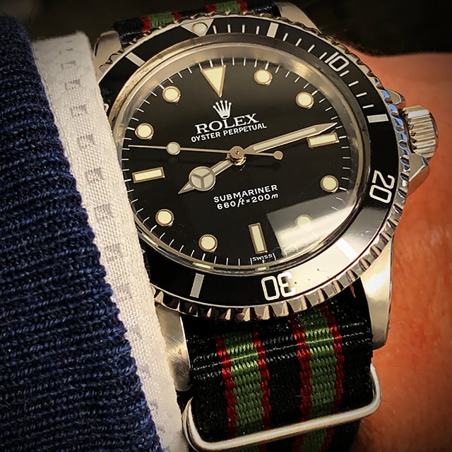
And now onto my workflow. Here's a photo I took this morning, with one version before, and one after post-processing:
The workflow below yielded the result above. This was done in Photoshop, but any photo processing app that has some or most of these post-processing features (including apps that work on-board a cellphone) can be used to make ordinary photos a lot more interesting and pleasing.
With the photo at full (original) resolution -- in this case 3024x3024 pixels for an iPhone XS, shot in Square mode with 2x Optical Zoom lens:
1) Adjust contrast with Levels (and/or the Contrast slider and/or Curves) until you get a visually pleasing result.
2) Adjust brightness (if necessary).
3) If colour is an interesting feature of the watch (or other elements of the photo), increase Vibrance (and/or Saturation) until you get a visually pleasing result (while being careful not to over-do it).
4) If you're going to reduce the image resolution before posting online, now's the time to do it. In this case I changed the resolution to 640x640 pixels for posting on the Omega Forum. I've found that 1024x1024 works better for Instragram because people like to pinch-and-zoom on their phones to see photos in greater detail.
5) Sharpen the image, being careful not to over-do it. Personally, I prefer the Smart Sharpen filter in Photoshop.
6) Get rid of remaining visual distractions like dust and lint (or a particularly distracting arm hair) using something equivalent to the Spot Healing Brush in Photoshop.
7) Add some additional "pop" to the subject by throwing a (darkened) vignette effect around the edges of the photo.
This might seem like a lot of work, but now that I've got this down to sort of a system I'm sure I didn't spend more than three or four minutes going from the original cellphone camera image to the final result. I hope this gives other Forum members some ideas on how they can make their own wristshot photos more visually appealing. Good luck!
Edited:


