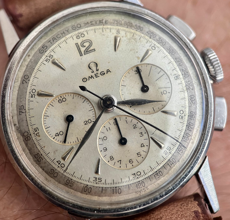
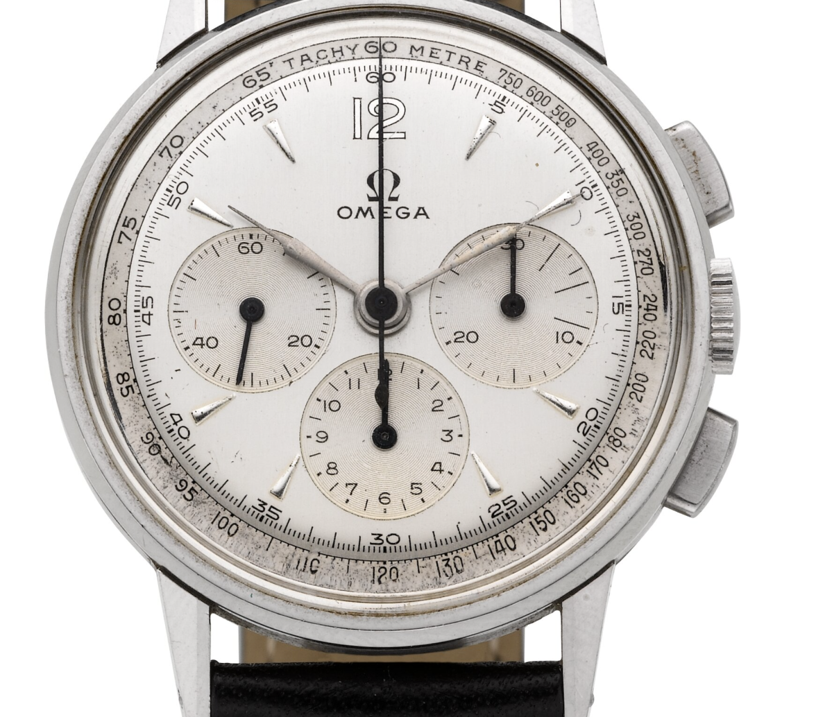
Omega Chronograph ca. 1951 Cal. 321
JimInOz
··Melbourne AustraliaMy immediate reaction on seeing the dial is that it has been re-painted.
No detective work involved as yet, just what hit my eyes.
Note: I am ignoring the circular track abberations as I suspect they may be distorted due to the crystal being unevenly polished.
No detective work involved as yet, just what hit my eyes.
Note: I am ignoring the circular track abberations as I suspect they may be distorted due to the crystal being unevenly polished.
seekingseaquest
·Unfortunately it has been repainted.
JimInOz
··Melbourne AustraliaOn further review I'd say original.
Omega font threw me at first, but kerning is OK and it's correctly centred.
Sub-dials still have good circular graining and centering.
But based on that photo I'm for original at this stage.
Omega font threw me at first, but kerning is OK and it's correctly centred.
Sub-dials still have good circular graining and centering.
But based on that photo I'm for original at this stage.
bassem abadan
·Hi All,
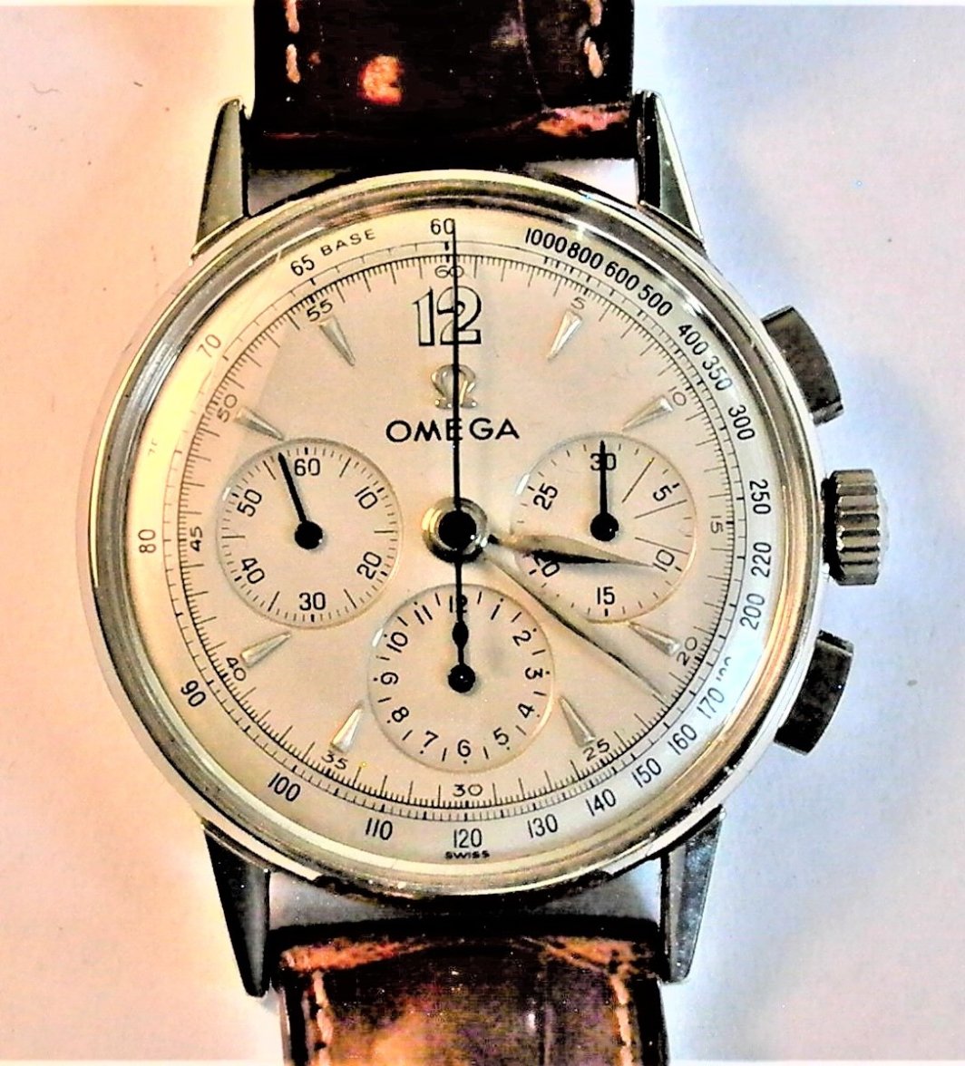
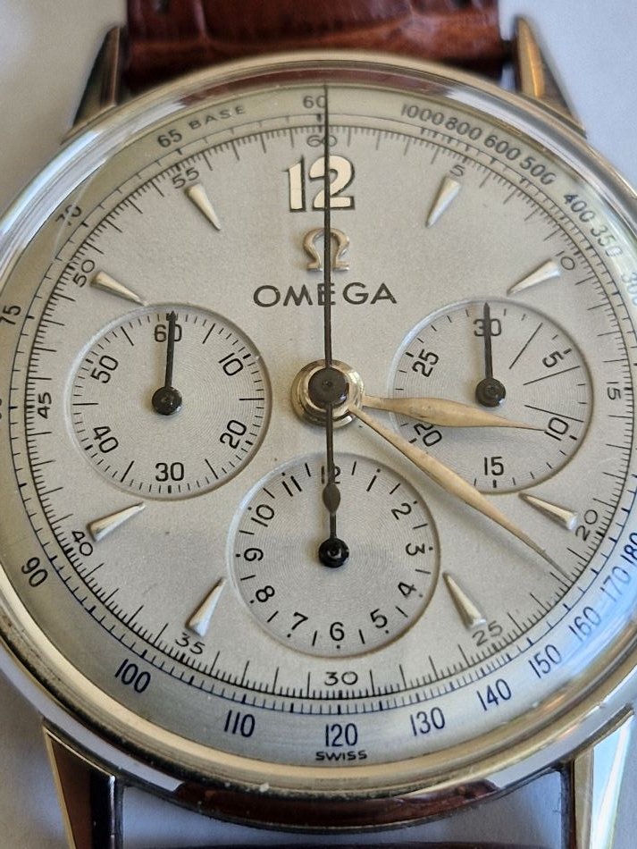
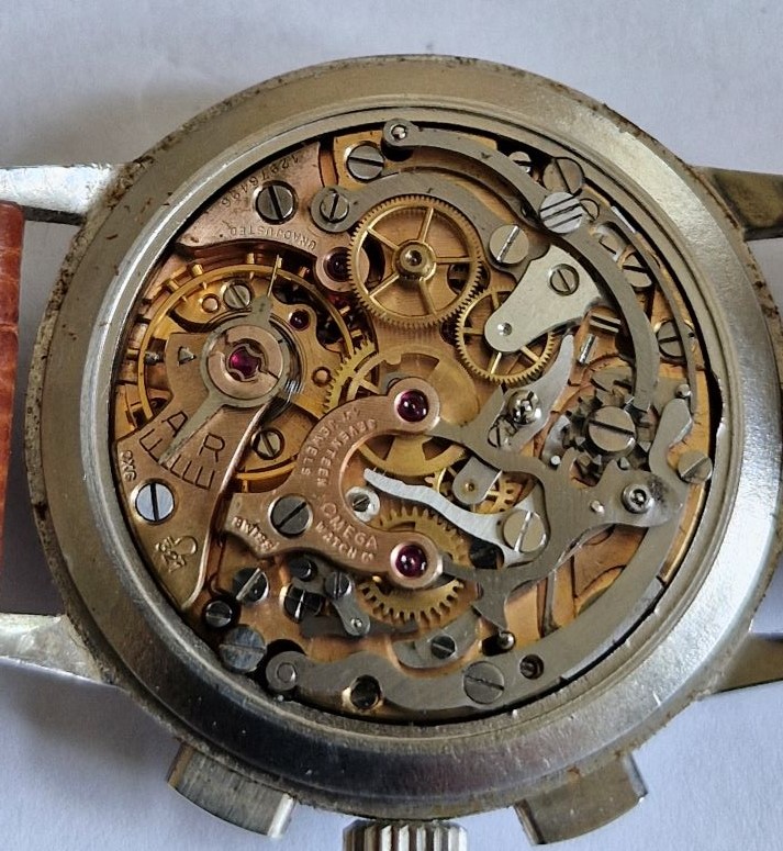
I would like to know what the experts think about this dial, in particular whether it original. The serial number of the movement suggests 1951 as the building date.
Thanks in advance, Bernhard
Risto
·redpcar
·Bernhard J
·Unfortunately it has been repainted.
If so, it seems to have been a really good job, compared with other repainted dials I have seen here.
JimJupiter
·If so, it seems to have been a really good job, compared with other repainted dials I have seen here.
you think? Its quite obvious in my eyes.
Bernhard J
·you think? Its quite obvious in my eyes.
Please educate me (and perhaps others) and kindly point to the obvious tell-tale details.
SWmania
·In my opinion, redial.
But curious point is that the [OMEGA] text is so bad, especially compared to the rest of the dial.
rest of the dial - decent redial job I would say
but [OMEGA] text - that is so bad. could tell it's a redial in the blink of an eye.
But curious point is that the [OMEGA] text is so bad, especially compared to the rest of the dial.
rest of the dial - decent redial job I would say
but [OMEGA] text - that is so bad. could tell it's a redial in the blink of an eye.
cristos71
·Please educate me (and perhaps others) and kindly point to the obvious tell-tale details.
Omega too big and too bold. Wierd font on the 12.
cristos71
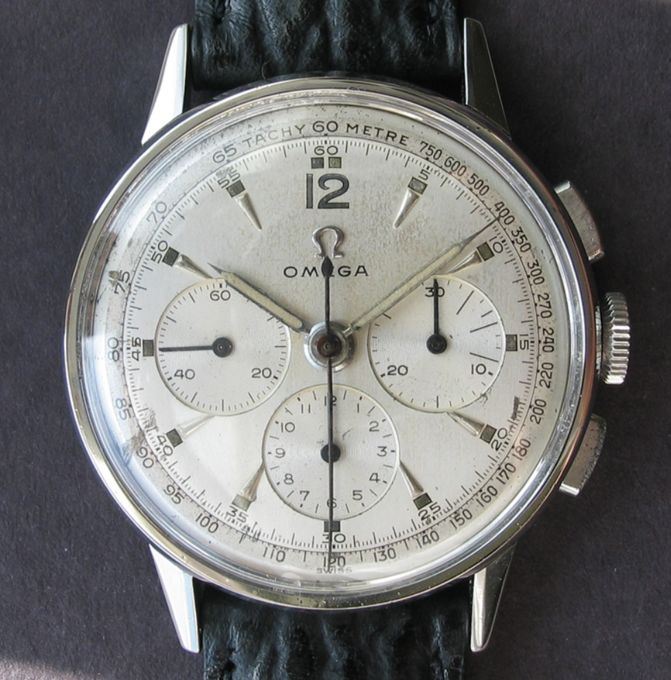
·2279 has a distinctive case and lug design which are easily recognisable once you know what to look for. As is the 2381 which is bascally the jumbo 2 register ( cal 320 ) version of this case shape
JimJupiter
·Please educate me (and perhaps others) and kindly point to the obvious tell-tale details.
What the others say. Font to bold and not crisp enough. Also the A is not flat.
seekingseaquest
·In addition to what has been mentioned, the paint texture in the center of the dial is unexpected.
Risto
·I know because I am big fan of Omega chronographs, although of their later models (1960s), and I have seen this one before. I had ref 2278 which is a bit similar from the late 50s.
Bernhard J
·I had bought it decades ago, that is long before I got to know this forum and the expertise assembled here. And do not even recall how much I had paid back then 🤔.
JimInOz
··Melbourne AustraliaGlad you got some educated responses Bernhard.
I'm going to stick with my "first impression gut instincts" from now on.
😉
I'm going to stick with my "first impression gut instincts" from now on.
😉
