Omega CHRO 33.3 Reference Number

Posts
6,577
Likes
11,215
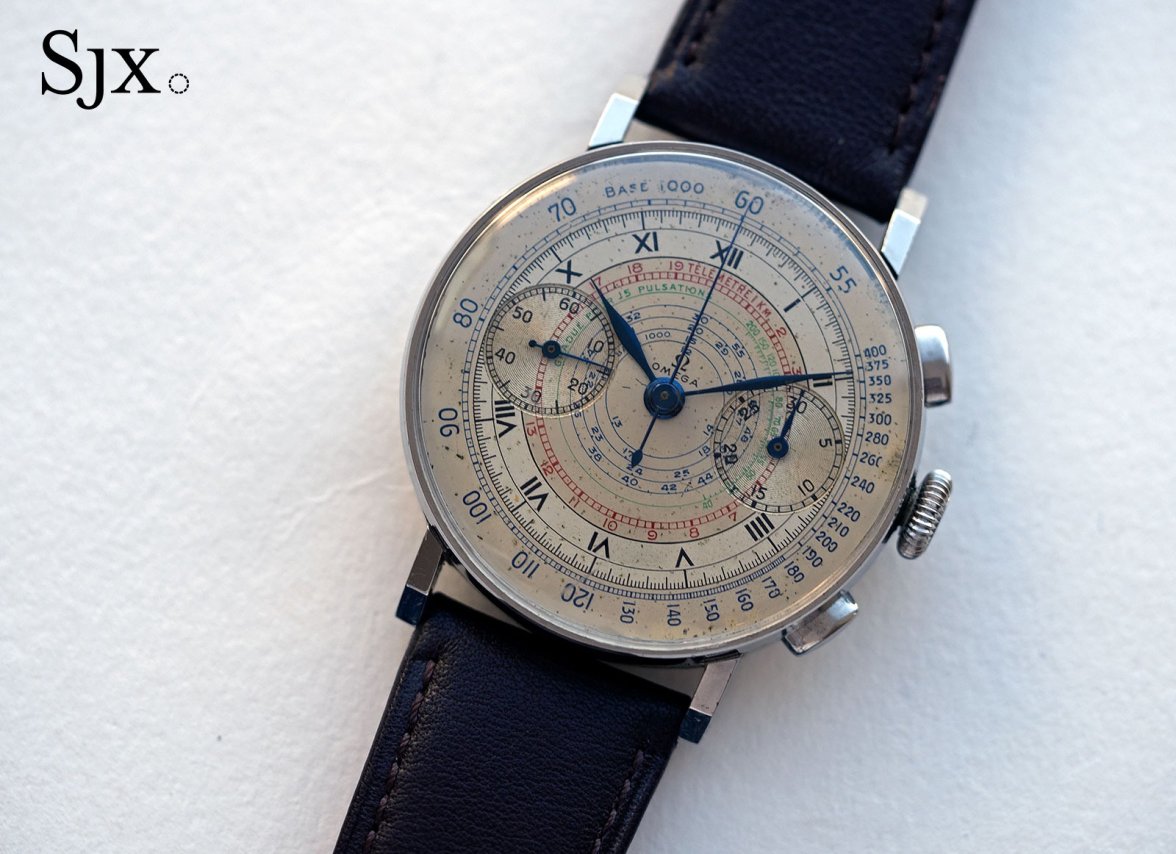
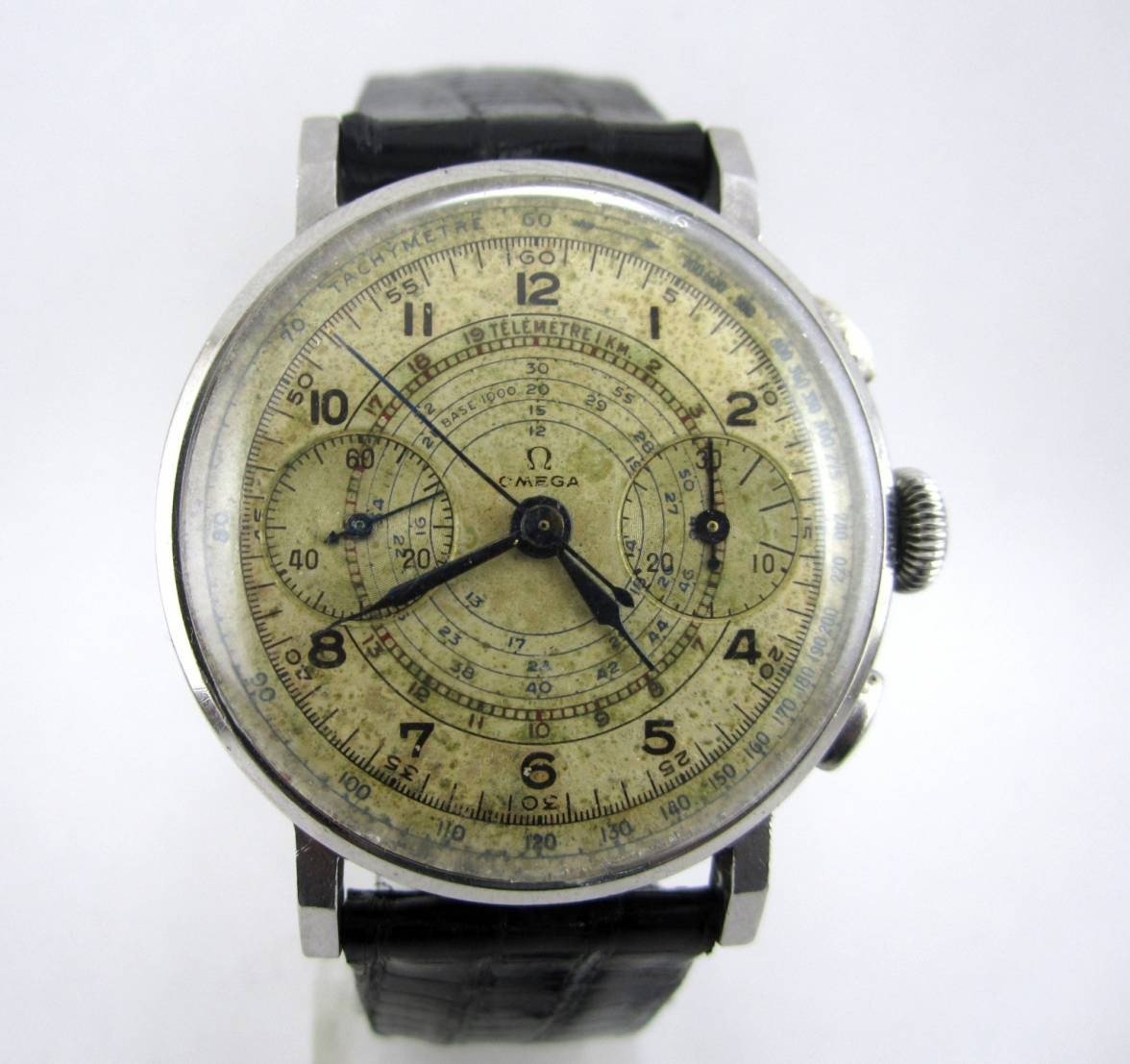
While I own a few 33.3s am not the expert on these but the dial looks “off” to me - too many slight imperfections as noted here. About 15 years ago there were several of these 33.3 redials sold on eBay that looked original but didn’t pass muster on closer inspection. This reminds me of those dials.

And I will say the top vintage omega experts in the world are active in this forum (some literally wrote the reference texts on this hobby) and I would personally trust their collective input over any single person. I am not sure the GIA certified person you consulted has the deep knowledge required to be a true vintage omega expert let alone when it comes to the 33.3 chronographs which is a small corner of the vintage omega universe. It’s a lot of work - literally more time and effort than it takes to earn a doctoral degree.
 
Posts
5,207
Likes
8,100
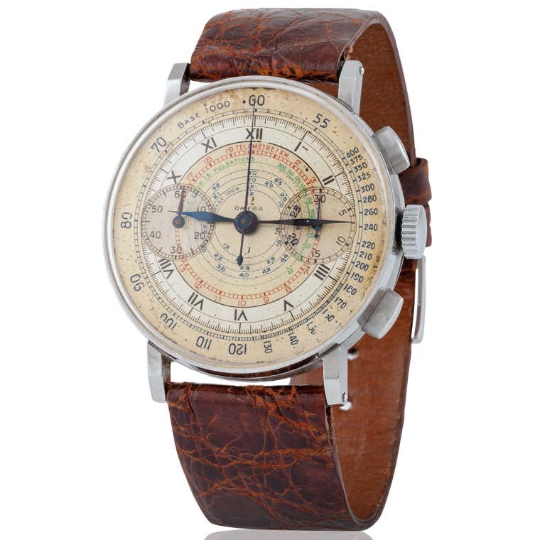
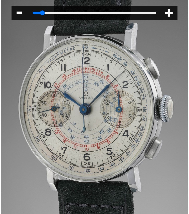
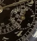
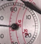
Couple of others - legit IMHO - show a lot of differences....

25649-0041ae11cc4f5f8cdac2eb2add.jpg Omega-33.3-chrono-multi-scale-1.jpg image (65).jpg Schermafbeelding 2024-05-03 084240.jpg
 
Posts
3,284
Likes
6,961
These dials were hand painted 80 years ago when they did not have modern day tools and techniques.

This is BS!
The dials were not hand painted at all but pad printed and those artists were better/more skilful than today´s dial restorers which fail most of the time.
Edited:
 
Posts
1,840
Likes
5,366
If they were hand painted, they would have finished two watches by now.
 
Posts
1,177
Likes
5,149
Without being an expert on these, I also immediately questioned the originality of the dial. My gut feeling was confirmed by the experts here.

However, the OP never asked for an opinion on the dial, only the reference number. So should we even bring this topic up and make an owner feel bad about a watch he/she previously liked? Personally, I would say, no, unless the watch is clearly intended for sale (to protect the buyer), which doesn't seem to be the case here.
 
Posts
5,207
Likes
8,100
Get your point but I don't think this is the place to 'flaunt' a watch without getting feedback

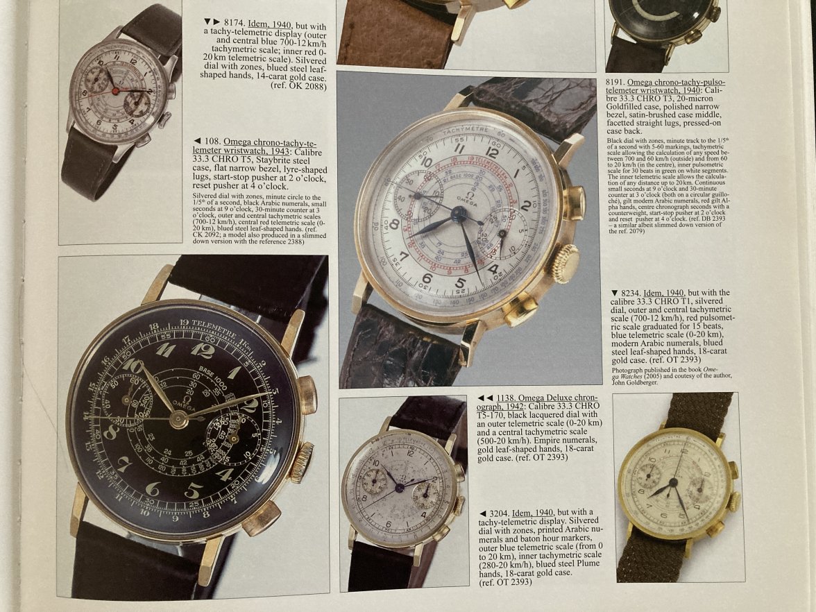
AJTT pic:
IMG_8053.JPG
Edited:
 
Posts
1,177
Likes
5,149
My comment wasn't directed per se at you because if it hadn't been you, somebody else would have brought up the R-word soon enough. I was more wondering how members thought about handling these situations in general.

I guess there won't be a consensus as there's the trade off between having an individual taking the blue pill and be happy (not the Pfizer type, the Matrix type :D) or educating the public (and I admit I learnt a lot from this thread alone).
 
Posts
3,131
Likes
13,607
I was more wondering how members thought about handling these situations in general.
Maybe a better way to think of this thread: The OP has graciously presented this forum with an example that have allowed forum experts the opportunity to share what they observe.

Given that vintage watch collectors generally prize originality above all else, these posts provide new and old collectors alike with an invaluable lesson in the evaluation process that collectors go through when seeing a new example. Many thanks to the OP for sharing their pictures with us.
 
Posts
328
Likes
335
Jjen, thank you for your input. My I ask what you are basing your opinion on?

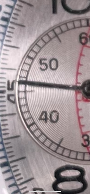
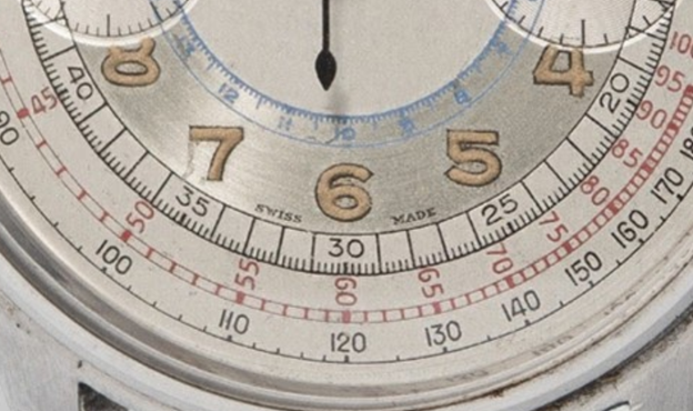
Subdials are brushed, not circular. Shiny ring on dial. The upper right part of the inner red printing doesn't reach the edge. Seconds counter hand looks repainted. The irregular overlap on the running seconds subdial between red text and black (10/20). Irregularities on the outer track of the marker lines and the printing. I mean, it doesn't look bad but it there are a lot of clues that it is not typical for a 33.3 and that it's a redial. I'm not a world renowned expert or anything but I owned one for a period of time and I had the privilege of examining the collection of a big collector of 33.3s.
 
Posts
328
Likes
335
This is BS!
The dials were not hand painted at all but pad printed and those artists were better/more skilful than today´s dial restorers which fail most of the time.
hand painted by the redialer for sure
 
Posts
7,290
Likes
33,734
I'll just add that in my observations of 33.3's "Swiss Made" is generally seen only after 10 million serial numbers and never so early as the OP's 9.6 million serial.
 
Posts
2,732
Likes
4,767
Thank you for your observations and the link to the other watch. I can see what you mean by silver-metallic appearance. However, I think this is primarily due to the lighting conditions under which my picture was taken. Below is another picture of my watch taken where only the lightening has changed and it does not look metallic at all. I can tell you when you actually hold the watch in your hand it looks more similar to the picture you provided.
To clarify, my point was that under no lighting conditions would I expect an original two-tone dial on a 33.3 to have such a silver-metallic appearance.
I agree that the lack of space between the seconds/minutes scale is unusual but there seem to be so many unique dials out there for the Chro 33.3. I have looked at a number of dials on-line that appear to be original due to the patina and they too have inconsistencies within the dial themselves (slight spacing differences for the railroad from one side around the 9 compared to the 3, some thicker lines etc). Maybe these very slight inconsistencies are to be expected considering these dials were painted by hand? They were the work of artists.
I agree, one can often find inconsistencies within dials. I also agree that one can find many different variants of similar dials. However, one can also find patterns and conventions across these variants. This is partly the result of dial makers using the same tools to print certain parts of different dials (e.g., signatures and sub-dials). This is also the result of apparent design conventions that dial makers adhered to, even across different watch brands that they supplied to. As @mac_omega mentioned, these dials were not painted by hand but rather printed using engraved metal plates and pad-printing devices.
I have relied upon the advice of the AGP/GIA expert, who saw it in person and stated that it was original and authentic 100%. I have also shown it to a vintage watch expert who said it was a museum piece. I have looked at dozens of images and all dials appear to be unique in design. If someone in the community has a photo of the same dial it would be greatly appreciated.
I will echo the sentiments of @MSNWatch and mention that some members of this forum are among the most knowledgeable collectors and scholars of Omega watches. They have dedicated many years to studying the subtleties of specific periods in Omega's history. This level of specialization is crucial to one's ability to recognize typical and atypical features. While a general vintage watch expect or professional jewelry appraiser might posses substantial broad knowledge with areas of greater depth, it is unlikely that they posses the same depth of expertise as a collector who has solely focused on a narrow area for many years. This is what makes Omega Forums such a valuable place to learn about vintage watches.
 
Posts
328
Likes
335
It’s pretty obvious it’s a redial can we all just playing around here. Sorry but it’s the truth
 
Posts
1,256
Likes
2,797
Yes I agree it is a redial, subtle factors such as proportion are off, spacing,and the "SWISS MADE" which is very odd to see on that watch.

I am sure like you said however that it is a delight in person and hope it brings you joy. :)
 
Posts
33
Likes
2
It has definitely been an interesting discussion for me. I too have increased my knowledge through this discussion. I am a newbie at this and can readily see that I will continue to be so for some time...there is a lot to learn.

I am NOT going to continue to present rationale or arguments to assert that the dial is genuine and not a redial. The Omega community has, so far, given a unanimous opinion on this issue; which I respect. That said, in the interest of learning more and also to further educate myself and the forum, I would like to raise the following:

1. My original post was intended to find out the reference number without opening my watch again. cristos71 suggested it was a 2393. It would be great to here from you about my question concerning the angular lugs being seen on references other than 2393?

2. With regards to the apparent irregularity, "upper right part of the inner red printing doesn't reach the edge". In general, is the pad printing process known to produce results that are not crisp, smudged, no paint curing issues or other flaws in genuine/original dials?

3. When looking at the sub-dials on my watch with the naked eye and as per the picture below, they are circular and not brushed as suggested by one of the posters, which is consistent with the other references provided by the forum. I can see from the previous picture that I provided how one would conclude that the sub-dials were brushed

upload_2024-5-3_23-54-39.png

I think that this issue illustrates just how misleading photos can be.

4. In the reference dials provided from the AJTT, some of the watch dials are stated as being silver and the pictures do look metallic. Particularly the one in the center with the gold bezel. Is it out of the realm of plausibility that these same watches would present more shiny/metallic with better photos?

5. My comment about hand painting was "my bad". I did and do realize that the dials were not hand painted with a paint brush and freehand. I assumed that there must have been a stencil or etching or some other process that involved less technology and precision than modern watches; and therefore more hands-on for vintage watches. From Mac_Omega, I can now appreciate that pad printing was the method used.

With the ability to zoom in on the other apparent original dials presented above, I have noticed very slight differences in railroad thickness/width/height. Also, very slight spacing differences. Also, the large font of the 20 on the overlay of the sub-dial on the second picture reference provided by Mark020 doesn't look right. Could the pad printing process produce such results?

6. I agree that the seconds hand paint on my watch does look a little thick. Not sure if it was repainted or simply aging?

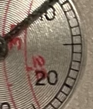
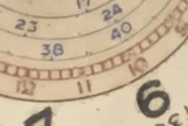
7. Regarding the alleged irregular overlap on the running seconds sub-dial on my watch between red text and black (10/20). From one of the AJTT watches provided by Mark020 (picture below), am I seeing concern with overlap?
AJTT
upload_2024-5-4_0-17-41.png View attachment 1778899

8. I have noticed watches with both "Swiss Made" and "Fab Suisse" from circa 1939, 1941. A quick internet search yielded these results:

a) https://www.vintage-portfolio.com/s...vintage-chronograph-gold-37mm-jumbo-oversize/
b) https://www.db1983.com/our-archive/omega-333-ck-2393-black-gilt-dial-1940
c) https://www.phillips.com/detail/omega/CH080117/189?fromSearch=omega chr&searchPage=3
d) https://www.monacolegendauctions.com/auction/rare-watches-fine-jewels-modern-art-8/lot-47

Thank you to everyone...I look forward to your thoughts.
 
Posts
1,256
Likes
2,797
1. My original post was intended to find out the reference number without opening my watch again. cristos71 suggested it was a 2393. It would be great to here from you about my question concerning the angular lugs being seen on references other than 2393?

As you can see from the capture from AJTT the 2393 is a slimmed down version of the 2079, so perhaps this is the other version you are seeing. the excerpt also shows one with reference 2080 so that gives two alternative references you can investigate.

2. With regards to the apparent irregularity, "upper right part of the inner red printing doesn't reach the edge". In general, is the pad printing process known to produce results that are not crisp, smudged, no paint curing issues or other flaws in genuine/original dials?

Authentic Omega printing even back in this era is crisp and clear.

3. When looking at the sub-dials on my watch with the naked eye and as per the picture below, they are circular and not brushed as suggested by one of the posters, which is consistent with the other references provided by the forum. I can see from the previous picture that I provided how one would conclude that the sub-dials were brushed
upload_2024-5-3_23-54-39.png

To me it is the circular brushing on the two tone silver section of the dial that I find quite unusual. I would usually expect the brushing to be in one linear direction.

4. In the reference dials provided from the AJTT, some of the watch dials are stated as being silver and the pictures do look metallic. Particularly the one in the center with the gold bezel. Is it out of the realm of plausibility that these same watches would present more shiny/metallic with better photos?

I own that same dial, in another case - reference 2092, see below. You'll note that it's not actually a grey silver, but rather a very white silver that has patinated over time.
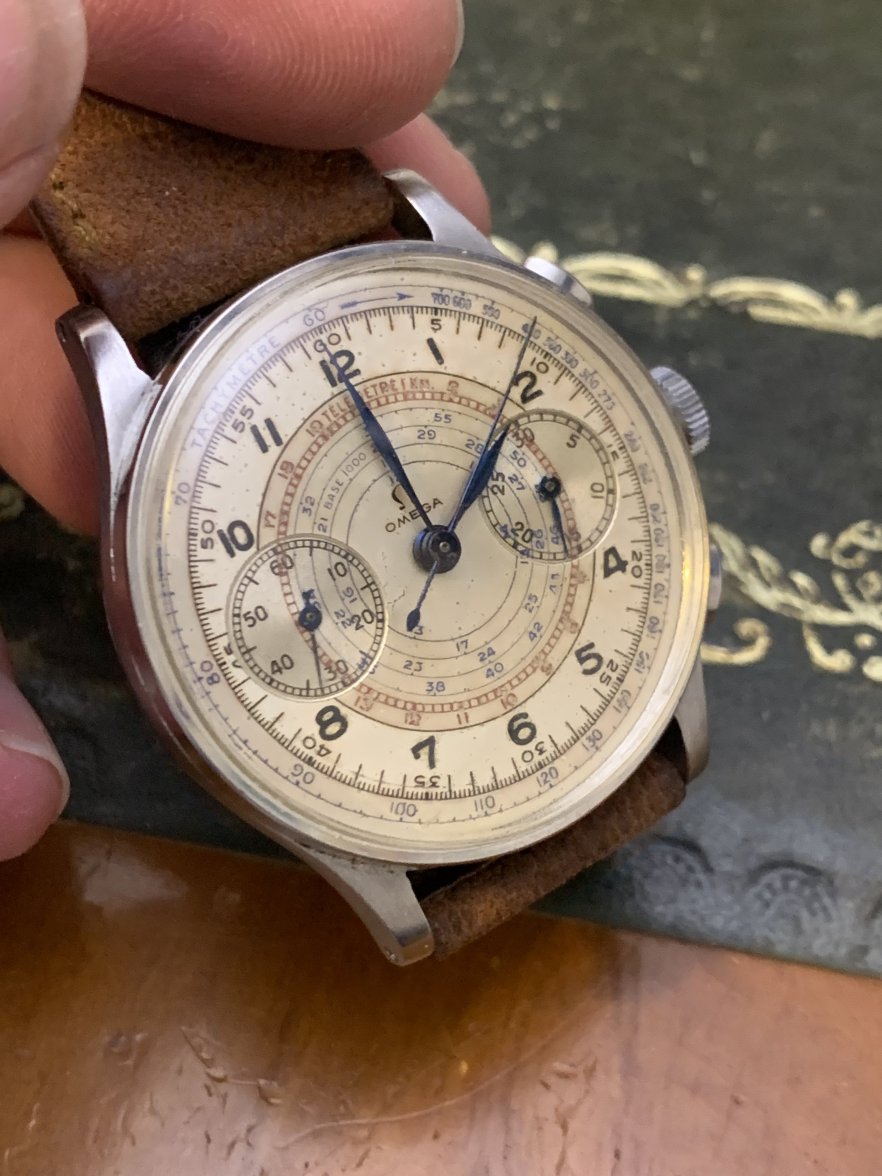
1576559-86610acf1ff7004d0d022664a0c2c32f.jpg


5. With the ability to zoom in on the other apparent original dials presented above, I have noticed very slight differences in railroad thickness/width/height. Also, very slight spacing differences. Also, the large font of the 20 on the overlay of the sub-dial on the second picture reference provided by Mark020 doesn't look right. Could the pad printing process produce such results?

The differences in thicknesses should be consistent across the printed artefact, but can be different between models depending on how much ink is on the pad. Could you point out the section that you think looks incorrect on Mark's photo? But like I say there can be thicker fonts that others.

6. I agree that the seconds hand paint on my watch does look a little thick. Not sure if it was repainted or simply aging?

I would suggest the second hand was not red to begin with and was blued like the other hands. It has been painted which has given it extra thickness.

7. Regarding the alleged irregular overlap on the running seconds sub-dial on my watch between red text and black (10/20). From one of the AJTT watches provided by Mark020 (picture below), am I seeing concern with overlap?
upload_2024-5-4_0-17-41.png

I'm not sure I can see an inconsistency here (on the left sub dial), however it would look like there are inconsistencies on the right hand sub dial.

8. I have noticed watches with both "Swiss Made" and "Fab Suisse" from circa 1939, 1941. A quick internet search yielded these results:

I would say that "fab suisse" is more common on watches of this era than Swiss made. Furthermore the example you provided showing swiss made does not look like the font and placement of yours. When used these are most always identical. Yours is higher above the second track. The spacing is off and the font is different.

Hope that helps!
 
Posts
33
Likes
2
As you can see from the capture from AJTT the 2393 is a slimmed down version of the 2079, so perhaps this is the other version you are seeing. the excerpt also shows one with reference 2080 so that gives two alternative references you can investigate.

POCKET OMEGA: Thank you for taking the time to reply to my posts OllieOnTheRocks. Well, I bit the bullet and had the case back removed. Cristos071 was correct; it is a 2393/3.
View attachment 1780189


OLLIE: Authentic Omega printing even back in this era is crisp and clear.

POCKET OMEGA: I would expect that Omega printing back then was crisp and clear but I guess my question was really whether or not this was true 100% of the time or are there known exceptions where issues were present in known original dials? It seems like 9 times out of ten, when I review an image of a Chro 33.3 (and I have looked at dozens and dozens) that there is something that looks not quite right. Be it font thickness, spacing, railroad thickness etc. Is it that the vast majority of Chro 33.3 dials out there are not 100% original?

OLLIE: To me it is the circular brushing on the two tone silver section of the dial that I find quite unusual. I would usually expect the brushing to be in one linear direction.

POCKET OMEGA: I did find this watch online which appears to have circular brushing. Also, it has "Swiss Made" on the dial. Perhaps another redial? The "Swiss Made" is at a different location on the dial. But then, the design of the dial is differs on each dial so the placement and font will be different on each dial?
Picture1.png
Here is a link to the above picture. You will see several other pictures of Chro 33.3's which have "Swiss Made" on them or just "Swiss" very faint on the edge of the dial below the 6 O'Clock marker.

https://www.watchprosite.com/omega/omega-33-3-chronographs-/677.1276406.10754626/


OLLIE: I own that same dial, in another case - reference 2092, see below. You'll note that it's not actually a grey silver, but rather a very white silver that has patinated over time.

1576559-86610acf1ff7004d0d022664a0c2c32f.jpg


POCKET OMEGA: Very beautiful watch! I understand your point about grey silver vs white but my previous picture re: circular brushing seems to show a quite metallic/grey looking finish on the hours ring. Perhaps it is a redial IDK.

I did notice what look to me like spacing and font issues in your watch picture above. I am in no way saying it is a redial. Please don't take this as an attack. Simply trying to become more proficient in identifying redials or not. I am assuming yours is an original and not a redial. That said I noticed. For example, that the spacing in the "23" and "24" appears wider between the 2 and the 3 in "23" than it does in between the "2" and the "4" in "24". Also the "6" hour border below the top of the "6" appears a little irregular. Perhaps this is because we can now zoom in on photos so much? See photo below:
Picture2.png


OLLIE: The differences in thicknesses should be consistent across the printed artefact, but can be different between models depending on how much ink is on the pad. Could you point out the section that you think looks incorrect on Mark's photo? But like I say there can be thicker fonts that others.

POCKET OMEGA: I don't know what to say other than, as I mentioned above re: 9 out of 10 Chro's have issues to my eye. I guess the section which looks incorrect on Mark's photo is all of the overlap shown in the picture below. A little surprising, to me anyway, that Omega would design such a cluster:
Picture 3.png


OLLIE: I would suggest the second hand was not red to begin with and was blued like the other hands. It has been painted which has given it extra thickness.

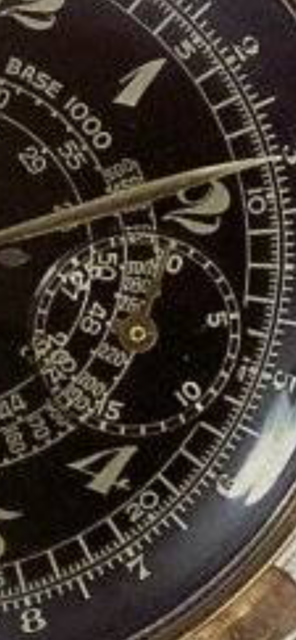
POCKET OMEGA: I appreciate your comment. I did find another Chro 33.3 photo (below with a Link) with a red seconds hand where the red paint appears to be peeling off. It appears that red seconds hands were rather uncommon in Chro 33.3's? Perhaps the below is just another instance of a repainted second's hand or perhaps an original red paint used by Omega is inclined to peel away with time?
Picture4.png
https://www.watchprosite.com/omega/omega-33-3-chronographs-/677.1276406.10754626/

OLLIE: I'm not sure I can see an inconsistency here (on the left sub dial), however it would look like there are inconsistencies on the right hand sub dial.

POCKET OMEGA: Comment noted.

OLLIE: I would say that "fab suisse" is more common on watches of this era than Swiss made. Furthermore the example you provided showing swiss made does not look like the font and placement of yours. When used these are most always identical. Yours is higher above the second track. The spacing is off and the font is different.

POCKET OMEGA: Please see my previous link above and repeated here: https://www.watchprosite.com/omega/omega-33-3-chronographs-/677.1276406.10754626/


OLLIE: Hope that helps!
POCKET OMEGA: This helps for sure OllieOnThe Rocks. I enjoy going down the various Chro 33.3 rabbit holes. Hopefully I have not breached any forum etiquette in my quest to learn more
Edited:
 
Posts
33
Likes
2
My apologies. Obviously, I haven't figured out how to splice out and respond to your various comments separately. Ended up embedding all my replies to your comments in your post. Ooops.
 
Posts
33
Likes
2
My apologies. Obviously, I haven't figured out how to splice out and respond to your various comments separately. Ended up embedding all my replies to your comments in your post. Ooops.

One more that I typed into my reply above but somehow didn't make it into the post:

OLLIE: I would suggest the second hand was not red to begin with and was blued like the other hands. It has been painted which has given it extra thickness.

Pocket Omega: I came across this photo (below) of another red seconds hand which has either been repainted or is simply lifting and peeling due to age.
Picture4.png
Here is a link to the picture: https://www.watchprosite.com/omega/omega-33-3-chronographs-/677.1276406.10754626/