gbesq
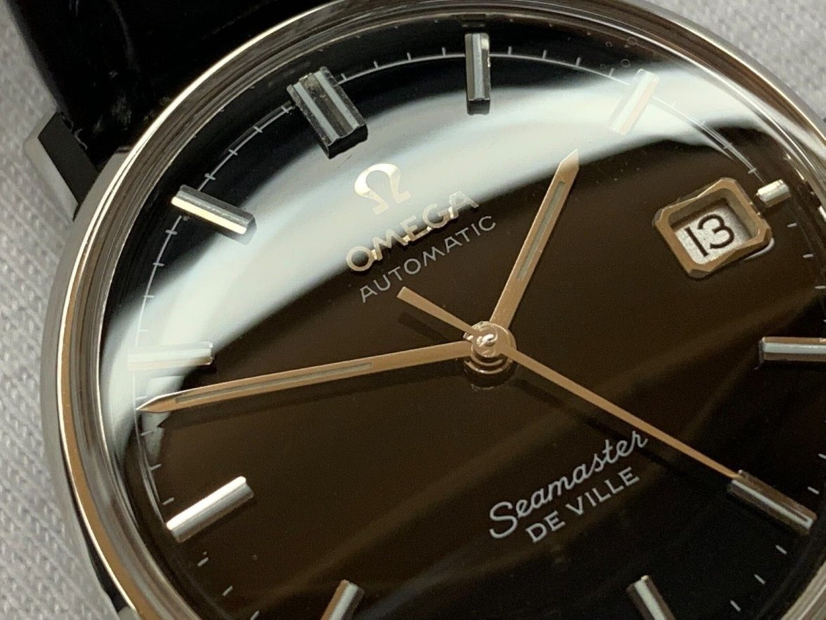
·Seller claims that the watch was inherited in 2015 and sent to the Omega mothership in Switzerland in 2019 for service. I've seen the service receipt ($1,100 USD!), but it comes from Jared Jewelers and that, among other things, initated a yellow alert iwth me. The case looks brand new, and I mean BRAND NEW (you could slice tomatoes with thoser edges), as does the rest of the watch. Problems that I see:
1. For a mid-60's watch, I've never seen a gloss black dial that looks this fresh that wasn't a redial. Seller claims that Omega wanted to refinish the dial but that he declined to have that done so Omega cleaned it instead. Unlikely.
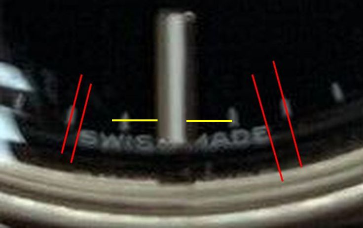
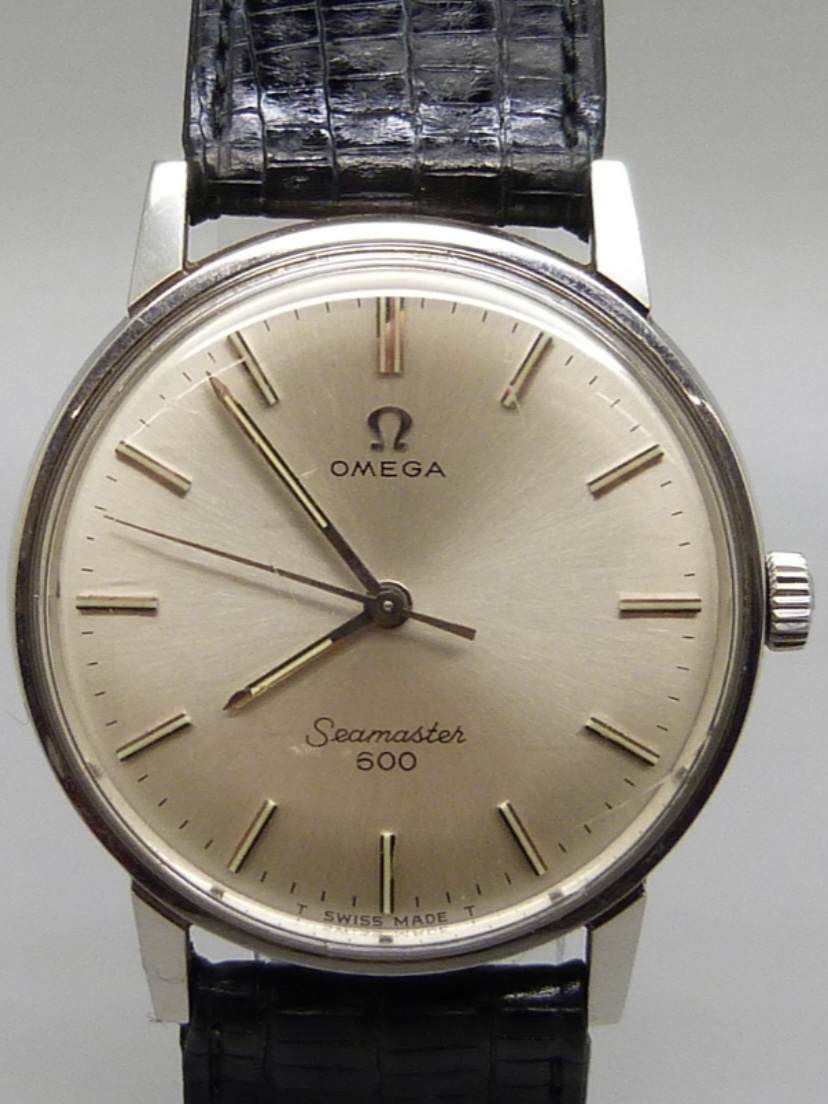
2. Lumed hands, but no T's on either side of the Swiss Made on the dial. Most Seamaster De Villes from this era of which I'm aware were lumed, both hands and dial. So maybe new lumed hands and a service dial on this example?
3. Look at the upper left quadrant of the dial on the enlarged photo. Looks like only that portion of the dial has a railtrack style of minute track, but the rest of the dial doesn't. Could possibly be a reflection? Otherwise, a really obvious sign of a redial.
4. The Seamaster De Ville text at the bottom of the dial looks too bold to me.
Overall, it's a very attractive watch until I start looking closely. Thoughts? Thank you.
Edited:


