- Posts
- 8,186
- Likes
- 28,850
Tony C.
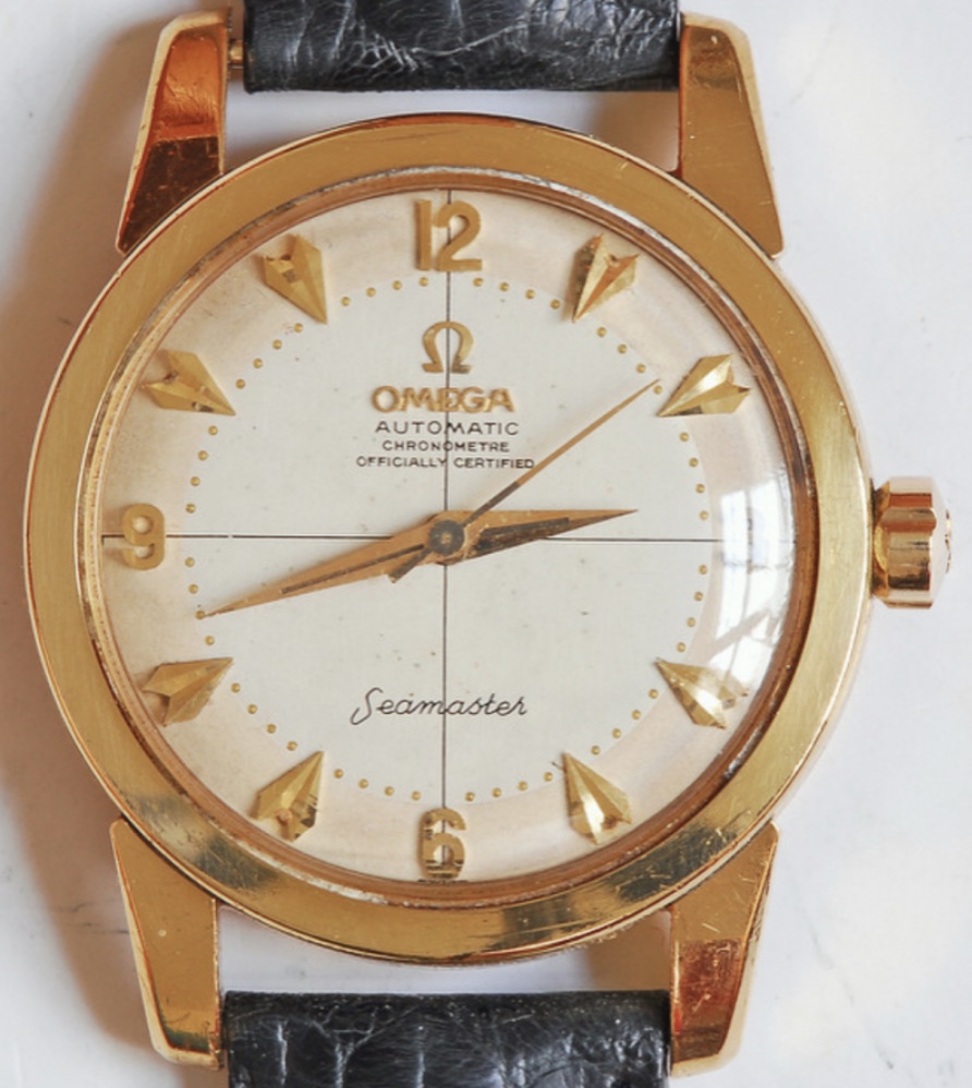
··Ωf Jury memberWhere did you find that!? I want. Even with the polished case.
'tis available! 'tain't cheap.
https://www.chrono24.com/omega/seamaster-2577-honeycomb-chronometre--id13850945.htm
Please consider donating to help offset our high running costs.
Where did you find that!? I want. Even with the polished case.
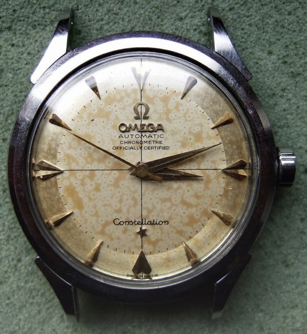
With minimal effort, I have found at least two apparently original dials with the same truncated "chronometre". Here's one:


I am trying to learn here as well. And I am eye-based.
The font combination is something I've never seen before.
Edit: And it's difficult to shut your mouth, when other members tell you not to comment on what you see.

I am also skeptical of originality. I do, however, think that it could be a later, factory replacement. If it is a redial, the work is very good, and why would a re-dialer have chosen to make things more complicated (not to mention anomalous) by adding serif?
.
Whoever can answer that probably can answer why the spacing between “automatic” and “chronometre” got screwed up. 😉
Do you believe these to be redials? The space is below, rather than above "automatic", but clearly the lines are not evenly spaced.
https://omegaforums.net/attachments/omega2521pg-nat3_edited-1-jpg.55700/
https://omegaforums.net/attachments/kgrhqmokpyfgwfj3m-vbrqc0uzefq__60_57-jpg.836919/

Take your time and have a closer look.
For first instance, compare the "OMEGA" to the "OMEGA".

Take your time and have a closer look.