My Omega SM300 Military Spec

Posts
360
Likes
591
100% which is why there are many more surviving examples of the milsub when compared to the sm300 mil-spec. The seamaster 300 was the first and actually wasn't as reliable as the submariner, which is why the sm300 had a short life with the MOD. They then moved on to the sub which had a much longer run.

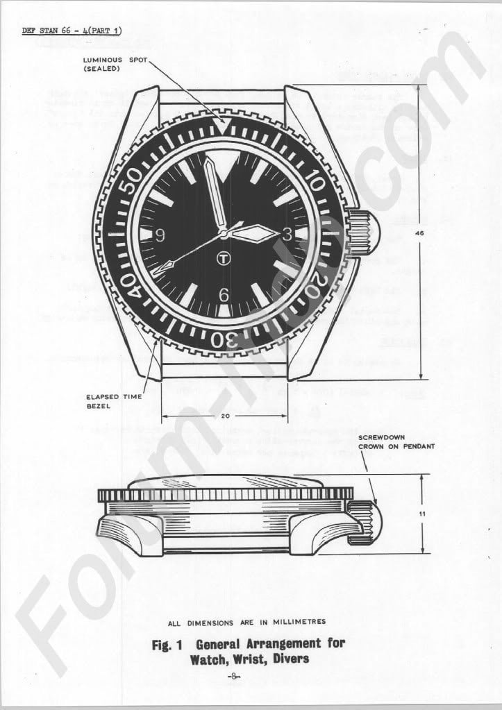
This was the Document with the general arrangement for the divers wristwatch by the MOD:
Ministry Of Defence Document 66-4 Part 1 / Issue 2

Therefore the Rolex Milsub had to look like a Seamaster 300...
 
Posts
27
Likes
49
This was the Document with the general arrangement for the divers wristwatch by the MOD:
Ministry Of Defence Document 66-4 Part 1 / Issue 2

Therefore the Rolex Milsub had to look like a Seamaster 300...
I know. i have this same document printed out from another forum. it's actually 11 pages long.
 
Posts
27
Likes
49
A clear picture of another collectors fat closed 6 BT dial for reference. Dial is exactly the same variation as my dial. It is so exact, this dial is probably from the same batch as my dial. My piece is 100% correct, there is no doubt about it regardless of what anyone says. The proof is in the pudding as they say
 
Posts
7,664
Likes
26,578
A clear picture of another collectors fat closed 6 BT dial for reference. Dial is exactly the same variation as my dial. It is so exact, this dial is probably from the same batch as my dial. My piece is 100% correct, there is no doubt about it regardless of what anyone says. The proof is in the pudding as they say

I hope that you are correct! However, the pedant in me can't resist pointing out that "they" are technically incorrect, as "The proof of the pudding is in the eating." (first known publication in 1605; evidence of the proverb as early as ~1400). 😁
 
Posts
27
Likes
49
I hope that you are correct! However, the pedant in me can't resist pointing out that "they" are technically incorrect, as "The proof of the pudding is in the eating." (first known publication in 1605; evidence of the proverb as early as ~1400). 😁
That’s a good thing because I really like “eating” puddings.
Christmas pudding, rice pudding, banana pudding, chocolate pudding, pistachio pudding, summer pudding, bread pudding, Yorkshire pudding, sticky toffee pudding, hasty pudding, cottage pudding, malva pudding, black pudding, figgy pudding, tapioca pudding, diplomat pudding, mango pudding... Love pudding.
 
Posts
2,555
Likes
5,606
Christmas pudding, rice pudding, banana pudding, chocolate pudding, pistachio pudding, summer pudding, bread pudding, Yorkshire pudding, sticky toffee pudding, hasty pudding, cottage pudding, malva pudding, black pudding, figgy pudding, tapioca pudding, diplomat pudding, mango pudding.

You forgot “pudding photos of my watch on OF for everyone to criticize” 😁
 
Posts
27
Likes
49
You forgot “pudding photos of my watch on OF for everyone to criticize” 😁
Touché.
Lesson learned.
 
Posts
569
Likes
2,580
I sent @kox a PM so I am hoping he chimes in soon with his expertise.
My take, since you asked for it 😉
First off, congrats with the watch. These are lovely and something very special indeed. And my comments below are not meant to put it down in any way, but just to share my somewhat informed opinion.

Secondly: I think your dial and bezel is original, for a RN300 in that serial range/production timeframe... but I don't think that they are authentic to the watch, meaning not born on this watch when it left the factory in Bienne.

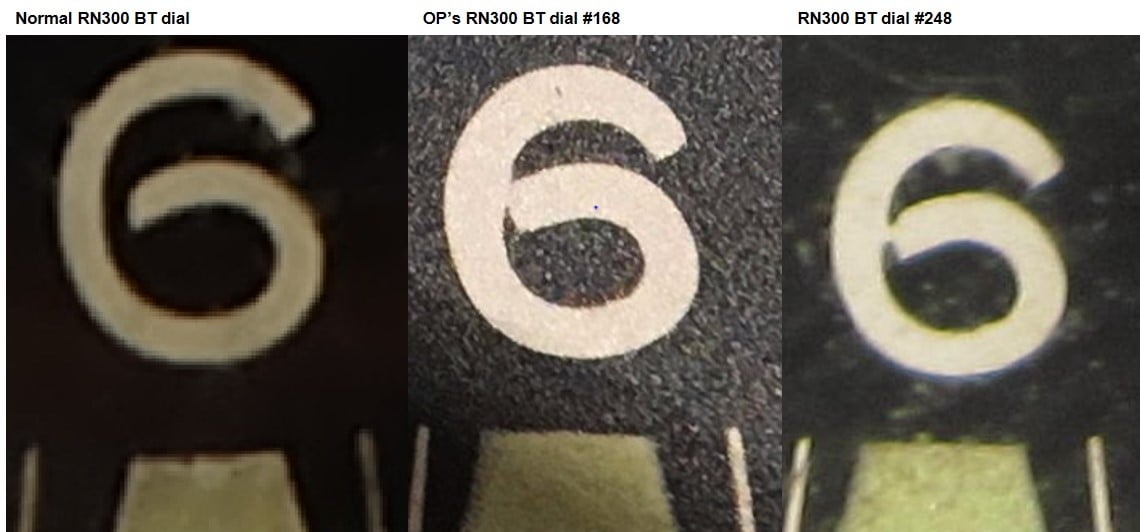
Thirdly: you refer to several examples with the same dial features as your example, primarly regarding the closed 6. These examples are actually one and the same watch. Check the bezel's triangle. Anyway, I know it's the same. ID #248. Together with yours #168 these are the only two I have seen with this kind of fat/sloppy printing. Which is interesting in itself, since these two were produced within a month of each other and serial is very close to each other. On the other hand there are many more in the same range that have the "normal" dial.

Bezel:
Easy part first. As @Dash1 stated, the bezel which it had installed during the Bonham auction is earlier. The type 3 bezel, which on the Military SM300s primarily are seen on W10's produced first half of 1967. This bezel was phased out around summer 1967, so very unlikely to have been on a august 1968 production one. The thin font blue type 6 bezel has been seen on a few, yes, and would be ok for yours in regards to originality, but it's of course not autentic to the watch in question, since we know it was added later.

Dial:
Well, the fat font on the numbers is an issue. See compare shot below. Clearly different from the normal ones. Also the 6 on the #168 and #248 are not exactly the same where they close.
The "O" in Omega is ok. The Omega logo is also ok, however a bit uneven on the inside slope.
Regarding the lume: yes, it should extend over the minut hashmarks, but I think what @JanV was saying, is that the minut hashmarks are visible through the lume. Which is not normal and IMO because the lume was very thin applied. And yes the lume area on the 5 minute marks are not 100% evenly between the hashmarks, but that's not that unsually on the other hand.
All in all, I agree that this dial is sloppy printed and lume application not up to standard. No trace of redial, relume or touch up job, so properly just from a low quality batch/ 2. sorted. And it's very likely that it was installed/replaced by the MoD goldsmith at a service. Only serviced ones would have the MoD added fat T (tippex if you like). The dial has no trace of patina, which is highly unlikely for a RN300 with authentic parts.

Remember, most, if not all Mil SM300s had some parts changed. So there is a long way from original correct parts on the watch, to a 100% authenic example - as it left the factory. But still nice! Enjoy it.

BTW: The watch was discussed here on OF back in 17 before the seller assigned it to the Bonham auction.
https://omegaforums.net/threads/royal-navy-seamaster-300.48191/
 
Posts
27
Likes
49
here is another reference shot from noble and graff, photo credit to them. From my research, it seems dial font variations for BT dials are all over the map in terms of thickness. You will notice on his below that the 6 is very fat. not touching, but fatter than I'm used to seeing on BT 300 mil dials. I wouldn't call mine "a closed 6" as it is more like a "kissing 6" Just like I see rarely on rolex "kissing 40 inserts" caused from worn pad printers.
 
Posts
27
Likes
49
kox kox
As I wrote, I think the dial is original, not reprint or redialed! Just bad production. But likely not the one that was first on the watch when it left the factory. And the reason why many RN300's have nice dials….well, replaced at MoD service
So Kox was saying in PM just to share with everyone, that most clean dialed RN300's that we see most likely have replaced dials from the MOD service. Which would explain the many examples below that we all come across on the net and on insta. photo cred left on pics for the owners.
all have same to similar lume and dial condition as mine. If what Kox is saying is correct, then it seems this was more of a common practice for the MOD than we all ever realized. Which from what I'm gathering is that any "tippex T" style dial is a mod replacement.


Posts
569
Likes
2,580
here is another reference shot from noble and graff, photo credit to them. From my research, it seems dial font variations for BT dials are all over the map in terms of thickness. You will notice on his below that the 6 is very fat. not touching, but fatter than I'm used to seeing on BT 300 mil dials. I wouldn't call mine "a closed 6" as it is more like a "kissing 6" Just like I see rarely on rolex "kissing 40 inserts" caused from worn pad printers.
Well, the font is fat on the BT dials (more fat than on non BT dials) and pictures tend to make them look more or less fat. But none is closed or kissing (besides the two mentioned) - well, that I have seen.

I can't comment on the above examples without seeing "all" of the watch in high-res pictures. But yes, if you have a truely pristine dial (AND the rest of the watch doesn't match that...!), you have a candidate that went through service....which, again, is very very normal with these! But you can't conclude as you just did on any clean looking example 😵‍💫

If you wan't to be more sure about your dial, you need to make pictures of the backside of it.
 
Posts
27
Likes
49
kox kox
Well, the font is fat on the BT dials (more fat than on non BT dials) and pictures tend to make them look more or less fat. But none is closed or kissing (besides the two mentioned) - well, that I have seen.

I can't comment on the above examples without seeing "all" of the watch in high-res pictures. But yes, if you have a truely pristine dial (AND the rest of the watch doesn't match that...!), you have a candidate that went through service....which, again, is very very normal with these! But you can't conclude as you just did on any clean looking example 😵‍💫

If you wan't to be more sure about your dial, you need to make pictures of the backside of it.
what should I be looking for on the back side?
 
Posts
569
Likes
2,580
what should I be looking for on the back side?
The right numbers