- Posts
- 1,157
- Likes
- 6,718
Felix_La_PuBelle
··A lot of room for comedy in there, gang.Hello Zenith enthusiasts.
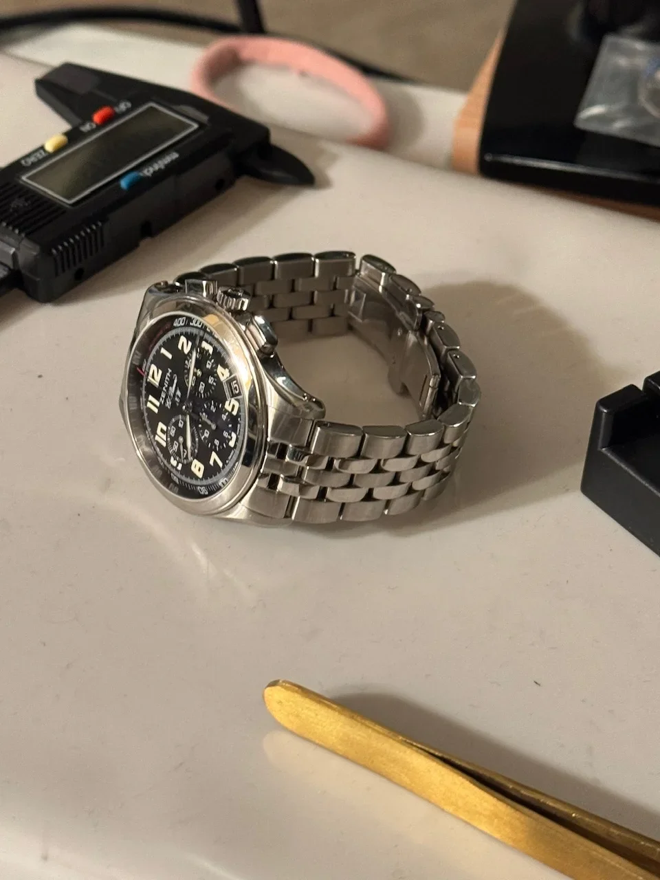
I recently picked up this El Primero HW (02.0500.420) that I had been eyeing for a long time. It’s my first Zenith. No telling if it will be my last.
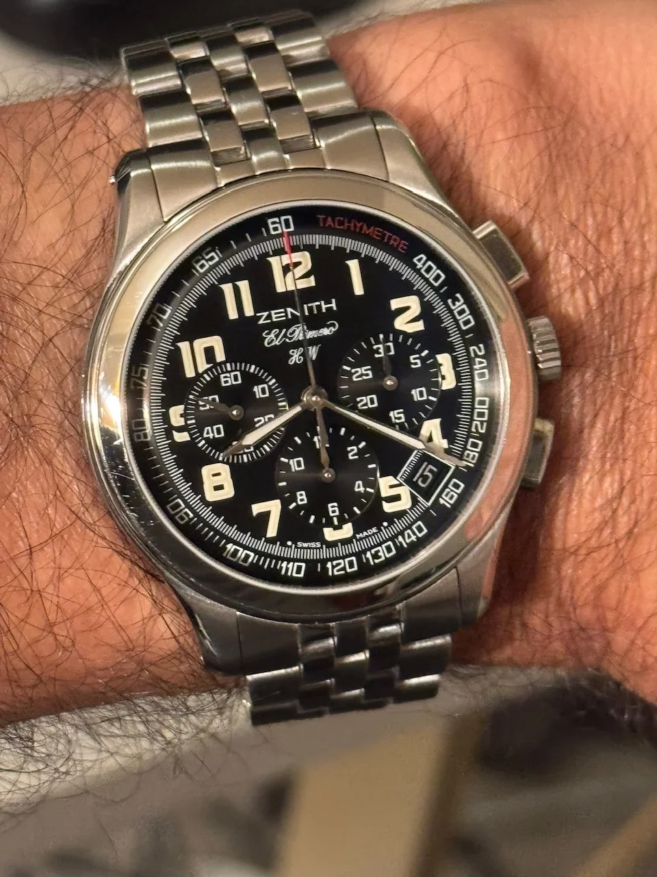
I don’t remember exactly when I got turned on to this reference but it’s been at least a year from when it hit my radar to when I got serious about acquiring one. In any case, it was definitely the idea of a manual wind EP that lured me in. I like to believe that the brand was doing a bit of tounge-in-cheek satire on the hullabaloo around who first invented the automatic chronograph, but my research tells me that it was more about the resurgence of analog watches in the 90s after the quartz crisis and a play at making the EP thinner and theoretically more dressy with the rotor-less 420 movement in the EP Prime. ***Note the Fratello article about the EP Prime posted below that was part of my research.
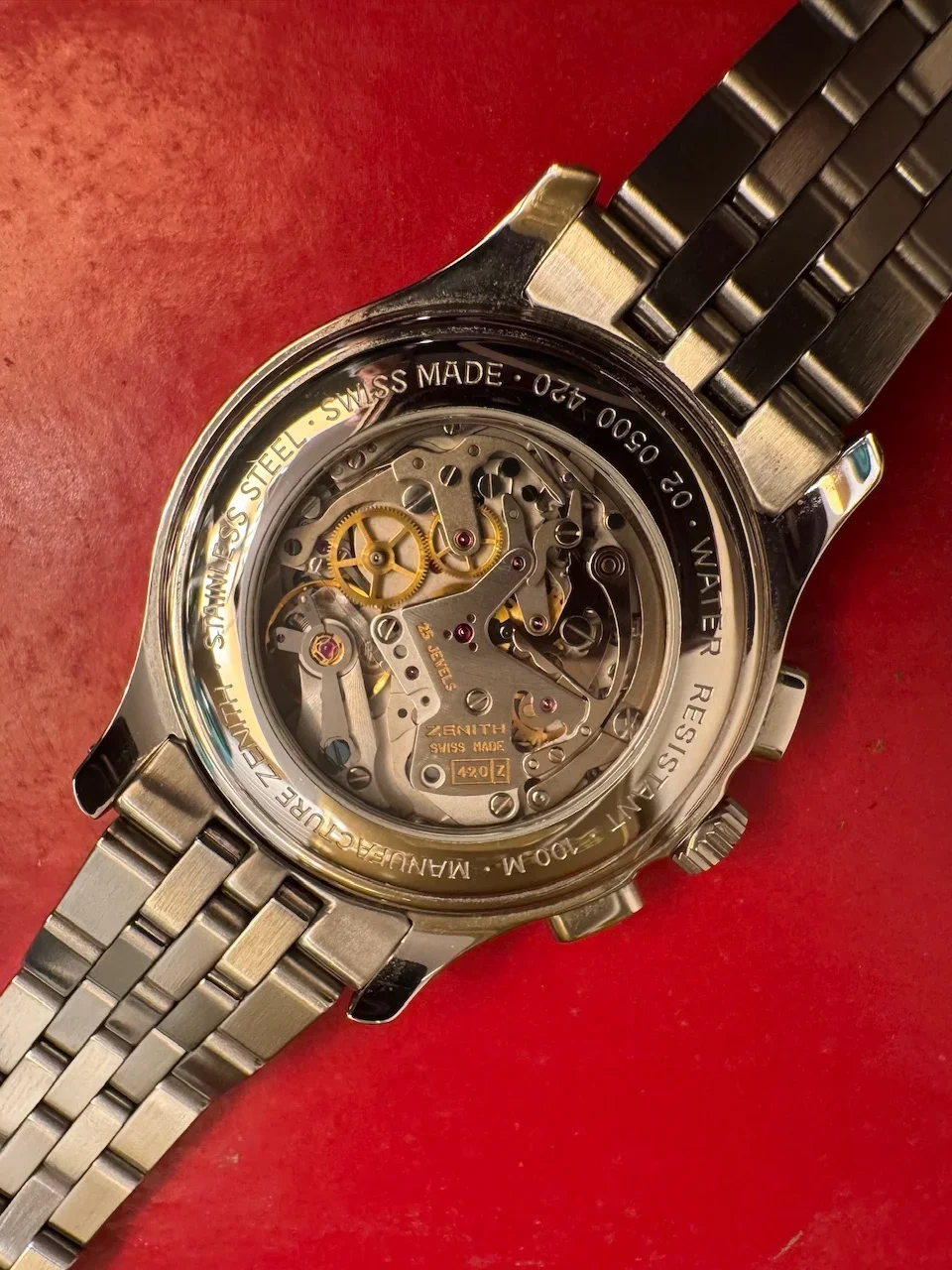
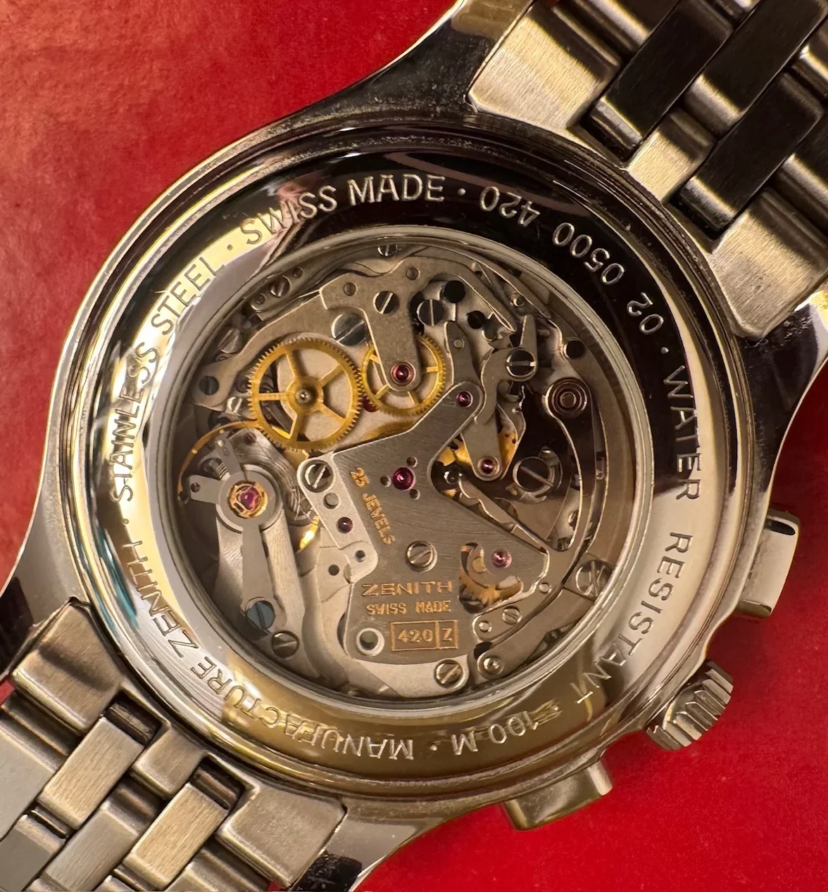
Whatever the true backstory, I like subtle quirkiness, and a manual wind EP delivers that. I also like when a watch that isn’t supposed to be thin is thin. Case in point, my first dive watch clocked in around 11mm thick, as does this EP HW.
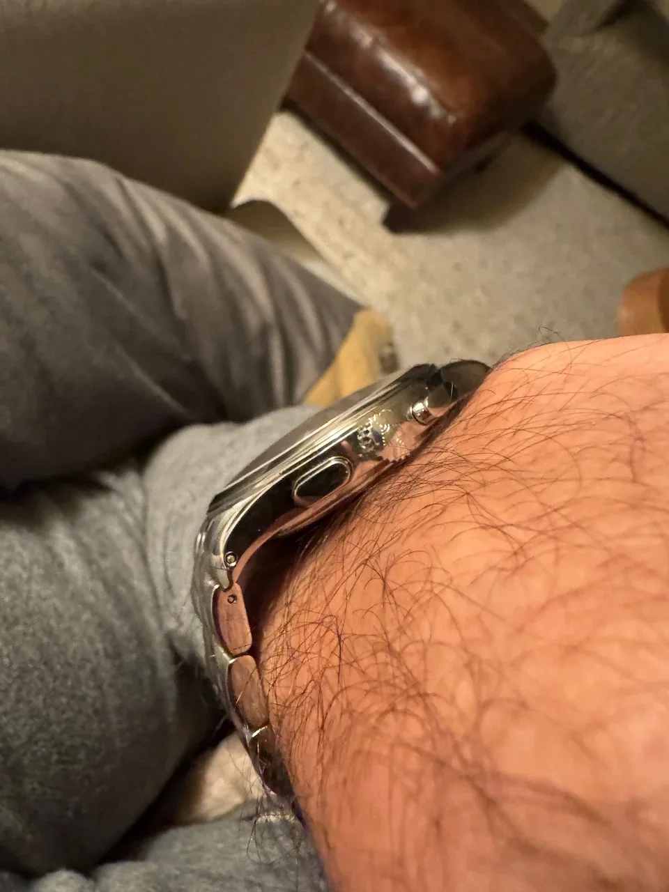
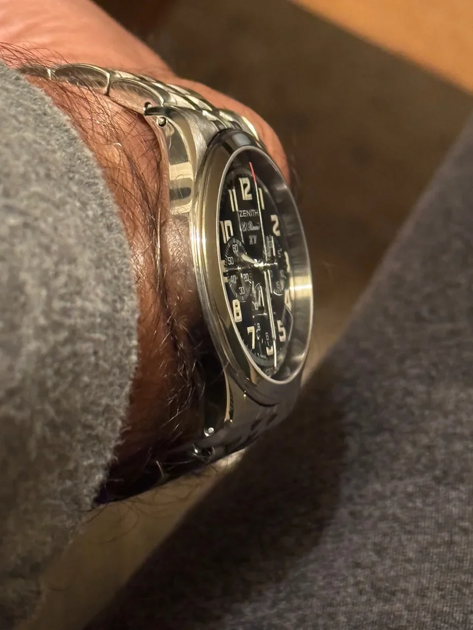
I also like busy dials done right. While the EP Prime looks to me like they were going for a somewhat conservative aesthetic, the HW goes for more flair. With its stylized big hour numerals and red accents on the tip of the chrono second hand and TACHYMETRE lettering, if the EP Prime reminds me of a no-nonsense flieger pilots watch, then the EP HW is a Breitling Cosmonaut by comparison.
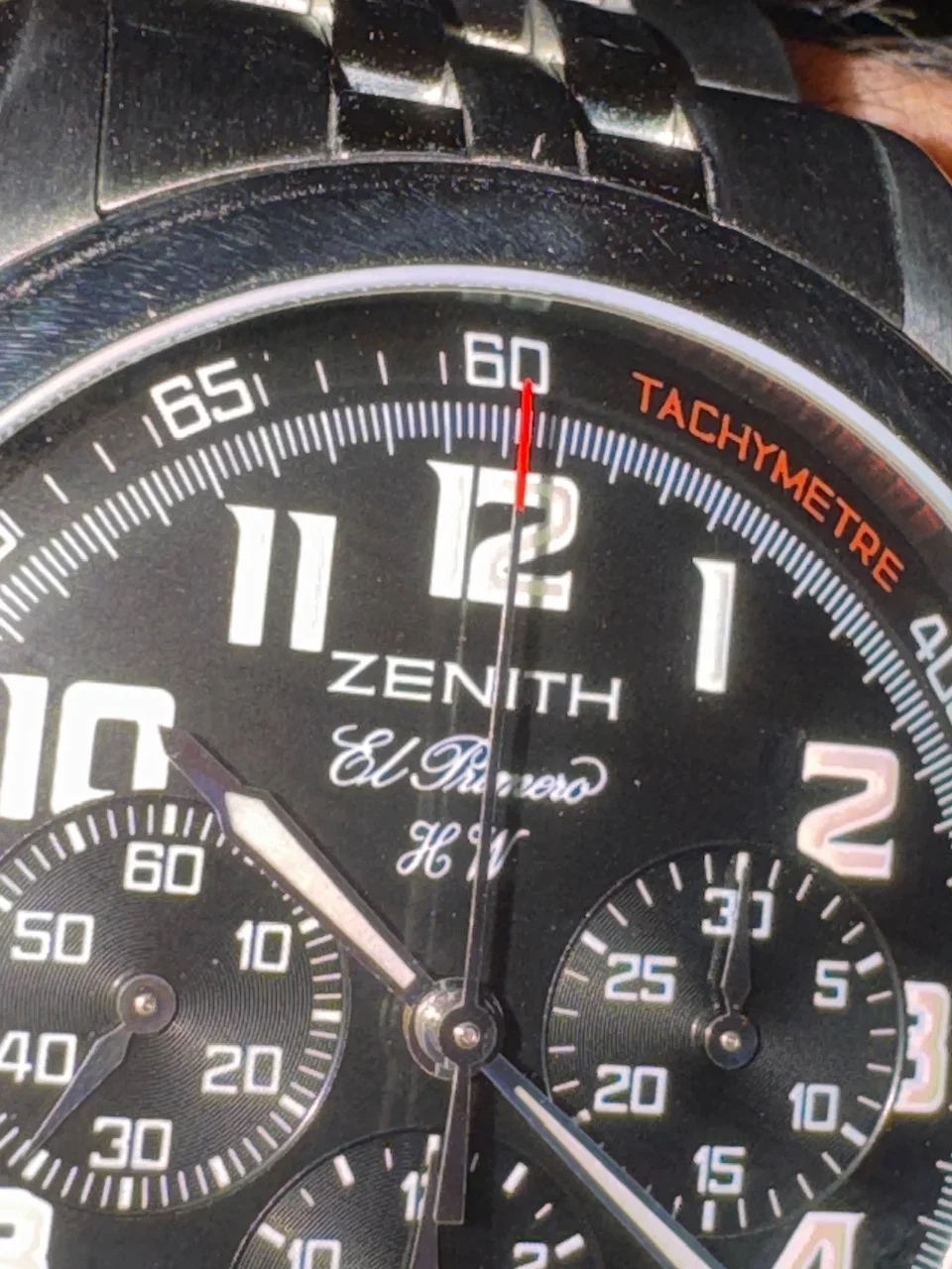
Because the hour marker font is so interesting, I first thought I didn’t like where the numerals are cut off by the sub-registers and date window, but if I imagine those gone and all the numerals appearing in full, I actually think they would look too big and crowded as laid out inside the minute track.
I could still live without the date window, but the fact that the minute track is continued on the inside edge of the date window frame makes me appreciate that someone was thoughtful about how it was incorporated and didn’t just cut a square hole and call it a day.
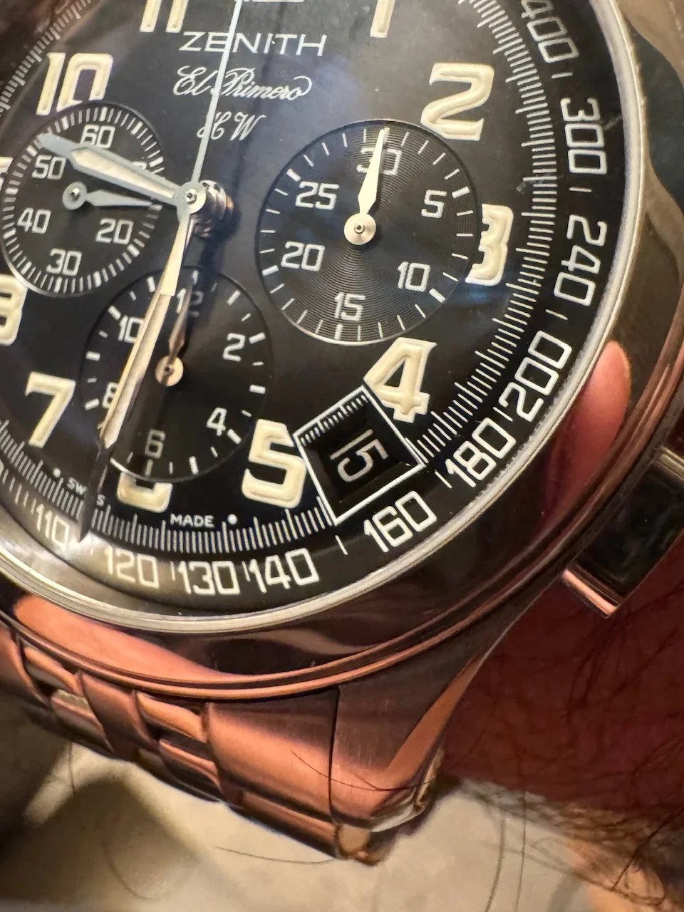
Finally, while I had heard the edge of the dial is convex around the tachy scale, no pictures I saw ever truly captured this. It’s much more dramatic in person and gives the dial a nice dynamic feel. The dial is glossy in the middle out to the minute track, then becomes more matte in appearance at the tachy scale. It also explains why the red TACHYMETRE text between 12 and 2 is often hidden by shadows in pictures.
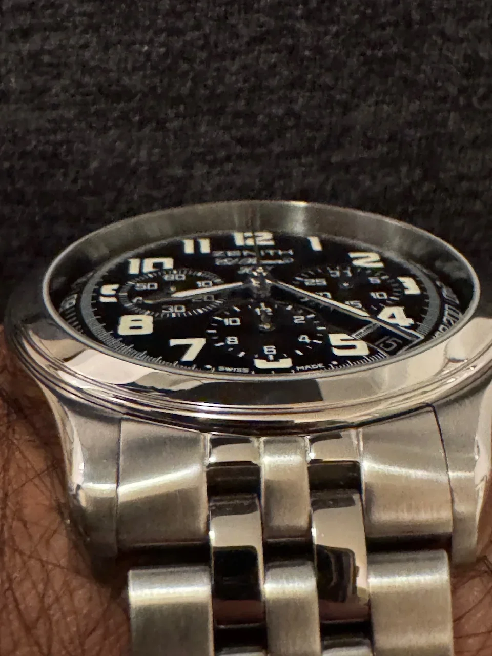
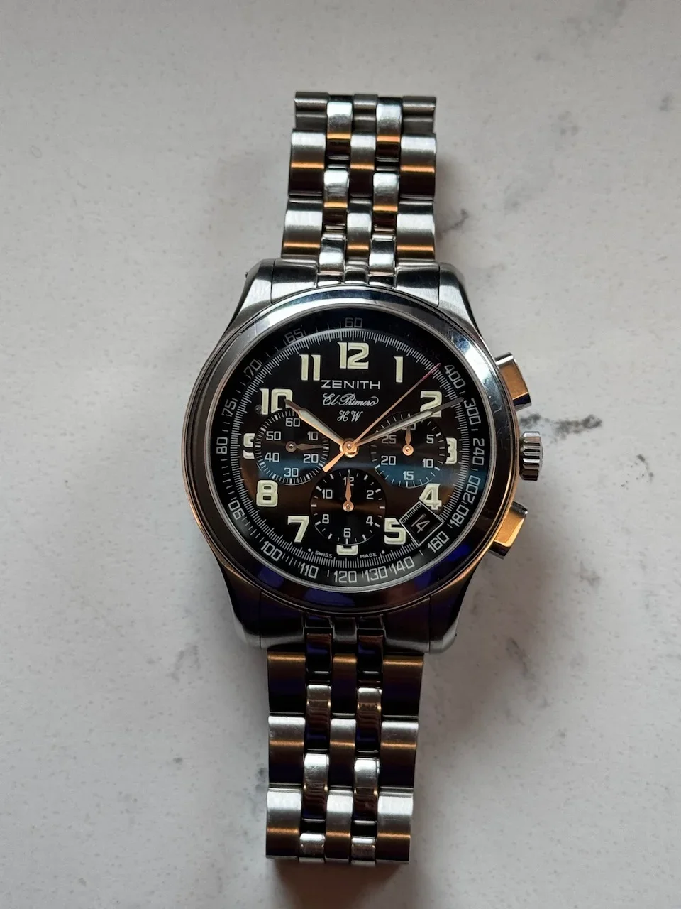
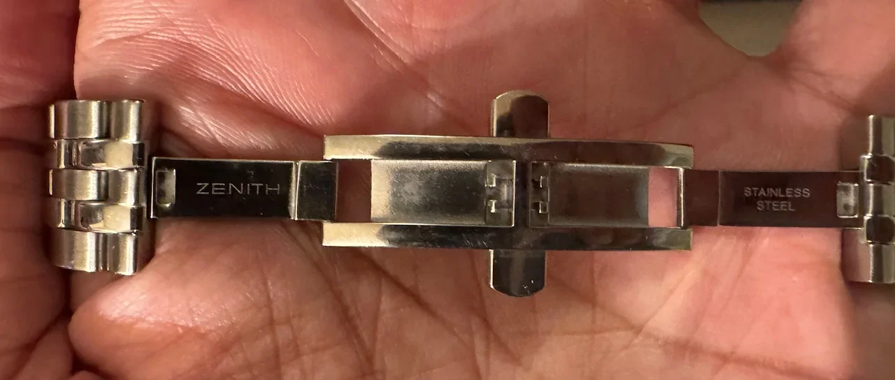
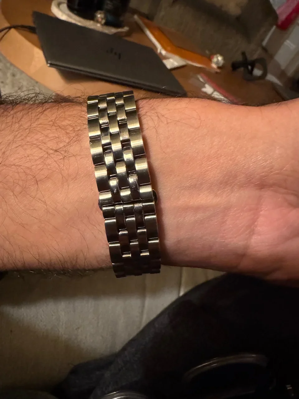
I even like the bracelet with its mostly hidden butterfly clasp. I imagine this as a 90s interpretation of an integrated bracelet at a reasonable price point. It may not be as refined as bracelet hawks might want but, for a 90s watch with a tool-ish aesthetic, it works for me.
So I’m very happy to have this watch and, if nothing else, it fills two “important” gaps in my collection. One, I didn’t have a Zenith, and two, I didn’t have anything from the 90s.
***
https://www.fratellowatches.com/best-kept-secrets-zenith-prime/#gref
I recently picked up this El Primero HW (02.0500.420) that I had been eyeing for a long time. It’s my first Zenith. No telling if it will be my last.
I don’t remember exactly when I got turned on to this reference but it’s been at least a year from when it hit my radar to when I got serious about acquiring one. In any case, it was definitely the idea of a manual wind EP that lured me in. I like to believe that the brand was doing a bit of tounge-in-cheek satire on the hullabaloo around who first invented the automatic chronograph, but my research tells me that it was more about the resurgence of analog watches in the 90s after the quartz crisis and a play at making the EP thinner and theoretically more dressy with the rotor-less 420 movement in the EP Prime. ***Note the Fratello article about the EP Prime posted below that was part of my research.
Whatever the true backstory, I like subtle quirkiness, and a manual wind EP delivers that. I also like when a watch that isn’t supposed to be thin is thin. Case in point, my first dive watch clocked in around 11mm thick, as does this EP HW.
I also like busy dials done right. While the EP Prime looks to me like they were going for a somewhat conservative aesthetic, the HW goes for more flair. With its stylized big hour numerals and red accents on the tip of the chrono second hand and TACHYMETRE lettering, if the EP Prime reminds me of a no-nonsense flieger pilots watch, then the EP HW is a Breitling Cosmonaut by comparison.
Because the hour marker font is so interesting, I first thought I didn’t like where the numerals are cut off by the sub-registers and date window, but if I imagine those gone and all the numerals appearing in full, I actually think they would look too big and crowded as laid out inside the minute track.
I could still live without the date window, but the fact that the minute track is continued on the inside edge of the date window frame makes me appreciate that someone was thoughtful about how it was incorporated and didn’t just cut a square hole and call it a day.
Finally, while I had heard the edge of the dial is convex around the tachy scale, no pictures I saw ever truly captured this. It’s much more dramatic in person and gives the dial a nice dynamic feel. The dial is glossy in the middle out to the minute track, then becomes more matte in appearance at the tachy scale. It also explains why the red TACHYMETRE text between 12 and 2 is often hidden by shadows in pictures.
I even like the bracelet with its mostly hidden butterfly clasp. I imagine this as a 90s interpretation of an integrated bracelet at a reasonable price point. It may not be as refined as bracelet hawks might want but, for a 90s watch with a tool-ish aesthetic, it works for me.
So I’m very happy to have this watch and, if nothing else, it fills two “important” gaps in my collection. One, I didn’t have a Zenith, and two, I didn’t have anything from the 90s.
***
https://www.fratellowatches.com/best-kept-secrets-zenith-prime/#gref
Edited: