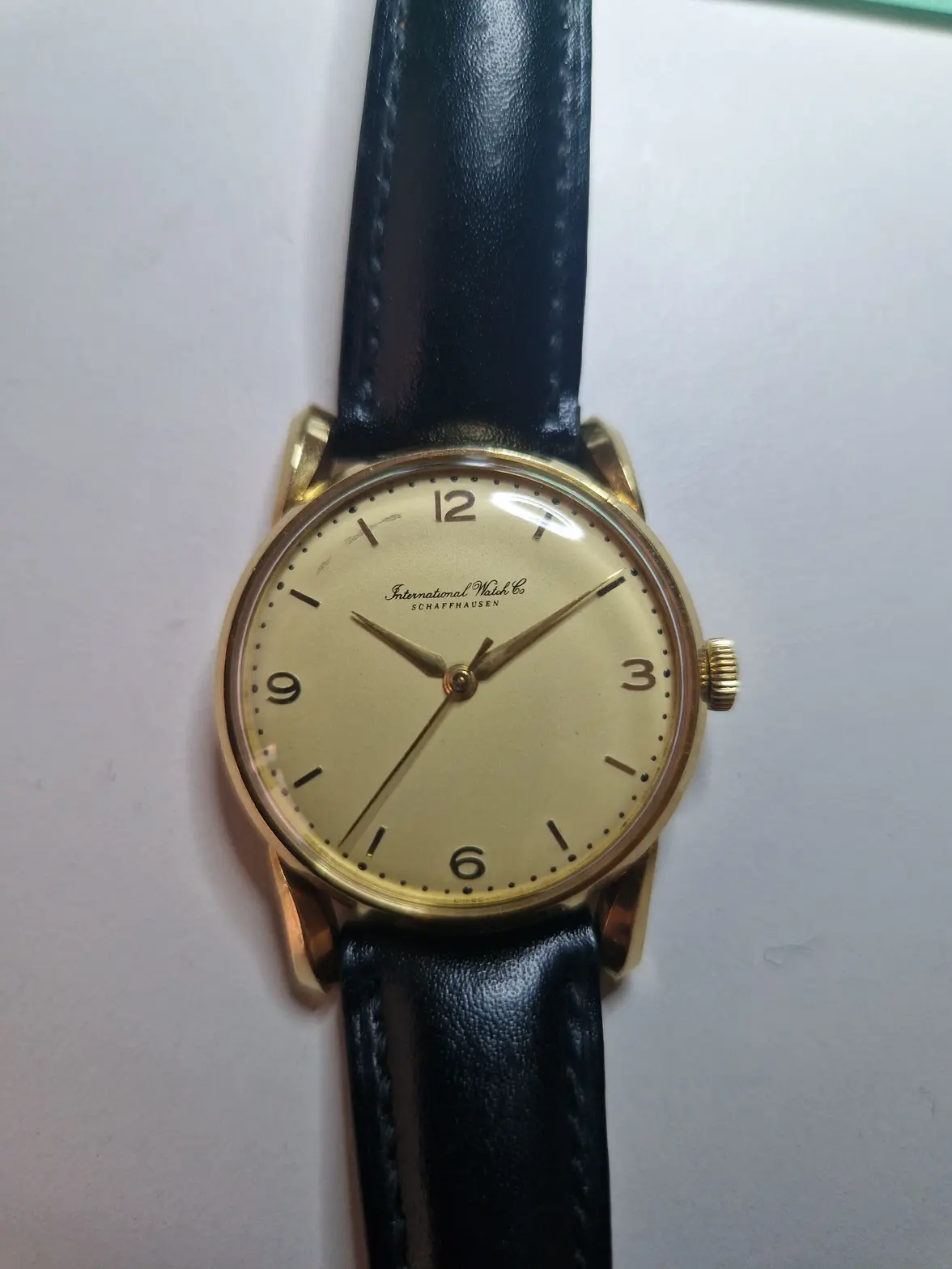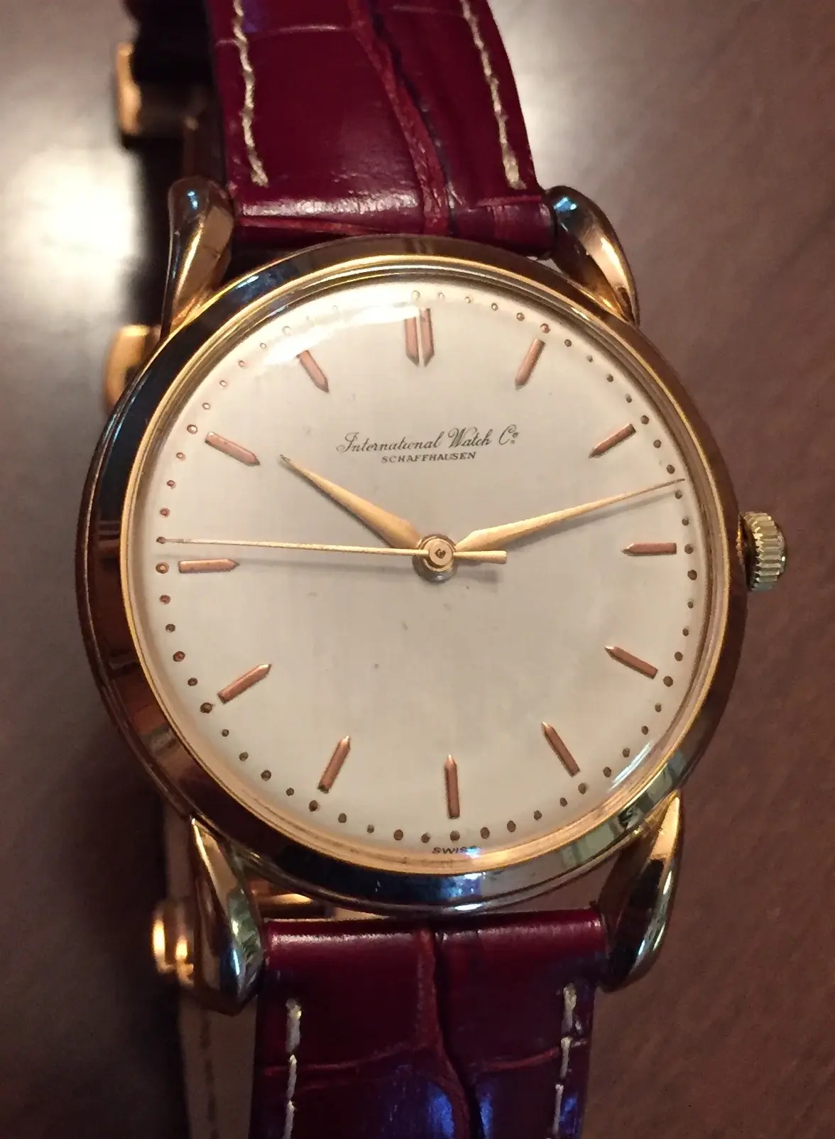
IWC cal 89 18k bombé lugs - redial?

Posts
281
Likes
455
Hi all,

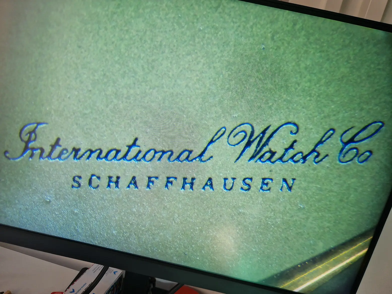
I'd appreciate your views on this dial on a 1956/1957 IWC with cal 89.
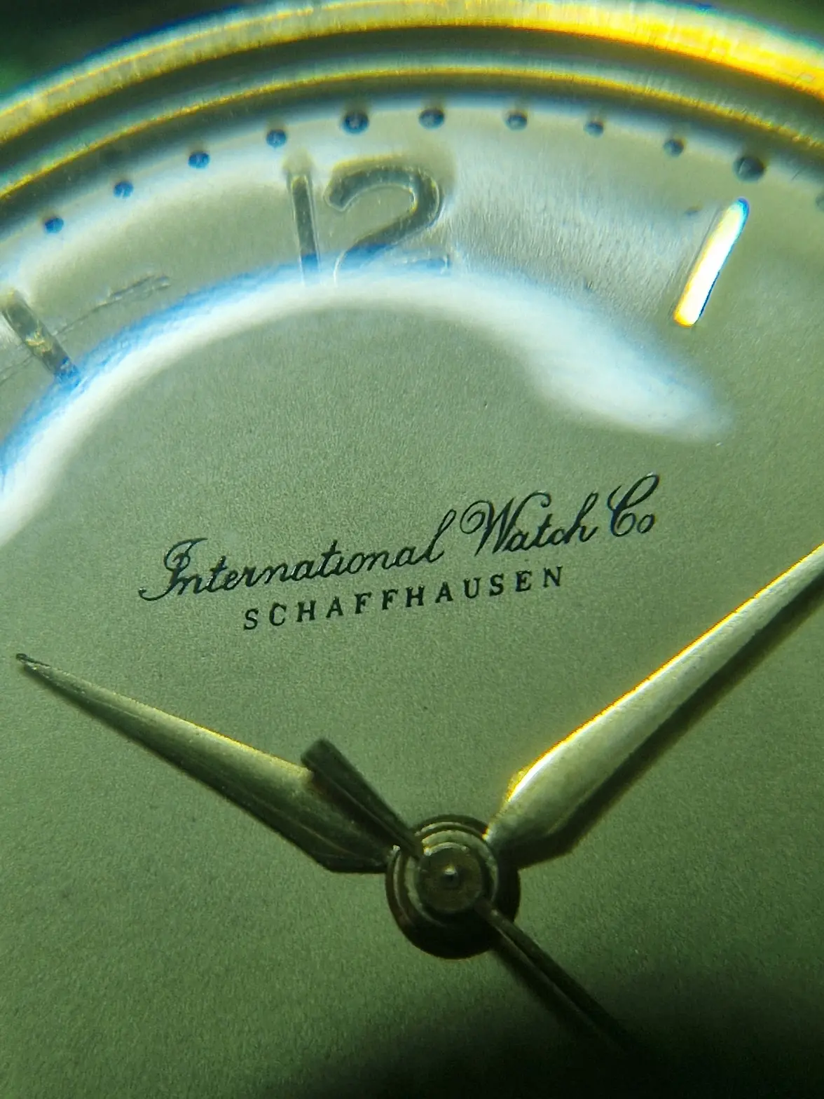
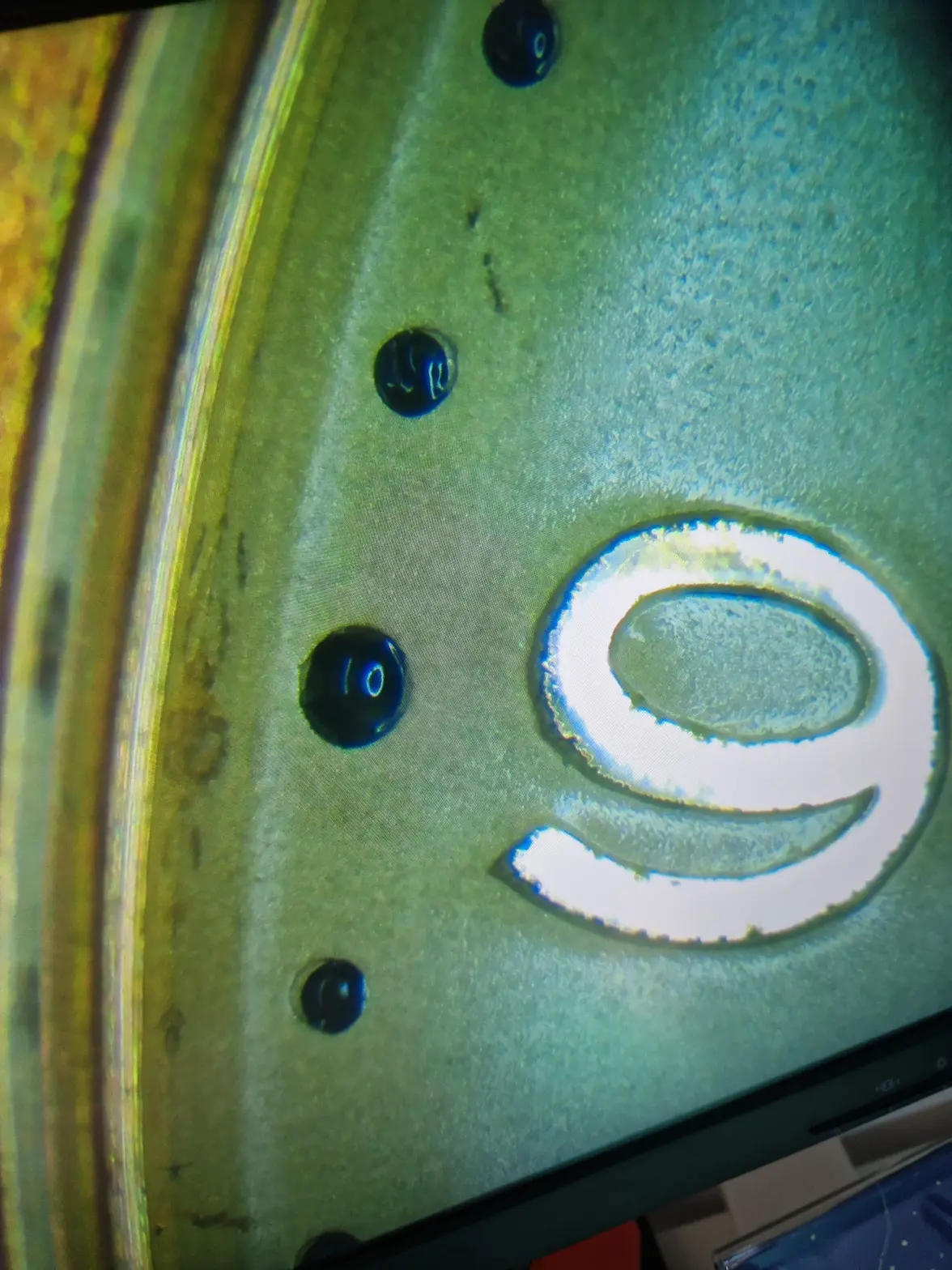
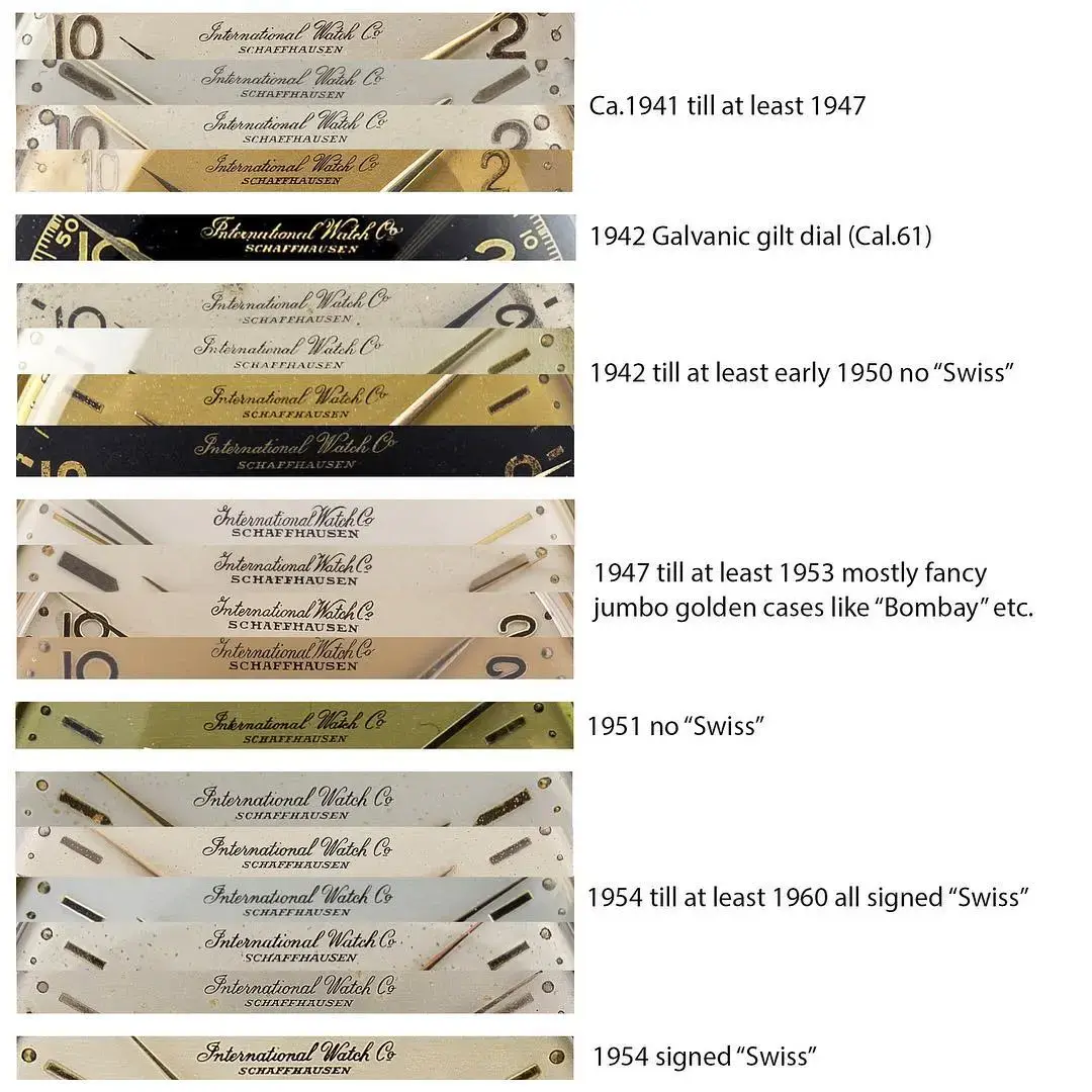
Of course, I found this insightful compilation on the forum and from that, it would surely be a redial (e.g. missing line under the final 'o'). But I'm also aware of variations that may occur between original dials. I'm not an IWC expert, so asking you for your kind assessments.

Thanks in advance


@Dan S @Tony C. please?
Edited:

 
Posts
24,723
Likes
54,916
It's pretty good, but I'm not sure about the "I". It's missing the initial flourish at the left side and the upper loop seems very streamlined. As you mentioned, it would be good to hear from @Tony C. and @gatorcpa especially.

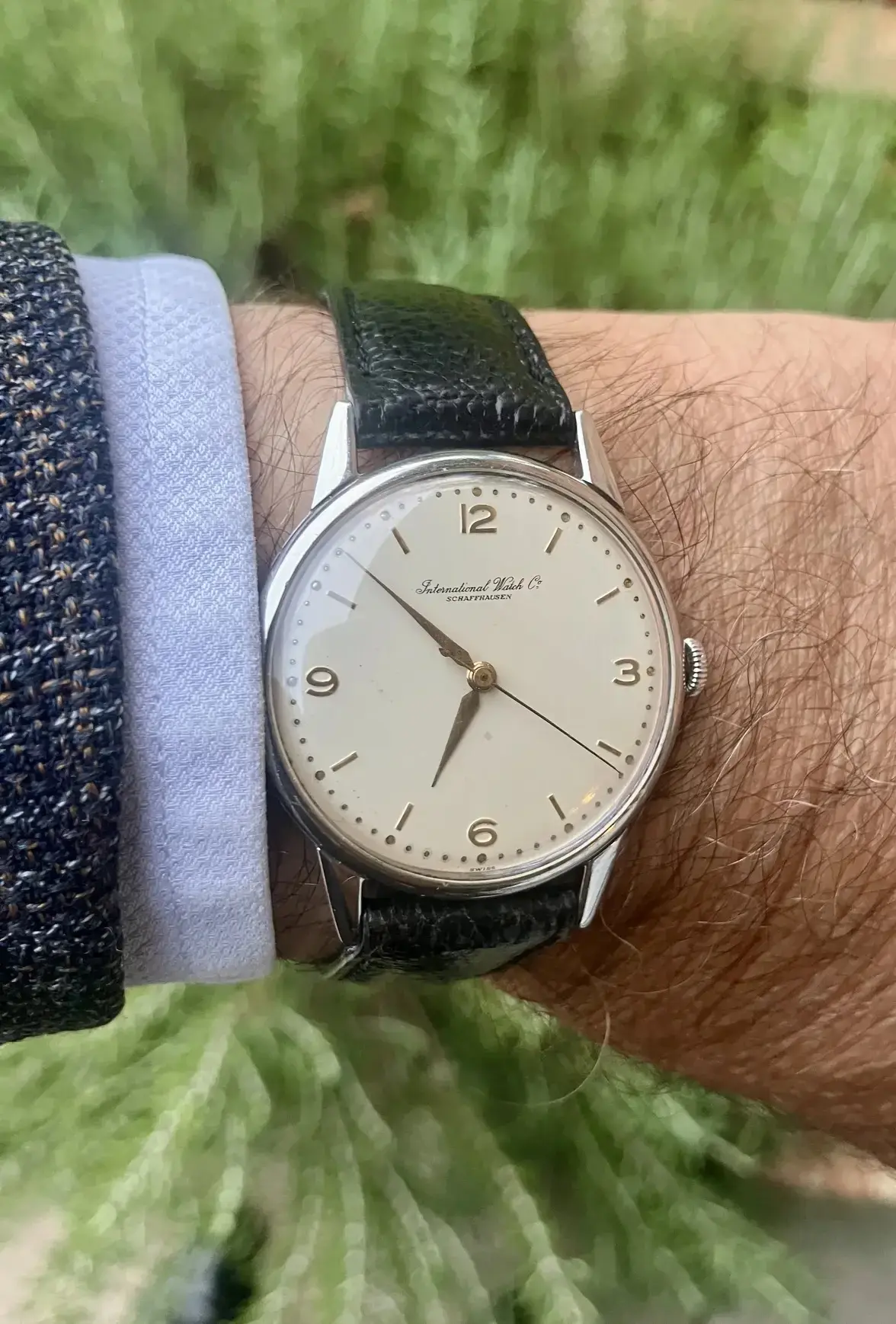
I have a similar watch, FWIW, with soft lugs unfortunately.

 
Posts
13,519
Likes
18,808
My gut tells me redial on this one. The "Schaffhausen" doesn't match any known IWC font.

But I have been wrong before.
gatorcpa
 
Posts
8,201
Likes
28,912
I believe it to be a redial, and not only because the Schaffhausen signature appears to be off. If you compare International and Watch, it appears that the characters on the latter are thicker, and that dissonance is problematic.
 
Posts
6,893
Likes
55,043
Mine dates to 1954 and the "Schaffhausen" resembles Dan's watch the most out of the variant markings in the set with the very last photo illustration of the set of photos coming in second. Thanks knebo!


Posts
281
Likes
455
Thank you all so much for your inputs!
@Tony C @gatorcpa @Dan S

I hear your consensus "probably a redial". But I'm a bit surprised by the "probably" as I recall more firm statements from other threads.
Therefore, here are some more photos from the microscope:


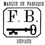
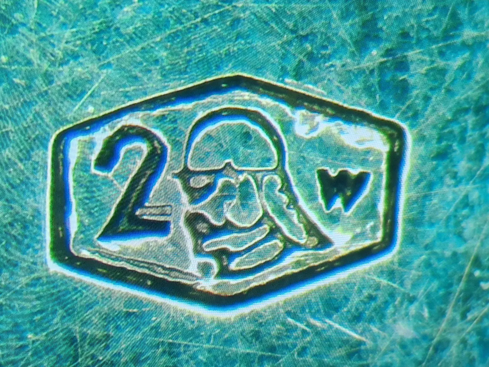
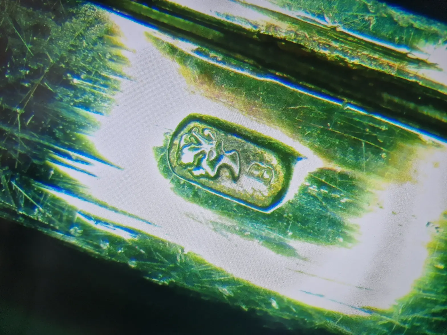
Beyond the dial, I'm also a bit confused by some hallmarks on the outside of the case:
- centre of the back of the case (outside)
- side of the case


It's a monocoque case (i.e. case + bezel with plexi, no caseback), so I haven't had the chance to look at the hallmarks inside the case.

What do you make of that?
 
Posts
1,778
Likes
3,533
For me that is a professionaly reprinted ( engraved cliché/plate + pad printing ) dial looking at the sharpness and thickness/heigth of the paint.
Far better then hand painting or restoring work but it misses the finer lines transfer into the next letter. And the O is out of place as already mentioned here. Could even be laser etched into the printing plate as the font is so evenly wide, and not hand engraved. But without a macro shot like yours it is getting very very difficult to tell, or you need a loupe and watch in hand.

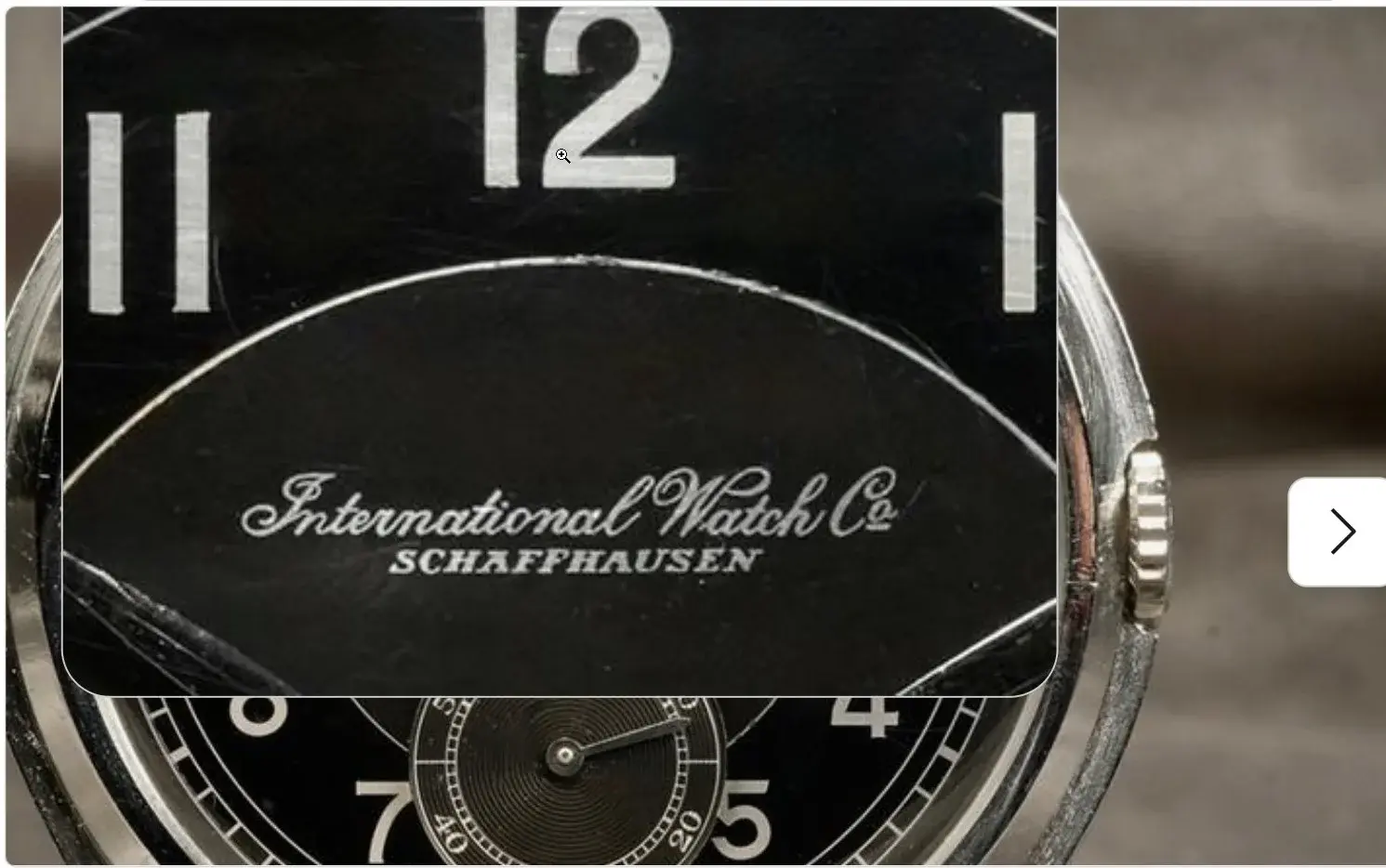
This honest Swiss seller shows a reprint IWC dial with the original dial next to it for comparison, and its getting scary close to the original. The italic script is very difficult to make flowing from thin to thicker lines but Bold or Capital letters are very close to perfect;

https://www.chrono24.nl/iwc/iwc-her...4811804.htm?searchHash=26fd158d_c9yNLi&pos=12

 
Posts
281
Likes
455
- side of the case
ok, so this is the slightly polished-over Helvetia hallmark indicating 18k gold and the B indicating that it was checked by the control office of Bern/Berne. So that's fine.

Still not sure about the other hallmark.