- Posts
- 77
- Likes
- 33
BCHH
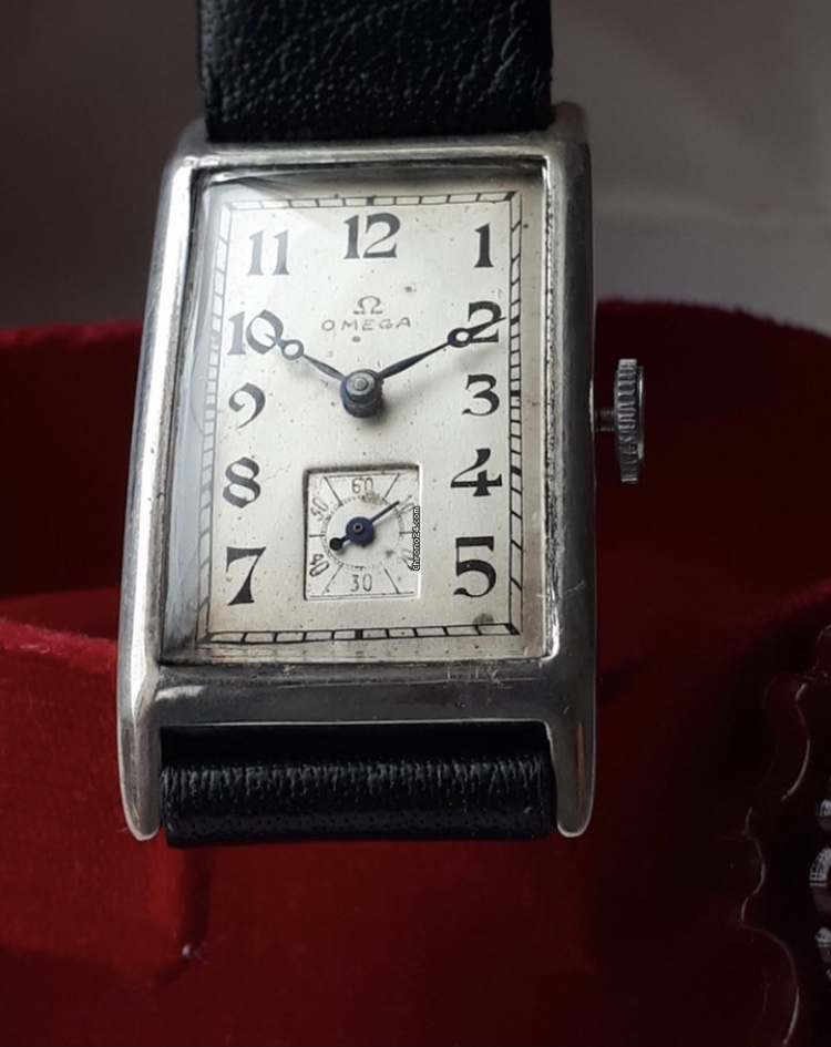
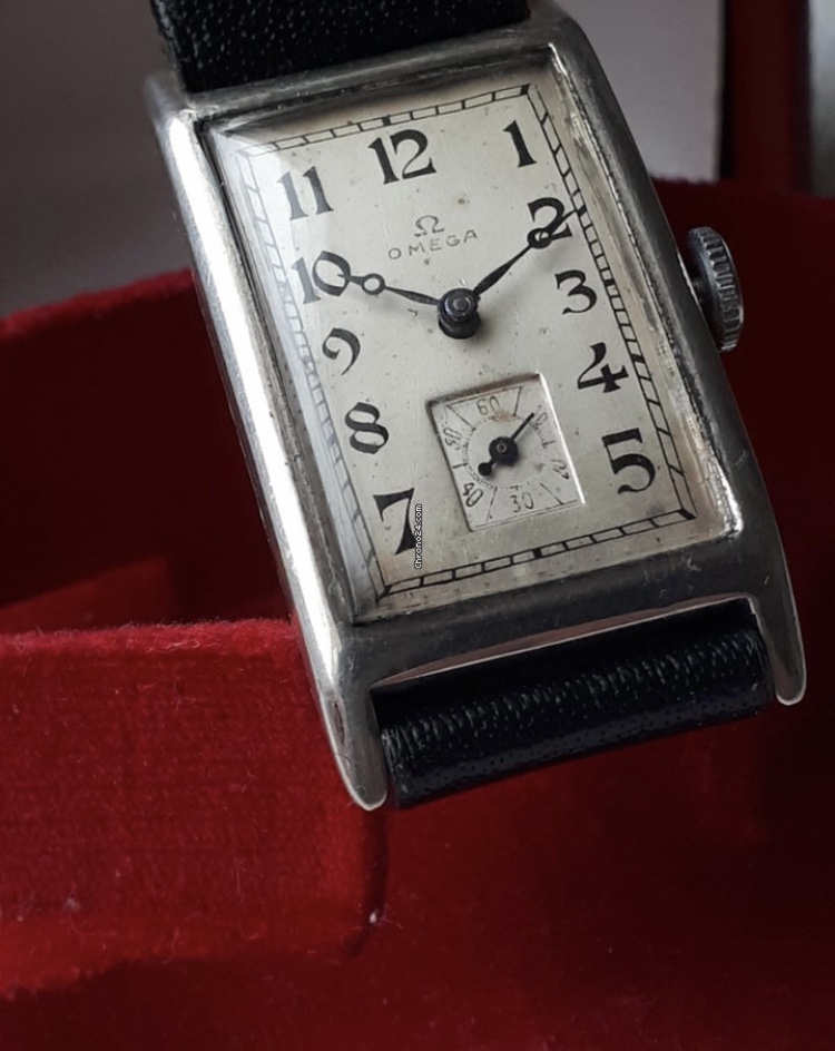
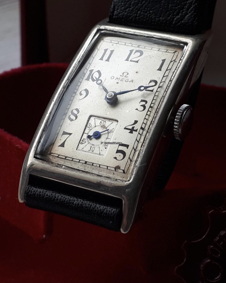
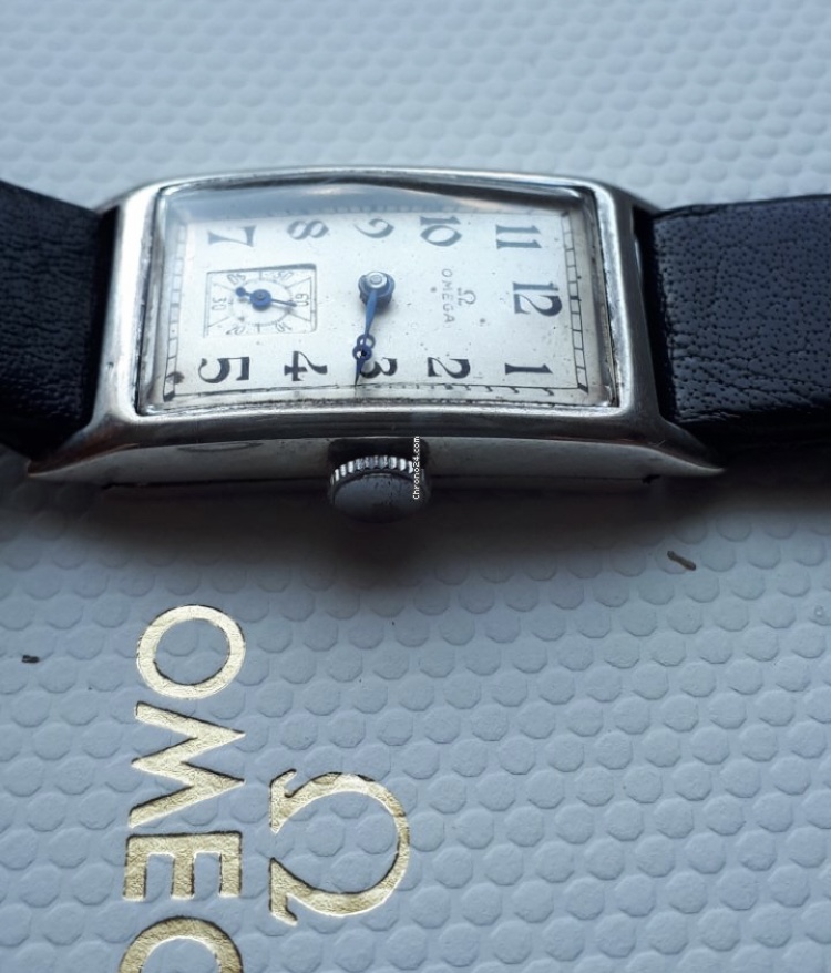
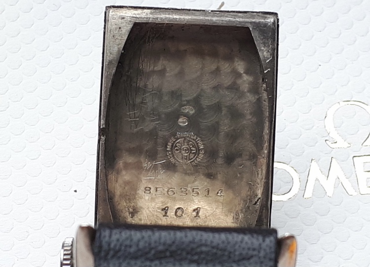
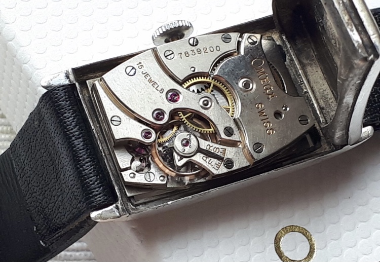
·I came accross this beauty from 1934 but I have my doubts about the dial. Everything else looks as it should and it has some nice patina, but I can't take my eyes off the logo.😒
Am I the only one who thinks it looks weird or is it normal for a watch this age to have a logo that doesn't look 'perfect'? Opinions?
Am I the only one who thinks it looks weird or is it normal for a watch this age to have a logo that doesn't look 'perfect'? Opinions?